Chapter 10. List Boxes
In this chapter:
10.1 List API overview
class javax.swing.JList
This class represents a basic GUI component allowing the selection of one or more items from a list of choices.
JList has two models: ListModel which handles data in the list, and ListSelectionModel which handles item selection (three different selection modes are supported which we will discuss below). JList also supports custom rendering, as we learned in the last chapter, through the implementation of the ListCellRenderer interface. We can use existing default implementation of ListCellRenderer (DefaultListCellRenderer) or create our own according to our particular needs (which we will see later in ths chapter). Note that unless we use a custom renderer, the default renderer will display each element as a String defined by that object’s toString() method (the only exceptions to this are Icon implementations which will be renderered as they would be in any JLabel). Also note that a ListCellRenderer returns a Component, but that component is not interactive and is on! ly used for display purposes (i.e. it acts as a "rubber ! st! amp"API). For instance, if a JCheckBox is used as a renderer we will not be able to check and uncheck it. Unlike JComboBox, however, JList does not support editing of any sort.A number of constructors are available to create a
JList component. We can use the default constructor or pass list data to a constructor as a one-dimensional array, a Vector, or as an implementation of the ListModel interface. The last variant provides maximum control over a list's properties and appearance. We can also assign data to a JList using the setModel() method, or one of the overloaded setListData() methods.JList
does not provide direct access to its elements, and we must access its ListModel to gain access to this data. JList does, however, provide direct access to its selection data by implementing all ListSelectionModel methods, and delegating their traffic to the actual ListSelectionModel instance. To avoid repetition we will discuss selection funcionality below in our overview of ListSelectionModel.JList
maintains selection foreground and background colors (assigned by its UI delegate when installed), and the default cell renderer, DefaultListCellRenderer, will use these colors to render selected cells. These colors can be assigned with setSelectedForeground() and setSelectedBackground(). Nonselected cells will be rendered with the component foreground and background colors assigned to JList with setForeground() and setBackground().JList
implements the Scrollable interface (see chapter 7) to provide vertical unit incremental scrolling corresponding the list cell height, and vertical block incremental scrolling corresponding to the number of visible cells. Horizontal unit increment scrolling corresponds to the size of the list’s font (1 if the font is null), and horizontal block unit increment scrolling corresponds to the current width of the list. Thus JList does not directly support scrolling and is intended to be placed in a JScrollPane.The
visibleRowCount property specifies how many cells should be visible when a JList is placed in a scroll pane. This defaults to 8 and can be set with the setVisibleRowCount() method. Another interesting method provided by JList is ensureIndexIsVisible(), which forces the list to scroll itself so that the element corresponding to the given index becomes visible. Note that JList also supports autoscrolling (i.e. it will scroll element by element every 100ms if the mouse is dragged below or above its bounds and if an item has been se! lected).By default the width of each cell is the width of the widest item, and the hieght of each cell corresponds to the hieght of the tallest item. We can overpower this behavior and specify our own fixed cell width and height of each list cell using the
setFixedCellWidth() and setFixedCellHeight() methods.Another way to control the width and height of each cell is through use of the
setPrototypeCellValue() method. This method takes an Object parameter and uses it to automatically determine the fixedCellWidth and fixedCellHeight. A typical use of this method would be to give it a String. This forces the list to use a fixed cell width and hieght equal to the width and hieght of that string when rendered in the Font currently assigned to the JList.JList
also provides a method called locationToIndex() which will return the index of a cell at the given Point (in list coordinates). -1 will be returned if none is found. Unfortunately JList does not provide support for double-clicking, but this method comes in very handy in implementing our own. The following psuedocode shows how we can use a MouseAdapter, MouseEvent, and the locationToIndex() method to determine the JList cell a double-click occurs on:
  myJist.addMouseListener( new MouseAdapter() {
    public void mouseClicked(MouseEvent e) {
      if (e.getClickCount() == 2) {
        int cellIndex = myJList.locationToIndex(e.getPoint());
        // We now have the index of the double-clicked cell..
      }
    }
  });
abstract interface javax.swing.ListModel
This interface describes a data model that holds a list of items. Method
getElementAt() retrieves the item at the given position as an Object instance. Method getSize() returns the number of items in the list. It also contains two methods allowing the registration of ListDataListeners (see below) to be notified of additions, removals, and any changes that occur to this model. Note that this interface leaves the job of specifying how we store and structure the data, as well as how we add, remove, or change an item, completely up to its implementations.10.1.2 AbstractListModel
abstract class javax.swing.AbstractListModel
This class represents a partial implementation of the
ListModel interface. It defines the default event handling functionality, and implements the add/remove ListDataListener methods, as well as methods to fire ListDataEvents (see below) when additions, removals, and changes occur. The remainder of ListModel, methods getElementAt() and getSize(), must be implemented in any concrete sub-class.10.1.3 DefaultListModel
class javax.swing.DefaultListModel
This class represents the concrete default implementation of the
ListModel interface. It extends AbstractListModel and uses a java.util.Vector to store its data. Almost all of the methods of this class correspond directly to Vector methods and we will not discuss them here. Familiarity with Vectors implies familiarity with how DefaultListModel works (see API docs).10.1.4 The ListSelectionModel interface
abstract interface javax.swing.ListSelectionModel
This interface describes the model used for selecting list items. It defines three modes of selection: single selection, single contiguous interval selection, and multiple contiguous interval selection. A selection is defined as an indexed range, or set of ranges, of list elements. The beginning of a selected range (where it originated) is referred to as the anchor, while the last item is referred to as the lead (the anchor can be greater than, less than, or equal to the lead). The lowest selected index is referred to as the minimum, and the highest selected index is referred to as the maximum (regardless of the order in which selection takes place). Each of these indices represents a
ListSelectionModel property. The minimum and maximum properties should be -1 when no selection exists, and the anchor and lead maintain their most recent value until a new selection occurs.To change selection mode we use the
setSelectionMode() method, passing it one of the following constants: MULTIPLE_INTERVAL_SELECTION, SINGLE_INTERVAL_SELECTION, and SINGLE_SELECTION. In SINGLE_SELECTION mode only one item can be selected. In SINGLE_INTERVAL_SELECTION mode a contiguous group of items can be selected by selecting an anchor item, holding down the SHIFT key, and choosing a lead item (which can be at a higher or lower index than the anchor). In MULTIPLE_INTERVAL_SELECTION mode any number of items can be selected regardless of their location by holding down the CTRL key and clicking. Multiple selection mode also allows use of SHIFT to select a contiguous interval, however, this has the effect of clearing the current selection.ListSelectionModel
provides several methods for adding, removing, and manipulating ranges of selections. Methods for registering/removing ListSelectionListeners (see below) are provided as well. Each of these methods is self-explanitory in the API docs and we will not describe them in detail here.JList
defines all the methods declared in this interface and simply delegates all traffic to its ListSelectionModel instance. This allows access to selection data without the need to directly communicate with the selection model.10.1.5 DefaultListSelectionModel
class javax.swing.DefaultListSelectionModel
This class represents the concrete default implementation of the
ListSelectionModel interface. It defines methods to fire ListSelectionEvents (see below) when a selection range changes.10.1.6 The ListCellRenderer interface
abstract interface javax.swing.ListCellRenderer
This interface describes a component used for rendering a list item. We discussed this interface, as well as its default concrete implementation,
DefaultListCellRenderer, in the last chapter (see 9.1.4 and 9.1.4). We will show how to construct several custom renderers in the examples that follow.10.1.7 The ListDataListener interface
abstract interface javax.swing.event.ListDataListener
Defines three methods for dispatching
ListDataEvents when list elements are added, removed or changed in the ListModel: intervalAdded(), intervalRemoved(), and contentsChanged().10.1.8 ListDataEvent
class javax.swing.event.ListDataEvent
This class represents the event delivered when changes occur in a list's
ListModel. It includes the source of the event as well as the index of the lowest and highest indexed elements affected by the change. It also includes the type of event that occurred. Three ListDataEvent types are defined as static ints: CONTENTS_CHANGED, INTERVAL_ADDED, and INTERVAL_REMOVED. We can use the getType() method to discover the type of a! ny ListDataEvent.10.1.9 The ListSelectionListener interface
abstract interface javax.swing.event.ListSelectionListener
This interface describes a listener which listens for changes in a list's
ListSelectionModel. It declares the valueChanged() method which accepts a ListSelectionEvent.10.1.10 ListSelectionEvent
class javax.swing.event.ListSelectionEvent
This class represents an event delivered by
ListSelectionModel when changes occur in its selection. It is almost identical to ListDataEvent, except that the indices specified signify where there has been a change in the selection model, rather than the data model.
UI Guideline : Advice on Usage and Design
UsageMuch of the UI Guideline advice for List Boxes is similar to that of Comboboxes. Clearly the two things are different and are intended for different purposes. Deciding when to use one or another can be difficult. Our advice is to think about reader output rather than data input. When the reader needs to see a collection of items then a List Box is the correct choice. Use a List Box where there is a collection of data, which may grow dynamically, and for reading purposes it is useful to see the whole collection or as much of the collection as can reasonably be fitted in the available space, e.g. Department Staff <List of Staff Name>.
Design
Like Comboboxes, there are a number of things which affect the usability of a List Box. Beyond more than a few items, they become unusable unless the data is sorted in some logical fashion e.g. alphabetical, numerical. List Boxes are designed to be used with Scroll Pane. It is assumed that the list will most often be too long to display in the available screen space. Using a sensible sorted order for the list, allows the user to predict how much they need to scroll to find what they are looking for.
When a list gets longer, usability is affected again.Once a list gets beyond a couple of hundred items, even when sorted, it becomes very slow for the user to locate specific item in the list. When a list becomes so long, it may be better to consider providing a Search Facility, or grouping the data inside the list using a Tree.
Graphical considerations for List Boxes are much like those for Comboboxes. List Boxes should be aligned to fit attractively into a panel. However, this can be problematic. You must avoid making a List Box which is simply too big for the list items contained e.g. a List Box showing supported file formats such as .gif need only be a few characters long, don't make it big enough to take 50 characters, as it will look unbalanced.
The nature of the list items must also be considered. If you have 50 items in a list where most items are around 20 characters but one item is 50 characters long then should you make the List Box big enough to display the longer one? Well maybe, but for most occasions your display will be unbalanced again. It is probably best to optimise for the more common length, providing the the longer one still has meaning when read in its truncated form. One solution to displaying the whole length of a truncated item is to use the tooltip facility. When the User places the mouse over an item, a tooltip appears with the full length data.
10.2 Basic JList example
This example displays a list of the united states using an array of
Strings in the following format:2-character abbreviation<tab character>full name<tab character>capital
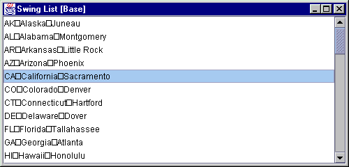
Figure 10.1 A JList displaying a list of Strings containing tab characters.
<<file figure10-1.gif>>
The Code: StatesList.java
see \Chapter10\1
import java.awt.*;
import java.awt.event.*;
import java.util.*;

import javax.swing.*;
import javax.swing.border.*;
import javax.swing.event.*;

public class StatesList	extends JFrame
{

    protected JList m_statesList;

    public StatesList()
    {
	super("Swing List [Base]");
	setSize(500, 240);

	String [] states = {
		"AK\tAlaska\tJuneau",
		"AL\tAlabama\tMontgomery",
		"AR\tArkansas\tLittle Rock",
		"AZ\tArizona\tPhoenix",
		"CA\tCalifornia\tSacramento",
		"CO\tColorado\tDenver",
		"CT\tConnecticut\tHartford",
		"DE\tDelaware\tDover",
		"FL\tFlorida\tTallahassee",
		"GA\tGeorgia\tAtlanta",
		"HI\tHawaii\tHonolulu",
		"IA\tIowa\tDes Moines",
		"ID\tIdaho\tBoise",
		"IL\tIllinois\tSpringfield",
		"IN\tIndiana\tIndianapolis",
		"KS\tKansas\tTopeka",
		"KY\tKentucky\tFrankfort",
		"LA\tLouisiana\tBaton Rouge",
		"MA\tMassachusetts\tBoston",
		"MD\tMaryland\tAnnapolis",
		"ME\tMaine\tAugusta",
		"MI\tMichigan\tLansing",
		"MN\tMinnesota\tSt.Paul",
		"MO\tMissouri\tJefferson City",
		"MS\tMississippi\tJackson",
		"MT\tMontana\tHelena",
		"NC\tNorth Carolina\tRaleigh",
		"ND\tNorth Dakota\tBismarck",
		"NE\tNebraska\tLincoln",
		"NH\tNew Hampshire\tConcord",
		"NJ\tNew Jersey\tTrenton",
		"NM\tNew Mexico\tSantaFe",
		"NV\tNevada\tCarson City",
		"NY\tNew York\tAlbany",
		"OH\tOhio\tColumbus",
		"OK\tOklahoma\tOklahoma City",
		"OR\tOregon\tSalem",
		"PA\tPennsylvania\tHarrisburg",
		"RI\tRhode Island\tProvidence",
		"SC\tSouth Carolina\tColumbia",
		"SD\tSouth Dakota\tPierre",
		"TN\tTennessee\tNashville",
		"TX\tTexas\tAustin",
		"UT\tUtah\tSalt Lake City",
		"VA\tVirginia\tRichmond",
		"VT\tVermont\tMontpelier",
		"WA\tWashington\tOlympia",
		"WV\tWest Virginia\tCharleston",
		"WI\tWisconsin\tMadison",
		"WY\tWyoming\tCheyenne"
		};

		m_statesList = new JList(states);

		JScrollPane ps = new JScrollPane();
		ps.getViewport().add(m_statesList);
		getContentPane().add(ps, BorderLayout.CENTER);

		WindowListener wndCloser = new WindowAdapter()
		{
			public void windowClosing(WindowEvent e)
			{
				System.exit(0);
			}
		};
		addWindowListener(wndCloser);

		setVisible(true);
	}

	public static void main(String argv[])
	{
	    new StatesList();
	}
}
Understanding the Code
Class StatesList
Class
StatesList extends JFrame to implement the frame container for this example. One instance variable, JList m_statesList, is used to store an array of state Strings (as described above). This list is created by passing the states String array to the JList constructor. It is then added to a JScrollPane instance ! to provide scrolling capabilities.Running the Code
Figure 10.1 shows
StatesList in action displaying the list of states and their capitals. Note that the separating tab character is displayed as an unpleasant square symbol (we'll fix this in the next example).
UI Guideline : Unbalanced Layout
In this example, the design is unblanced due to the tab character not being displayed correctly. The box is ugly but the spacing is also wrong. The large whitespace area to the right ought to be avoided. The next example corrects this.
10.3 Custom rendering
In this section we’ll add the ability to allign
Strings containing tab separators into a table-like arrangement. We want each tab character to shift all text to its right, to a specified location instead of being rendered as the square symbol we saw above. These locations should be determined uniformly for all elements of the list to form columns that line up correctly.Note that this example works well with proportional fonts as well as with fixed width fonts (i.e. it doesn’t matter what font we use because alignment is not designed to be font-dependent). This makes
JList a powerful but simple component, which can be used in place of JTable in simple cases such as the example presented here (where the involvement of JTable would create unnecessary overhead).To accomplish the desired rendering we construct a custom renderer,
TabListCellRenderer, which exposes accessor methods to specify and retreive tab positions based on the index of a tab character in a String being rendered:getDefaultTab()/setDefaultTab(int)
: manages the default tab size (defaults to 50). In case a position is not specified for a given tab index, we use a default size to determine how far to offset a portion of text.getTabs()/setTabs(int[])
: manages an array of positions based on the index of a tab character in a String being rendered. These positions used in rendering each element in the list to provide conisitent alignment.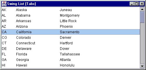
Figure 10.2 Custom ListCellRenderer to display tab-separated Strings in a table-like fashion.
<<file figure10-2.gif>>
The Code: StatesList.java
see \Chapter10\2
import java.awt.*;
import java.awt.event.*;
import java.util.*;

import javax.swing.*;
import javax.swing.border.*;
import javax.swing.event.*;

public class StatesList extends JFrame
{
  protected JList m_statesList;

  public StatesList() {
  // Unchanged code from section 10.2

  m_statesList = new JList(states);
  TabListCellRenderer renderer = new TabListCellRenderer();
  renderer.setTabs(new int[] {50, 200, 300});
  m_statesList.setCellRenderer(renderer);

  // Unchanged code from section 10.2
  }
}
// NEW
class TabListCellRenderer extends JLabel implements ListCellRenderer
{
    protected static Border m_noFocusBorder;
    protected FontMetrics m_fm = null;
    protected Insets m_insets = new Insets(0, 0, 0, 0);

    protected int m_defaultTab = 50;
    protected int[] m_tabs = null;

    public TabListCellRenderer()
    {
	super();
	m_noFocusBorder = new EmptyBorder(1, 1, 1, 1);
	setOpaque(true);
	setBorder(m_noFocusBorder);
    }

    public Component getListCellRendererComponent(JList list,
		Object value, int index, boolean isSelected, boolean cellHasFocus)
    {
	setText(value.toString());

	setBackground(isSelected ? list.getSelectionBackground() : list.getBackground());
	setForeground(isSelected ? list.getSelectionForeground() : list.getForeground());

	setFont(list.getFont());
	setBorder((cellHasFocus) ? UIManager.getBorder("List.focusCellHighlightBorder") : m_noFocusBorder);

	return this;
    }

    public void setDefaultTab(int defaultTab) { m_defaultTab = defaultTab; }

    public int getDefaultTab() { return m_defaultTab; }

    public void setTabs(int[] tabs) { m_tabs = tabs; }

    public int[] getTabs() { return m_tabs; }

    public int getTab(int index)
    {
	if (m_tabs == null)
	   return m_defaultTab*index;

	int len = m_tabs.length;
	if (index >= 0 && index < len)
	   return m_tabs[index];

	return m_tabs[len-1] + m_defaultTab*(index-len+1);
    }


    public void paint(Graphics g)
    {
	m_fm = g.getFontMetrics();

	g.setColor(getBackground());
	g.fillRect(0, 0, getWidth(), getHeight());
	getBorder().paintBorder(this, g, 0, 0, getWidth(), getHeight());

	g.setColor(getForeground());
	g.setFont(getFont());
	m_insets = getInsets();
	int x = m_insets.left;
	int y = m_insets.top + m_fm.getAscent();

	StringTokenizer	st = new StringTokenizer(getText(), "\t");
	while (st.hasMoreTokens())
	{
	      String sNext = st.nextToken();
	      g.drawString(sNext, x, y);
		x += m_fm.stringWidth(sNext);

		if (!st.hasMoreTokens())
			break;
		int index = 0;
		while (x >= getTab(index))
	  	      index++;
		x = getTab(index);
	}
   }

}
Understanding the Code
Class StatesList
Minor changes have been made to this class (compared to
StatesList from the previous section). We create an instance of our custom TabListCellRenderer, pass it an array of positions and set it as the renderer for our JList component.Class TabListCellRenderer
Class
TabListCellRenderer extends JLabel and implements the ListCellRenderer interface to be used as our custom renderer.Class variable:
Border m_noFocusBorder
: border to be used when a list item has no focus.Instance variables:
FontMetrics m_fm
: used in calculating text positioning when drawing.Insets m_insets
: insets of the cell being rendered.int m_defaultTab
: default tab size.int[] m_tabs
: an array of positions based on tab index in a String being rendered.The constructor creates assigns text, sets its opaque property to
true (to render the component's area with the specified background), and sets the border to m_noFocusBorder.The
getListCellRendererComponent() method is required when implementing ListCellRenderer, and is called each time a cell is about to be rendered. It takes five parameters:JList list
: reference to the list instance.Object value
: data object to be painted by the renderer.int index
: index of the item in the list.boolean isSelected
: true if the cell is currently selected.boolean cellHasFocus: true
if the cell currently has the focus.Our implementation of this method assigns new text, sets the background and foreground (depending on whether or not the cell is selected), sets the font to that taken from the parent list component, and sets the border according to whether or not the cell has input focus.
Four additional methods provide set/get support for the
m_defaultTab and m_tabs variables, and do not require detailed explanation beyond the code listing. Now let's take a close look at the getTab() method which calculates and returns the position for a given tab index. If no tab array, m_tabs, is set, this method returns the m_defaultTab distance (defaults to 50) multiplied by the given tab index. If the m_tabs array is not null and the tab index is less than it's length, the proper value from that array is returned. Otherwise, if the tab index is greater than the array's length, we have no choice but to use the default tab size again.Since the
JLabel component does not render tab characters properly, we do not benefit a lot from its inheritance and implement the paint() method to draw tabbed Strings ourselves.
Note: Because this is a very simple component that we do not plan to enhance with custom UI functionality, overriding
paint() is acceptable.First, our
paint() method requests a reference to the FontMetrics instance for the given Graphics. Then we fill the component's rectangle with the background color (which is set in the getListCellRendererComponent() method depending on whether or not the cell is selected, see above), and paint the component's border.
Note: Alternatively we could use the
drawTabbedText() method from the javax.swing.text.Utilities class to draw tabbed text. However, this requires us to implement the TabExpander interface. In our case it's easier to draw text directly without using that utility. As an interesting exercise you can modify the code from this example to use drawTabbedText() method. We will discuss working with tabs more in chapter 19.In the next step we prepare to draw the tabbed
String. We set the foreground color, font, and determine the initial x and y positions for drawing the text, taking into account the component's insets.
Reminder: To draw text in Java you need to use a baseline
y-coordinate. This is why the getAscent() value is added to the y position. The getAscent() method returns the distance from the font's baseline to the top of most alphanumeric characters. See chapter 2 for more information on drawing text and Java 2 FontMetrics caveats.We then use a
StringTokenizer to parse the String and extract the portions separated by tabs. Each portion is drawn with the drawString() method, and the x-coordinate is adjusted to the length of the text. We cycle through this process, positioning each portion of text by calling the getTab() method, until no more tabs are found.Running the Code
Figure 10.2 shows
StatesList displaying an array of tab-separated Strings. Note that the tab symbols are not drawn directly, but form consistently aligned columns inside the list.
UI Guideline : Improved Balance
With the tab character now being displayed correctly, the list box now has much better balance. The available area for Capital City is still very large and as designer you may wish to consider reduing this, thus reducing the excessive white space to the right hand side. Such a decision would normally be made after the List Box is seen in situation and necessary alignment and overall panel balance is taken into consideration.
10.4 Processing keyboard input and searching
In this section we will continue to enhance our
JList states example by adding the ability to select an element whose text starts with a character corresponding to a key press. We will also show how to extend this functionality to search for an element whose text starts with a sequence of typed key characters.
To do this, we must use a
KeyListener to listen for keyboard input, and accumulate this input in a String. Each time a key is pressed, the listener must search through the list and select the first element whose text matches the String that we have accumulated. If the time interval between two key presses exceeds a certain pre-defined value, the accumulated String must be cleared before appending a new character to avoid overflow.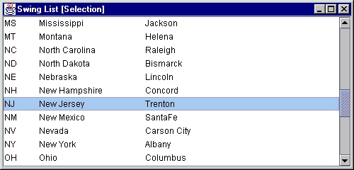
Figure 10.3 JList allowing accumulated keyboard input to search for a matching item.
<<file figure10-3.gif>>
The Code: StatesList.java
see \Chapter10\3
import java.awt.*;
import java.awt.event.*;
import java.util.*;

import javax.swing.*;
import javax.swing.border.*;
import javax.swing.event.*;

public class StatesList extends JFrame
{
  protected JList m_statesList;

  public StatesList() {
    // Unchanged code from section 10.3

    m_statesList = new JList(states);
    TabListCellRenderer renderer = new TabListCellRenderer();
    renderer.setTabs(new int[] {50, 200, 300});
    m_statesList.setCellRenderer(renderer);
    m_statesList.addKeyListener(new ListSearcher(m_statesList));

    // Unchanged code from section 10.3
  }
}
class ListSearcher extends KeyAdapter
{
    protected JList m_list;
    protected ListModel m_model;
    protected String m_key = "";
    protected long m_time = 0;

    public static int CHAR_DELTA = 1000;

    public ListSearcher(JList list)
    {
		m_list = list;
		m_model = m_list.getModel();
    }

    public void keyTyped(KeyEvent e)
    {
	char ch = e.getKeyChar();
	if (!Character.isLetterOrDigit(ch))
	   return;

	if (m_time+CHAR_DELTA < System.currentTimeMillis())
	   m_key = "";
	m_time = System.currentTimeMillis();

	m_key += Character.toLowerCase(ch);
	for (int k = 0; k < m_model.getSize(); k++)
	{
	    String str = ((String)m_model.getElementAt(k)).toLowerCase();
	    if (str.startsWith(m_key))
	    {
				m_list.setSelectedIndex(k);
				m_list.ensureIndexIsVisible(k);
				break;
	    }
	}
    }
}
Understanding the Code
Class StatesList
An instance of
ListSearcher is added to the m_statesList component as a KeyListener. This is the only difference made to this class with respect to the previous example.Class ListSearcher
Class
ListSearcher extends the KeyAdapter class and defines on class variable:int CHAR_DELTA
: static variable to hold the maximum time interval in ms between two subsequent key presses before clearing the search key character String.Instance variables:
JList m_list
: list component to search and change selection based on keyboard input.ListModel m_model
: list model of m_list.String m_key
: key character String used to search for a match.long m_time
: time in ms of the last key press.The
ListSearcher constructor simply takes a reference to the parent JList component and stores it in instance variable m_list, and its model in m_model.The
keyTyped() method is called each time a new character is typed (i.e. a key is pressed and released). Our implementation first obtains a typed character and returns if that character is not letter or digit. keyTyped() then checks the time interval between now and the time when the previous key type event occurred. If this interval exceeds CHAR_DELTA, the m_key String is cleared. Finally, this method walks through the list and performs a case-insensitive comparison of the list Strings and searching String (m_key). If an element’s text starts with m_key, this element is selected and it is forced to appear within our current JList view using the ensureIndexIsVisible() method.Running the Code
Try out the search functionality. Figure 10.3 shows our list's selection after pressing "n" immediately followed by "j". As expected, New Jersey is selected.
UI Guideline : Extending Usability and List Size
This technique of allowing accumulated keyboard input to sift and select a List item, improves usability by making the task of search and locating an item in the list easier. This extends the number of items you can put in a list and still have a usable design. A technique like this can easily improve the usefulness of the list up to several thousand entries.
This is another good example of improved usability when the developer takes extra time to provide additional code to make the User's task easier.
10.5 List of check boxes
Lists can certainly be used for more than just
Strings. We can easily imagine a list of Swing components. A list of check boxes is actually common in software packages when prompting for selection of optional constituents during installation. In Swing such a list can be constructed by implementing a custom renderer that uses the JCheckBox component. The catch is that mouse and keyboard events must be handled manually to check/uncheck these boxes.The following example shows how to create a list of check boxes representing imaginary optional program constituents. Associated with each component is an instance of our custom
InstallData class with the following fields:Field Type Description
m_name
String Component's namem_size
int Component's size in KBm_selected
boolean true if component is selected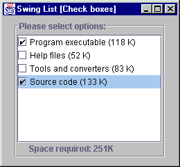
Figure 10.4 JList with JCheckBox renderers.
<<file figure10-4.gif>>
The Code: CheckBoxList.java
see \Chapter10\4
import java.awt.*;
import java.awt.event.*;
import java.util.*;

import javax.swing.*;
import javax.swing.border.*;
import javax.swing.event.*;

public class CheckBoxList extends JFrame
{

	protected JList  m_list;
	protected JLabel m_total;

	public CheckBoxList()
	{
		super("Swing List [Check boxes]");
		setSize(260, 240);
		getContentPane().setLayout(new FlowLayout());

		InstallData[] options = {
			new InstallData("Program executable", 118),
			new InstallData("Help files", 52),
			new InstallData("Tools and converters", 83),
			new InstallData("Source code", 133)
		};

		m_list = new JList(options);
		CheckListCellRenderer renderer = new CheckListCellRenderer();
		m_list.setCellRenderer(renderer);
		m_list.setSelectionMode(ListSelectionModel.SINGLE_SELECTION);

		CheckListener lst = new CheckListener(this);
		m_list.addMouseListener(lst);
		m_list.addKeyListener(lst);

		JScrollPane ps = new JScrollPane();
		ps.getViewport().add(m_list);

		m_total = new JLabel("Space required: 0K");

		JPanel p = new JPanel();
		p.setLayout(new BorderLayout());
		p.add(ps, BorderLayout.CENTER);
		p.add(m_total, BorderLayout.SOUTH);
		p.setBorder(new TitledBorder(new EtchedBorder(),
			"Please select options:") );
		getContentPane().add(p);

		WindowListener wndCloser = new WindowAdapter()
		{
			public void windowClosing(WindowEvent e)
			{
				System.exit(0);
			}
		};
		addWindowListener(wndCloser);

		setVisible(true);

		recalcTotal();
	}

	public void recalcTotal()
	{
		ListModel model = m_list.getModel();
		int total = 0;
		for (int k=0; k < model.getSize(); k++)
		{
			InstallData data = (InstallData)model.getElementAt(k);
			if (data.isSelected())
				total += data.getSize();
		}
		m_total.setText("Space required: "+total+"K");
	}

	public static void main(String argv[])
	{
		new CheckBoxList();
	}
}

class CheckListCellRenderer extends JCheckBox implements ListCellRenderer
{
	protected static Border m_noFocusBorder =
		new EmptyBorder(1, 1, 1, 1);

	public CheckListCellRenderer()
	{
		super();
		setOpaque(true);
		setBorder(m_noFocusBorder);
	}

	public Component getListCellRendererComponent(JList list,
		Object value, int index, boolean isSelected, boolean cellHasFocus)
	{
		setText(value.toString());

		setBackground(isSelected ? list.getSelectionBackground() :
			list.getBackground());
		setForeground(isSelected ? list.getSelectionForeground() :
			list.getForeground());

		InstallData data = (InstallData)value;
		setSelected(data.isSelected());

		setFont(list.getFont());
		setBorder((cellHasFocus) ?
			UIManager.getBorder("List.focusCellHighlightBorder")
			 : m_noFocusBorder);

		return this;
	}
}

class CheckListener implements MouseListener, KeyListener
{
	protected CheckBoxList m_parent;
	protected JList m_list;

	public CheckListener(CheckBoxList parent)
	{
		m_parent = parent;
		m_list = parent.m_list;
	}

	public void mouseClicked(MouseEvent e)
	{
		if (e.getX() < 20)
			doCheck();
	}

	public void mousePressed(MouseEvent e) {}

	public void mouseReleased(MouseEvent e) {}

	public void mouseEntered(MouseEvent e) {}

	public void mouseExited(MouseEvent e) {}

	public void keyPressed(KeyEvent e)
	{
		if (e.getKeyChar() == ' ')
			doCheck();
	}

	public void keyTyped(KeyEvent e) {}
	public void keyReleased(KeyEvent e) {}

	protected void doCheck()
	{
		int index = m_list.getSelectedIndex();
		if (index < 0)
			return;
		InstallData data = (InstallData)m_list.getModel().
			getElementAt(index);
		data.invertSelected();
		m_list.repaint();
		m_parent.recalcTotal();
	}
}

class InstallData
{
    protected String m_name;
    protected int m_size;
    protected boolean m_selected;

    public InstallData(String name, int size)
    {
	m_name = name;
	m_size = size;
	m_selected = false;
    }

    public String getName() { return m_name; }

    public int getSize() { return m_size; }

    public void setSelected(boolean selected) { m_selected = selected;}

    public void invertSelected() { m_selected = !m_selected; }

    public boolean isSelected() { return m_selected; }

    public String toString() { return m_name+" ("+m_size+" K)"; }
}
Understanding the Code
Class CheckBoxList
CheckBoxList
extends JFrame to provide the basic frame for this example. Instance variables:JList m_list
: list to display program constituents.JLabel m_total
: label to display total space required for installation based on selected constituents.An array of four
InstallData objects is passed to the constructor of our JList component (note that we use the DefaultListModel, which is sufficient for our purposes here). SINGLE_SELECTION is used as our list’s selection mode. An instance of our custom CheckListCellRenderer is created and set as the cell renderer for our list. An instance of our custom CheckListener is then registered as both a mouse and key listener to handle item checking / unchecking for each check box (see below).The list component is added to a
JScrollPane to provide scrolling capabilities. Then JLabel m_total is created to display the total amount of space required for installation based on the currently selected check boxes.In previous examples the
JList component occupied all of our frame's available space. In this example, however, we are required to consider a different layout. JPanel p is now used to hold both the list and label (m_total). To ensure that the label will always be placed below the list we use a BorderLayout. We also use a TitledBorder for this panel’s border to provide visual grouping.Method
recalcTotal() steps through the sequence of InstallData instances contained in the list, and calculates the sum of sizes of the selected items. The result is then displayed in the m_total label.Class CheckListCellRenderer
This class implements the
ListCellRenderer interface and is similar to our TabListCellRenderer class from section 10.3. An important difference is that CheckListCellRenderer extends JCheckBox (not JLabel) and uses that component to render each item in our list. Method getListCellRendererComponent() sets the check box text, determines whether or not the current list item is selected, and sets the check box’s selection state accordingly (using its inherited JC! heckBox.setSelected() method).
Note: Alternatively we could use
JLabels with custom icons to imitate checked and unchecked boxes. However, the use of JCheckBox is preferred for graphical consistency with other parts of a GUI.
Class CheckListener
This class implements both
MouseListener and KeyListener to process all user input which can change the state of check boxes in the list. Its constructor takes a CheckBoxList instance as parameter in order to gain access to the CheckBoxList.recalcTotal() method.We’ve assumed in this example, that an item's checked state should be changed if:
1. The user clicks the mouse close enough to the item's check box (say, up to 20 pixels from the left edge).
2. The user transfers focus to the item (with the mouse or keyboard) and then presses the space bar.
Bearing this in mind, two methods need to be implemented:
mouseClicked() and keyPressed(). They both call protected method doCheck() if either of the conditions described above are satisfied. All other methods from the MouseListener and KeyListener interfaces have empty implementations.Method
doCheck() determines the first selected index (the only selected index--recall that our list uses single selection mode) in the list component and retrieves the corresponding InstallData object. This method then calls invertSelected() to change the checked state of that object. It then repaints the list component, and displays the new total by calling the recalcTotal() method.Class InstallData
Class
InstallData handles a data unit for this example (it functions as a custom model). InstallData encapsulates three variables described at the beginning of this section: m_name, m_size, and m_selected. Its only constructor takes three parameters to fill these variables. Besides the obvious set/get methods, the invertSelected() method is defined to negate the value of m_selected. Method toString() determines the String representation of this object to be used by the list renderer.Running the Code
Figure 10.4 shows our list composed of check boxes in action. Select any item and click over the check box, or press space bar to change its checked state. Note that the total kilobytes required for these imaginary implementations is dynamically displayed in the label at the bottom.
UI Guideline : When to use Check Boxes in a List
Check boxes tend to be used inside bordered panes to show groupings of mutually related binary attributes. Such a technique is good for a fixed number of attributes, however, it becomes problematic when the number of items can vary.The technique shown here is a good way to solve the problem when the collection of attributes or data is of an undetermined size. Use a CheckBox list for binary (True/False) selection of items from a collection of a size which cannot be determined at design time.
For example, imagine the team selection for a football team. The coach has a pool of players and needs to indicate who has been picked for the Saturday game. With such a problem, you could show the whole pool of players (sorted alphabetically or by number) in the list and allow the coach to check off each selected player.