Part I consists of two chapters that lay the foundation for a successful and productive journey through the JFC Swing class library. The first begins with a brief overview of what Swing is and an introduction to its architecture. The second builds up into a detailed discussion of the key mechanisms underlying Swing, and how to interact with them. There are several sections on topics that are fairly advanced, such as multithreading and painting. This material is central to many areas of Swing and by introducing it in chapter 2, your understanding of what is to come will be significantly enhanced. We expect that you will want to refer back to this chapter quite often, and in several places we explicitly refer you to it in the text. At the very least, it is recommended that you know what chapter 2 contains before moving on.
Chapter 1. Swing Overview
In this chapter:
- AWT
- Swing
- MVC
- UI delegates and PLAF
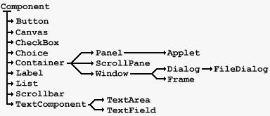
AWT (the Abstract Window Toolkit) is the part of Java designed for creating user interfaces and painting graphics and images. It is a set of classes intended to provide everything a developer requires in order to create a graphical interface for any Java applet or application. Most
AWT components are derived from the java.awt.Component class as figure 1.1 illustrates. (Note that AWT menu bars and menu bar items do not fit within the Component hierarchy.)
The Java Foundation Classes consist of five major parts: AWT, Swing, Accessibility, Java 2D, and Drag and Drop. Java 2D has become an integral part of AWT, Swing is built on top of AWT, and Accessibility support is built into Swing. The five parts of JFC are certainly not mutually exclusive, and Swing is expected to merge more deeply with AWT in future versions of Java. The Drag and Drop API was far from mature at the time of this writing but we expect this technology to integrate further with Swing and AWT in the near future. Thus, AWT is at the core of JFC, which in turn makes it one of the most important libraries in Java 2.
1.2 Swing
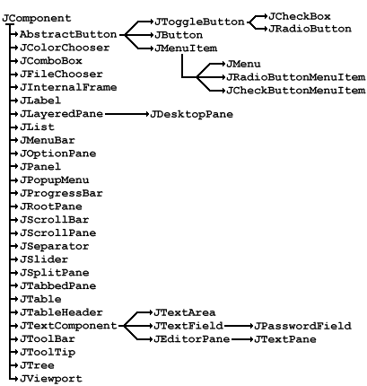
Swing is a large set of components ranging from the very simple, such as labels, to the very complex, such as tables, trees, and styled text documents. Almost all Swing components are derived from a single parent called
JComponent which extends the AWT Container class. Thus, Swing is best described as a layer on top of AWT rather than a replacement for it. Figure 1.2 shows a partial JComponent hierarchy. If you compare this with the AWT Component heirarchy of figure 1.1 you will notice that for each AWT component there is a Swing equivalent with prefix "J". The only exception to this is the AWT Canvas class, for which JComponent, JLabel, or JPanel can be used as a replacement (in section 2.8 we discuss this in detail). You will also notice many Swing classes with no AWT counterparts.
Figure 1.2 represents only a small fraction of the Swing library, but this fraction consists of the classes you will be dealing with most. The rest of Swing exists to provide extensive support and customization capabilities for the components these classes define.
1.2.1 Z-order
Swing components are referred to as lightweights while AWT components are referred to as heavyweights. The difference between lightweight and heavyweight components is z-order: the notion of depth or layering. Each heavyweight component occupies its own z-order layer. All lightweight components are contained inside heavyweight components and maintain their own layering scheme defined by Swing. When we place a heavyweight inside another heavyweight container it will, by definition, overlap all lightweights in that container.
What this ultimately means is that we should avoid using both heavyweight and lightweight components in the same container whenever possible. This does not mean that we can never mix AWT and Swing components successfully. It just means we have to be careful and know which situations are safe and which are not. Since we probably won’t be able to completely eliminate the use of heavyweight components anytime soon, we have to find ways to make the two technologies work together in an acceptable way.
The most important rule to follow is that we should never place heavyweight components inside lightweight containers that commonly support overlapping children. Some examples of these containers are
JInternalFrame, JScrollPane, JLayeredPane, and JDesktopPane. Secondly, if we use a popup menu in a container holding a heavyweight component, we need to force that popup to be heavyweight. To control this for a specific JPopupMenu instance we can use its setLightWeightPopupEnabled() method.
Note: For
JMenus (which use JPopupMenus to display their contents) we first have to use the getPopupMenu() method to retrieve the associated popup menu. Once retrieved we can then call setLightWeightPopupEnabled(false) on that popup to enforce heavyweight functionality. This needs to be done with each JMenu in our application, including menus contained within menus, etc.
Alternatively we can call
JPopupMenu’s static setDefaultLightWeightPopupEnabled() method, and pass it a value of false to force all popups in a Java session to be heavyweight. Note that this will only affect popup menus created after this call is made. It is therefore a good idea to call this method early within initialization.1.2.2 Platform independence
The most remarkable thing about Swing components is that they are written in 100% Java and do not depend on peer components, as most AWT components do. This means that a Swing button or text area will look and function identically on Macintosh, Solaris, Linux, and Windows platforms. This design eliminates the need to test and debug applications on each target platform.
Note: The only exceptions to this are four heavyweight Swing components that are direct subclasses of AWT classes relying on platform-dependent peers:
JApplet, JDialog, JFrame, and JWindow. See chapter 3.
1.2.3 Swing package overview
javax.swing
Contains the most basic Swing components, default component models, and interfaces. (Most of the classes shown in Figure 1.2 are contained in this package.)
javax.swing.borderClasses and interfaces used to define specific border styles. Note that borders can be shared by any number of Swing components, as they are not components themselves.
javax.swing.colorchooserClasses and interfaces supporting the
JColorChooser component, used for color selection. (This package also contains some interesting undocumented private classes.) javax.swing.eventThe event package contains all Swing-specific event types and listeners. Swing components also support events and listeners defined in
java.awt.event and java.beans. javax.swing.filechooserClasses and interfaces supporting the
JFileChooser component, used for file selection. javax.swing.plafContains the pluggable look-and-feel API used to define custom user interface components. Most of the classes in this package are abstract. They are subclassed and implemented by look-and-feel implementations such as metal, motif, and basic. The classes in this package are intended for use only by developers who, for one reason or another, cannot build on top of existing look-and-feels.
javax.swing.plaf.basicConsists of the Basic look-and-feel implementation which all look-and-feels provided with Swing are built on top of. We are normally expected to subclass the classes in this package if we want to create our own customized look-and-feel.
javax.swing.plaf.metalMetal is the default look-and-feel of Swing components. It is the only look-and-feel that ships with Swing not designed to be consistent with a specific platform.
javax.swing.plaf.multiThis is the Multiplexing look-and-feel. This is not a regular look-and-feel implementation in that it does not define the actual look or feel of any components. Rather, it provides the ability to combine several look-and-feels for simultanteous use. A typical example might be using an audio-based look-and-feel in combination with metal or motif. Currently Java 2 does not ship with any multiplexing look-and-feel implemenations (however, rumor has it that the Swing team is working on an audio look-and-feel as we write this).
javax.swing.tableClasses and interfaces supporting the
JTable control. This component is used to manage tabular data in spreadsheet form. It supports a high degree of customization without requiring look-and-feel enhancements. javax.swing.textClasses and interfaces used by the text components including support for plain and styled documents, the views of those documents, highlighting, caret control and customization, editor actions and keyboard customization.
javax.swing.text.htmlThis extension of the text package contains support for HTML text components. (HTML support was being completely rewritten and expanded upon while we were writing this book. Because of this our coverage of it is regretably limited.)
javax.swing.text.html.parserSupport for parsing HTML.
javax.swing.text.rtfContains support for RTF documents.
javax.swing.treeClasses and interfaces supporting the
JTree component. This component is used for the display and management of hierarcical data. It supports a high degree of customization without requiring look-and-feel enhancements. javax.swing.undoThe
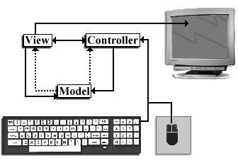
undo package contains support for implementing and managing undo/redo functionality. 1.3 MVC architectureMVC is a well known object-oriented user interface design decomposition that dates back to the late 1970s. Components are broken down into three parts: a model, a view, and a controller. Each Swing component is based on a more modern version of this design. Before we discuss how MVC works in Swing, we need to understand how it was originally designed to work.
Note: The three-way separation described here is only used today by a small number of user interface frameworks, VisualWorks being the most notable.
1.3.1 Model
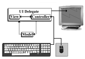
The model is responsible for maintaining all aspects of the component state. This includes, for example, such values as the pressed/unpressed state of a push button, a text component’s character data and information about how it is structured, etc. A model may be responsible for indirect communication with the with the view and the controller. By indirect we mean that the model does not ‘know’ its view and controller--it does not maintain or retreive references to them. Instead the model will send out notifications or broadcasts (what we know as events). In figure 1.3 this indirect communication is represented by dashed lines.
1.3.2 View
The view determines the visual representation of the component’s model. This is a component’s "look." For example, the view displays the correct color of a component, whether the component appears raised or lowered (in the case of a button), and the rendering of a desired font. The view is responsible for keeping its on-screen representation updated and may do so upon receiving indirect messages from the model, or direct messages from the controller.
1.3.3 Controller
The controller is responsible for determining whether the component should react to any input events from input devices such as the keyboard or mouse. The controller is the "feel" of the component, and it determines what actions are performed when the component is used. The controller can receive direct messages from the view, and indirect messages from the model.
For example, suppose we have a checked (selected) checkbox in our interface. If the controller determines that the user has performed a mouse click it may send a message to the view. If the view determines that the click occurred on the checkbox it sends a message to the model. The model then updates itself and broadcasts a message, which will be received by the view(s), to tell it that it should update itself based on the new state of the model. In this way, a model is not bound to a specific view or controller, allowing us to have several views and controller’s manipulating a single model.
1.3.4 Custom view and conroller
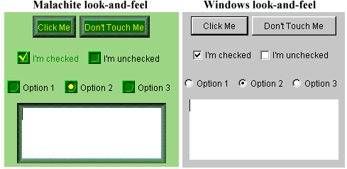
One of the major advantages MVC architecture provides is the ability to customize the "look" and "feel"of a component without modifying the model. Figure 1.4 shows a group of components using two different user interfaces. The important point to make about this figure is that the components shown are actually the same, but they are shown using two different look-and-feel implementations (different views and conrollers -- discussed below).
Some Swing components also provide the ability to customize specific parts of a component without affecting the model. More specifically, these components allow us to define custom cell renderers and editors used to display and accept specific data respectively. Figure 1.5 shows the columns of a table containing stock market data rendered with custom icons and colors. We will examine how to take advantage of this functionality in our study of Swing combo boxes, lists, tables, and trees.
1.3.5 Custom models
Another major advantage of Swing’s MVC architecture is the ability customize and replace a component’s data model. For example, we can construct our own text document model that enforces the entry of a date or phone number in a very specific form. We can also associate the same data model with more than one component (as we discussed above in looking at MVC). For instance, two
JTextAreas can store their textual content in the same document model, while maintaining two different views of that information.
We will design and implement our own data models for
JComboBox, JList, JTree, JTable, and extensively throughout our coverage of text components. Below we’ve listed some of Swing’s model interface definitions along with a brief description of what data their implementations are designed to store, and what components they are used with:BoundedRangeModel
Used by
: JProgressBar, JScrollBar, JSlider.Stores: 4 integers: value, extent, min, max.
The value and the extent must be between a specified min and max values. The extent is always <= max and >=value.
ButtonModelUsed by
: All AbstractButton subclasses.Stores: A boolean representing whether the button is selected (armed) or unselected (disarmed).
ListModelUsed by
: JList.Stores: A collection of objects.
ComboBoxModelUsed by
: JComboBox.Stores: A collection of objects and a selected object.
MutableComboBoxModelUsed by
: JComboBox.Stores: A
Vector (or another mutable collection) of objects and a selected object. ListSelectionModelUsed by
: JList, TableColumnModel.Stores: One or more indices of selected list or table items. Allows single, single-interval, or multiple-interval selections.
SingleSelectionModelUsed by
: JMenuBar, JPopupMenu, JMenuItem, JTabbedPane.Stores: The index of the selected element in a collection of objects owned by the implementor.
ColorSelectionModelUsed by
: JColorChooser.Stores: A
Color. TableModelUsed by
: JTable.Stores: A two dimensional array of objects.
TableColumnModelUsed by
: JTable.Stores: A collection of
TableColumn objects, a set of listeners for table column model events, width between each column, total width of all columns, a selection model, and a column selection flag. TreeModelUsed by
: JTree.Stores: Objects that can be displayed in a tree. Implementations must be able to distinguish between branch and leaf objects, and the objects must be organized hierarchically.
TreeSelectionModelUsed by
: JTree.Stores: Selected rows. Allows single, contiguous, and discontiguous selection.
DocumentUsed by
: All text components.Stores: Content. Normally this is text (character data). More complex implementations support styled text, images, and other forms of content (e.g. embedded components).
Not all Swing components have models. Those that act as containers, such as JApplet, JFrame, JLayeredPane, JDesktopPane, JInternalFrame, etc. do not have models. However, interactive components such as JButton, JTextField, JTable, etc. do have models. In fact some Swing components have more than one model (e.g. JList uses a model to hold selection information, and another model to store its data). The point is that MVC is not hard and fastened rule in Swing. Simple components, or complex components that don’t store lots of information (such as JDesktopPane), do not need separate models. The view and controller of each component is, however, almost always separate for each component, as we will see in the next section.
So how does the component itself fit into the MVC picture? The component acts as a mediator between the model(s), the view and the controller. It is neither the M, the V, or the C, although it can take the place of any or all of these parts if we design it to. This will become more clear as we progress through this chapter, and throughout the rest of the book.
1.4 UI delegates and PLAF
Almost all modern user interface frameworks coalesce the view and controller, whether they are based on SmallTalk, C++, and now Java. Examples include MacApp, Smalltalk/V, Interviews, and the X/Motif widgets used in IBM Smalltalk. JFC Swing is the newest addition to this crowd. Swing packages each component’s view and controller into an object called a UI delegate. For this reason Swing’s underlying architecture is more accurately referred to as model-delegate rather than model-view-controller. Ideally communication between both the model and the UI delegate is indirect, allowing more than one model to be associated with one UI delegate, and vice versa. Figure 1.6 illustrates.
1.4.1 The ComponentUI class
Each UI delegate is derived from an abstract class called
ComponentUI
This is normally implemented to return a shared instance of the UI delegate defined by the defining
ComponentUI subclass itself. This instance is used for sharing among components of the same type (e.g. All JButtons using the Metal look-and-feel share the same static UI delegate instance defined in javax.swing.plaf.metal.MetalButtonUI by default.)Installs this
ComponentUI on the specified component. This normally adds listeners to the component and/or its model(s), to notify the UI delegate when changes in state occur that require a view update. uninstallUI(JComponent c)Removes this
ComponentUI and any listeners added in installUI() from the specified component and/or its model(s). update(Graphics g, JComponent c)If the component is opaque this should paint its background and then call
paint(Graphics g, JComponent c). paint(Graphics g, JComponent c)Gets all information it needs from the component and possibly its model(s) to render it correctly.
getPreferredSize(JComponent c)Return the preferred size for the specified component based on this
ComponentUI. getMinimumSize(JComponent c)Return the minimum size for the specified component based on this
ComponentUI. getMaximumSize(JComponent c)Return the maximum size for the specified component based on this
ComponentUI.
To enforce the use of a specific UI delegate we can call a component’s
setUI() method (note that setUI() is declared protected in JComponent because it only makes sense in terms of a JComponent subclass):
    JButton m_button = new JButton();
    m_button.setUI((MalachiteButtonUI) MalachiteButtonUI.createUI(m_button));
Most UI delegates are constructed such that they know about a component and its model(s) only while performing painting and other view-controller tasks. Swing normally avoids associating UI delegates on a per-component basis (hence the static instance). However, nothing stops us from assigning our own as the code above demonstrates.
Note: The
JComponent class defines methods for assigning UI delegates because the method declarations required do not involve component-specific code. However, this is not possible with data models because there is no base interface that all models can be traced back to (i.e. there is no base class such as ComponentUI for Swing models). For this reason methods to assign models are defined in subclasses of JComponent where necessary.
1.4.2 Pluggable look-and-feel
Swing includes several sets of UI delegates. Each set contains
ComponentUI implementations for most Swing components and we call each of these sets a look-and-feel or a pluggable look-and-feel (PLAF) implementation. The javax.swing.plaf package consists of abstract classes derived from ComponentUI, and the classes in the javax.swing.plaf.basic package extend these abstract classes to implement the Basic look-and-feel. This is the set of UI delegates that all other look-and-feel classes are expected to use as a base for building off of. (Note that the Basic look-and-feel cannot be used on its own, as BasicLookAndFeel is an abstract class.) There are three pluggable look-and-feel implemenations derived from the Basic look-and-feel:
Windows:
CDE\Motif:
Metal (default):
There is also a
MacLookAndFeel for simulating Macintosh user interfaces, but this does not ship with Java 2 and must be downloaded separately. The Windows and Macintosh pluggable look-and-feel libraries are only supported on the corresponding platform.
The multiplexing look-and-feel,
javax.swing.plaf.multi.MultiLookAndFeel, extends all the abstract classes in javax.swing.plaf. It is designed to allow combinations of look-and-feels to be used simultaneously and is intended for, but not limited to, use with Accessibility look-and-feels. The job of each multiplexing UI delegate is to manage each of its child UI delegates.
Each look-and-feel package contains a class derived from the abstract class
javax.swing.LookAndFeel: BasicLookAndFeel, MetalLookAndFeel, WindowsLookAndFeel, etc. These are the central points of access to each look-and-feel package. We use them when changing the current look-and-feel, and the UIManager class (used to manage installed look-and-feels) uses them to access the current look-and-feel’s UIDefaults table (which contains, among other things, UI delegate class names for that look-and-feel corresponding to each Swing component). To change the current look-and-feel of an application we can simply call the UIManager’s setLookAndFeel() method, passing it the fully qualified name of the LookAndFeel to use. The following code can be used to accomplish this at run-time:
  try {
    UIManager.setLookAndFeel(
      "com.sun.java.swing.plaf.motif.MotifLookAndFeel");
    SwingUtilities.updateComponentTreeUI(myJFrame);
  }
  catch (Exception  e) {
    System.err.println("Could not load LookAndFeel");
  }
SwingUtilities.updateComponentTreeUI()
informs all children of the specified component that the look-and-feel has changed and they need to discard their UI delegate in exchange for a different one of the specified type.1.4.3 Where are the UI delegates?
We’ve discussed
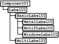
ComponentUI, and the packages LookAndFeel implementations reside in, but we haven’t really mentioned anything about the specific UI delegate classes derived from ComponentUI. Each abstract class in the javax.swing.plaf package extends ComponentUI and corresponds to a specific Swing component. The name of each class follows the general scheme of class name (without the "J" prefix) plus a "UI" suffix. For instance LabelUI extends ComponentUI and is the base delegate used for JLabels.
These classes are extended by concrete implementations such as those in the
basic and multi packages. The names of these subclasses follow the general scheme of look-and-feel name prefix added to the superclass name. For instance, BasicLabelUI and MultiLabelUI both extend LabelUI and reside in the basic and multi packages respectively. Figure 1.7 illustrates the LabelUI hierarchy.
Most look-and-feel implementations are expected to extend the concrete classes defined in the
basic package, or use them directly. The Metal, Motif, and Windows UI delegates are built on top of Basic versions. The Multi look-and-feel, however, is unique in that each implementation does not extend from Basic, and is merely a shell allowing an arbitrary number of UI delegates to be installed on a given component.
Figure 1.7 should emphasize the fact that Swing supplies a very large number of UI delegate classes. If we were to create an entire pluggable look-and-feel implementation, it is evident that some serious time and effort would be involved. In chapter 21 we will learn all about this process, as well as how to modify and work with the existing look-and-feels.