Chapter 21. Pluggable Look & Feel
In this chapter:
21.1 Pluggable Look & Feel overview
The pluggable look-and-feel architecture is one of Swing’s greatest milestones. It allows seamless changes in the appearance of an application and the way an application interacts with the user. This can occur without modification or recompilation of the application, and can be invoked programmatically during any single JVM session. In this chapter we'll discuss how L&F works, how custom L&F can be implemented for standard Swing components, and how L&F support (both existing and custom) can be added to custom components.
Note: In chapter 1 we introduced the basic concepts behind L&F and UI delegates, and it may be helpful to review this material before moving on.
In examining Swing component source code, you will quickly notice that these classes do not contain any code for sophisticated rendering. All this drawing code is stored somewhere else. As we learned in chapter 1, this code is defined within various UI delegates, which act as both a component’s view and controller. (In chapter 6 we learned how to customize a tabbed pane and its UI delegate. This was only a small taste of the flexibility offered by pluggable look-and-feel that we will be discussing here.) Before jumping into the examples we need to discuss how the most significant L&F-related classes and interfaces function and interact in more detail.
21.1.1 LookAndFeel
abstract class javax.swing.LookAndFeel
This abstract class serves as the superclass of the central class of any pluggable look-and-feel implementation. The
getDefaults() method returns an instance of UIDefaults (see 21.1.2). The getDescription() method returns a one-to-two sentence description of the L&F. getID() returns a simple, unique string that identifies an L&F. getName() returns a short string representing the name of that L&F, such as "Malachite," or "Windows."The
isNativeLookAndFeel() method querie’s the System class to determine whether the given LookAndFeel corresponds to that which emulates the operating system platform the running VM is designed for. The isSupportedLookAndFeel() method is used to determine whether the given LookAndFeel is supported by the operating system the running VM is designed for. Due to legal issues, some LookAndFeels will not be supported by certain operating systems, even though they have the ability to function perfectly fine.Note: We will not go into the details of how to work around this imposed limitation (although it is relatively easy), specifically because of the legal issues involved.
The
initialize() and uninitialize() methods are called when a LookAndFeel is installed and uninstalled, respectively. The toString() method is defined to return the description returned by getDescription(), as well as the fully qualified class name.Several convenient static methods are also provided for assigning and unassigning borders, colors, and fonts to components:
installBorder(), installColors(), installColorsAndFont(), and uninstallBorder(). LookAndFeel implements these so that the specified properties only change if the current property value of the given component is a UIResource (see 21.1.4) or null. Static methods makeKeyBindings() and makeIcon() are convenience methods for building a list of text component key bindings, and creating a UIDefaults.LazyValue (see 21.1.2) which can create an ImageIcon UIResource.21.1.2 UIDefaults
class javax.swing.UIDefaults
This class extends
Hashtable and manages a collection of custom resources (objects, primitives, etc) used in this L&F. Methods put(Object key, Object value) and putDefaults(Object[] keyValueList) can be used to store data (in the latter case they must be placed in a one-dimensional array in the order: key1, value1, key2, value2, etc.). Method get(Object key) can be used to retrieve a stored resource.UIDefaults also defines two inner classes:
LazyValue and ActiveValue. A LazyValue is an entry in the UIDefaults hashtable that is not instantiated until it is looked up with its associated key name. Large objects that take a long time to instantiate, and are rarely used, can benefit from being implemented as LazyValues. An ActiveValue is one that is instantiated each time it is looked up with its associated key name. Those resources that must be unique in each place they are used are often implemented as ActiveValues.Both interfaces require the definition of the
createValue() method. The following code shows a simple LazyValue that constructs a new border.
  Object myBorderLazyValue = new UIDefaults.LazyValue() {
    public Object createValue(UIDefaults table) {
      return new BorderFactory.createLoweredBevelBorder();
    }
  };
  myUIDefaults.put("MyBorder", borderLazyValue);
Note that the
createValue() method will only be called once for LazyValues, whereas with ActiveValues it will be called each time that resource is requested.21.1.3 UIManager
public class javax.swing.UIManager
This class provides a set of static methods used to manage the current look-and-feel. The current look-and-feel is actually made up of a three-level
UIDefaults hierarchy: user defaults, current look-and-feel defaults, and system defaults. Particularly important methods are getUI(JComponent target), which retrieves an instance of ComponentUI for the specified component, and getDefaults(), which retrieves a shared instance of the UIDefaults class.21.1.4 The UIResource interface
abstract interface javax.swing.plaf.UIResource
This interface has no implementation and is used solely to mark resource objects created for a component’s UI delegate. Several classes used to wrap component UI resources implement this interface. For example:
InsetsUIResource, FontUIResource, IconUIResource, BorderUIResource, and ColorUIResource. These wrapper classes are used for assigning resources that will be relinquished when a component’s UI delegate is changed. In other words, if we were to assign an instance of JLabel a background o! f Color.Yellow, this background setting would persist even through a UI delegate change. However, if we were to assign that JLabel a background of new ColorUIResource(Color.Yellow), the background would only persist until another UI delegate is installed. When the next UI delegate is installed, the label will receive a new label background based on the L&F the new UI delegate belongs to.21.1.5 ComponentUI
abstract class javax.swing.plaf.ComponentUI
This abstract class represents a common superclass of all component UI delegate classes implemented by each different L&F packages. The
createUI(JComponent c) static method creates an instance of ComponentUI for a given component. See chapter 1, section 1.4.1, for a description of each ComponentUI method.Abstract classes in the
javax.swing.plaf package extend ComponentUI to represent the base class from which each Swing component’s UI should extend: ButtonUI, TreeUI, etc. Each of these classes have a concrete default implementation in the javax.swing.plaf.basic package: BasicButtonUI, BasicTreeUI, etc. In turn, these basic UI classes can be, and are intended to be, extended by other L&F implementations. For example, the classes mentioned above are extended b! y MetalButtonUI and MetalTreeUI defined in the javax.swing.plaf.metal package.21.1.6 BasicLookAndFeel
class javax.swing.plaf.basic.BasicLookAndFeel
This class provides the basic implementation of
javax.swing.LookAndFeel. It creates all resources used by UI classes defined in the basic package. Custom L&F classes are expected to extend this class, rather than LookAndFeel directly, to replace only those resources that need to be customized.
Note: Though we will not go into the details of each basic UI delegate implementation in this book (indeed this is a large topic and deserves a whole volume unto itself), note that the basic package contains a class called BasicGraphicsUtils which consists of several static methods used for drawing various types of rectangles most commonly used for borders. The basic package also contains several other quite useful utility-like classes, and a quick browse through the basic package API docs will reveal some of these interesting members.
21.1.7 How L&F works
Now we’ll discuss how the pluggable look-and-feel mechanism works and what actually happens when a Swing component is created, painted, and when the user changes the application's L&F during a Java session.
All Swing component constructors call the
updateUI() method inherited from JComponent. This method also may be called with the SwingUtilities.updateComponentTreeUI() helper method. The latter method recursively updates the UI delegate of each child of the specified component (we’ve already seen how this is used in chapters 1 and 16).The
updateUI() method overridden by most Swing components typically has an implementation similar to the following: setUI((
)UIManager.getUI(this));
This invokes the static
UIManager.getUI() method and passes a this component reference as parameter. This method, in turn, triggers a call to getUI() on the shared UIDefaults instance retrieved with the getDefaults() method.
The
UIDefaults.getUI() method actually creates the ComponentUI object for a given JComponent. First it calls getUIClassID() on that component to discover the unique string ID associated with that class. For example, the JTree.getUIClassID() call returns the string: "TreeUI."Prior to the process described above, the
UIDefaults instance (which extends Hashtable) is initialized by the sub-class of LookAndFeel which is currently in charge. For instance, the Java look-and-feel (also referred to as "Metal") is defined by javax.swing.plaf.metal.MetalLookAndFeel. This class fills that look-and-feel’s shared UIDefaults instance with key-value pairs. For each component which has a corresponding UI delegate implementation in the current L&F, a component ID String and a fully qualified UI delegate class name is added as a key/value pair to UIDefaults. For instance, the "TreeUI" ID key corresponds to the "javax.swing.plaf.metal.MetalTreeUI" value in MetalLookAndFeel’s L&F UIDefaults. If a particular LookAndFeel implementation does not specify a UI delegate for some component, a value from the parent javax.swing.plaf.BasicLookAndFeel class is used.Using these key/value pairs, the
UIDefaults.getUI() method determines the fully qualified class name and calls the createUI() method on that class using the Java reflection API. This static method returns an instance of the proper UI delegate, for instance, MetalTreeUI.Back to the
updateUI() method, the retrieved ComponentUI object is passed to thesetUI() method and stored into protected variable, ComponentUI ui, inherited from the JComponent base class. This completes the creation of a UI delegate.
Recall that UI delegates are normally in charge of performing the associated component’s rendering, as well as processing user input directed to that component. The
update() method of a UI delegate is normally responsible for painting a component’s background, if it is opaque, and then calling paint(). A UI delegate’s paint() method is what actually paints a component’s content, and is the method we most often override when building our own delegates.Now let's review this process from a higher level perspective:
1. The currently installed look-and-feel provides an application with information about UI delegates to be used for all Swing components instantiated in that application.
2. Using this information, an instance of a UI delegate class can be instantiated on demand for a given component.
3. This UI delegate is passed to the component and generally takes responsibility for providing the complete user interface (view and controller).
4. The UI delegate can be easily replaced with another one at run-time without affecting the underlying component or its data (e.g. its model).
21.1.8 Selecting an L&F
The Swing API shipped with Java 2 includes three standard L&Fs: Metal, Motif, and Windows (available only for Microsoft Windows users). The first one is not associated with any existing platform and is considered the "Java L&F." This look-and-feel is the default, and will be used automatically unless we directly change L&Fs in our app.
Reference: Apple provides the MacOS look-and-feel available for download at http://www.apple.com/macos/java/text/download.html.
Note: Swing also provides a Multiplexing look-and-feel which allows more than one UI delegate to be associated with a component at the same time. This L&F is intended for, but not limited to, use with accessible technologies.
To select a particular L&F we call the
UIManager.setLookAndFeel() method and specify the fully qualified class name of a subclass of javax.swing.LookAndFeel which defines the desired L&F. The following code shows how to force an application to use the Motif L&F:
    try {
      UIManager.setLookAndFeel(
        "com.sun.java.swing.plaf.motif.MotifLookAndFeel");
    }
    catch (Exception e) {
      System.out.println ("Couldn't load Motif L&F " + e);
    }
Note that this should be called before we instantiate any components. Alternatively we can call this method and then use the
SwingUtilities updateComponentTree() method to change the current L&F of a container and all its children, as discussed previously.
UI Guideline : Design Balance is affected by Look & Feel Selection
Beware! Although it is technically possible to update Look & Feel on-the-fly, this may often be visually undesirable. Different L&Fs use different graphical weights for each component e.g. bezel thickness on buttons. Therefore, a display which is designed to look good in a particular Look and Feel may be visually unbalanced and inelegant when switched to another L&F. This could be due to the change in White Space which balances against the graphical weight of elements such as bezels or it may be a change in alignment. For example, the "Malachite" L&F is visually heavy, as a rough guide, more white space will be required compared to Metal L&F for a well balanced effect.
21.1.9 Creating a custom LookAndFeel implementation
Swing provides the complete flexibility of implementing our own custom L&F, and distributing it with our application. This task usually involves overriding the rendering functionality of all Swing components supported by our L&F (default implementations are then used for each remaining component we are not interested in customizing). In general this is not a simple project, and will almost always require referencing Swing
plaf source code.The first step is to establish a basic idea of how we will provide consistent UI delegate appearances. This includes some thought as to what colors and icons will be used for each component, and whether or not these choices fit well together.
Then we move on to the most significant step in creating a custom look-and-feel, which is the implementation of a
javax.swing.LookAndFeel sub-class. The following five abstract methods are the minimum that must be defined:String getID()
: returns the string ID of this L&F (e.g. "Motif").String getName()
: returns a short string describing this L&F (e.g. "CDE/Motif").String getDescription()
: returns a one line string description of this L&F.boolean isNativeLookAndFeel()
: returns true if the L&F corresponds to the current underlying native platform.boolean isSupportedLookAndFeel()
: returns true if the the current underlying native platform supports and/or permits this L&F.UIDefaults getDefaults()
: returns the L&F-specific Hashtable of resources (discussed above). This is the most important method of any LookAndFeel implementation.However, to make implementation simpler, it is normally expected that we extend
javax.swing.plaf.basic.BasicLookAndFeel instead of javax.swing.LookAndFeel directly. In this case we override some of the following BasicLookAndFeel methods (along with a few LookAndFeel methods above):void initClassDefaults(UIDefaults table)
: fills a given UIDefaults instance with key/value pairs specifying IDs and fully qualified class names of UI delegates for each component supported by this L&F.void initComponentDefaults(UIDefaults table)
: fills a given UIDefaults instance with key/value pairs using information (typically drawing resources, e.g. colors, images, borders, etc.) specific to this L&F.void initSystemColorDefaults(UIDefaults table)
: fills a given UIDefaults instance with color information specific to this L&F.void loadSystemColors(UIDefaults table, String[] systemColors, boolean useNative)
: fills a given UIDefaults instance with color information specific to the underlying platform.The first two methods are the most significant, and we will discuss them in a bit more detail here.
21.1.10 Defining default component resources
The following code shows how to override the
initComponentDefaults() method to store custom resources in a given UIDefaults instance. These resources will be used to construct a JButton UI delegate corresponding to this L&F (an imaginary implementation for now):
    protected void initComponentDefaults(UIDefaults table) {
      super.initComponentDefaults(table);
      Object[] defaults = {
        "Button.font", new FontUIResource("Arial", Font.BOLD, 12 ),
        "Button.background", new ColorUIResource(4, 108, 2),
        "Button.foreground", new ColorUIResource(236, 236, 0),
        "Button.margin", new InsetsUIResource(8, 8, 8, 8)
      };
      table.putDefaults( defaults );
    }
Note that the super-class
initComponentDefaults() method is called before putting our custom information in the table, since we only want to override button UI resources. Also note that the resource objects are encapsulated in special wrapper classes defined in javax.swing.plaf package (Font instances are placed in FontUIResources, Colors in ColorUIResources, etc.). This is necessary to correctly load and unload resources when the current L&F is changed.
Note: Resources keys start with the component name, minus the "J" prefix. So "Button.font" defines the font resource for
JButtons, while "RadioButton.font" defines the font resource for JRadioButtons. Unfortunately these standard resource keys are not documented, but they can all be found directly in Swing L&F source code. For example, see MetalLookAndFeel.java in package javax.swing.plaf.metal.
21.1.11 Defining class defaults
Providing custom resources, such as colors and fonts, is the simplest way to create a custom L&F. However, to provide more powerful customizations we need to develop custom extensions of
ComponentUI classes for specific components. We also need to provide a means of locating our custom UI delegate classes so that UIManager can successfully switch a component’s L&F on demand.The following code overrides the
initClassDefaults() method to store information about our imaginary myLF.MyLFButtonUI class (a member of the imaginary myLF look-and-feel package), which extends javax.swing.plaf.ButtonUI, and will be used to provide a custom L&F for JButton:
  protected void initClassDefaults(UIDefaults table) {
    super.initClassDefaults(table);
    try {
        String className = "myLF.MyLFButtonUI";
        Class buttonClass = Class.forName(className);
        table.put("ButtonUI", className);
        table.put(className, buttonClass);
    }
    catch (Exception ex) {
        ex.printStackTrace();
    }
  }
The
initClassDefaults() implementation of the super-class is called before (not after) we populate the table with our custom information. This is because we don’t intend to override all UI class mappings for all components. Instead we use the default settings for all but "ButtonUI." (We did a similar thing above in initComponentDefaults().) Also note that we place both the fully qualified class name of the delegate, as well as the Class instance itself, in the table.
Note: Placing only the class name in the defaults table does not provide correct functionality. As of Java 2 FCS, without a corresponding
Class instance in the table as well, getUI() will not be able to retrieve instances of custom L&F delegates. We will see that this is the case in the examples below.
21.1.12 Creating custom UI delegates
Now it's time to show a simple pseudo-code implemention of our imaginary
myLF.MyLFButtonUI class we've been relating our discussion to:
package myLF;

public class MyLFButtonUI extends  BasicButtonUI {
  private final static MyLFButtonUI m_buttonUI =
    new MyLFButtonUI();

  protected Color  m_backgroundNormal = null;
  // Declare variables for other resources.

  public static ComponentUI createUI( JComponent c ) {
    return m_buttonUI;
  }

  public void installUI(JComponent c) {
    super.installUI(c);
    m_backgroundNormal = UIManager.getColor(
      "Button.background");
    // Retrieve other resources and store them
    // as instance variables.
    // Add listeners. These might be registered to receive
    // events from a component’s model or the component itself.
  }

  public void uninstallUI(JComponent c) {
    super.uninstallUI(c);
    // Provide cleanup.
    // Remove listeners.
  }

  public void update(Graphics g, JComponent c) {
    // Provide custom background painting if the component is
    // opaque, then call paint().
  }

  public void paint(Graphics g, JComponent c) {
    // Provide custom rendering for the given component.
  }

  // Provide implementation for listeners.
}
This class extends
javax.swing.plaf.basic.BasicButtonUI to override some of its functionality and relies on basic L&F defaults for the rest. The shared instance, MyLFButtonUI m_buttonUI, is created once and retrieved using the createUI() method. Thus, only one instance of this delegate will exist, and it will act as the view and controller for all JButton instances with the myLF look-and-feel.The
installUI() method retrieves myLF-specific resources corresponding to JButton (refer back to our discussion of initComponentDefaults() above). We might also use this method to add mouse and key listeners to provide L&F-specific functionality. For instance, we might design our button UI such that an associated JButton’s text changes color each time the mouse cursor rolls over it. An advantage of this approach is that we don't need to modify our application--we can still use normal JButtons. Once myLF is installed, this functionality will automatically appear.The
uninstallUI() method performs all necessary cleanup, including the removal of any listeners that this delegate might have attached to the component or its model.The
update() method will paint the given component’s background if it is opaque, and then immediately call paint() (do not confuse this method with JComponent’s paint() method).
Note: We always recommend to implement painting functionality in this way, but in reality the background of Swing components are more often painted directly within the
paint() method (a quick skim through Swing UI delegate source code illustrates--for example, see BasicRadioButtonUI.java). If this is not the case the resulting background will be that painted by JComponent’s painting routine. For this reason we often find no background rendering code at all in UI delegates.This is a relatively minor issue. Just make sure that if you do want to take control of a component’s background rendering, it is best to do so in UI delegate
update() methods. This rendering should only occur if the associated component’s opaque property is set to true, and it should be called before the main detail of its view is painted (update() should end with a call to paint()).The
paint() method renders a given component using the given graphical context. Note that to use an L&F successfully, the component class should not implement any rendering functionality for itself. Instead, it should allow its painting to be controlled by UI delegate classes so that all rendering is L&F-specific (refer back to chapter 2 for further discussion of painting issues).
Note: Implementing a custom L&F will make much more sense once we step through the first two examples. We suggest that you reference the above discussion often as you make your way through this chapter. Reviewing the discussion of MVC in chapter 1 may also be helpful at this point.
21.1.13 Metal themes
class javax.swing.plaf.metal.MetalTheme
Themes are sets of color and font definitions that can be dynamically plugged into
MetalLookAndFeel, and immediately used by a Swing app on-the-fly if Metal is the current L&F. To create a theme we simply sub-class MetalTheme (or DefaultMetalTheme) and override a selection of its numerous getXX() methods to return a specific font or color. A quick browse through these methods shows implementations for all the colors and fonts used throughout the Metal L&F, allowing us to customize Metal appearance however we like. MetalLookAndFeel contains createDefaultTheme(), a protected method used to create the default metal theme, and provides us with the setCurrentTheme() method which allows us to plug in a new theme. The effects of plugging in a new theme are seen immediately. Themes offer a simple alternative to building a custom LookAndFeel, when all that is desired are some simple appearance changes.21.2 Custom L&F: part I - Using custom resources
UI Guideline : When to consider a Custom L&F
Developing a Custom L&F is not a trivial undertaking. Almost certainly, there is more effort needed for the design rather than the coding. Consider a Custom Look & Feel in these situations:
You are designing a single use system, such as a self-service kiosk
You are intending to roll-out a suite of enterprise applications which will work together and you want the L&F to reflect the corporate image or identity.
You are developing a family of software products and want to develop a unique environment or corporate identity. This was exactly Sun's intention with Metal L&F which closely reflects the colours and styles used in the Sun Corporate identity. Other examples of custom designed environments are Lotus Notes, Lotus eSuite and Sun HotJava Views.
The easiest way to create a custom look-and-feel is to simply customize default component resources (colors, borders, fonts, etc.) without actually implementing any custom UI delegates. In this case, the only thing we need to do is extend
BasicLookAndFeel (see above discussion), or another existing LookAndFeel implementation, and provide a set of resources. The following example demonstrates how this can be done by beginning the implementation of our custom "Malachite" L&F.
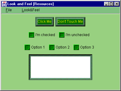
Figure 21.1 Malachite L&F in action.
<<file figure21-1.gif>>
The Code: Button1.java
see \Chapter21\1
import java.awt.*;
import java.awt.event.*;
import java.util.*;

import javax.swing.*;
import javax.swing.event.*;

import Malachite.*;

public class Button1 extends JFrame
{
    protected Hashtable  m_lfs;

    public Button1()
    {
	super("Look and Feel [Resources]");
	setSize(400, 300);
	getContentPane().setLayout(new FlowLayout());

	JMenuBar menuBar = createMenuBar();
	setJMenuBar(menuBar);

	JPanel p = new JPanel();
	JButton bt1 = new JButton("Click Me");
	p.add(bt1);

	JButton bt2 = new JButton("Don't Touch Me");
	p.add(bt2);
	getContentPane().add(p);

	p = new JPanel();
	JCheckBox chk1 = new JCheckBox("I'm checked");
	chk1.setSelected(true);
	p.add(chk1);

	JCheckBox chk2 = new JCheckBox("I'm unchecked");
	chk2.setSelected(false);
	p.add(chk2);
	getContentPane().add(p);

	p = new JPanel();
	ButtonGroup grp = new ButtonGroup();
	JRadioButton rd1 = new JRadioButton("Option 1");
	rd1.setSelected(true);
	p.add(rd1);
	grp.add(rd1);

	JRadioButton rd2 = new JRadioButton("Option 2");
	p.add(rd2);
	grp.add(rd2);

	JRadioButton rd3 = new JRadioButton("Option 3");
	p.add(rd3);
	grp.add(rd3);
	getContentPane().add(p);

	JTextArea txt = new JTextArea(5, 30);
	getContentPane().add(txt);

	WindowListener wndCloser = new WindowAdapter()
	{
		public void windowClosing(WindowEvent e)
		{
			System.exit(0);
		}
	};
	addWindowListener(wndCloser);

	setVisible(true);
    }

    protected JMenuBar createMenuBar()
    {
	JMenuBar menuBar = new JMenuBar();
	JMenu mFile = new JMenu("File");
	mFile.setMnemonic('f');

	JMenuItem mItem = new JMenuItem("Exit");
	mItem.setMnemonic('x');
	ActionListener lstExit = new ActionListener()
	{
		public void actionPerformed(ActionEvent e)
		{
			System.exit(0);
		}
	};
	mItem.addActionListener(lstExit);
	mFile.add(mItem);
	menuBar.add(mFile);

	ActionListener lst = new ActionListener()
	{
	    public void actionPerformed(ActionEvent e)
	    {
		String str = e.getActionCommand();
		Object obj = m_lfs.get(str);
		if (obj != null)
		try
		{
			String className = (String)obj;
			Class lnfClass = Class.forName(className);
			UIManager.setLookAndFeel((LookAndFeel)(lnfClass.newInstance()));
			SwingUtilities.updateComponentTreeUI(Button1.this);
		}
		catch (Exception ex)
		{
		   ex.printStackTrace();
 		   System.err.println(ex.toString());
		}
	    }
	};

	m_lfs = new Hashtable();
	UIManager.LookAndFeelInfo lfs[] = UIManager.getInstalledLookAndFeels();
	JMenu mLF = new JMenu("Look&Feel");
	mLF.setMnemonic('l');
	for (int k = 0; k < lfs.length; k++ )
	{
		String name = lfs[k].getName();
		JMenuItem lf = new JMenuItem(name);
		m_lfs.put(name, lfs[k].getClassName());
		lf.addActionListener(lst);
		mLF.add(lf);
	}
	menuBar.add(mLF);

	return menuBar;
    }

    public static void main(String argv[])
    {
	try
	{
		LookAndFeel malachite = new Malachite.MalachiteLF();
		UIManager.LookAndFeelInfo info =
				new UIManager.LookAndFeelInfo(malachite.getName(),
		malachite.getClass().getName());
		UIManager.installLookAndFeel(info);
		UIManager.setLookAndFeel(malachite);
	}
	catch (Exception ex)
	{
	   ex.printStackTrace();
	   System.err.println(ex.toString());
	}

	new Button1();
    }
}
The Code: MalachiteLF.java
see \Chapter21\1\Malachite
package Malachite;

import java.awt.*;

import javax.swing.*;
import javax.swing.plaf.*;
import javax.swing.plaf.basic.*;

public class MalachiteLF extends BasicLookAndFeel
	implements java.io.Serializable
{

    public String getID()
    {
	return "Malachite";
    }

    public String getName()
    {
	return "Malachite Look and Feel";
    }

    public String getDescription()
    {
	return "Sample L&F from Swing";
    }

    public boolean isNativeLookAndFeel()
    {
	return false;
    }

    public boolean isSupportedLookAndFeel()
    {
	return true;
    }

    protected void initComponentDefaults(UIDefaults table)
    {
	super.initComponentDefaults(table);

	ColorUIResource commonBackground =
			new ColorUIResource(152, 208, 128);
	ColorUIResource commonForeground =
			new ColorUIResource(0, 0, 0);
	ColorUIResource buttonBackground =
			new ColorUIResource(4, 108, 2);
	ColorUIResource buttonForeground =
			new ColorUIResource(236, 236, 0);
	ColorUIResource menuBackground =
			new ColorUIResource(128, 192, 128);

	BorderUIResource borderRaised = new
			BorderUIResource(new MalachiteBorder(
			MalachiteBorder.RAISED));
	BorderUIResource borderLowered = new
			BorderUIResource(new MalachiteBorder(
			MalachiteBorder.LOWERED));

	FontUIResource commonFont = new
			FontUIResource("Arial", Font.BOLD, 12 );

	Icon ubox = new ImageIcon("Malachite/ubox.gif");
		Icon ubull = new ImageIcon("Malachite/ubull.gif");

	Object[] defaults =
	{
		"Button.font", commonFont,
		"Button.background", buttonBackground,
		"Button.foreground", buttonForeground,
		"Button.border", borderRaised,
		"Button.margin", new InsetsUIResource(8, 8, 8, 8),
		"Button.textIconGap", new Integer(4),
		"Button.textShiftOffset", new Integer(2),

		"CheckBox.font", commonFont,
		"CheckBox.background", commonBackground,
		"CheckBox.foreground", commonForeground,
		"CheckBox.icon", new IconUIResource(ubox),

		"MenuBar.font", commonFont,
		"MenuBar.background", menuBackground,
		"MenuBar.foreground", commonForeground,

		"Menu.font", commonFont,
		"Menu.background", menuBackground,
		"Menu.foreground", commonForeground,
		"Menu.selectionBackground", buttonBackground,
		"Menu.selectionForeground", buttonForeground,

		"MenuItem.font", commonFont,
		"MenuItem.background", menuBackground,
		"MenuItem.foreground", commonForeground,
		"MenuItem.selectionBackground", buttonBackground,
		"MenuItem.selectionForeground", buttonForeground,
		"MenuItem.margin", new InsetsUIResource(2, 2, 2, 2),

		"Panel.background", commonBackground,
		"Panel.foreground", commonForeground,

		"RadioButton.font", commonFont,
		"RadioButton.background", commonBackground,
		"RadioButton.foreground", commonForeground,
		"RadioButton.icon", new IconUIResource(ubull),

		"TextArea.margin", new InsetsUIResource(8, 8, 8, 8),
		"TextArea.border", borderLowered
	  };

	  table.putDefaults( defaults );
    }
}
The Code: MalachiteBorder.java
see \Chapter21\1\Malachite
package Malachite;

import java.awt.*;

import javax.swing.*;
import javax.swing.border.*;
import javax.swing.event.*;

public class MalachiteBorder implements Border
{
    public static final int RAISED = 0;
    public static final int LOWERED = 1;

    static final String IMAGE_DIR = "Malachite/";

    static final ImageIcon IMAGE_NW = new ImageIcon(IMAGE_DIR+"nw.gif");
    static final ImageIcon IMAGE_N  = new ImageIcon(IMAGE_DIR+"n.gif");
    static final ImageIcon IMAGE_NE = new ImageIcon(IMAGE_DIR+"ne.gif");
    static final ImageIcon IMAGE_E  = new ImageIcon(IMAGE_DIR+"e.gif");
    static final ImageIcon IMAGE_SE = new ImageIcon(IMAGE_DIR+"se.gif");
    static final ImageIcon IMAGE_S  = new ImageIcon(IMAGE_DIR+"s.gif");
    static final ImageIcon IMAGE_SW = new ImageIcon(IMAGE_DIR+"sw.gif");
    static final ImageIcon IMAGE_W  = new ImageIcon(IMAGE_DIR+"w.gif");

    static final ImageIcon IMAGE_L_NW = new ImageIcon(IMAGE_DIR+"l_nw.gif");
    static final ImageIcon IMAGE_L_N  = new ImageIcon(IMAGE_DIR+"l_n.gif");
    static final ImageIcon IMAGE_L_NE = new ImageIcon(IMAGE_DIR+"l_ne.gif");
    static final ImageIcon IMAGE_L_E  = new ImageIcon(IMAGE_DIR+"l_e.gif");
    static final ImageIcon IMAGE_L_SE = new ImageIcon(IMAGE_DIR+"l_se.gif");
    static final ImageIcon IMAGE_L_S  = new ImageIcon(IMAGE_DIR+"l_s.gif");
    static final ImageIcon IMAGE_L_SW = new ImageIcon(IMAGE_DIR+"l_sw.gif");
    static final ImageIcon IMAGE_L_W  = new ImageIcon(IMAGE_DIR+"l_w.gif");

    protected int m_w = 7;
    protected int m_h = 7;

    protected boolean m_isRaised = true;

    public MalachiteBorder()
    {
    }

    public MalachiteBorder(int type)
    {
	if (type != RAISED && type != LOWERED)
		throw new IllegalArgumentException(
				"Type must be RAISED or LOWERED");
	m_isRaised = (type == RAISED);
    }

    public Insets getBorderInsets(Component c)
    {
	return new Insets(m_h, m_w, m_h, m_w);
    }

    public  boolean isBorderOpaque()
    {
	return true;
    }

    public void paintBorder(Component c, Graphics g, int x, int y, int w, int h)
    {
	int x1 = x+m_w;
	int x2 = x+w-m_w;
	int y1 = y+m_h;
	int y2 = y+h-m_h;
	int xx, yy;

	if (m_isRaised)
	{
	   for (xx=x1; xx<=x2; xx += IMAGE_N.getIconWidth())
		g.drawImage(IMAGE_N.getImage(), xx, y, c);

	   for (yy=y1; yy<=y2; yy += IMAGE_E.getIconHeight())
		g.drawImage(IMAGE_E.getImage(), x2, yy, c);

  	   for (xx=x1; xx<=x2; xx += IMAGE_S.getIconWidth())
		g.drawImage(IMAGE_S.getImage(), xx, y2, c);

	   for (yy=y1; yy<=y2; yy += IMAGE_W.getIconHeight())
		g.drawImage(IMAGE_W.getImage(), x, yy, c);

	   g.drawImage(IMAGE_NW.getImage(), x, y, c);
	   g.drawImage(IMAGE_NE.getImage(), x2, y, c);
	   g.drawImage(IMAGE_SE.getImage(), x2, y2, c);
	   g.drawImage(IMAGE_SW.getImage(), x, y2, c);
	}
	else
	{
	    for (xx=x1; xx<=x2; xx += IMAGE_L_N.getIconWidth())
		g.drawImage(IMAGE_L_N.getImage(), xx, y, c);

	    for (yy=y1; yy<=y2; yy += IMAGE_L_E.getIconHeight())
		g.drawImage(IMAGE_L_E.getImage(), x2, yy, c);

	    for (xx=x1; xx<=x2; xx += IMAGE_L_S.getIconWidth())
		g.drawImage(IMAGE_L_S.getImage(), xx, y2, c);

	    for (yy=y1; yy<=y2; yy += IMAGE_L_W.getIconHeight())
		g.drawImage(IMAGE_L_W.getImage(), x, yy, c);

	    g.drawImage(IMAGE_L_NW.getImage(), x, y, c);
	    g.drawImage(IMAGE_L_NE.getImage(), x2, y, c);
	    g.drawImage(IMAGE_L_SE.getImage(), x2, y2, c);
	    g.drawImage(IMAGE_L_SW.getImage(), x, y2, c);
	}

    }
}
Understanding the Code
Class Button1
This class represents a simple frame container populated by several components:
JButtons, JCheckBoxes, JRadioButtons, and JTextArea. Code in the constructor should be familair and requires no special explanation here.The
createMenuBar() method is responsible for creating this frame’s menu bar. A menu titled "Look&Feel" is populated by menu items corresponding to LookAndFeel implementations available on the current JVM. An array of UIManager.LookAndFeelInfo instances is retrieved using the UIManager.getInstalledLookAndFeels() method. L&F class names stored in each info object are placed into the m_lfs Hashtable for future use. A brief text description of a particular L&F retrieved using the getName()! method is used to create each corresponding menu item.When a menu item is selected, the corresponding
ActionListener updates the L&F for our application. This listener locates the class name corresponding to the selected menu item, and a new instance of that class is created, through reflection, and set as the current L&F using the UIManager.setLookAndFeel() method.
Note: We can also use the overloaded
UIManager.setLookAndFeel(String className) method which takes a fully qualified LookAndFeel class name as parameter. However, as of Java 2 FCS, this does not work properly on all platforms.The
main() method creates an instance of our custom L&F, MalachiteLF (defined in the Malachite package), makes it available to the the Java session using UIManager.installLookAndFeel(), and sets is as the current L&F using UIManager.setLookAndFeel(). Our example frame is then created, which uses Malachite resources initially.Class Malachite.MalachiteLF
This class defines our Malachite look-and-feel. Note that it extends
BasicLookAndFeel to override its functionality and resources only where necessary. This L&F is centered around a green malachite palette.
Note: Malachite is a green mineral containing copper. This mineral can be found in the Ural Mountains of Russia, in Australia, and in Arizona in the US. Since ancient times it has been used as gemstone.
Methods
getID(), getName(), and getDescription() return a short ID, name, and a text description of this L&F respectively. As we've discussed earlier, method initComponentDefaults() fills a given UIDefaults instance with key/value pairs representing information specific to this L&F. In our implementation we customize resources for the following components (recall that the "J" prefix is not used): Button, CheckBox, RadioButton, TextArea, MenuBar, Menu, MenuItem, and Panel.Note that we did not define the
initClassDefaults() method because we have not implemented any custom UI delegates (we will do this in the next section).Class Malachite.MalachiteBorder
This class defines our custom Malachite implementation of the
Border interface. This border is intended to provide the illusion of a 3D frame cut out of a green gemstone. It can be drawn in two forms: lowered or raised. A 3D effect is produced through the proper combination of previously prepared images. The actual rendering is done in the paintBorder() method, which simply draws a set of these images to render the border.Running the Code
Figure 21.1 shows our
Button1 example frame populated with controls using the Malachite L&F. Note that these controls are lifeless. We cannot click buttons, check or uncheck boxes, or select radio buttons. Try using the menu to select another L&F available on your system and note the differences.The components are actually fully functional when using the Malachite L&F, but they do not have the ability to change their appearance in response to user interaction. More functionality needs to be added to provide mouse and key listener capabilities, as well as additional resources for use in representing the selected state of the button components. We will do this in the next section.
Note: The UI delegate used for each of these components is the corresponding
basic L&F version, because we did not override any class defaults in MalachiteLF. A quick look in the source code for these delegates shows that the rendering functionality for selected and focused states is not implemented. All sub-classes corresponding to specific L&Fs are responsible for implementing this functionality themselves.
Note: The text area in this example is not placed in a scrolling pane specifically because we want to emphasize the use of our custom border. This is the reason it resizes when a significant amount of text is entered.
21.3 Custom L&F: part II - Creating custom UI delegates
The next step in the creation of a custom L&F is the implementation of custom UI delegates corresponding to each supported component. In this section we'll show how to implement Malachite delegates for three relatively simple Swing components:
JButton, JCheckBox, and JRadioButton.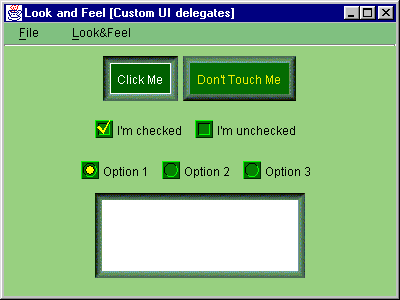
Figure 21.2 Custom Malachite UI delegates in action.
<<file figure21-2.gif>>
The Code: MalachiteLF.java
see \Chapter21\2\Malachite
package Malachite;

import java.awt.*;

import javax.swing.*;
import javax.swing.plaf.*;
import javax.swing.plaf.basic.*;

public class MalachiteLF extends BasicLookAndFeel
 implements java.io.Serializable
{
  // Unchanged code from section 21.1

  protected void initClassDefaults(UIDefaults table) {
    super.initClassDefaults(table);
    putDefault(table, "ButtonUI");
    putDefault(table, "CheckBoxUI");
    putDefault(table, "RadioButtonUI");
  }

  protected void putDefault(UIDefaults table, String uiKey) {
    try  {
      String className = "Malachite.Malachite"+uiKey;
      Class buttonClass = Class.forName(className);
      table.put(uiKey, className);
      table.put(className, buttonClass);
    }
    catch (Exception ex) {
      ex.printStackTrace();
    }
  }

  protected void initComponentDefaults(UIDefaults table) {
    super.initComponentDefaults(table);

    // Unchanged code from section 21.1

    Icon ubox = new ImageIcon("Malachite/ubox.gif");
    Icon ubull = new ImageIcon("Malachite/ubull.gif");

    Icon cbox = new ImageIcon("Malachite/cbox.gif");
    Icon pcbox = new ImageIcon("Malachite/p_cbox.gif");
    Icon pubox = new ImageIcon("Malachite/p_ubox.gif");

    Icon cbull = new ImageIcon("Malachite/cbull.gif");
    Icon pcbull = new ImageIcon("Malachite/p_cbull.gif");
    Icon pubull = new ImageIcon("Malachite/p_ubull.gif");

    Object[] defaults = {
      "Button.font", commonFont,
      "Button.background", buttonBackground,
      "Button.foreground", buttonForeground,
      "Button.border", borderRaised,
      "Button.margin", new InsetsUIResource(8, 8, 8, 8),
      "Button.textIconGap", new Integer(4),
      "Button.textShiftOffset", new Integer(2),

      "Button.focusBorder", focusBorder,
      "Button.borderPressed", borderLowered,
      "Button.activeForeground", new ColorUIResource(255, 255, 255),
      "Button.pressedBackground", new ColorUIResource(0, 96, 0),

      "CheckBox.font", commonFont,
      "CheckBox.background", commonBackground,
      "CheckBox.foreground", commonForeground,
      "CheckBox.icon", new IconUIResource(ubox),

      "CheckBox.focusBorder", focusBorder,
      "CheckBox.activeForeground", activeForeground,
      "CheckBox.iconPressed", new IconUIResource(pubox),
      "CheckBox.iconChecked", new IconUIResource(cbox),
      "CheckBox.iconPressedChecked", new IconUIResource(pcbox),
      "CheckBox.textIconGap", new Integer(4),

     // Unchanged code from section 21.1

      "RadioButton.font", commonFont,
      "RadioButton.background", commonBackground,
      "RadioButton.foreground", commonForeground,
      "RadioButton.icon", new IconUIResource(ubull),

      "RadioButton.focusBorder", focusBorder,
      "RadioButton.activeForeground", activeForeground,
      "RadioButton.iconPressed", new IconUIResource(pubull),
      "RadioButton.iconChecked", new IconUIResource(cbull),
      "RadioButton.iconPressedChecked", new IconUIResource(pcbull),
      "RadioButton.textIconGap", new Integer(4),

      "TextArea.margin", new InsetsUIResource(8, 8, 8, 8),
      "TextArea.border", borderLowered
    };

    table.putDefaults( defaults );
  }
}
The Code: MalachiteButtonUI.java
see \Chapter21\2\Malachite
package Malachite;

import java.awt.*;
import java.awt.event.*;

import javax.swing.*;
import javax.swing.border.*;
import javax.swing.plaf.*;
import javax.swing.plaf.basic.*;

public class MalachiteButtonUI extends BasicButtonUI
 implements java.io.Serializable, MouseListener, KeyListener
{
  private final static MalachiteButtonUI m_buttonUI =
    new MalachiteButtonUI();

  protected Border m_borderRaised = null;
  protected Border m_borderLowered = null;
  protected Color  m_backgroundNormal = null;
  protected Color  m_backgroundPressed = null;
  protected Color  m_foregroundNormal = null;
  protected Color  m_foregroundActive = null;
  protected Color  m_focusBorder = null;

  public MalachiteButtonUI() {}

  public static ComponentUI createUI( JComponent c ) {
    return m_buttonUI;
  }

  public void installUI(JComponent c) {
    super.installUI(c);

    m_borderRaised = UIManager.getBorder(
      "Button.border");
    m_borderLowered = UIManager.getBorder(
      "Button.borderPressed");
    m_backgroundNormal = UIManager.getColor(
      "Button.background");
    m_backgroundPressed = UIManager.getColor(
      "Button.pressedBackground");
    m_foregroundNormal = UIManager.getColor(
      "Button.foreground");
    m_foregroundActive = UIManager.getColor(
      "Button.activeForeground");
    m_focusBorder = UIManager.getColor(
      "Button.focusBorder");

    c.addMouseListener(this);
    c.addKeyListener(this);
  }

  public void uninstallUI(JComponent c) {
    super.uninstallUI(c);
    c.removeMouseListener(this);
    c.removeKeyListener(this);
  }

  public void paint(Graphics g, JComponent c) {
    AbstractButton b = (AbstractButton) c;
    Dimension d = b.getSize();

    g.setFont(c.getFont());
    FontMetrics fm = g.getFontMetrics();

    g.setColor(b.getForeground());
    String caption = b.getText();
    int x = (d.width - fm.stringWidth(caption))/2;
    int y = (d.height + fm.getAscent())/2;
    g.drawString(caption, x, y);

    if (b.isFocusPainted() && b.hasFocus()) {
      g.setColor(m_focusBorder);
      Insets bi = b.getBorder().getBorderInsets(b);
      g.drawRect(bi.left, bi.top, d.width-bi.left-bi.right-1,
      d.height-bi.top-bi.bottom-1);
    }
  }

  public Dimension getPreferredSize(JComponent c) {
    Dimension d = super.getPreferredSize(c);
    if (m_borderRaised != null) {
      Insets ins = m_borderRaised.getBorderInsets(c);
      d.setSize(d.width+ins.left+ins.right,
        d.height+ins.top+ins.bottom);
    }
    return d;
  }

  public void mouseClicked(MouseEvent e) {}

  public void mousePressed(MouseEvent e) {
    JComponent c = (JComponent)e.getComponent();
    c.setBorder(m_borderLowered);
    c.setBackground(m_backgroundPressed);
  }

  public void mouseReleased(MouseEvent e) {
    JComponent c = (JComponent)e.getComponent();
    c.setBorder(m_borderRaised);
    c.setBackground(m_backgroundNormal);
  }

  public void mouseEntered(MouseEvent e) {
    JComponent c = (JComponent)e.getComponent();
    c.setForeground(m_foregroundActive);
    c.repaint();
  }

  public void mouseExited(MouseEvent e) {
    JComponent c = (JComponent)e.getComponent();
    c.setForeground(m_foregroundNormal);
    c.repaint();
  }

  public void keyTyped(KeyEvent e) {}

  public void keyPressed(KeyEvent e) {
    int code = e.getKeyCode();
    if (code == KeyEvent.VK_ENTER || code == KeyEvent.VK_SPACE) {
      JComponent c = (JComponent)e.getComponent();
      c.setBorder(m_borderLowered);
      c.setBackground(m_backgroundPressed);
    }
  }

  public void keyReleased(KeyEvent e) {
    int code = e.getKeyCode();
    if (code == KeyEvent.VK_ENTER || code == KeyEvent.VK_SPACE) {
      JComponent c = (JComponent)e.getComponent();
      c.setBorder(m_borderRaised);
      c.setBackground(m_backgroundNormal);
    }
  }
}
The Code: MalachiteCheckBoxUI.java
see \Chapter21\2\Malachite
package Malachite;

import java.awt.*;
import java.awt.event.*;

import javax.swing.*;
import javax.swing.border.*;
import javax.swing.plaf.*;
import javax.swing.plaf.basic.*;

public class MalachiteCheckBoxUI extends BasicCheckBoxUI
 implements java.io.Serializable, MouseListener
{
  private final static MalachiteCheckBoxUI m_buttonUI = new MalachiteCheckBoxUI();

  protected Color  m_backgroundNormal = null;
  protected Color  m_foregroundNormal = null;
  protected Color  m_foregroundActive = null;
  protected Icon   m_checkedIcon = null;
  protected Icon   m_uncheckedIcon = null;
  protected Icon   m_pressedCheckedIcon = null;
  protected Icon   m_pressedUncheckedIcon = null;
  protected Color  m_focusBorder = null;
  protected int    m_textIconGap = -1;

  public MalachiteCheckBoxUI() {}

  public static ComponentUI createUI( JComponent c ) {
    return m_buttonUI;
  }

  public void installUI(JComponent c) {
    super.installUI(c);
    m_backgroundNormal = UIManager.getColor(
      "CheckBox.background");
    m_foregroundNormal = UIManager.getColor(
      "CheckBox.foreground");
    m_foregroundActive = UIManager.getColor(
      "CheckBox.activeForeground");
    m_checkedIcon = UIManager.getIcon(
      "CheckBox.iconChecked");
    m_uncheckedIcon = UIManager.getIcon(
      "CheckBox.icon");
    m_pressedCheckedIcon = UIManager.getIcon(
      "CheckBox.iconPressedChecked");
    m_pressedUncheckedIcon = UIManager.getIcon(
      "CheckBox.iconPressed");
    m_focusBorder = UIManager.getColor(
      "CheckBox.focusBorder");
    m_textIconGap = UIManager.getInt(
      "CheckBox.textIconGap");

    c.setBackground(m_backgroundNormal);
    c.addMouseListener(this);
  }

  public void uninstallUI(JComponent c) {
    super.uninstallUI(c);
    c.removeMouseListener(this);
  }

  public void paint(Graphics g, JComponent c) {
    AbstractButton b = (AbstractButton)c;
    ButtonModel model = b.getModel();
    Dimension d = b.getSize();

    g.setFont(c.getFont());
    FontMetrics fm = g.getFontMetrics();

    Icon icon = m_uncheckedIcon;
    if (model.isPressed() && model.isSelected())
      icon = m_pressedCheckedIcon;
    else if (model.isPressed() && !model.isSelected())
      icon = m_pressedUncheckedIcon;
    else if (!model.isPressed() && model.isSelected())
      icon = m_checkedIcon;

    g.setColor(b.getForeground());
    int x = 0;
    int y = (d.height - icon.getIconHeight())/2;
    icon.paintIcon(c, g, x, y);

    String caption = b.getText();
    x = icon.getIconWidth() + m_textIconGap;
    y = (d.height + fm.getAscent())/2;
    g.drawString(caption, x, y);

    if (b.isFocusPainted() && b.hasFocus()) {
      g.setColor(m_focusBorder);
      Insets bi = b.getBorder().getBorderInsets(b);
      g.drawRect(x-2, y-fm.getAscent()-2, d.width-x,
      fm.getAscent()+fm.getDescent()+4);
    }
  }

  public void mouseClicked(MouseEvent e) {}
  public void mousePressed(MouseEvent e) {}
  public void mouseReleased(MouseEvent e) {}

  public void mouseEntered(MouseEvent e) {
    JComponent c = (JComponent)e.getComponent();
    c.setForeground(m_foregroundActive);
    c.repaint();
  }

  public void mouseExited(MouseEvent e) {
    JComponent c = (JComponent)e.getComponent();
    c.setForeground(m_foregroundNormal);
    c.repaint();
  }
}
The Code: MalachiteRadioButtonUI.java
see \Chapter21\2\Malachite
package Malachite;

import java.awt.*;
import java.awt.event.*;

import javax.swing.*;
import javax.swing.border.*;
import javax.swing.plaf.*;
import javax.swing.plaf.basic.*;

public class MalachiteRadioButtonUI extends MalachiteCheckBoxUI
 implements java.io.Serializable, MouseListener
{
  private final static MalachiteRadioButtonUI m_buttonUI =
    new MalachiteRadioButtonUI();

  public MalachiteRadioButtonUI() {}

  public static ComponentUI createUI( JComponent c ) {
    return m_buttonUI;
  }

  public void installUI(JComponent c) {
    super.installUI(c);
    m_backgroundNormal = UIManager.getColor(
      "RadioButton.background");
    m_foregroundNormal = UIManager.getColor(
      "RadioButton.foreground");
    m_foregroundActive = UIManager.getColor(
      "RadioButton.activeForeground");
    m_checkedIcon = UIManager.getIcon(
      "RadioButton.iconChecked");
    m_uncheckedIcon = UIManager.getIcon(
      "RadioButton.icon");
    m_pressedCheckedIcon = UIManager.getIcon(
      "RadioButton.iconPressedChecked");
    m_pressedUncheckedIcon = UIManager.getIcon(
      "RadioButton.iconPressed");
    m_focusBorder = UIManager.getColor(
      "RadioButton.focusBorder");
    m_textIconGap = UIManager.getInt(
      "RadioButton.textIconGap");

    c.setBackground(m_backgroundNormal);
    c.addMouseListener(this);
  }
}
Understanding the Code
Class Malachite.MalachiteLF
The
initClassDefaults() method inherited from BasicLookAndFeel is now overridden. As we've discussed above, this method will be called to fill a given UIDefaults instance with information about the specific classes responsible for providing a component's UI delegate for this L&F. Our implementation calls the super-class’s initClassDefaults() method to provide all default options. It then replaces the delegate classes for our three supported button components by calling our putDefault() custom method. This helper method puts two entries into the given UIDefaults instance: the UI delegate fully qualified class name, and a corresponding instance of java.lang.Class (see 21.1.11).The
initComponentDefaults() method now places more custom resources into the given UIDefaults instance, including six custom icons. These resources are needed by our custom Malachite UI delegates, as we will see below.Class Malachite.MalachiteButtonUI
This class provides a custom UI delegate for
JButton. It extends BasicButtonUI to reuse much of its functionality, and implements MouseListener and KeyListener to capture and process user input.Class variable:
MalachiteButtonUI m_buttonUI
: a shared instance of this class which is returned by createUI().Instance variables:
Border m_borderRaised
: border when not pressed.Border m_borderLowered
: border when pressed.Color m_backgroundNormal
: background color when not pressed.Color m_backgroundPressed
: background color when pressed.Color m_foregroundNormal
: foreground color.Color m_foregroundActive
: foreground color when mouse cursor rolls over.Color m_focusBorder
: focus rectangle color.The
installUI() method retrieves rendering resources from the defaults table by calling static methods defined in the UIManager class (these resources were stored by MalichiteLF as described above). It also attaches this as a MouseListener and KeyListener to the specified component. The uninstallUI() simply removes these listeners.The
paint() method renders a given component using the given graphical context. Rendering of the background and border is done automatically by JComponent (see 21.1.12), so the responsibility of this method is to simply render a button's text and focus rectangle.The
getPreferredSize() method is overridden since the default implementation in the BasicButtonUI class does not take into account the button's border (interestingly enough). Since we use a relatively thick border in Malachite, we need to override this method and add the border's insets to the width and height returned by the superclass implementation.The next five methods represent an implementation of the
MouseListener interface. To indicate that a button component is currently pressed, the mousePressed() method changes a button's background and border, which in turn causes that component to be repainted. Method mouseReleased() restores these attributes. To provide an additional rollover effect, method mouseEntered() changes the associated button's foreground color, which is then restored in the mouseExited() method.The remaining three methods represent an implementation of the
KeyListener interface. Pressing the space-bar or Enter keys while the button is in focus produces the same effect as performing a button click.Class Malachite.MalachiteCheckBoxUI
This class extends
BasicCheckBoxUI to provide a custom UI delegate for our JCheckBox component.Class variable:
MalachiteCheckBoxUI m_buttonUI
: a shared instance of this class which is returned by createUI() method.Instance variables:
Color m_backgroundNormal
: component's background.Color m_foregroundNormal
: foreground color.Color m_foregroundActive
: rollover foreground color.Icon m_checkedIcon
: icon displayed when checked and not pressed.Icon m_uncheckedIcon
: icon displayed when not checked and not pressed.Icon m_pressedCheckedIcon
: icon displayed when checked and pressed.Icon m_pressedUncheckedIcon
: icon displayed when not checked and pressed.Color m_focusBorder
:focus rectangle color.int m_textIconGap
: gap between icon and text.Similar to
MalachiteButtonUI, the installUI() method retrieves rendering resources from the defaults table and stores them in instance variables. It also attatches this as a MouseListener to the given component.The
paint() method renders the given component using a given graphical context. It draws an icon, text, and focus rectangle when appropriate (this code is fairly straightforward and does not require detailed explanation here).The next five methods represent an implementation of the
MouseListener interface which provides a similar rollover effect to that of MalachiteButtonUI.Class Malachite.MalachiteRadioButtonUI
This class extends
MalachiteCheckBoxUI. The only major difference between this class and its parent is that this class uses a different set of icons to render the radio button. The paint() method is not overriden. The installUI() method is modified to retrieve the necessary resources.Running the Code
Figure 21.2 shows our example frame from the previous section with our new Malachite UI delegates in action. You can see that the push buttons have became bigger because their size now properly includes the border thickness. The most significant difference appears when the buttons are clicked, and boxes are checked/unchecked using using the mouse and keyboard.
At this point we leave the implementation of Malachite UI delegates for other existing Swing components up to you. You should now have a good idea of how to approach the task for any component. Switching gears, we will now discuss L&F customization from the opposite point of view: providing existing L&F capabilities for custom components.
21.4 L&F for custom components: part I - Implementing L&F support
In this section we'll add support for existing L&Fs to a custom component, namely our
InnerFrame developed in chapter 15. We'll show how to modify this component so it complies with the look-and-feel paradigm and behaves accordingly. It will use shared resources provided by the installed L&F and use these resources for rendering itself. This requires creation of a custom UI delegate as well as modification of the component itself.To allow direct comparison with
JInternalFrame, we create a desktop pane container with a menu bar to allow the creation of an arbitrary number of InnerFrames and JInternalFrames in a cascaded fashion. We also allow L&F switching at run-time (as we did in the previous examples).
Note: We use a
JDesktopPane instead of our mdi package’s custom MDIPane component because JInternalFrame generates a null pointer exception when activated (in Java 2 FCS) if its parent is not a JDesktopPane.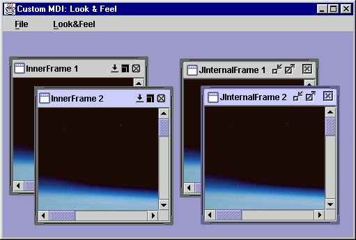
Figure 21.4 InnerFrame and JInternalFrame in the Metal L&F.
<<file figure21-4.gif>>
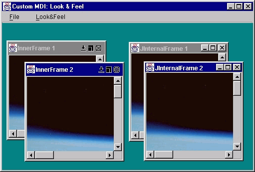
Figure 21.5 InnerFrame and JInternalFrame in the Windows L&F.
<<file figure21-5.gif>>
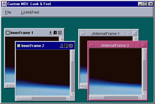
Figure 21.6 InnerFrame and JInternalFrame in the Motif L&F.
<<file figure21-6.gif>>
The Code: MdiContainer.java
see \Chapter21\3
import java.awt.*;
import java.awt.event.*;
import java.util.*;

import javax.swing.*;

import mdi.*;

public class MdiContainer extends JFrame
{
  protected ImageIcon m_icon;
  protected Hashtable m_lfs;

  public MdiContainer() {
    super("Custom MDI: Look & Feel");

    setSize(570,400);
    setContentPane(new JDesktopPane());

    m_icon = new ImageIcon("earth.jpg");
    JMenuBar menuBar = createMenuBar();
    setJMenuBar(menuBar);

    WindowListener wndCloser = new WindowAdapter() {
      public void windowClosing(WindowEvent e) {
        System.exit(0);
      }
    };
    addWindowListener(wndCloser);
    setVisible(true);
  }

  protected JMenuBar createMenuBar() {
    JMenuBar menuBar = new JMenuBar();

    JMenu mFile = new JMenu("File");
    mFile.setMnemonic('f');

    JMenuItem mItem = new JMenuItem("New InnerFrame");
    mItem.setMnemonic('i');
    ActionListener lst = new ActionListener() {
      int m_counter = 0;
      public void actionPerformed(ActionEvent e) {
        m_counter++;
        InnerFrame frame = new InnerFrame("InnerFrame " +
          m_counter);
        int i = m_counter % 5;
        frame.setBounds(20+i*20, 20+i*20, 200, 200);
        frame.getContentPane().add(
          new JScrollPane(new JLabel(m_icon)));
        getContentPane().add(frame);
        frame.toFront();
      }
    };
    mItem.addActionListener(lst);
    mFile.add(mItem);

    mItem = new JMenuItem("New JInternalFrame");
    mItem.setMnemonic('j');
    lst = new ActionListener() {
      int m_counter = 0;
      public void actionPerformed(ActionEvent e) {
        m_counter++;
        JInternalFrame frame = new JInternalFrame(
          "JInternalFrame " + m_counter);
        frame.setClosable(true);
        frame.setMaximizable(true);
        frame.setIconifiable(true);
        frame.setResizable(true);

        int i = m_counter % 5;
        frame.setBounds(50+i*20, 50+i*20, 200, 200);
        frame.getContentPane().add(
          new JScrollPane(new JLabel(m_icon)));
        getContentPane().add(frame);
        frame.toFront();
      }
    };
    mItem.addActionListener(lst);
    mFile.add(mItem);
    mFile.addSeparator();

    mItem = new JMenuItem("Exit");
    mItem.setMnemonic('x');
    lst = new ActionListener() {
      public void actionPerformed(ActionEvent e) {
        System.exit(0);
      }
    };
    mItem.addActionListener(lst);
    mFile.add(mItem);
    menuBar.add(mFile);

    lst = new ActionListener() {
      public void actionPerformed(ActionEvent e) {
        String str = e.getActionCommand();
        Object obj = m_lfs.get(str);
        if (obj != null)
          try {
            String className = (String)obj;
            Class lnfClass = Class.forName(className);
            UIManager.setLookAndFeel(
              (LookAndFeel)(lnfClass.newInstance()));
            SwingUtilities.updateComponentTreeUI(
              MdiContainer.this);
          }
          catch (Exception ex) {
            ex.printStackTrace();
            System.err.println(ex.toString());
          }
      }
    };

    m_lfs = new Hashtable();
    UIManager.LookAndFeelInfo lfs[] =
      UIManager.getInstalledLookAndFeels();
    JMenu mLF = new JMenu("Look&Feel");
    mLF.setMnemonic('l');
    for (int k = 0; k < lfs.length; k++ ) {
      String name = lfs[k].getName();
      JMenuItem lf = new JMenuItem(name);
      m_lfs.put(name, lfs[k].getClassName());
      lf.addActionListener(lst);
      mLF.add(lf);
    }
    menuBar.add(mLF);

    return menuBar;
  }

  public static void main(String argv[]) {
    new MdiContainer();
  }
}
The Code: InnerFrame.java
see \Chapter21\3\mdi
package mdi;

import java.awt.*;
import java.awt.event.*;
import java.io.*;
import javax.swing.*;
import javax.swing.event.*;
import javax.swing.border.*;

import javax.swing.plaf.ComponentUI;
import mdi.plaf.*;

public class InnerFrame extends JPanel
 implements RootPaneContainer, Externalizable
{
  // Unchanged code from section 15.7

  private Color m_titleBarBackground;
  private Color m_selectedTitleBarBackground;
  private Color m_titleBarForeground;
  private Color m_selectedTitleBarForeground;
  private Font  m_titleBarFont;
  private Border m_frameBorder;

  private Icon m_frameIcon;

  public InnerFrame() {
    this("");
  }

  // Unchanged code from section 15.7

  ////////////////////////////////////////////
  /////////////// L&F Support ////////////////
  ////////////////////////////////////////////

  static {
    UIManager.getDefaults().put(
      "InnerFrameUI", "mdi.plaf.InnerFrameUI");
    UIManager.getDefaults().put("InnerFrameButtonUI",
      "javax.swing.plaf.basic.BasicButtonUI");
  }

  public static ComponentUI createUI(JComponent a) {
    ComponentUI mui = new InnerFrameUI();
    return mui;
  }

  public void setUI(InnerFrameUI ui) {
    if ((InnerFrameUI)this.ui != ui) {
      super.setUI(ui);
      repaint();
    }
  }

  public InnerFrameUI getUI() {
    return (InnerFrameUI)ui;
  }

  public void updateUI() {
    setUI((InnerFrameUI)UIManager.getUI(this));
    invalidate();
  }

  public String getUIClassID() {
    return "InnerFrameUI";
  }

  // Unchanged code from section 15.7

  public void setSelectedTitleBarForeground(Color c) {
    m_selectedTitleBarForeground = c;
    updateTitleBarColors();
  }

  public Color getSelectedTitleBarForeground() {
    return m_selectedTitleBarForeground;
  }

  public void setTitleBarFont(Font f) {
    m_titleBarFont = f;
    updateTitleBarColors();
  }

  public Font getTitleBarFont() {
    return m_titleBarFont;
  }

  public void setBorder(Border b) {
    m_frameBorder = b;
    if (b != null) {
      Insets ins = b.getBorderInsets(this);
      if (m_northResizer != null)
        m_northResizer.setHeight(ins.top);
      if (m_southResizer != null)
        m_southResizer.setHeight(ins.bottom);
      if (m_eastResizer != null)
        m_eastResizer.setWidth(ins.right);
      if (m_westResizer != null)
        m_westResizer.setWidth(ins.left);
      if (isShowing())
        validate();
    }
  }

  public Border getBorder() {
    return m_frameBorder;
  }

  protected void updateTitleBarColors() {
    if (isShowing())
        repaint();
  }

  public void setFrameIcon(Icon fi) {
    m_frameIcon = fi;
    if (fi != null) {
      if (m_frameIcon.getIconHeight() > TITLE_BAR_HEIGHT)
        setTitleBarHeight(m_frameIcon.getIconHeight() + 2*FRAME_ICON_PADDING);
      if (m_iconLabel != null)
        m_iconLabel.setIcon(m_frameIcon);
    }
    else
        setTitleBarHeight(TITLE_BAR_HEIGHT);
    if (isShowing())
        revalidate();
  }

  public Icon getFrameIcon() {
    return m_frameIcon;
  }

  // Unchanged code from section 15.7

  protected void createTitleBar() {
  m_titlePanel = new JPanel() {
    public Dimension getPreferredSize() {
      return new Dimension(InnerFrame.this.getWidth(),
        m_titleBarHeight);
    }

    public Color getBackground() {
      if (InnerFrame.this == null)
        return super.getBackground();
      if (isSelected())
        return getSelectedTitleBarBackground();
      else
        return getTitleBarBackground();
    }
  };
  m_titlePanel.setLayout(new BorderLayout());
  m_titlePanel.setOpaque(true);

  m_titleLabel = new JLabel() {
    public Color getForeground() {
      if (InnerFrame.this == null)
        return super.getForeground();
      if (isSelected())
        return getSelectedTitleBarForeground();
      else
        return getTitleBarForeground();
    }

    public Font getFont() {
      if (InnerFrame.this == null)
        return super.getFont();
      return m_titleBarFont;
    }
  };

  // Unchanged code from section 15.7

  class InnerFrameButton extends JButton
  {
    // Unchanged code from section 15.7

    public void setBorder(Border b) { }

    public Border getBorder() { return null; }

    public String getUIClassID() {
        return "InnerFrameButtonUI";
    }
  }

  // Unchanged code from section 15.7

  class EastResizeEdge extends JPanel
   implements MouseListener, MouseMotionListener
  {
    private int WIDTH = BORDER_THICKNESS;
    private int MIN_WIDTH = ICONIZED_WIDTH;
    private boolean m_dragging;
    private JComponent m_resizeComponent;

    protected EastResizeEdge(JComponent c) {
      m_resizeComponent = c;
      setOpaque(false);
      if (m_frameBorder != null)
        WIDTH =
          m_frameBorder.getBorderInsets(InnerFrame.this).right;
    }

    public void setWidth(int w) {
      WIDTH = w;
    }

    // Unchanged code from section 15.7
  }

  // Classes WestResizeEdge, NorthResizeEdge, and SouthResizeEdge
  // are modified similarly

  public void writeExternal(ObjectOutput out) throws IOException {
    out.writeObject(m_titleBarBackground);
    out.writeObject(m_titleBarForeground);
    out.writeObject(m_selectedTitleBarBackground);
    out.writeObject(m_selectedTitleBarForeground);
    out.writeObject(m_frameBorder);

    // Unchanged code from section 15.7
  }

  public void readExternal(ObjectInput in)
   throws IOException, ClassNotFoundException {
    setTitleBarBackground((Color)in.readObject());
    setTitleBarForeground((Color)in.readObject());
    setSelectedTitleBarBackground((Color)in.readObject());
    setSelectedTitleBarForeground((Color)in.readObject());
    setBorder((Border)in.readObject());

    setTitle((String)in.readObject());

    // Unchanged code from section 15.7

    setFrameIcon((Icon)in.readObject());
    // Unchanged code from section 15.7
  }
}
The Code: InnerFrameUI.java
see \Chapter21\3\mdi\plaf
package mdi.plaf;

import java.awt.*;
import java.util.*;

import javax.swing.*;
import javax.swing.border.*;
import javax.swing.plaf.*;

import mdi.*;

public class InnerFrameUI extends javax.swing.plaf.PanelUI
{
  private static InnerFrameUI frameUI;

  protected static Color DEFAULT_TITLE_BAR_BG_COLOR;
  protected static Color DEFAULT_SELECTED_TITLE_BAR_BG_COLOR;
  protected static Color DEFAULT_TITLE_BAR_FG_COLOR;
  protected static Color DEFAULT_SELECTED_TITLE_BAR_FG_COLOR;
  protected static Font  DEFAULT_TITLE_BAR_FONT;
  protected static Border DEFAULT_INNER_FRAME_BORDER;
  protected static Icon  DEFAULT_FRAME_ICON;

  private static Hashtable m_ownDefaults = new Hashtable();

  static {
    m_ownDefaults.put("InternalFrame.inactiveTitleBackground",
      new ColorUIResource(108,190,116));
    m_ownDefaults.put("InternalFrame.inactiveTitleForeground",
      new ColorUIResource(Color.black));
    m_ownDefaults.put("InternalFrame.activeTitleBackground",
      new ColorUIResource(91,182,249));
    m_ownDefaults.put("InternalFrame.activeTitleForeground",
      new ColorUIResource(Color.black));
    m_ownDefaults.put("InternalFrame.titleFont",
      new FontUIResource("Dialog", Font.BOLD, 12));
    m_ownDefaults.put("InternalFrame.border",
      new BorderUIResource(new MatteBorder(4, 4, 4, 4, Color.blue)));
    m_ownDefaults.put("InternalFrame.icon",
      new IconUIResource(new ImageIcon("mdi/default.gif")));
  }

  public static ComponentUI createUI(JComponent c) {
    if(frameUI == null)
      frameUI = new InnerFrameUI();
    try {
      frameUI.installDefaults();
      InnerFrame frame = (InnerFrame)c;
      frame.setTitleBarBackground(DEFAULT_TITLE_BAR_BG_COLOR);
      frame.setSelectedTitleBarBackground(
        DEFAULT_SELECTED_TITLE_BAR_BG_COLOR);
      frame.setTitleBarForeground(DEFAULT_TITLE_BAR_FG_COLOR);
        frame.setSelectedTitleBarForeground(
          DEFAULT_SELECTED_TITLE_BAR_FG_COLOR);
      frame.setTitleBarFont(DEFAULT_TITLE_BAR_FONT);
      frame.setBorder(DEFAULT_INNER_FRAME_BORDER);
      frame.setFrameIcon(DEFAULT_FRAME_ICON);
      if (frame.isShowing())
        frame.repaint();
    }
    catch (Exception ex) {
      System.err.println(ex);
      ex.printStackTrace();
    }

    return frameUI;
  }

  public void installUI(JComponent c) {
    InnerFrame frame = (InnerFrame)c;
    super.installUI(frame);
  }

  public void uninstallUI(JComponent c) {
    super.uninstallUI(c);
  }

  protected void installDefaults() {
    DEFAULT_TITLE_BAR_BG_COLOR = (Color)findDefaultResource(
      "InternalFrame.inactiveTitleBackground");
    DEFAULT_TITLE_BAR_FG_COLOR = (Color)findDefaultResource(
      "InternalFrame.inactiveTitleForeground");
    DEFAULT_SELECTED_TITLE_BAR_BG_COLOR = (Color)findDefaultResource(
      "InternalFrame.activeTitleBackground");
    DEFAULT_SELECTED_TITLE_BAR_FG_COLOR = (Color)findDefaultResource(
      "InternalFrame.activeTitleForeground");
    DEFAULT_TITLE_BAR_FONT = (Font)findDefaultResource(
      "InternalFrame.titleFont");
    DEFAULT_INNER_FRAME_BORDER = (Border)findDefaultResource(
      "InternalFrame.border");
    DEFAULT_FRAME_ICON = (Icon)findDefaultResource(
      "InternalFrame.icon");
  }

  protected Object findDefaultResource(String id) {
    Object obj = null;
    try {
      UIDefaults uiDef = UIManager.getDefaults();
      obj = uiDef.get(id);
    }
    catch (Exception ex) {
      System.err.println(ex);
    }
    if (obj == null)
      obj = m_ownDefaults.get(id);
    return obj;
  }

  public void paint(Graphics g, JComponent c) {
    super.paint(g, c);
    if (c.getBorder() != null)
      c.getBorder().paintBorder(
    c, g, 0, 0, c.getWidth(), c.getHeight());
  }

  public Color getTitleBarBkColor() {
    return DEFAULT_TITLE_BAR_BG_COLOR;
  }

  public Color getSelectedTitleBarBkColor() {
    return DEFAULT_SELECTED_TITLE_BAR_BG_COLOR;
  }

  public Color getTitleBarFgColor() {
    return DEFAULT_TITLE_BAR_FG_COLOR;
  }

  public Color getSelectedTitleBarFgColor() {
    return DEFAULT_SELECTED_TITLE_BAR_FG_COLOR;
  }

  public Font getTitleBarFont() {
    return DEFAULT_TITLE_BAR_FONT;
  }

  public Border getInnerFrameBorder() {
    return DEFAULT_INNER_FRAME_BORDER;
  }
}
Understanding the Code
Class MdiContainer
This class represents a simple frame container similar to the one used in chapter 15 to demonstrate our custom MDI interface. An instance of
JDesktopPane is set as the content pane for this frame to support JInternalFrames as well as our InnerFrame component.The
createMenuBar() method creates and populates a menu bar for this example. A "File" menu is constructed with three menu items:Menu item "New InnerFrame" creates a new instance of
Menu item "New JInternalFrame" creates a new instance of Swing’s
JInternalFrame and adds it to the desktop pane.Menu item "Exit" quits this application.
A "Look&Feel" menu is constructed with an array of menu items corresponding to the L&Fs currently installed. These items are handled the same way they were in previous examples and do not require additional explanation here.
Class mdi.InnerFrame
This class was introduced in chapter 15 and requires some minor modifications to support L&F. First note that the new
mdi.plaf package and javax.swing.plaf.ComponentUI class are imported.As we know, it is typical for L&F-compliant components to not perform any rendering by themselves and not explicitly hold any resources for this process. Instead all rendering and necessary resources involved (colors, icons, borders etc.) should be maintained by a UI delegate corresponding to that component. To conform to this design pattern, we remove several class variables from our
InnerFrame class and move them to our custom InnerFrameUI class (see below). Specifically: DEFAULT_TITLE_BAR_BG_COLOR, DEFAULT_SELECTED_TITLE_BAR_BG_COLOR, and DEFAULT_FRAME_ICON. We will use resources provided ! by the currently installed L&F for these variables instead of hard-coded values defined in the component class.Two class variables (
DEFAULT_BORDER_COLOR and DEFAULT_SELECTED_BORDER_COLOR) have been removed. We don't need them any more since we'll use a Border instance to render InnerFrame's border. Eight default icon variables (ICONIZE_BUTTON_ICON, RESTORE_BUTTON_ICON, CLOSE_BUTTON_ICON, MAXIMIZE_BUTTON_ICON, MINIMIZE_BUTTON_ICON! , and their pressed variants) are intentionally left unchanged. We could move them into our UI delegate class as well, and use standard icons provided by L&F for these variables. But we’ve decided to preserve some individuality for our custom component.
Note: Swing's
JInternalFrame delegates provide only one standard icon for the frame controls, whereas our implementation uses two icons for pressed and not pressed states. Since we will use JInternalFrame UI delegate resources, this would require us to either remove our two-icon functionality, or construct separate icons for use with each L&F.Now let's take a look at the instance variables that have been modified:
Color m_titleBarBackground
: background color for the title bar of an inactive frame; now initialized by the InnerFrameUI delegate.Color m_selectedTitleBarBackground
: background color for the title bar of an active frame; now initialized by the InnerFrameUI delegate.Color m_titleBarForeground
: foreground color for the title bar of an inactive frame; now initialized by the InnerFrameUI delegate. The previous version supported only one foreground color. This version distinguishes between the foreground of active and inactive frames (that is necessary for support of various L&Fs).Color m_selectedTitleBarForeground
: new variable for foreground color of the title bar of an active frame. Two new methods, setSelectedTitleBarForeground() and getSelectedTitleBarForeground(), support this variable.Font m_titleBarFont
: new variable for the title bar's font. The previous version used a default font for to render frame's title, but this may not be acceptable for all L&Fs. Two new methods, setTitleBarFont() and getTitleBarFont(), support this variable.Border m_frameBorder
: new variable for frame's border. The previous version’s border was made from the four resizable edge components which were colored homogeneously. In this example we use a shared Border instance provided by the current L&F, and store it in the m_frameBorder variable. Two new methods, setBorder() and getBorder(), support this variable.Icon m_frameIcon
: this variable was formerly defined as an ImageIcon instance. This may not be acceptable for L&F implementations which provide a default frame icon as a different instance of the Icon interface. So we now declare m_frameIcon as an Icon, resulting in several minor modifications throughout the code.We have also removed two instance variables:
m_BorderColor and m_selectedBorderColor. Their corresponding set/get methods have also been removed. Method updateBorderColors() is left without implementation and can also be removed from the code. The reason for this change is that we no longer support direct rendering of the resize edge components (they are now non-opaque, see below), and instead delegate this functionality to the m_frameBorder instance retrieved from the currently installed L&F.
Note: We also no longer support different borders for active and inactive frames since not all L&Fs provide two
Border instances for internal frames.A significant amount of code needs to be added for look-and-feel support in this component. First note that a
static block places two values into UIManager‘s resource defaults storage. These key/value pairs allow retrieval of the fully-qualified InnerFrameUI class name, and that of the custom delegate of it's inner class title bar button component, InnerFrameButtonUI (for this we simply use BasicButtonUI):
  static {
    UIManager.getDefaults().put("InnerFrameUI", "mdi.plaf.InnerFrameUI");
    UIManager.getDefaults().put("InnerFrameButtonUI",
				"javax.swing.plaf.basic.BasicButtonUI");
  }
As we've discussed in the previous examples, for all provided Swing components this information is provided by the concrete sub-classes of
LookAndFeel class (added to the defaults table in the initClassDefaults() method). However, these implementations have no knowledge of our custom component, so we must place it in the table ourselves.
Note: In this case we do not need to add a corresponding
java.lang.Class instance to to the defaults table, as was necessary when implementing our own LookAndFeel (see 21.1.11).The
createUI() method will be called to create and return an instance of InnerFrame’s UI delegate, InnerFrameUI (see below). The setUI() method installs a new InnerFrameUI instance, and the getUI() method retrieves the current delegate (both use the protected ui variable inherited from the JComponent class).Method
updateUI() will be called to notify the component whenever the current L&F changes. Our implementation requests an instance of InnerFrameUI from UIManager (using getUI()), which is then passed to setUI(). Then invalidate(). is called to mark this component for revalidation because the new L&F’s resources will most likely change the sizing and position of InnerFrame’s constituents.The
getUIClassID() method returns a unique String ID identifying this component’s base UI delegate name. This String must be consistent with the string used as the key for the fully qualified class name of this component’s delegate that was placed in UIManager’s resource defaults table (see above):public String getUIClassID() { return "InnerFrameUI"; }
Several simple
setXX()/getXX() methods have been added that do not require any explanation. The only exception is setBorder(), which overrides the corresponding JComponent method. The Border parameter is stored in our m_frameBorder variable, to be painted manually by InnerFrameUI, and we do not call the super class implementation. Thus, the border is not used in the typical way we are used to. Specifically, it does not define any insets for InnerFrame. Instead, it is just painted directly on top of it. We do this purposefully because we desire the border to be painted over each resize edge child.To do this, we make the resize edge components
NorthResizeEdge, SouthResizeEdge, EastResizeEdge, and WestResizeEdge transparent, and preserve all functionality (changing the mouse cursor, resizing the frame, etc.). Thus, they form an invisible border whose width is synchronized (in the setBorder() method) with the width of the Border instance stored in our m_frameBorder variable. As you’ll see below in our InnerFrameUI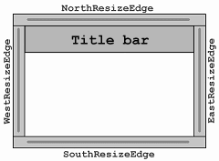
Figure 21.3 Invisible resize edge components around InnerFrame.
<<file figure21-3.gif>>
Note: The
setBorder() method checks whether the component is shown on the screen (if isShowing() returns true) before calling validate(). This precaution helps avoid exceptions during creation of the application. A similar check needs to be made before update(), repaint(), etc., calls if they can possibly be invoked before InnerFrame is displayed on the screen.Method
updateTitleBarColors() has lost his importance, as the overridden methods in the title bar provide the current color information (so we don't have to call setXX() methods explicitly each time the color palette is changed).Method
createTitleBar() creates and initializes the title bar for this frame. The anonymous inner class defining our m_titlePanel component receives a new getBackground() method, which returns getSelectedTitleBarBackground() or getTitleBarBackground() depending on whether the frame is selected or not. Take note of the following code, which may seem strange:
    public Color getBackground() {
      if (InnerFrame.this == null)
        return super.getBackground();
      if (isSelected())
        return getSelectedTitleBarBackground();
      else
        return getTitleBarBackground();
    }
The reason that a check against
null is made here is because this child component will be created before the creation of the corresponding InnerFrame instance is completed. By doing this we can avoid any possible NullPointerExceptions that would occur from calling parent class methods too early.The
m_titleLabel component is also now defined as an anonymous inner class. It overrides two JComponent methods, getForeground() and getFont(). These methods return instance variables from the parent InnerFrame instance. Thus we can avoid keeping track of the font and foreground of this child component, as long as the corresponding instance variables are properly updated. Note that we check the InnerFrame.this reference for null here as well.Finally, methods
writeExternal() and readExternal() have been modified to reflect the changes in the instance variables we have discussed.Class mdi.InnerFrame.InnerFrameButton
This inner class has received two minor changes. First, we override
JComponent’s setBorder() and getBorder() methods to hide the default implementation and eliminate the possibility of assigning any border to these small custom buttons (otherwise every time the L&F is changed the standard JButton border will be set).We also override the
getUIClassID() method which returns a string ID representing this child component’s UI delegate. Referring back to the static block in the InnerFrame class, we see that this ID is associated with javax.swing.plaf.basic.BasicButtonUI class. Thus, we directly assign the BasicButtonUI class as the delegate for this component instead of allowing the current L&F to take control.Class mdi.InnerFrame.EastResizeEdge, WestResizeEdge, NorthResizeEdge, SouthResizeEdge
This
EastResizeEdge inner class has received a few minor changes. The opaque property is now set to false, and we drop any code for the background color since this component is now transparent. Second, the WIDTH variable is initially set to the right inset of the frame's border. This variable is also accessible using the new setWidth() method, which was constructed primarily for synchronizing the size of this component with the width of the Border drawn around the frame (see InnerFrame’s setBorder() method above). Each resize edge component is modified similarly.Class mdi.plaf.InnerFrameUI
This class extends
javax.swing.plaf.PanelUI and defines the custom UI delegate for our InnerFrame component. The basic idea behind this class is to retrieve and reuse the rendering resources defined by the current L&F for JInternalFrame. It is perfectly reasonable to use resources already defined in the LookAndFeel implementations for standard Swing components. By doing so we can more easily provide consistent views of custom components under different L&Fs, and reduce the amount of required coding. However, if we cannot rely on pre-defined resources in a particular LookAndFeel, we need to define our own custom resources. The next section will show how to deal with this situation (which might arise when using third party L&Fs).Class variables:
InnerFrameUI frameUI
: a shared instance of this class returned by createUI().Color DEFAULT_TITLE_BAR_BG_COLOR
: default background color for the title bar of an inactive frame.Color DEFAULT_SELECTED_TITLE_BAR_BG_COLOR
: default background color for the title bar of an active frame.Color DEFAULT_TITLE_BAR_FG_COLOR
: default foreground color for the title bar of an inactive frame.Color DEFAULT_SELECTED_TITLE_BAR_FG_COLOR
: default foreground color for the title bar of an active frame.Font DEFAULT_TITLE_BAR_FONT
: default title bar font.Border DEFAULT_INNER_FRAME_BORDER
: default frame border.Icon DEFAULT_FRAME_ICON
: default frame icon.Hashtable m_ownDefaults
: a collection of resources stored in this UI delegate, and used when a particular resource is not implemented in the current L&F.
Note: The resource variables listed above are default in the sense that they're used unless other values are set explicitly using
setXX() methods of InnerFrame (e.g. setTitleBarFont(), setBorder(), etc.).The
static block defined in this class creates and populates Hashtable m_ownDefaults. Method createUI() creates the InnerFrameUI shared instance (if it is not created yet) and calls installDefaults()to refresh its attributes with resources provided by the current L&F. Several setXX() methods are then called to update the properties of the specified InnerFrame instance.Methods
installUI() and uninstallUI() simply delegate their calls to the super-class implementation. They are included here because, in some cases, we may need to override these methods (as we saw in the previous section).Method
installDefaults() retrieves resources provided by the current L&F by calling our custom findDefaultResource() method, and stores them in the class variables. Remember that the keys for these resources are not documented, but can easily be found in the Swing LookAndFeel implementation source code. "InternalFrame.inactiveTitleBackground" is used to retrieve the background for JInternalFrame’s inactive title bar, "InternalFrame.icon" is used for the JInternalFrame's icon, etc.The custom method
findDefaultResource() takes a resource ID String and searches for it in UIManager’s UIDefaults table. If the resource is not found or an exception occurs, a resource stored in our m_ownDefaults collection under the same ID is used.The
paint() method renders a given component using a given graphical context. As we've discussed above, it explicitly paints the border around InnerFrame by calling the border’s paintBorder() method.Several remaining
getXX() methods allow simple retrieval of the default rendering resources defined in this class, and do not require explanation here.Running the Code
Create several
InnerFrames and JInternalFrames using the "File" menu. Select different L&Fs and note that the appearance of InnerFrame changes accordingly. Compare the appearance of InnerFrame to JInternalFrame in each available L&F. Figures 21.4, 21.5, and 21.6 shows MdiContainer displaying two InnerFrames and two JInternalFrames in the Metal, Windows, and Motif L&! Fs respectively.
Bug Alert! The Motif L&F does not supply proper resources for
JInternalFrame rendering. A quick look at the MotifLookAndFeel source code shows that no resources are placed in the defaults table corresponding to JInternalFrame. This is why the appearance of InnerFrame is not at all consistent with JInternalFrame under the Motif L&F. (This is actually more of a design flaw than a bug.)
Note: The selection of
JInternalFrames and InnerFrames is not synchronized. A single instance of each can be selected at any given time. Also note that because of known flaws in JDesktopPane, InnerFrame (as well as JInternalFrame) will not receive resize events from it, which cripples maximize functionality. Placing these components in an instance of our MDIPane would fix this. However, we would then see null pointer exceptions each time a JInternalFrame’s title bar is pressed.
21.5 L&F for custom components: part II - third party L&F support
The previous example demonstrated how to exploit existing L&F to provide custom components with an appearance consistent with the currently installed look-and-feel. But what if we want to support a custom L&F which does not provide any suitable resources? The most direct way, of course, is to adjust the code in the L&F package. This can be done if we have developed both a custom component and a custom L&F ourselves (as we did in 21.2 and 21.3). However, in the case of a custom L&F supplied by a third party vendor, we would need to provide all necessary resources inside our custom component’s UI delegate.
The following example shows how to add support for a custom L&F, namely Malachite, to our
InnerFrame component. (Recall that MalachiteLF only provides rendering resources for three types of buttons and a border.) We intentionally will not modify, or add to, the original Malachite package (acting as if it is supplied by a third party vendor), and will include all necessary modifications to our component’s UI delegate itself.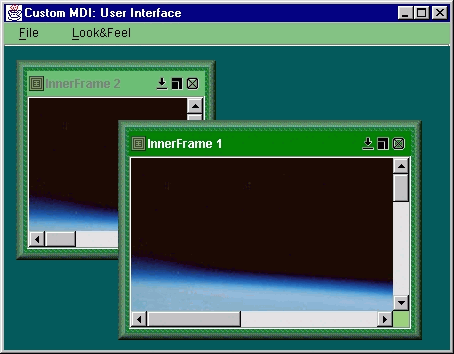
Figure 21.7 InnerFrames in the Malachite L&F.
<<file figure21-7.gif>>
The Code: MdiContainer2.java
see \Chapter21\4
import java.awt.*;
import java.awt.event.*;
import java.util.*;

import javax.swing.*;

import mdi.*;

public class MdiContainer2 extends JFrame
{
  public MdiContainer2() {
    super("Custom MDI: User Interface");
    getContentPane().setLayout(new FlowLayout());
    // Unchanged code from section 21.4
  }
  // Unchanged code from section 21.4

  public static void main(String argv[]) {
    try {
      LookAndFeel malachite = new Malachite.MalachiteLF();
      UIManager.LookAndFeelInfo info =
        new UIManager.LookAndFeelInfo(malachite.getName(),
        malachite.getClass().getName());
      UIManager.installLookAndFeel(info);
      UIManager.setLookAndFeel(malachite);
    }
    catch (Exception ex) {
      ex.printStackTrace();
      System.err.println(ex.toString());
    }

    new MdiContainer2();
  }
}
The Code: InnerFrameUI.java
see \Chapter21\4\mdi\plaf
package mdi.plaf;

import java.awt.*;
import java.util.*;

import javax.swing.*;
import javax.swing.border.*;
import javax.swing.plaf.*;

import mdi.*;

public class InnerFrameUI extends javax.swing.plaf.PanelUI
{
  // Unchanged code from section 21.4

  public static ComponentUI createUI(JComponent c) {
    LookAndFeel currentLF = UIManager.getLookAndFeel();
    if (currentLF != null && currentLF.getID().equals("Malachite"))
      return mdi.plaf.Malachite.MalachiteInnerFrameUI.createUI(c);

  // Remaining code unchanged from section 21.4
}
The Code: MalachiteInnerFrameUI.java
see \Chapter21\4\mdi\plaf\Malachite
package mdi.plaf.Malachite;

import java.awt.*;
import java.util.*;

import javax.swing.*;
import javax.swing.border.*;
import javax.swing.plaf.*;

import mdi.*;
import Malachite.*;

public class MalachiteInnerFrameUI extends mdi.plaf.InnerFrameUI
{
  private static MalachiteInnerFrameUI frameUI;

  public static ComponentUI createUI(JComponent c) {
    if(frameUI == null)
      frameUI = new MalachiteInnerFrameUI();
    try {
      frameUI.installDefaults();

      InnerFrame frame = (InnerFrame)c;
      frame.setTitleBarBackground(DEFAULT_TITLE_BAR_BG_COLOR);
      frame.setSelectedTitleBarBackground(
        DEFAULT_SELECTED_TITLE_BAR_BG_COLOR);
      frame.setTitleBarForeground(DEFAULT_TITLE_BAR_FG_COLOR);
      frame.setSelectedTitleBarForeground(
        DEFAULT_SELECTED_TITLE_BAR_FG_COLOR);
      frame.setTitleBarFont(DEFAULT_TITLE_BAR_FONT);
      frame.setBorder(DEFAULT_INNER_FRAME_BORDER);
      frame.setFrameIcon(DEFAULT_FRAME_ICON);
      if (frame.isShowing())
        frame.repaint();
    }
    catch (Exception ex) {
      System.err.println(ex);
      ex.printStackTrace();
    }

    return frameUI;
  }

  protected void installDefaults() {
    DEFAULT_TITLE_BAR_BG_COLOR = new ColorUIResource(108,190,116);
    DEFAULT_TITLE_BAR_FG_COLOR = new ColorUIResource(Color.gray);
    DEFAULT_SELECTED_TITLE_BAR_BG_COLOR = new ColorUIResource(0,128,0);
    DEFAULT_SELECTED_TITLE_BAR_FG_COLOR = new ColorUIResource(Color.white);
    DEFAULT_TITLE_BAR_FONT = new FontUIResource("Dialog", Font.BOLD, 12);
    Border fb1 = new MalachiteBorder();
    Border fb2 = new MatteBorder(4, 4, 4, 4, new ImageIcon("mdi/plaf/Malachite/body.gif"));
    DEFAULT_INNER_FRAME_BORDER = new BorderUIResource(new CompoundBorder(fb1, fb2));
    DEFAULT_FRAME_ICON = new IconUIResource(new ImageIcon("mdi/plaf/Malachite/icon.gif"));
  }
}
Understanding the Code
Class MdiContainer2
This container class is similar to that in the previous example, but now the Malachite L&F is installed just as it was in the examples of sections 21.2 and 21.3.
Class mdi.plaf.InnerFrameUI
Method
createUI(), which is responsible for creation of this InnerFrame UI delegate, has been modified to check the ID of the current L&F. If it matches "Malachite", createUI() is invoked in the new mdi.plaf.Malachite.MalachiteInnerFrameUI class.Class mdi.plaf.Malachite.MalachiteInnerFrameUI
This new class, a sub-class of
InnerFrameUI, provides InnerFrame with support for our custom Malachite L&F. Note that it is defined in a separate package, which is recommended for organized support of various different L&Fs.Since this class extends
mdi.plaf.InnerFrameUI, only two methods need to be overridden. The createUI() method now creates an instance of MalachiteInnerFrameUI as a shared instance, and calls installDefaults() on that instance. It then assigns the class variables inherited from InnerFrameUI using rendering resources appropriate for the Malachite L&F. Particularly the background colors form a green palette, and the frame's border is built as a CompoundBorder consisting of a MalachiteBorder! (on the outside) and a MatteBorder drawn using a small green dashed image (on the inside).Running the Code
Create several
InnerFrames using the "File" menu, and note that their appearance is in fact consistent with the Malachite L&F. Figure 21.7 illustrates.