Part II - The Basics
Part II consists of twelve chapters containing discussion and examples of the basic Swing components. Chapter 3 introduces frames, panels and borders, including an example showing how to create a custom rounded-edge border. Chapter 4 is devoted to layout managers with a comparison of the most commonly used layouts, a contributed section on the use of
GridBagLayout, the construction of several custom layouts, and the beginnings of a JavaBeans property editing environment with the ability to change the layout manager dynamically. Chapter 5 covers labels and buttons, and presents the construction of a custom transparent polygonal button designed for use in applets, as well as a custom tooltip manager to provide proper tooltip functionality for these polygonal buttons. Chapter 6 is about using and customizing tabbed panes, including an example showing how t! o customize JTabbedPane and its UI delegate to build a tabbed pane which uses background images. Chapter 7 discusses scroll panes and how to customize scrolling functionality. Examples show how to use the row and column headers for tracking scroll position, how to change the speed of scrolling through implementation of the Scrollable interface, how to implement grab-and-drag scrolling, and how to programmatically invoke scrolling. Chapter 8 takes a brief look at split panes with an example showing how to base programmatic actions on the position of the divider (a gas model simulation). Chapter 9 covers combo boxes with examples showing how to build custom combo box models and cell renderers, add functionlity to the default combo box editor, and serialize a combo box model for later use. Chapter 10 is about list boxes with examples of buildin! g a custom tab-based cell renderer, adding keyboard search fu! nc! tionality for quick item selection, and constructing a custom checkbox cell renderer. Chapter 11 introduces the text components and undo/redo functionality with basic examples and discussions of each (text package coverage continues in chapters 19 and 20). Chapter 12 is devoted to menu bars, menus, menu items, toolbars and actions. Examples include the construction of a basic text editor with floatable toolbar, custom toolbar buttons, and a custom color chooser menu item. Chapter 13 discusses progress bars, sliders and scroll bars, including a custom scroll pane, a slider-based date chooser, a JPEG image quality editor, and an FTP client application. Chapter 14 covers dialogs, option panes, and file and color choosers. Examples demonstrate the basics of custom dialog creation and the use of JOptionPane, as well as how to add a custom component to JColorChooser, and how to customize JFileChooser to allow multiple file selection and the addition of a custom component (a ZIP/JAR archive creation, extraction and preview tool).Chapter 3. Frames, Panels, and Borders
In this chapter:
3.1 Frames and panels overview
3.1.1 JFrame
class javax.swing.JFrame
The main container for a Swing-based application is
JFrame. All objects associated with a JFrame are managed by its only child, an instance of JRootPane. JRootPane is a simple container for several child panes. When we add components to a JFrame we don’t directly add them to the JFrame as we did with an AWT Frame. Instead we have to specify exactly which pane of the JFrame’s JRootPane we want the component to be placed in. In most cases components are added to the contentPane by calling:
myJFrame.getContentPane().add(myComponent);
Similarly when setting a layout for a
JFrame’s contents we usually just want to set the layout for the contentPane:
getContentPane().setLayout(new FlowLayout());
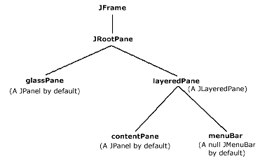
Each
JFrame contains a JRootPane as protected field rootPane. Figure 3.1 illustrates the hierarchy of a JFrame and its JRootPane. The lines in this diagram extend downward representing the "has a" relationship of each container. We will see JFrame in action soon enough.
Figure 3.1 Default JFrame and JRootPane "has a" relationship
<<file figure3-1.gif>>
3.1.2 JRootPane
class javax.swing.JRootPane
Each
JRootPane contains several components referred to here by variable name: glassPane (a JPanel by default), layeredPane (a JLayeredPanel), contentPane (a JPanel by default) and menuBar (a JMenuBar).
Note:
glassPane and contentPane are just variable names used by JRootPane. They are not unique Swing classes, as some explanations might lead you to believe.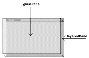
Figure 3.2 glassPane
<<file figure3-2.gif>>
The
glassPane is initialized as a non-opaque JPanel that sits on top of the JLayeredPane as illustrated in Figure 3.3. This component is very useful in situations where we need to intercept mouse events to display a certain cursor over the whole frame or redirect the current application focus. The glassPane can be any component but is a JPanel by default. To change the glassPane from a JPanel to another component a call t! o the setGlassPane() method must be made:
setGlassPane(myComponent);
Though the
glassPane does sit on top of the layeredPane it is, by default, not visible. It can be set visible (i.e. show itself) by calling:
getGlassPane().setVisible(true);
The
glassPane allows you to display components in front of an existing JFrame‘s contents. In chapter 15 we will find that can be useful as an invisible panel for detecting internal frame focus changes.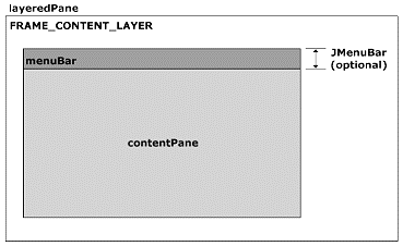
Figure 3.3 Default JFrame contents of the JLayeredPane FRAME_CONTENT_LAYER
<<file figure3-3.gif>>
The
contentPane, and optional menuBar, are contained within JRootPane’s layeredPane at the FRAME_CONTENT_LAYER (this is layer -30000; see chapter 15). The menuBar does not exist by default but can be set by calling the setJMenuBar() method: JMenuBar menu = new JMenuBar();
setJMenuBar(menu);
When the
JMenuBar is set it is automatically positioned at the top of the FRAME_CONTENT_LAYER. The rest of the layer is occupied by the contentPane as illustrated in Figure 3.3.The
contentPane is, by default, an opaque JPanel. It can be set to any other component by calling: setContentPane(myComponent);
Note: The default layout for the
contentPane is BorderLayout. The default layout for any other JPanel is FlowLayout. Be careful not to set the layout of a JFrame directly. This will generate an exception. Setting the layout of the rootPane is also something that should be avoided because every JRootPane uses its own custom layout manager called RootLayout! . We will discuss layout managers more in chapter 4.
3.1.3 RootLayout
class javax.swing.JRootPane.RootLayout
RootLayout
is a layout manager built specifically to manage JRootPane’s layeredPane, glassPane, and menuBar. If it is replaced by another layout manager that manager must be able to handle the positioning of these components. RootLayout is an inner class defined within JRootPane and as such, is not intended to have any use outside of this class. Thus it is not discussed in this text.3.1.4 The RootPaneContainer interface
abstract interface javax.swing.RootPaneContainer
The purpose of the
RootPaneContainer interface is to organize a group of methods that should be used to access a container’s JRootPane and its different panes (see API docs). Because JFrame‘s main container is a JRootPane, it implements this interface (as does JFrame and JDialog). If we were to build a new component which uses a JRootPane as its main container we would most likely implement the RootPaneContainer interface. (Note that this interface exists for convenience, consistency, and organizational purposes. We are encouraged to, but certainly not required to, use it in our own container implementations.)3.1.5 The WindowConstants interface
abstract interface javax.swing.WindowConstants
We can specify how a
JFrame, JInternalFrame, or JDialog acts in response to the user closing it through use of the setDefaultCloseOperation() method. There are three possible settings, as defined by WindowConstants interface fields: WindowConstants.DISPOSE_ON_CLOSE
WindowConstants.DO_NOTHING_ON_CLOSE
WindowConstants.HIDE_ON_CLOSE
The names are self-explanatory.
DISPOSE_ON_CLOSE disposes of the JFrame and its contents, DO_NOTHING_ON_CLOSE renders the close button useless, and HIDE_ON_CLOSE just removes the container from view. (HIDE_ON_CLOSE may be useful if we may need the conatiner, or something it contains, at a later time but do not want it to be visible until then. DO_NOTHING_ON_CLOSE is very useful as you will see below.)3.1.6 The WindowListener interface
abstract interface java.awt.event.WindowListener
Classes that want explicit notification of window events (such as window closing, iconification, etc.) need to implement this interface. Normally the
WindowAdapter class is extended instead. "When the window's status changes by virtue of being opened, closed, activated or deactivated, iconified or deiconified, the relevant method in the listener object is invoked, and theWindowEvent is passed to it."API
The methods any implementation of this interface must define are:
void
(WindowEvent e)
void
(WindowEvent e)
void
(WindowEvent e) void windowDeactivated(WindowEvent e) void windowDeiconified(WindowEvent e) void windowIconified(WindowEvent e) void windowOpened(WindowEvent e)
3.1.7 WindowEvent
class java.awt.event.WindowEvent
The type of event used to indicate that a window has changed state. This event is passed to every
WindowListener or WindowAdapter object which is registered on the source window to receive such events. Method getWindow() returns the window that generated the event. Method paramString() retreives a String describing the event type and its source, among other things.
There are six types of
WindowEvents that can be generated; each is represented by the following static WindowEvent fields: WINDOW_ACTIVATED, WINDOW_CLOSED, WINDOW_CLOSING, WINDOW_DEACTIVATED, WINDOW_DEICONIFIED, WINDOW_ICONIFIED, WINDOW_OPENED.3.1.8 WindowAdapter
abstract class java.awt.event.WindowAdapter
This is an abstract implementation of the
WindowListener interface. It is normally more convenient to extend this class than to implement WindowListener directly.Notice that none of the
WindowConstants close operations actually terminate program execution. This can be accomplished by extending WindowAdapter and overriding the methods we are interested in handling (in this case just the windowClosed() method). We can create an instance of this extended class, cast it to a WindowListener object, and register this listener with the JFrame using the addWindowListener() method. This can easily be added to any application as follows:WindowListener l = new WindowAdapter() {
public void windowClosing(WindowEvent e) {
System.exit(0);
}
};
myJFrame.addWindowListener(l);
The best method of all is to combine
WindowAdapter and values from the WindowConstants interface to present the user with an exit confirmation dialog as follows:
myJFrame.setDefaultCloseOperation (WindowConstants.DO_NOTHING_ON_CLOSE);
WindowListener l = new WindowAdapter() {
   public void windowClosing(WindowEvent e) {
      int confirm = JOptionPane.showOptionDialog(myJFrame,"Really Exit?", "Exit Confirmation",
		                                   JOptionPane.YES_NO_OPTION,JOptionPane.QUESTION_MESSAGE,
          					   null, null, null);
      if (confirm == 0) {
        myJFrame.dispose();
        System.exit(0);
      }
   };
};

myJFrame.addWindowListener(l);
Note: This can also be done for
JDialog. However, to do the same thing for a JInternalFrame we must build a custom JInternalFrame subclass and implement the PropertyChangeListener interface. See chapter 16 for details.Inserting this code into your application will always display the dialog shown in figure 3.4 when the
JFrame close button is pressed. Note that this functionality is not used until later chapters in which we work with applications where closing may cause a loss of unsaved material.
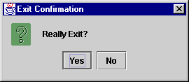
Figure 3.4 Application exit confirmation dialog
<<file figure3-4.gif>>
Reference: Dialogs and
JOptionPane are discussed in Chapter 14.
3.1.9 Custom frame icons
Often we want to use a custom icon to represent our application frame. Because
JFrame is a subclass of awt.Frame we can set its icon using the setIconImage() method. This method is intended to set the minimized icon to use for this frame. On some platforms this icon is also used for a title bar image (e.g. Windows).
UI Guideline: Brand Identity.
Use the frame icon to establish and reinforce your brand identity. Pick a simple image which can be effective in the small space and re-used throughout the application and any accompanying material. Fig 3-5 shows the Sun Coffee Cup which was itilise as a brand mark for Java. ImageIcon image = new ImageIcon("spiral.gif");
myFrame.setIconImage(image.getImage());
There is no limit to the size of the icon that can be used. A
JFrame will resize any image passed to setIconImage() to fit the bound it needs. Figure 3.5 shows the top of a JFrame with a custom icon.
Figure 3.5 JFrame custom Icon
<<file figure3-5.gif>>
3.1.10 Centering a frame on the screen
By default a
JFrame displays itself in the upper left-hand corner of the screen. Often it is desirable to place it in the center of the screen. Using the getToolkit() method of the Window class (of which JFrame is a second level subclass), we can communicate with the operating system and query the size of the screen. (The Toolkit methods make up the bridge between Java components and their native, operating-system-specific, peer components.)The
getScreenSize() method gives us the information we need: Dimension dim = getToolkit().getScreenSize();
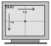
Figure 3.6 Screen coordinates
<<file figure3-6.gif>>
When setting the location of the
JFrame, the upper left hand corner of the frame is the relevant coordinate. So to center a JFrame on the screen we need to subtract half its width and half its height from the center-of-screen coordinate: myJFrame.setLocation(dim.width/2 - myJFrame.getWidth()/2,
dim.height/2 - myJFrame.getHeight()/2);
3.1.11 JApplet
class javax.swing.JApplet
JApplet
is the Swing equivalent of the AWT Applet class. Like JFrame, JApplet’s main child component is a JRootPane and its structure is the same. JApplet acts just like Applet and we will not go into detail about how applets work.
Reference: We suggest that readers unfamiliar with applets refer to the Java tutorial to learn more: http://java.sun.com/docs/books/tutorial/
Several examples in later chapters are constructed as Swing applets and we will see
JApplet in action soon enough. Appendix A contains information about deploying Swing-based applets for use in a browser, Java 2 applet security issues, and working with JAR archives.3.1.12 JWindow
class javax.swing.JWindow
JWindow
is very similar to JFrame except that it has no title bar, and is not resizable, minimizable, maximizable, or closable. Thus it cannot be dragged without writing custom code to do so (e.g. JToolBar’s UI delegate provides this functionality for docking and undocking). We normally use JWindow to display a temporary message or splash screen logo. Since JWindow is a RootPaneContainer, we can treat it just like JFrame or JApplet when manipulating its contents.
Note: We will use
JWindow to display a splash screen in several complex examples later to provide simple feedback to the user when potentially long startup times are encountered.
3.1.12 JPanel
class javax.swing.JPanel
This is the simple container component commonly used to organize a group or groups of child components inside another container.
JPanel is an integral part of JRootPane, as we discussed above, and is used in each example throughout this book. Each JPanel’s child components are managed by a layout manager. A layout manager controls the size and location of each child in a container. JPanel’s default layout manager is FlowLayout (we will discuss this more in chapter 4). The only exception to this is JRootPane’s contentPane, which is managed by a BorderLayout by default.3.2 Borders
package javax.swing.border
The
border package provides us with the following border classes which can be applied to any Swing component:BevelBorder
A 3D border with a raised or lowered appearance.
CompoundBorder
A combination of two borders: an inside border and an outside border.
EmptyBorder
A transparent border used to define empty space (often referred to as white space) around a component.
EtchedBorder
A border with an etched lineappearance.
LineBorder
A flat border with a specified thickness and color.
MatteBorder
A border consisting of either a flat color or tiled image.
SoftBevelBorder
A 3D border with a raised or lowered appearance, and rounded edges.
TitledBorder
A border allowing a
String title in a specific location and position. We can set the title font, color, justification, and position of the title text using TitleBorder methods and constants where necessary (see API docs).To set the border of a Swing component we simply call JComponent’s setBorder() method. There is also a convenience class called BorderFactory, contained in the javax.swing package (not the javax.swing.border package as you might think), which contains a group of static methods used for constructing borders quickly. For example, to create an EtchedBorder we can use BorderFactory as follows:
myComponent.setBorder(BorderFactory.createEtchedBorder());
The border classes do not provide methods set their dimensions, colors, etc. Insetad of modifying an existing border we are normally expected to create a new instance to replace the old one.
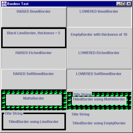
Figure 3.7 Simple Borders demonstration
<<file figure3-7.gif>>
The following code creates a
JFrame containing twelve JPanels using borders of all types. Figure 3.7 illustrates:The Code: BorderTest.java
see \Chapter3\1
import java.awt.*;
import javax.swing.*;
import javax.swing.border.*;
class BorderTest extends JFrame
{
  public BorderTest()
  {
    setTitle("Border Test");
    setSize(450, 450);

    JPanel content = (JPanel) getContentPane();
    content.setLayout(new GridLayout(6,2));

    JPanel p = new JPanel();
    p.setBorder(new BevelBorder (BevelBorder.RAISED));
    p.add(new JLabel("RAISED BevelBorder"));
    content.add(p);

    p = new JPanel();
    p.setBorder(new BevelBorder (BevelBorder.LOWERED));
    p.add(new JLabel("LOWERED BevelBorder"));
    content.add(p);

    p = new JPanel();
    p.setBorder(new LineBorder (Color.black, 5));
    p.add(new JLabel("Black LineBorder, thickness = 5"));
    content.add(p);

    p = new JPanel();
    p.setBorder(new EmptyBorder (10,10,10,10));
    p.add(new JLabel("EmptyBorder with thickness of 10"));
    content.add(p);

    p = new JPanel();
    p.setBorder(new EtchedBorder (EtchedBorder.RAISED));
    p.add(new JLabel("RAISED EtchedBorder"));
    content.add(p);

    p = new JPanel();
    p.setBorder(new EtchedBorder (EtchedBorder.LOWERED));
    p.add(new JLabel("LOWERED EtchedBorder"));
    content.add(p);

    p = new JPanel();
    p.setBorder(new SoftBevelBorder (SoftBevelBorder.RAISED));
    p.add(new JLabel("RAISED SoftBevelBorder"));
    content.add(p);

    p = new JPanel();
    p.setBorder(new SoftBevelBorder (SoftBevelBorder.LOWERED));
    p.add(new JLabel("LOWERED SoftBevelBorder"));
    content.add(p);

    p = new JPanel();
    p.setBorder(new MatteBorder (new ImageIcon("spiral.gif")));
    p.add(new JLabel("MatteBorder"));
    content.add(p);

    p = new JPanel();
    p.setBorder(new TitledBorder (
      new MatteBorder (new ImageIcon("spiral.gif")),
      "Title String"));
    p.add(new JLabel("TitledBorder using MatteBorder"));
    content.add(p);

    p = new JPanel();
    p.setBorder(new TitledBorder (
      new LineBorder (Color.black, 5),
      "Title String"));
    p.add(new JLabel("TitledBorder using LineBorder"));
    content.add(p);

    p = new JPanel();
    p.setBorder(new TitledBorder (
      new EmptyBorder (10,10,10,10),
      "Title String"));
    p.add(new JLabel("TitledBorder using EmptyBorder"));
    content.add(p);

    setVisible(true);
  }

  public static void main(String args[])
  {
    new BorderTest();
  }
}
UI Guideline:
Borders for Visual Layering.
Use borders to create a visual association between components on a view. Bevelled borders are graphically very strong and can be used to strongly associate items. Windows Look & Feel does this. For example buttons use a RAISED BevelBorder and data fields use a LOWERED BevelBorder. If you want to visually associate components or draw attention to a component then you can create a visual layer by careful use of BevelBorder. If you want to draw attention to a particular button or group of buttons, you might consider thickening the RAISED bevel using BorderInsets discussed in 3.2.2Borders for Visual Grouping. Use borders to create Group Boxes. EtchedBorder and LineBorder are particularly effective for this, as they are graphically weaker then BevelBorder. EmptyBorder is also very useful for grouping. It uses the power of negative (white) space to visually associate the contained components and draw the viewer eye to the group.
You may wish to create a visual grouping of attributes or simply signify the bounds of a set of choices. Grouping related Radio Buttons and Checkboxes is particularly useful.
Achieving Visual Integration and Balance using Negative Space. Use a compound border including an EmptyBorder to increase the Negative (white) Space around a Component or Panel. Visually, a Border sets what is known as a Ground (or area) for a Figure. The Figure is what is contained within the Border. It is important to keep Figure and Ground in balance. This is done by providing adequate white space around the Figure. The stronger the border, the more white space will be required e.g. a BevelBorder will require more white space than an EtchedBorder. Ref. Mullet 95 (see Appendix B).
Border for Visual Grouping with Layering. Doubly compounded borders can be used to group information and communicate hierarchy using Visual Layering. Consider the following implementation (fig 3-8). Here we are indicating a common belonging for the attributes within the border. They are both attributes of Customer. Because we have indicated the label Customer (top LHS) in the border title, we do not need to repeat the label for each field. We are further communicating the type of the Customer with the VIP label (bottom RHS).
Visual Layering of the hierachy involved is achieved by position and font.
(i) Position: In western cultures, the eye is trained to scan from top left to bottom right. Thus something located top left has a visual higher rank than something located bottom right.
(ii) Font: By bolding the Customer, we are clearly communicating it as the highest ranking detail.
What we are displaying is a Customer of type VIP. Not a VIP of type Customer. The positioning and re-inforcing with heavier font, clearly communicate this message
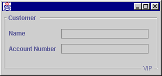
Figure 3.8 Visual Grouping with Layering
<<file figure3-8.gif>>
3.2.2 Inside Borders
It is important to understand that borders are not components. In fact
AbstractBorder, the abstract class all border classes are derived from, directly extends Object. Thus we cannot attach action and mouse listeners, set tool tips, etc.
Note: This has certain side effects, one of which is that borders are much less efficient in painting themselves. There is no optimization support like there is in
JComponent. We can do intersting things like use a very thick MatteBorder to tile a panel with an image, but this is an inefficient (and also unreliable) solution. In general don’t use really large borders for anything. If you need an extremely large border consider simulating one using JLabels and a container managed by BorderLayout.One major benefit of
Borders not being components is that we can use a single Border instance with an arbitrary number of components. In large scale apps this can reduce a significant amount of overhead.When a Swing component is assigned a border its
Insets are defined by that border’s width and height settings. When layout managers lay out JComponents, as we will see in the next chapter, they take into account their Insets and normally use JComponent’s getInsets() method to obtain this information. Inside the getInsets() method, the current border is asked to provide its Insets using the getBorderInsets() method.The
Insets class consists of four publicly accessible int values: bottom, left, right, top. TitleBorder must compute its Insets based on its current font and text position which will not effect every side and requires handling for many different cases--without a doubt this is the most complex border provided by Swing. In the case of CompoundBorderBorder
s get painted last in the JComponent rendering pipeline to ensure that they always appear on top of their associated component. AbstractBorder defines methods to get a Rectangle representing the interior region of the component a border is attached to: getInteriorRectangle(). Any JComponent subclass implementing its own painting methods may be interested in this area. Combined with the Graphics clipping area, components may use this information to minimize! their rendering work (refer back to chapter 2).3.3 Creating a custom border
To create a custom border we can implement the
javax.swing.Border interface and define the following three methods:void paintBorder(Component c, Graphics g)
: perform the border rendering--only paint within the Insets region.Insets getBorderInsets(Component c)
: return an Insets instance representing the top, bottom, left, and right thicknesses.boolean isBorderOpaque()
: return whether or not the border is opaque or transparent.The following class is a simple implementation of a custom rounded-rectangle border which we call
OvalBorder.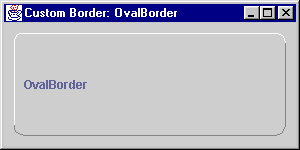
Figure 3.9 A custom rounded-corner Border implementation.
<<file figure3-9.gif>>
The Code: OvalBorder.java
see \Chapter3\2
import java.awt.*;

import javax.swing.*;
import javax.swing.border.*;

public class OvalBorder implements Border
{
  protected int m_w=6;
  protected int m_h=6;
  protected Color m_topColor = Color.white;
  protected Color m_bottomColor = Color.gray;

  public OvalBorder() {
    m_w=6;
    m_h=6;
  }

  public OvalBorder(int w, int h) {
    m_w=w;
    m_h=h;
  }

  public OvalBorder(int w, int h, Color topColor,
   Color bottomColor) {
    m_w=w;
    m_h=h;
    m_topColor = topColor;
    m_bottomColor = bottomColor;
  }

  public Insets getBorderInsets(Component c) {
    return new Insets(m_h, m_w, m_h, m_w);
  }

  public boolean isBorderOpaque() { return true; }

  public void paintBorder(Component c, Graphics g,
   int x, int y, int w, int h) {
    w--;
    h--;
    g.setColor(m_topColor);
    g.drawLine(x, y+h-m_h, x, y+m_h);
    g.drawArc(x, y, 2*m_w, 2*m_h, 180, -90);
    g.drawLine(x+m_w, y, x+w-m_w, y);
    g.drawArc(x+w-2*m_w, y, 2*m_w, 2*m_h, 90, -90);

    g.setColor(m_bottomColor);
    g.drawLine(x+w, y+m_h, x+w, y+h-m_h);
    g.drawArc(x+w-2*m_w, y+h-2*m_h, 2*m_w, 2*m_h, 0, -90);
    g.drawLine(x+m_w, y+h, x+w-m_w, y+h);
    g.drawArc(x, y+h-2*m_h, 2*m_w, 2*m_h, -90, -90);
  }

  public static void main(String[] args) {
    JFrame frame = new JFrame("Custom Border: OvalBorder");
    JLabel label = new JLabel("OvalBorder");
    ((JPanel) frame.getContentPane()).setBorder(new CompoundBorder(
      new EmptyBorder(10,10,10,10), new OvalBorder(10,10)));
    frame.getContentPane().add(label);
    frame.setBounds(0,0,300,150);
    frame.setVisible(true);
  }
}
Understanding the Code
This border consists of a raised shadowed rectangle with rounded corners. Instance variables:
int m_w
: left and right inset value.int m_h
: top and bottom inset value.Color m_topColor
: non-shadow color.Color m_bottomColor
: shadow color.Three constructors are provided to allow optional specification of the width and height of left/right and top/bottom inset values respectively. We can also specify the shadow color (bottom color) and non-shadow color (top color). The inset values default to 6, the top color defaults to white, and the shadow color defaults to gray.
The
isBorderOpaque() method always returns true to signify that this border’s region will always be completely filled. getBorderInsests() simpley returns an Insets instance made up of the left/right and top/bottom inset values specified in a constructor.The
paintBorder() method is responsible of rendering our border and simply paints a sequence of four lines and arcs in the approproate colors. By simply reversing the use of bottomColor and topColor we can switch from a raised look to a lowered look (a more flexible implementation might include a raised/lowered flag, and an additional constructor parameter used to specify this).The
main() method creates a JFrame with content pane surrounded by a CompoundBorder. The outer border is an EmptyBorder to provide white space, and the inner border is an instance of our OvalBorder class with inset values of 10.Running the Code
Figure 3.9 illustrates. Try running this class and resize the parent frame. Note that with a very small width or height the border does not render itself pleasantly. A more professional implementation would take this into account in the
paintBorder() routine.