Chapter 5. Labels and Buttons
In this chapter:
5.1 Labels and buttons overview
5.1.1 JLabel
class javax.swing.JLabel
JLabel
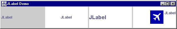
is one of the simplest Swing components, and is most often used to identify other components. JLabel can display text, an icon, or both in any combination of positions (note that text will always overlap the icon). The following code creates four different JLabels and places them in a GridLayout, and figure 5.1 illustrates.
Figure 5.1 JLabel demo
<<file figure5-1.gif>>
The Code: LabelDemo.java
see \Chapter5\6
import java.awt.*;
import javax.swing.*;

class LabelDemo
extends JFrame
{
  public LabelDemo()
  {
    super("JLabel Demo");
    setSize(600, 100);

    JPanel content = (JPanel) getContentPane();
    content.setLayout(new GridLayout(1, 4, 4, 4));

    JLabel label = new JLabel();
    label.setText("JLabel");
    label.setBackground(Color.white);
    content.add(label);

    label = new JLabel("JLabel",
      SwingConstants.CENTER);
    label.setOpaque(true);
    label.setBackground(Color.white);
    content.add(label);

    label = new JLabel("JLabel");
    label.setFont(new Font("Helvetica", Font.BOLD, 18));
    label.setOpaque(true);
    label.setBackground(Color.white);
    content.add(label);

    ImageIcon image = new ImageIcon("flight.gif");
    label = new JLabel("JLabel", image,
      SwingConstants.RIGHT);
    label.setVerticalTextPosition(SwingConstants.TOP);
    label.setOpaque(true);
    label.setBackground(Color.white);
    content.add(label);

    setVisible(true);
  }

  public static void main(String args[])
  {
     new LabelDemo();
  }
}
The first label is created with the default constructor and its text is set using the
setText() method. We then set its background to white, but when we run this program the background of this label shows up as light gray! The reason this happens is because we didn’t force this label to be opaque. In chapter 2 we learned that Swing components support transparency, which means that a component does not have to paint every pixel within its bounds. So when a component is not opaque it will not fill its background, and a JLabel (as with most components) is non-opaque by default.Also note that we can set the font and foreground color of a
JLabel using JComponent’s setFont() and setForeground() methods. Refer back to chapter 2 for information about working the the Font and Color classes.The default horizontal alignment of
JLabel is LEFT if only text is used, and CENTER if an image or an image and text are used. An image will appear to the left of the text by default, and every JLabel is initialized with a centered vertical alignment. Each of these default behaviors can easily be adjusted as we will see below.5.1.2 Text Alignment
To specify alignment or position in many Swing components we make us of the
javax.swing.SwingConstants interface. This defines several constant strings, five of which are applicable to JLabel’s text alignment settings:SwingConstants.LEFT
SwingConstants.CENTER
SwingConstants.RIGHT
SwingConstants.TOP
SwingConstants.BOTTOM
Alignment of both a label’s text and icon can be specified in the constructor or through the use of
setHorizontalAlignment() and setVerticalAlignment() methods. The text can be aligned both vertically or horizontally, independent of the icon (text will overlap the icon when necessary) using the setHorizontalTextAlignment() and setVerticalTextAlignment() methods. Figure 5.2 shows where a JLabel’s text will be placed corresponding to each possible combination of vertical and horizontal text alignment settings.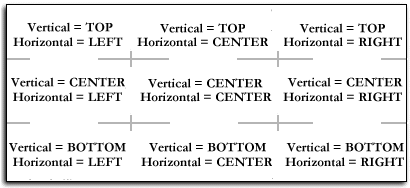
Figure 5.2 JLabel text alignment
<<file figure5-2.gif>>
5.1.3 Icons and Icon Alignment
The simple example above included a label with an image of an airplane by reading a GIF file in as an
ImageIcon and passing it to a JLabel constructor:ImageIcon image = new ImageIcon("flight.gif");
label = new JLabel("JLabel", image,
SwingConstants.RIGHT);
An image can also be set or replaced at any time using the
setIcon() method (passing null will remove the current icon, if any). JLabel also supports a disabled icon for use when a label is in the disabled state. To assign a disabled icon we use the setDisabledIcon() method.
Note: Animated GIFs can be used with
ImageIcon’s and labels just as any static GIF, and require no additional code. ImageIcon also supports JPGs.
5.1.4 GrayFilter
class javax.swing.GrayFilter
The
GrayFilter class can be used to create disabled images using its static createDisabledImage() method:ImageIcon disabledImage = new ImageIcon(
GrayFilter.createDisabledImage(image.getImage()));
Figure 5.3 shows the fourth label in
LabelDemo now using a disabled icon generated by GrayFilter. Note that JLabel only displays the disabled icon when it has been disabled using JComponent’s setEnabled() method.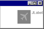
Figure 5.3 Demonstrating a disabled icon using GrayFilter
<<file figure5-3.gif>>
5.1.5 The labelFor and the displayedMnemonic properties
JLabel
maintains a labelFor property and a displayedMnemonic property. The displayed mnemonic is a character that, when pressed in syncronization with ALT (e.g. ALT+R), will call JComponent’s requestFocus() method on the component referenced by the labelFor property. The first instance of displayed mnemonic character (if any) in a label’s text will be underlined. We can access these properties using typical get/set accessors (see API docs).5.1.6 AbstractButton
abstract class javax.swing.AbstractButton
AbstractButton
is the template class from which all buttons are defined. This includes push buttons, toggle buttons, check boxes, radio buttons, menu items, and menus themselves. Its direct subclasses are JButton, JToggleButton, and JMenuItem. There are no subclasses of JButton in Swing. JToggleButton has two subclasses: JCheckBox, JRadioButton. JMenuIt! em has three subclasses: JCheckBoxMenuItem, JRadioButtonMenuItem, and JMenu. The remainder of this chapter will focus on JButton and the JToggleButton family. (See chapter 12 for more about menus and menu items).5.1.7 The ButtonModel interface
abstract interface javax.swing.ButtonModel
Each button class uses a model to store its state. We can access any button’s model with the
AbstractButton getModel() and setModel() methods. The ButtonModel interface is the template interface from which all button models are defined. JButton uses the DefaultButtonModel implementation. JToggleButton defines an inner class extension of DefaultButtonModel, JToggleButton.ToggleButtonModel, which is used by itself, as well as both its subclasses.The following boolean property values represent the state of a button, and have associated
isXX() and setXX() accessors in DefaultButtonModel:selected
: Switches state on each click (only relevant for JToggleButtons).pressed
: True when the button is held down with the mouse.rollover
: True when the mouse is hovering over the button.armed
: This state stops events from being fired when we press a button with the mouse, and then release the mouse when its cursor is outside that button’s bounds.enabled
: True when the button is active. None of the other properties can normally be changed when this is false.A button’s keyboard mnemonic is also stored in its model, as well as the
ButtonGroup it belongs to, if any. (We’ll discuss the ButtonGroup class while we discuss JToggleButtons, as it only applies to this family of buttons.)5.1.8 JButton
class javax.swing.JButton
JButton
is a basic push-button, one of the simplest Swing components. Almost everything we know about JLabel also applies to JButton. We can add images, specify text and image alignment, set foreground and background colors (remember to call setOpaque(true)), set fonts, etc. Additionally, we can add ActionListeners, ChangeListeners, and ItemListeners to receive ActionEvents,In most application dialogs we expect to find a button which initially has the focus and will capture an Enter key press, regardless of the current keyboard focus (unless focus is within a multi-line text component). This is referred to as the default button. Any
JRootPane container can define a default button using JRootPane’s setDefaultButton() method (passing null will disable this feature). For instance, to make a button the default button for a JFrame we would do the following:myJFrame.getRootPane().setDefaultButton(myButton);
The
isDefaultButton() method returns a boolean value indicating whether or not the button instance it was called on is a default button for a JRootPane.We most often register an
ActionListener with a button to receive ActionEvents from that button whenever it is clicked (Note that if a button has the focus, pressing the space-bar will also fire an ActionEvent). ActionEvents carry with them information about the event that occurred including, most importantly, which component they came from. (Note that an ActionListener can be registered to receive events from any number of components. See chapter 2 for an overview of event handling.)To create an
ActionListener we need to create a class that implements the ActionListener interface, which requires the definition of its actionPerformed() method. Once we have built an ActionListener we can register it with a button using the JComponent‘s addActionListener() method. The following is a typical inner class implementation. When an ActionEvent is intercepted, "Swing is powerful!!" is printed to standard output.
  JButton myButton = new JButton();
  ActionListener act = new ActionListener() {
    public void actionPerformed(ActionEvent e) {
      System.out.println("Swing is powerful!!");
    }
  };
  myButton.addActionListener(act);
We primarily use this method throughout this book to attach listeners to components. However, some developers prefer to implement the
ActionListener interface in the class that owns the button instance. In the case of classes with several registered components, this is not as efficient as using a separate listener class and can require writing common code in several places. Specifically, implementing ActionListener for use with multiple event sources requires us to check the source of each ActionEvent (using ActionEvent’s getSource() method) before processing.An icon can be assigned to a
JButton instance via the constructor or with the setIcon() method. We can optionally assign individual icons for the normal, selected, pressed, rollover, and disabled states. See the API docs for more detail on the following methods:setDisabledSelectedIcon() setPressedIcon() setRolloverIcon() setRolloverSelectedIcon() setSelectedIcon()
A button can also be disabled and enabled the same way as a
JLabel, using setEnabled(). As we would expect, a disabled button will not respond to any user actions.A button’s keyboard mnemonic provides an alternative way of activation. To add a keyboard mnemonic to a button we use the
setMnemonic() method:button.setMnemonic('R');
We can then activate a button (equivalent to clicking it) by pressing ALT and its mnemonic key simultaneously. (e.g. ALT+R) The first appearance of the assigned mnemonic character, if any, in the button text will be underlined to indicate which key activates it. There is no distinction made between upper and lower case characters. Avoid duplicating mnemonics for components sharing a common ancestor.
5.1.9 JToggleButton
class javax.swing.JToggleButton
JToggleButton
provides a selected state mechanism which extends to its children, JCheckBox and JRadioButton, and corresponds to the selected property we discussed in section 5.2. We can test whether a toggle button is selected using AbstractButton’s isSelected() method, and we can set this property with its setSelected() method.5.1.10 ButtonGroup
class javax.swing.ButtonGroup
JToggleButton
s are often used in ButtonGroups. A ButtonGroup manages a set of buttons by guaranteeing that only one button within that group can be selected at any given time. Thus, only JToggleButton and its subclasses are useful in a ButtonGroup (because a JButton does not maintain a selected state). The following code constructs three JToggleButtons and places them in a single ButtonGroup.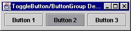
Figure 5.4 JToggleButtons in a ButtonGroup
<<file figure5-4.gif>>
The Code: ToggleButtonDemo.java
see \Chapter5\2
import java.awt.*;
import java.awt.event.*;
import javax.swing.*;

class ToggleButtonDemo extends JFrame
{
  public ToggleButtonDemo ()
  {
    super("ToggleButton/ButtonGroup Demo");
    getContentPane().setLayout(new FlowLayout());

    JToggleButton button1 = new JToggleButton("Button 1",true);
    getContentPane().add(button1);
    JToggleButton button2 = new JToggleButton("Button 2",false);
    getContentPane().add(button2);
    JToggleButton button3 = new JToggleButton("Button 3",false);
    getContentPane().add(button3);

    ButtonGroup buttonGroup = new ButtonGroup();
    buttonGroup.add(button1);
    buttonGroup.add(button2);
    buttonGroup.add(button3);

    pack();
    setVisible(true);
  }

  public static void main(String args[])
  {
    new ToggleButtonDemo();
  }
}
5.1.11 JCheckBox and JRadioButton
class javax.swing.JCheckBox, class javax.swing.JRadioButton
JCheckBox
and JRadioButton both inherit all JToggleButton functionality. In fact the only significant differences between all three components is their UI delegate views (i.e. how they are rendered). Both button types are normally used to select the mode of a particular application function. Figures 5.5 and 5.6 show the previous example running with JCheckBoxes and JRadioButtons as replacements for the JToggleButtons.
Figure 5.5 JCheckBoxes in a ButtonGroup
<<file figure5-5.gif>>
Figure 5.6 JRadioButtons in a ButtonGroup
<<file figure5-6.gif>>
5.1.12 JToolTip & ToolTipManager
class javax.swing.JToolTip, class javax.swing.ToolTipManager
A
JToolTip is a small popup window designed to contain informative text about a component when the mouse moves over it. We don’t generally create instances of these components ourselves. Rather, we call setToolTipText() on any JComponent subclass and pass it a descriptive String. This String is then stored as a client property within that component’s client properties Hashtable, and that component is then registered with the ToolTipManager (using ToolTipManager’s registerComponent() method). The ToolTipManager adds a MouseListener to each component that registers with it.To unregister a component we can pass
null to that component’s setToolTipText() method. This invokes ToolTipManager’s unregisterComponent() method which removes its MouseListener from that component. Figure 5.7 shows a JToggleButton with simple tooltip text.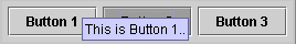
Figure 5.7 JToggleButton with tooltip text
<<file figure5-7.gif>>
The
ToolTipManager is a service class that maintains a shared instance registered with AppContext (see chapter 2). We can access the ToolTipManager directly by calling its static sharedInstance() method:ToolTipManager toolTipManager = ToolTipManager.sharedInstance();
Internally this class uses three non-repeating
Timers with delay times defaulting to 750, 500, and 4000. ToolTipManager uses these Timer’s in coordination with mouse listeners to determine if and when to display a JToolTip with a component’s specified tooltip text. When the mouse enters a components bounds ToolTipManager will detect this and wait 750ms until displaying a JToolTip for that component. This is referred to as the initial delay time. A JToolTip will stay visible for 4000ms or until we move the mouse outside of that component’s bounds, whichever comes first. This is referred to as the dismiss delay time. The 500ms Timer represents the reshow delay time which specifies how soon the JToolTip we have just seen will appear again when this component is re-entered. Each of these delay times can be set using ToolTipManager’s setDismissDelay(), setInitialDelay(), and setReshowDelay() methods.ToolTipManager
is a very nice service to have implemented for us, but it does have significant limitations. When we construct our polygonal buttons in section 5.6 below, we will find that it is not robust enough to support non-rectangular components. It is also the case that JToolTips are only designed to allow a single line of text.5.1.13 Labels and buttons with HTML text
The Swing 1.1.1 Beta 1 release (February 1999) offers a particularly interesting new feature (among several bug fixes). Now we can use HTML text in
JButton and JLabel components (as well as for tooltip text). We don't have to learn any new methods to use this functionality, and the UI delegate handles the HTML rendering for us. If a button/label's text starts with <HTML>, Swing knows to lightweight render the text in HTML format. We can use normal paragraph tags (<P>, </P>), line break tags (<BR&! gt;), etc. For instance, we can assign a multiple-line tooltip to any component like so:myComponent.setToolTipText("<html>Multi-line tooltips<br>" +
"are easy!");
The
<br> tag specifies a line break. The following example demonstrates this functionality.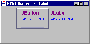
Figure 5.12 A JButton and JLabel with HTML text.
<<file figure5-12.gif>>
The Code: HtmlButtons.java
see \Chapter5\3
import java.awt.*;
import java.awt.event.*;
import javax.swing.*;

public class HtmlButtons
	extends JFrame
{
	public HtmlButtons()
	{
		super("HTML Buttons and Labels");
		setSize(400, 300);

		getContentPane().setLayout(new FlowLayout());

		String htmlText =
			"< html >< p >< font color=\"#800080\" " +
			"size=\"4\" face=\"Verdana\">JButton< /font > < /p >"+
			"< address >< font size= \"2\" >< em >"+
			"with HTML text< /em >< /font >"+
			"< /address >";
		JButton btn = new JButton(htmlText);
		getContentPane().add(btn);

		htmlText =
			"< html >< p >< font color=\"#800080\" "+
			"size=\"4\" face=\"Verdana\" >JLabel< /font> < /p>"+
			"< address >< font size=\"2\" >< em >"+
			"with HTML text< /em >< /font >"+
			"< /address >";
		JLabel lbl = new JLabel(htmlText);
		getContentPane().add(lbl);

		WindowListener wndCloser = new WindowAdapter()
		{
			public void windowClosing(WindowEvent e)
			{
				System.exit(0);
			}
		};
		addWindowListener(wndCloser);
		setVisible(true);
	}

	public static void main(String args[])
	{
		new HtmlButtons();
	}
}
5.2 Custom buttons: part I - Transparent buttons
Buttons in Swing can adopt almost any presentation we can think of. Of course some presentations are tougher to implement than others. In the remainder of this chapter we will deal directly with these issues. The example in this section shows how to construct invisible buttons which only appear when the user moves the mouse cursor over them. Specifically, a border will be painted, and tooltip text will be activated in the default mannar.
Such button’s can be useful in applets for pre-defined hyperlink navigation, and we will design our invisible button class with this in mind. Thus, we will show how to create an applet that reads a set of parameters from the HTML page it is embedded in, and loads a corresponding set of invisible buttons. For each button, the designer of the HTML page must provide three parameters: the desired hyperlink URL, the button’s bounds (positions and size), and the button’s tooltip text. Additionaly our sample applet will require a background image parameter. Our button’s bounds are intended to directly correspond to an ‘active’ region of this background image--much like the venerable HTML image mapping functionality.
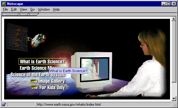
Figure 5.8 Transparent rectangular buttons in an applet
<<file figure5-8.gif>>
The Code: ButtonApplet.java
see \Chapter5\4
import java.applet.*;
import java.awt.*;
import java.awt.event.*;
import java.net.*;
import java.util.*;

import javax.swing.*;
import javax.swing.border.*;
import javax.swing.event.*;

public class ButtonApplet
	extends JApplet
{

	public ButtonApplet() {}

	public synchronized void init()
	{
		String imageName = getParameter("image");
		if (imageName == null)
		{
			System.err.println("Need \"image\" parameter");
			return;
		}
		URL imageUrl = null;
		try
		{
			imageUrl = new URL(getDocumentBase(), imageName);
		}
		catch (MalformedURLException ex)
		{
			ex.printStackTrace();
			return;
		}
		ImageIcon bigImage = new ImageIcon(imageUrl);
		JLabel bigLabel = new JLabel(bigImage);
		bigLabel.setLayout(null);

		int index = 1;
		int[] q = new int[4];
		while(true)
		{
			String paramSize = getParameter("button"+index);
			String paramName = getParameter("name"+index);
			String paramUrl = getParameter("url"+index);
			if (paramSize==null || paramName==null || paramUrl==null)
				break;

			try
			{
				StringTokenizer tokenizer = new StringTokenizer(
					paramSize, ",");
				for (int k=0; k < 4; k++)
				{
					String str = tokenizer.nextToken().trim();
					q[k] = Integer.parseInt(str);
				}
			}
			catch (Exception ex) { break; }

			NavigateButton btn = new NavigateButton(this,
				paramName, paramUrl);
			bigLabel.add(btn);
			btn.setBounds(q[0], q[1], q[2], q[3]);

			index++;
		}

		getContentPane().setLayout(null);
		getContentPane().add(bigLabel);
		bigLabel.setBounds(0, 0, bigImage.getIconWidth(),
			bigImage.getIconHeight());
	}

	public String getAppletInfo()
	{
		return "Sample applet with NavigateButtons";
	}

	public String[][] getParameterInfo()
	{
		String pinfo[][] = {
			{"image",  "string",  "base image file name"},
			{"buttonX","x,y,w,h", "button's bounds"},
			{"nameX",  "string",  "tooltip text"},
			{"urlX",   "url",     "link URL"} };
		return pinfo;
	}
}

class NavigateButton
	extends JButton
	implements ActionListener
{
	protected Border m_activeBorder;
	protected Border m_inactiveBorder;

	protected Applet m_parent;
	protected String m_text;
	protected String m_sUrl;
	protected URL    m_url;

	public NavigateButton(Applet parent, String text, String sUrl)
	{
		m_parent = parent;
		setText(text);
		m_sUrl = sUrl;
		try
		{
			m_url = new URL(sUrl);
		}
		catch(Exception ex) { m_url = null; }

		setOpaque(false);
		enableEvents(AWTEvent.MOUSE_EVENT_MASK);

		m_activeBorder = new MatteBorder(1, 1, 1, 1, Color.yellow);
		m_inactiveBorder = new EmptyBorder(1, 1, 1, 1);
		setBorder(m_inactiveBorder);

		addActionListener(this);
	}

	public void setText(String text)
	{
		m_text = text;
		setToolTipText(text);
	}

	public String getText()
	{
		return m_text;
	}

	protected void processMouseEvent(MouseEvent evt)
	{
		switch (evt.getID())
		{
		case MouseEvent.MOUSE_ENTERED:
			setBorder(m_activeBorder);
			setCursor(Cursor.getPredefinedCursor(
				Cursor.HAND_CURSOR));
			m_parent.showStatus(m_sUrl);
			break;

		case MouseEvent.MOUSE_EXITED:
			setBorder(m_inactiveBorder);
			setCursor(Cursor.getPredefinedCursor(
				Cursor.DEFAULT_CURSOR));
			m_parent.showStatus("");
			break;
		}
		super.processMouseEvent(evt);
	}

	public void actionPerformed(ActionEvent e)
	{
		if (m_url != null)
		{
			AppletContext context = m_parent.getAppletContext();
			if (context != null)
				context.showDocument(m_url);
		}
	}

	public void paintComponent(Graphics g)
	{
		paintBorder(g);
	}
}
Understanding the Code
Class ButtonApplet
This class extends
JApplet to provide web page functionality. The init() method creates and initializes all GUI components. It starts by reading the applet's "image" parameter which is then used along with the applet’s codebase to construct a URL:imageUrl = new URL(getDocumentBase(), imageName);
This URL points to the image file which is used to create our
bigLabel label which is used as the applet’s background image.The applet can be configured to hold several invisible buttons for navigating to pre-defined URLs. For each button, three applet parameters must be provided:
buttonN
: holds four comma-delimited numbers for x, y, width, and height of button N.nameN
: tooltip text for button N.urlN
: URL to re-direct the browser when the user clicks mouse over button N.As soon as these parameters can be read and parsed for a given N, a new button is created and added to
bigLabel:
      NavigateButton btn = new NavigateButton(this,
        paramName, paramUrl);
      bigLabel.add(btn);
      btn.setBounds(q[0], q[1], q[2], q[3]);
Finally the
bigLabel component is added to the applet's content pane. It receives a fixed size to avoid any repositioning if the applet's pane is somehow resized.The
getAppletInfo() method returns a String description of this applet. The getParameterInfo() method returns a 2-dimensional String array describing the parameters accepted by this applet. Both are strongly recommended constituents of any applet, but are not required for raw functionality.Class NavigateButton
This class extends
JButton to provide our custom implementation of an invisible button. It implements the ActionListener interface, eliminating the need to add an external listener, and shows how we can enable mouse events without implementing the MouseListener interface.Several parameters are declared in this class:
Border m_activeBorder
: the border which will be used when the button is active (when the mouse cursor is moved over the button).Border m_inactiveBorder
: the border which will be used when the button is inactive (when no mouse cursor is over the button). Usually this will not be visible.Applet m_parent
: a reference to the parent applet.String m_text
: tooltip text for this button.String m_sUrl
: string representation of the URL (for display in the browser's status bar).URL m_url
: the actual URL to redirect the browser to when a mouse click occurs.The constructor of the
NavigateButton class takes three parameters: a reference to the parent applet, tooltip text, and a String representation of a URL. It assigns all instance variables and creates a URL from the given String. Note that if the URL address cannot be resolved, it is set to null (this will disable navigation). The Opaque property is set to false because this component is supposed to be transparent. Note also that this component processes its own MouseEvents, enabled with the enableEvents() method. This button will also receive ActionEvents by virtue of implementing ActionListener and adding itself as a listener.The
setText() and getText() methods manage the m_text (tooltip text) property. They also serve to override the corresponding methods inherited from the JButton class.The
processMouseEvent() method will be called for notification about mouse events on this component. We want to process only two kinds of events: MOUSE_ENTERED and MOUSE_EXITED. When the mouse enters the button's bounds, we set the border to m_activeBorder, change the mouse cursor to the hand cursor, display the String description of the URL in the browser's status bar. When the mouse exits the button's bounds we perform the opposite actions: set the border to m_inactiveBorder, set the mouse cursor to the default cursor, and clear t! he browser's status bar.The
actionPerformed() method will be called when the user presses this button (note that we use the inherited JButton processing for both mouse clicks and the keyboard mnemonic). If both the URL and AppletContext instances are not null, the showDocument() method is called to redirect the browser to the button's URL.
Note: Do not confuse
AppletContext with the AppContext class we discussed in section 2.5. AppletContext is an interface for describing an applet’s environment, including information about the document it is contained in, as well as information about other appets that might also be contained in that document.The
paintComponent() method used for this button has a very simple implementation. We just draw the button's border by calling the paintBorder(). Because this component does not have a UI delegate we do not need to call super.paintComponent() from this method.Running the Code
To run it in the web browser we have constructed the following HTML file:
<html>
<head>
<title></title>
</head>
<body>
<OBJECT classid="clsid:8AD9C840-044E-11D1-B3E9-00805F499D93"
WIDTH = 563 HEIGHT = 275 codebase="http://java.sun.com/products/plugin/1.2/jinstall-12-win32.cab#Version=1,2,0,0">
<PARAM NAME = "CODE" VALUE = "ButtonApplet.class" >
<PARAM NAME = "type" VALUE ="application/x-java-applet;version=1.2">
<param name="button1" value="49, 134, 161, 22">
<param name="button2" value="49, 156, 161, 22">
<param name="button3" value="16, 178, 194, 22">
<param name="button4" value="85, 200, 125, 22">
<param name="button5" value="85, 222, 125, 22">
<param name="image" value="nasa.gif">
<param name="name1" value="What is Earth Science?">
<param name="name2" value="Earth Science Missions">
<param name="name3" value="Science of the Earth System">
<param name="name4" value="Image Galery">
<param name="name5" value="For Kids Only">
<param name="url1"
value="http://www.earth.nasa.gov/whatis/index.html">
<param name="url2"
value="http://www.earth.nasa.gov/missions/index.html">
<param name="url3"
value="http://www.earth.nasa.gov/science/index.html">
<param name="url4"
value="http://www.earth.nasa.gov/gallery/index.html">
<param name="url5"
value="http://kids.mtpe.hq.nasa.gov/">
<COMMENT>
<EMBED type="application/x-java-applet;version=1.2" CODE = "ButtonApplet.class"
WIDTH = "563" HEIGHT = "275"
codebase="./"
button1="49, 134, 161, 22"
button2="49, 156, 161, 22"
button3="16, 178, 194, 22"
button4="85, 200, 125, 22"
button5="85, 222, 125, 22"
image="nasa.gif"
name1="What is Earth Science?"
name2="Earth Science Missions"
name3="Science of the Earth System"
name4="Image Galery"
name5="For Kids Only"
url1="http://www.earth.nasa.gov/whatis/index.html"
url2="http://www.earth.nasa.gov/missions/index.html"
url3="http://www.earth.nasa.gov/science/index.html"
url4="http://www.earth.nasa.gov/gallery/index.html"
url5="http://kids.mtpe.hq.nasa.gov/"
pluginspage=
"http://java.sun.com/products/plugin/1.2/plugin-install.html">
<NOEMBED>
</COMMENT>
alt="Your browser understands the <APPLET> tag but isn't
running the applet, for some reason."
Your browser is completely ignoring the <APPLET> tag!
</NOEMBED>
</EMBED>
</OBJECT>
</p>
<p> </p>
</body>
</html>
Note: The HTML file above works with appletviewer, Netscape Navigator 4.0 and Microsoft Internet Explorer 4.0. This compatibility is achieved due to Java Plug-in technology. See http://www.javasoft.com/products/plugin/1.2/docs/tags.html for more details on how to write Plug-in compatible HTML files. The downside is that we need to include all applet parameters two times for each web browser.
Reference: For additional information about the Java Plug-in and Plug-in HTML converter (a convenient utility to generate Plug-in compliant HTML), see Swing Connection’s "Swinging on the Web" article at:
http://java.sun.com/products/jfc/tsc/java_plug-in/java_plug-in.html.Figure 5.8 shows
ButtonApplet running in Netscape Navigator 4.05 using the Java Plug-in. Note how invisible buttons react when the mouse cursor moves over them. Click a button and navigate to one of the NASA sites.5.3 Custom buttons: part II - Polygonal buttons
The approach described in the previous section assumes that all navigational buttons have a rectangular shape. This can be too restrictive for complex active regions needed in the navigation of images such as geographical maps. In this example we will show how to extend the idea of transparent buttons developed in the previous example, to transparent non-rectangular buttons.
The
java.awt.Polygon class is extremely helpful for this purpose, especially its following two related methods (see API docs for more info):Polygon.contains(int x, int y)
: returns true if a point with the given coordinates is contained inside the Polygon.Graphics.drawPolygon(Polygon polygon)
: draws an outline of a Polygon using given Graphics object.The first method will be used in this example to verify that the mouse cursor is located inside the given polygon. The second will be used to actually draw a polygon representing the bounds of a non-rectangular button.
This seems fairly basic, but there is one significant complication that exists. All Swing components are encapsulated in rectangular bounds and nothing can be done about this. If some component receives a mouse event which occurs in it's rectangular bounds, the overlapped underlying components do not have a chance to receive this event. Figure 5.9 illustrates two overlapping non-rectangular buttons. A part of Button B lying under the rectangle of Button A will never receive mouse events and cannot be clicked.
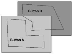
Figure 5.9 Illustration of two overlapping non-rectangular buttons.
<<file figure5-9.gif>>
To resolve this situation we can skip any mouse event processing in our non-rectangular components. Instead, all mouse events can be directed to the parent container. All buttons can then register themselves as
MouseListeners and MouseMotionListeners with that container. In this way, mouse events can be received without regard to overlapping! By doing this all buttons will receive notification about all events without any preliminary filtering. To minimize the resulting impact on the system's performance we need to provide a quick discard of events lying outside the button's basic rectangle.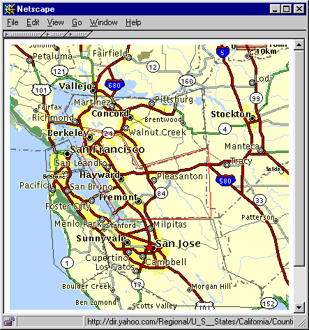
Figure 5.10 Polygonal buttons in an applet.
<<file figure5-10.gif>>
The Code: ButtonApplet2.java
see \Chapter5\5
import java.applet.*;
import java.awt.*;
import java.awt.event.*;
import java.net.*;
import java.util.*;

import javax.swing.*;
import javax.swing.border.*;
import javax.swing.event.*;

public class ButtonApplet2 extends JApplet
{

	public ButtonApplet2() {}

	public synchronized void init()
	{
		String imageName = getParameter("image");
		if (imageName == null)
		{
			System.err.println("Need \"image\" parameter");
			return;
		}
		URL imageUrl = null;
		try
		{
			imageUrl = new URL(getDocumentBase(), imageName);
		}
		catch (MalformedURLException ex)
		{
			ex.printStackTrace();
			return;
		}
		ImageIcon bigImage = new ImageIcon(imageUrl);
		JLabel bigLabel = new JLabel(bigImage);
		bigLabel.setLayout(null);

		int index = 1;
		while(true)
		{
			String paramSize = getParameter("button"+index);
			String paramName = getParameter("name"+index);
			String paramUrl = getParameter("url"+index);
			if (paramSize==null || paramName==null || paramUrl==null)
				break;
			// NEW
			Polygon p = new Polygon();
			try
			{
				StringTokenizer tokenizer = new StringTokenizer(
					paramSize, ",");
				while (tokenizer.hasMoreTokens())
				{
					String str = tokenizer.nextToken().trim();
					int x = Integer.parseInt(str);
					str = tokenizer.nextToken().trim();
					int y = Integer.parseInt(str);
					p.addPoint(x, y);
				}
			}
			catch (Exception ex) { break; }

			PolygonButton btn = new PolygonButton(this, p,
				paramName, paramUrl);
			bigLabel.add(btn);

			index++;
		}

		getContentPane().setLayout(null);
		getContentPane().add(bigLabel);
		bigLabel.setBounds(0, 0, bigImage.getIconWidth(),
			bigImage.getIconHeight());
	}

	public String getAppletInfo()
	{
		return "Sample applet with PolygonButtons";
	}

	public String[][] getParameterInfo()
	{
		String pinfo[][] = {
			{"image",  "string",  "base image file name"},
			{"buttonX","x1,y1, x2,y2, ...", "button's bounds"},
			{"nameX",  "string",  "tooltip text"},
			{"urlX",   "url",     "link URL"} };
		return pinfo;
	}
}

class PolygonButton extends JComponent
	implements MouseListener, MouseMotionListener
{
	static public Color ACTIVE_COLOR = Color.red;
	static public Color INACTIVE_COLOR = Color. darkGray;

	protected JApplet m_parent;
	protected String m_text;
	protected String m_sUrl;
	protected URL    m_url;

	protected Polygon m_polygon;
	protected Rectangle m_rc;
	protected boolean m_active;

	protected static PolygonButton m_currentButton;

	public PolygonButton(JApplet parent, Polygon p,
		String text, String sUrl)
	{
		m_parent = parent;
		m_polygon = p;
		setText(text);
		m_sUrl = sUrl;
		try
		{
			m_url = new URL(sUrl);
		}
		catch(Exception ex) { m_url = null; }

		setOpaque(false);

		m_parent.addMouseListener(this);
		m_parent.addMouseMotionListener(this);

		m_rc = new Rectangle(m_polygon.getBounds()); // Bug alert!
		m_rc.grow(1, 1);

		setBounds(m_rc);
		m_polygon.translate(-m_rc.x, -m_rc.y);
	}

	public void setText(String text)
	{
		m_text = text;
	}

	public String getText()
	{
		return m_text;
	}

	public void mouseMoved(MouseEvent e)
	{
		if (!m_rc.contains(e.getX(), e.getY()) || e.isConsumed())
		{
			if (m_active)
				setState(false);
			return;		// quickly return, if outside our rectangle
		}

		int x = e.getX() - m_rc.x;
		int y = e.getY() - m_rc.y;
		boolean active = m_polygon.contains(x, y);

		if (m_active != active)
			setState(active);
		if (m_active)
			e.consume();
	}

	public void mouseDragged(MouseEvent e) {}

	protected void setState(boolean active)
	{
		m_active = active;
		repaint();
		if (m_active)
		{
			if (m_currentButton != null)
				m_currentButton.setState(false);
			m_currentButton = this;
			m_parent.setCursor(Cursor.getPredefinedCursor(
				Cursor.HAND_CURSOR));
			m_parent.showStatus(m_sUrl);
		}
		else
		{
			m_currentButton = null;
			m_parent.setCursor(Cursor.getPredefinedCursor(
				Cursor.DEFAULT_CURSOR));
			m_parent.showStatus("");
		}
	}

	public void mouseClicked(MouseEvent e)
	{
		if (m_active && m_url != null && !e.isConsumed())
		{
			AppletContext context = m_parent.getAppletContext();
			if (context != null)
				context.showDocument(m_url);
			e.consume();
		}
	}

	public void mousePressed(MouseEvent e) {}

	public void mouseReleased(MouseEvent e) {}

	public void mouseExited(MouseEvent e)
	{
		mouseMoved(e);
	}

	public void mouseEntered(MouseEvent e)
	{
		mouseMoved(e);
	}

	public void paintComponent(Graphics g)
	{
		g.setColor(m_active ? ACTIVE_COLOR : INACTIVE_COLOR);
		g.drawPolygon(m_polygon);
	}

}
Understanding the Code
Class ButtonApplet2
This class is a slightly modified version of the
ButtonApplet class in the previous section to accommodate polygonal button sizes rather than rectangles (the parser has been modified to read in an arbitrary amount of points). Now it creates a Polygon instance and parses a data string, which is assumed to contain pairs of comma-separated coordinates, adding each coordinate to the Polygon using the the addPoint() method. The resulting Polygon instance is used to create a new PolygonButton compo! nent.Class PolygonButton
This class serves as a replacement for the
NavigateButton class in the previous example. Note that it extends JComponent directly. This is necessary to disassociate any mouse handling inherent in buttons (which is actually built into the button UI delegates). Remember, we want to handle mouse events ourselves, but we want them each to be sent from within the parent’s bounds to each PolygonButton, not from each PolygonButton to the parent.
Note: This is the opposite way of working with mouse listeners that we are used to. The idea may take a few moments to sink in because directing events from child to parent is so much more common, we generally don’t think of things the other way around.
So, to be notified of mouse events from the parent, we’ll need to implement the
MouseListener and MouseMotionListener interfaces.Four new instance variables are declared:
Polygon m_polygon
: the polygonal region representing this button’s bounds.Rectangle m_rc
: this button’s bounding rectangle as seen in the coordinate space of the parent.boolean m_active
: flag indicating that this button is active.PolygonButton m_currentButton
: a static reference to the instance of this class which is currently active.The constructor of the
PolygonButton class takes four parameters: a reference to the parent applet, the Polygon instance representing this component’s bounds, tooltip text, and a String representation of a URL. It assigns all instance variables and instantiates a URL using the associate String parameter (similar to what we saw in the last example). Note that this component adds itself to the parent applet as a MouseListener and MouseMotionListener:m_parent.addMouseListener(this);
m_parent.addMouseMotionListener(this);
The bounding rectangle
m_rc is computed with the Polygon.getBounds() method. Note that this method does not create a new instance of the Rectangle class, but returns a reference to the an internal Polygon instance variable which is subject to change. This is not safe, so we must explicitly create a new Rectangle instance from the supplied reference. This Rectangle’s bounds are expanded (using its grow() method) to take into ! account border width. Finally the Rectangle m_rc is set as the button's bounding region, and the Polygon is translated into the component's local coordinates by shifting it's origin using its translate() method.The
mouseMoved() method is invoked when mouse events occur in the parent container. First we quickly check whether the event lies inside our bounding rectangle and is not yet consumed by another component. If this is true, we continue processing this event. Otherwise our method returns. Before we return, however, we first check whether this button is still active for some reason (this can happen if the mouse cursor moves too fast out of this button’s bound, and the given component did not receive a MOUSE_EXITED MouseEvent to deactivate itself). If this is the case, we deactivate it and then exit.Next we translate the coordinates of the event, manually, into our button’s local system (remember that this is an event from the parent container) and check whether this point lies within our polygon. This gives us a boolean result which should indicate whether this component is currently active or inactive. If our button’s current activation state (
m_active) is not equal to this value, we call the setState() method to change it so that it is. Finally, if this component is active we consume the given MouseEvent to avoid activation of two components simultaneously.The
setState() method is called, as described above, to set a new activation state of this component. It takes a boolean value as parameter and stores it in the m_active instance variable. Then it repaints the component to reflect a change in state, if any:1. If the
2. If the
m_active flag is set to false this method sets the m_currentButton static variable to null, changes mouse cursor to the default cursor, and clears the browser's status bar.The
mouseClicked() method checks whether this component is active (this implies that the mouse cursor is located within our polygon, and not just within the bounding rectangle), the URL is resolved, and the mouse event is not consumed. If all three checks are verifiable, this method redirects the browser to the component's associated URL and consumes the mouse event to avoid processing by any other components.The rest of methods, implemented due to the
MouseListener and MouseMotionListener interfaces, receive empty bodies, except for the mouseExited() and mouseEntered() methods. Both of these methods send all their traffic to the mouseMoved() method to notify the component that the cursor has left or has enetered the container.The
paintComponent() method simply draws the component's Polygon with in gray if inactive, and in red if active.
Note: We've purposefully avoided including tooltip text for these non-rectangular buttons. The reason is that the underlying Swing
ToolTipManager essentially relies on the rectangular shape of the components it manages. Somehow, invoking the Swing tooltip API destroys our model of processing mouse events. In order to allow tooltips we have to develop our own version of a tooltip manager--this is the subject of the next example.Running the Code
To run it in the web browser we have constructed the following HTML file (see Java Plug-in and Java Plug-in HTML converter references in the previous example):
<html>
<head>
<title></title>
</head>
<body>
<OBJECT classid="clsid:8AD9C840-044E-11D1-B3E9-00805F499D93"
WIDTH = 400 HEIGHT = 380 codebase="http://java.sun.com/products/plugin/1.2/jinstall-12-win32.cab#Version=1,2,0,0">
<PARAM NAME = "CODE" VALUE = "ButtonApplet2.class" >
<PARAM NAME = "type"
VALUE ="application/x-java-applet;version=1.2">
<param name="image" value="bay_area.gif">
<param name="button1"
value="112,122, 159,131, 184,177, 284,148, 288,248, 158,250, 100,152">
<param name="name1" value="Alameda County">
<param name="url1"
value="http://dir.yahoo.com/Regional/U_S__States/
California/Counties_and_Regions/Alameda_County/">
<param name="button2"
value="84,136, 107,177, 76,182, 52,181, 51,150">
<param name="name2" value="San Francisco County">
<param name="url2"
value="http://dir.yahoo.com/Regional/U_S__States/
California/Counties_and_Regions/San_Francisco_County/">
<param name="button3"
value="156,250, 129,267, 142,318, 235,374, 361,376, 360,347, 311,324, 291,250">
<param name="name3" value="Santa Clara County">
<param name="url3"
value="http://dir.yahoo.com/Regional/U_S__States/
California/Counties_and_Regions/Santa_Clara_County/">
<param name="button4"
value="54,187, 111,180, 150,246, 130,265, 143,318, 99,346, 63,314">
<param name="name4" value="San Mateo County">
<param name="url4"
value="http://dir.yahoo.com/Regional/U_S__States/
California/Counties_and_Regions/San_Mateo_County/">
<param name="button5"
value="91,71, 225,79, 275,62, 282,147, 185,174, 160,129, 95,116, 79,97">
<param name="name5" value="Contra Costa County">
<param name="url5"
value="http://dir.yahoo.com/Regional/U_S__States/
California/Counties_and_Regions/Contra_Costa_County/">
<COMMENT>
<EMBED type="application/x-java-applet;version=1.2" CODE = "ButtonApplet2.class"
WIDTH = "400" HEIGHT = "380"
codebase="./"
image="bay_area.gif"
button1="112,122, 159,131, 184,177, 284,148, 288,248, 158,250, 100,152"
name1="Alameda County"
url1="http://dir.yahoo.com/Regional/U_S__States/California/Counties_and_Regions/Alameda_County/"
button2="84,136, 107,177, 76,182, 52,181, 51,150"
name2="San Francisco County"
url2="http://dir.yahoo.com/Regional/U_S__States/California/Counties_and_Regions/San_Francisco_County/"
button3="156,250, 129,267, 142,318, 235,374, 361,376, 360,347, 311,324, 291,250"
name3="Santa Clara County"
url3="http://dir.yahoo.com/Regional/U_S__States/California/Counties_and_Regions/Santa_Clara_County/"
button4="54,187, 111,180, 150,246, 130,265, 143,318, 99,346, 63,314"
name4="San Mateo County"
url4="http://dir.yahoo.com/Regional/U_S__States/California/Counties_and_Regions/San_Mateo_County/"
button5="91,71, 225,79, 275,62, 282,147, 185,174, 160,129, 95,116, 79,97"
name5="Contra Costa County"
url5="http://dir.yahoo.com/Regional/U_S__States/California/Counties_and_Regions/Contra_Costa_County/"
pluginspage="http://java.sun.com/products/plugin/1.2/plugin-install.html">
<NOEMBED></COMMENT>
alt="Your browser understands the <APPLET> tag but isn't running the applet, for some reason."
Your browser is completely ignoring the <APPLET> tag!
</NOEMBED>
</EMBED>
</OBJECT>
</p>
<p> </p>
</body>
</html>
Figure 5.10 shows the
ButtonApplet2 example running in Netscape 4.05 with the Java Plug-in. Our HTML file has been constructed to display an active map of the San Francisco bay area. Five non-rectangular buttons correspond to this area’s five counties. Note how the non-rectangular buttons react when the mouse cursor moves in and out of their boundaries. Verify that they behave correctly even if a part of a given button lies under the bounding rectangle of another button (a good place to check is the sharp border between Alameda and Contra Costa counties). Click over the button and note the navigation to one of the Yahoo sites containing information about the selected county.It is clear that tooltip displays would help to dispel any confusion as to which county is which. The next example shows how to implement this feature.
5.4 Custom buttons: part III - Tooltip management
In this section we'll discuss how to implement custom management of tooltips in a Swing application. If you're completely satisfied with the default
ToolTipManager provided with Swing, you can skip this section. But there may be situations when this default implementation is not satisfactory, as in our example above using non-rectangular components.We will construct our own version of a tooltip manager to display a tooltip window if the mouse cursor rests over some point inside the button's area longer than a specified time interval. It will be displayed for a speecified amount of time and, to avoid annoying the user, we will then hide the tooltip window until the mouse cursor moves to a new position. In designing our tooltip manager we will take a different approach than that taken by Swing’s default
ToolTipManager (see section 5.4). Instead of using three different Timers, we will use just one. This involves tracking more information, but is slightly more efficient by avoiding the handling of multiple ActionEvents.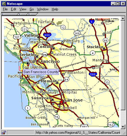
Figure 5.11 Polygonal buttons with custom tooltip manager.
<<file figure5-11.gif>>
The Code: ButtonApplet3.java
see \Chapter5\6
import java.applet.*;
import java.awt.*;
import java.awt.event.*;
import java.net.*;
import java.util.*;

import javax.swing.*;
import javax.swing.border.*;
import javax.swing.event.*;

public class ButtonApplet3 extends JApplet
{
	// NEW
	protected MyToolTipManager m_manager;

	public ButtonApplet3() {}

	public synchronized void init()
	{
		String imageName = getParameter("image");
		if (imageName == null)
		{
			System.err.println("Need \"image\" parameter");
			return;
		}
		URL imageUrl = null;
		try
		{
			imageUrl = new URL(getDocumentBase(), imageName);
		}
		catch (MalformedURLException ex)
		{
			ex.printStackTrace();
			return;
		}
		ImageIcon bigImage = new ImageIcon(imageUrl);
		JLabel bigLabel = new JLabel(bigImage);
		bigLabel.setLayout(null);

		int index = 1;
		while(true)
		{
			String paramSize = getParameter("button"+index);
			String paramName = getParameter("name"+index);
			String paramUrl = getParameter("url"+index);
			if (paramSize==null || paramName==null || paramUrl==null)
				break;

			Polygon p = new Polygon();
			try
			{
				StringTokenizer tokenizer = new StringTokenizer(
					paramSize, ",");
				while (tokenizer.hasMoreTokens())
				{
					String str = tokenizer.nextToken().trim();
					int x = Integer.parseInt(str);
					str = tokenizer.nextToken().trim();
					int y = Integer.parseInt(str);
					p.addPoint(x, y);
				}
			}
			catch (Exception ex) { break; }

			PolygonButton btn = new PolygonButton(this, p,
				paramName, paramUrl);
			bigLabel.add(btn);

			index++;
		}

		m_manager = new MyToolTipManager(this);
		PolygonButton.m_toolTip = m_manager.m_toolTip;

		getContentPane().setLayout(null);
		getContentPane().add(bigLabel);
		bigLabel.setBounds(0, 0, bigImage.getIconWidth(),
			bigImage.getIconHeight());
	}

	public String getAppletInfo()
	{
		return "Sample applet with PolygonButtons";
	}

	public String[][] getParameterInfo()
	{
		String pinfo[][] = {
			{"image",  "string",  "base image file name"},
			{"buttonX","x1,y1, x2,y2, ...", "button's bounds"},
			{"nameX",  "string",  "tooltip text"},
			{"urlX",   "url",     "link URL"} };
		return pinfo;
	}
}

class PolygonButton extends JComponent
	implements MouseListener, MouseMotionListener
{
	static public Color ACTIVE_COLOR = Color.red;
	static public Color INACTIVE_COLOR = Color. darkGray;

	protected JApplet m_parent;
	protected String m_text;
	protected String m_sUrl;
	protected URL    m_url;

	protected Polygon m_polygon;
	protected Rectangle m_rc;
	protected boolean m_active;

	protected static PolygonButton m_currentButton;

	// NEW
	public static JToolTip m_toolTip;

	public PolygonButton(JApplet parent, Polygon p,
		String text, String sUrl)
	{
		m_parent = parent;
		m_polygon = p;
		setText(text);
		m_sUrl = sUrl;
		try
		{
			m_url = new URL(sUrl);
		}
		catch(Exception ex) { m_url = null; }

		setOpaque(false);

		m_parent.addMouseListener(this);
		m_parent.addMouseMotionListener(this);

		m_rc = new Rectangle(m_polygon.getBounds()); // Bug alert!
		m_rc.grow(1, 1);

		setBounds(m_rc);
		m_polygon.translate(-m_rc.x, -m_rc.y);
	}

	public void setText(String text)
	{
		m_text = text;
	}

	public String getText()
	{
		return m_text;
	}

	public void mouseMoved(MouseEvent e)
	{
		if (!m_rc.contains(e.getX(), e.getY()) || e.isConsumed())
		{
			if (m_active)
			{
				m_active = false;
				repaint();
			}
			return;		// quickly return, if outside our rectangle
		}

		int x = e.getX() - m_rc.x;
		int y = e.getY() - m_rc.y;
		boolean active = m_polygon.contains(x, y);

		if (m_active != active)
			setState(active);
		if (active)
			e.consume();
	}

	public void mouseDragged(MouseEvent e) {}

	protected void setState(boolean active)
	{
		m_active = active;
		repaint();
		if (active)
		{
			if (m_currentButton != null)
				m_currentButton.setState(false);
			m_parent.setCursor(Cursor.getPredefinedCursor(
				Cursor.HAND_CURSOR));
			m_parent.showStatus(m_sUrl);
			if (m_toolTip != null)
				m_toolTip.setTipText(m_text);	// NEW
		}
		else
		{
			m_currentButton = null;
			m_parent.setCursor(Cursor.getPredefinedCursor(
				Cursor.DEFAULT_CURSOR));
			m_parent.showStatus("");
			if (m_toolTip != null)
				m_toolTip.setTipText(null);		// NEW
		}
	}

	public void mouseClicked(MouseEvent e)
	{
		if (m_active && m_url != null && !e.isConsumed())
		{
			AppletContext context = m_parent.getAppletContext();
			if (context != null)
				context.showDocument(m_url);
			e.consume();
		}
	}

	public void mousePressed(MouseEvent e) {}

	public void mouseReleased(MouseEvent e) {}

	public void mouseExited(MouseEvent e)
	{
		mouseMoved(e);
	}

	public void mouseEntered(MouseEvent e)
	{
		mouseMoved(e);
	}

	public void paint(Graphics g)
	{
		g.setColor(m_active ? ACTIVE_COLOR : INACTIVE_COLOR);
		g.drawPolygon(m_polygon);
	}

}

// NEW
class MyToolTipManager extends MouseMotionAdapter
	implements ActionListener
{
	protected Timer m_timer;
	protected int m_lastX = -1;
	protected int m_lastY = -1;
	protected boolean m_moved = false;
	protected int m_counter = 0;

	public JToolTip m_toolTip = new JToolTip();

	MyToolTipManager(JApplet parent)
	{
		parent.addMouseMotionListener(this);

		m_toolTip.setTipText(null);
		parent.getContentPane().add(m_toolTip);

		m_toolTip.setVisible(false);
		m_timer = new Timer(1000, this);
		m_timer.start();
	}

	public void mouseMoved(MouseEvent e)
	{
		m_moved = true;
		m_counter = -1;
		m_lastX = e.getX();
		m_lastY = e.getY();
		if (m_toolTip.isVisible())
		{
			m_toolTip.setVisible(false);
			m_toolTip.getParent().repaint();
		}
	}

	public void actionPerformed(ActionEvent e)
	{
		if (m_moved || m_counter==0 || m_toolTip.getTipText()==null)
		{
			if (m_toolTip.isVisible())
				m_toolTip.setVisible(false);
			m_moved = false;
			return;
		}

		if (m_counter < 0)
		{
			m_counter = 4;
			m_toolTip.setVisible(true);
			Dimension d = m_toolTip.getPreferredSize();
			m_toolTip.setBounds(m_lastX, m_lastY+20,
				d.width, d.height);
		}

		m_counter--;
	}
}
Understanding the Code
Class ButtonApplet3
This class requires very few modifications from
ButtonApplet2 in the last section. It declares and creates MyToolTipManager m_manager and passes a this reference to it:m_manager = new MyToolTipManager(this);
As you will see below, our
MyToolTipManager class manages a publically accessible JToolTip, m_toolTip. MyToolTipManager itself is not intended to provide any meaningful content to this tooltip. Rather, this is to be done by other components, in our case, by the PolygonButtons. Thus, our PolygonButton class declares a static reference to a JToolTip compone! nt. Whenever a button becomes active, this JToolTip’s text will be assigned to that of the active button. So, when we create our instance of MyToolTipManager, we assign its publically accessible JToolTip as our Polygon class’s static JToolTip (which is also publically accessible):PolygonButton.m_toolTip = m_manager.m_toolTip;
Thus, there will only be one
JToolTip instance in existance for the lifetime of this applet, and both MyToolTipManager and our PolygonButtons have control over it.Class PolygonButton
As we've mentioned above, this class now declares the static variable:
JToolTip m_toolTip. Class PolygonButton does not initialize this reference. However, this reference is checked during PolygonButton activation in the setState() method. If m_toolTip is not null (set to point to a valid tooltip window by some outer class--which, in our example, is done in the ButtonApplet3 init()Class MyToolTipManager
This class represents a custom tooltip manager which is free from assumption of the rectangularity of its child components. It extends the
MouseMotionAdapter class and implements the ActionListener interface to work as both a MouseMotionListener and ActionListener. Six instance variables are declared:Timer m_timer
: our managing timer.int m_lastX, m_lastY
: the last coordinates of the mouse cursor--reassigned each time the mouse is moved.boolean m_moved
: flag indicating that the mouse cursor has moved.int m_counter
: time ticks counter managing the tooltip's time to live (see below).JToolTip m_toolTip
: the tooltip component to be displayed.The constructor of the
MyToolTipManager class takes a reference to the parenting JApplet as a parameter and registers itself as a MouseMotionListener on this component. Then it creates the JToolTip m_toolTip component and adds it to the applet's content pane. m_tooltip is set invisible, using setVisible(false), and can then be used by any interested class by repositioning it and calling setVisible(true). Finally a Timer with a 1000 ms delay time is created and started.The mouseMoved() method will be invoked when the mouse cursor moves over the applet's pane. It sets the m_moved flag to true, m_counter to -1, and stores the coordinates of the mouse cursor. Then this method hides the tooltip component if is visible.
The actionPerformed() method is called when the Timer fires events (see 2.6 for details). It implements the logic of displaying/hiding the tooltip window based on two instance variables: m_moved and m_counter:
    if (m_moved || m_counter==0 || m_toolTip.getTipText()==null) {
      if (m_toolTip.isVisible())
        m_toolTip.setVisible(false);
      m_moved = false;
      return;
    }
The above block of code is invoked when any one of the following statements are true:
1. Mouse cursor has been moved since the last time tick.
2. Counter has reached zero.
3. No tooltip text is set.
In any of these cases, the tooltip component is hidden (if previously visible), and the
m_moved flag is set to false. Note that the m_counter variable remains unchanged.
    if (m_counter < 0) {
      m_counter = 4;
      m_toolTip.setVisible(true);
      Dimension d = m_toolTip.getPreferredSize();
      m_toolTip.setBounds(m_lastX, m_lastY+20,
      d.width, d.height);
    }
This block of code is responsible for displaying the tooltip component. It will be executed only when
m_counter is equal to -1 (set by mouseMoved()), and the m_moved flag is false (cleared by the previous code fragment). m_counter is set to four which determines the amount of time the tooltip will be displayed (4000ms in this example). Then we make the tooltip component visible and place it at the current mouse location with a vertical offset approximately equal to the mouse cursor's height. Note that this construction provides an arbitrary time delay between when mo! use motion stops and the tooltip is displayed.The last line of code in the
actionPerformed() method is m_counter--, which decrements the counter each time tick until it reaches 0. As we saw above, once it reaches 0 the tooltip will be hidden.
Note: The actual delay time may vary from 1000ms to 2000 ms since the mouse movements and time ticks are not synchronized. A more accurate and complex implementation could start a new timer after each mouse movement, as is done in Swing’s
ToolTipManager.The following table illustrates how the
m_counter and m_moved variables control this behavior.Timer m_moved m_counter m_counter Comment
tick flag before after
0 false 0 0
1 true -1 -1 Mouse moved between 0-th and 1-st ticks
2 false -1 4 Tool tip is displayed
3 false 4 3
4 false 3 2
5 false 2 1
6 false 1 0
7 false 0 0 Tool tip is hidden
8 false 0 0 Waiting for the next mouse move
Running the Code
Figure 5.11 shows
ButtonApplet3 running in Netscape Navigator 4.05 with the Java Plug-in. You can use the same HTML file as presented in the previous section. Move the mouse cursor over some non-rectangular component and note how it displays the proper tooltip message. This tooltip disappears after a certain amount of time or when the mouse is moved to a new location.