Chapter 6. Tabbed Panes
In this chapter:
6.1 JTabbedPane
class javax.swing.JTabbedPane
JTabbedPane
is simply a stack of components in selectable layers. Each layer can contain one component which is normally a container. Tab extensions are used to move a given layer to the front of the tabbed pane veiw. These tab extensions are similar to labels in that they can have assigned text, an icon (as well as a disabled icon), background and foreground colors, and a tooltip.To add a component to a tabbed pane we use one of its overloaded
add() methods. This creates a new selectable tab and reorganizes the other tab extensions so the new one will fit (if necessary). We can also use the addTab() and insertTab() methods to do create new selectable layers. The remove() method takes a component as a parameter and removes the tab associated with that component, if any.Tab extensions can reside to the north, south, east, or west of the tabbed pane’s content. This can be specified using its
setTabPlacement() method and passing one of the corresponding SwingConstants fields as parameter.
UI Guideline : Vertical or Horizontal Tabs?
When is it best to choose between vertical or horizontal tabs?
There are three possible rules of thumb to help make the decision whether to place tabs horizontally or vertically. Firstly, consider the nature of the data to be displayed, is vertical or horizontal space at a premium within the available display space? If for example you have a list with a single column but 200 entries then clearly vertical space is at a premium. If you have a table with only 10 entries but 15 columns then horizontal space is at a premium. Simply place the tabs where space is cheaper to obtain. In the first example with the long list, place the tabs vertically. When you place the tabs vertically, they use horizontal space which is available. In the second exmaple, place the tabs horizontally. When you place the tabs horizontally, you use vertical space which is available while horizontal space is fully taken by the table columns.
Another possibility is the number and size of the tabs. If you need to display perhaps 12 tabs, each with a long label, then it is unlikely that these will fit across the screen horizontally. In this case you are more likely to fit them by placing them vertically. Using space in these ways when introducing a tabbed pane, should minimise the introduction of scroll panes and maximise ease of use. Finally, consider the layout and mouse movements required for operating the software. If for example, your application uses a toolbar, then it may make sense to align the tabs close to the toolbar, thus minimising mouse movements between the toolbar buttons and the tabs. If you have a horizontal toolbar across the top of the screen, then choose a horizontal set of tabs across the top (North).
We can get/set the selected tab index at any given time using its
getSelectedIndex() and setSelectedIndex() methods respecitively. We can get/set the component associated with the selected tab similarly using the getSelectedComponent() and setSelectedComponent() methods.One or more
ChangeListeners can be added to a JTabbedPane, which get registered with its model (an instance of DefaultSingleSelectionModel by default -- see chapter 12 for more about SingleSelectionModel and DefaultSingleSelectionModel). Whenever a new tab is selected the model will send out ChangeEvents to all registered ChangeListeners. The stateChanged() method of each listener is invoke! d, and in this way we can capture and perform any desired actions when the user selects any tab. JTabbedPane also fires PropertyChangeEvents whenever its model or tab placement properties change state.
UI Guideline : Transaction Boundaries and Tabbed Panes
If your using a tabbed pane within a dialog then the transaction boundary is normally clear. It will be an OK or Cancel Button on the dialog. In this case it is obvious that the OK and Cancel buttons would lie outside the tabbed pane and in the dialog itself. This is an important point. Place action buttons which terminate a transaction outside the tabbed panes. If for example you had a tabbed pane which contained a Save and Cancel button within the first tab, is it clear that the Save and Cancel work across all tabs or only on the first. Actually, its ambiguous! To clearly define the transaction, define the buttons outside the tabbed pane then it should be clear to the User that any changes made to any tab will either be accepted/saved when OK/Save is pressed or discarded when Cancel is pressed. The action buttons apply across the complete set of tabs.
6.2 Dynamically changeable tabbed pane
We now turn to a
JTabbedPane example applet demonstrating dynamically reconfigurable tab layout as well as the addition and removal of any number of tabs. A ChangeListener is attached to the tabbed pane to listen for tab selection events and display the currently selected tab index in a status bar. For enhanced feedback, audio clips are played when the tab layout changes and whenever a tab is added and removed.
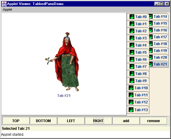
Figure 6.1 TabbedPaneDemo
<<file figure6-1.gif>>
The Code: TabbedPaneDemo.java
see \Chapter6\1
import java.awt.*;
import java.applet.*;
import java.awt.event.*;
import javax.swing.*;
import javax.swing.event.*;
import javax.swing.border.*;

public class TabbedPaneDemo extends JApplet implements ActionListener
{
  private ImageIcon m_tabimage;
  private ImageIcon m_utsguy;
  private ImageIcon m_jfcgirl;
  private ImageIcon m_sbeguy;
  private ImageIcon m_tiger;
  private JTabbedPane m_tabbedPane;
  private JButton m_topButton;
  private JButton m_bottomButton;
  private JButton m_leftButton;
  private JButton m_rightButton;
  private JButton m_addButton;
  private JButton m_removeButton;
  private JLabel m_status;
  private JLabel m_loading;
  private AudioClip m_layoutsound;
  private AudioClip m_tabsound;

  public void init() {
    m_loading = new JLabel("Initializing applet...",
      SwingConstants.CENTER);
    getContentPane().add(m_loading);

    Thread initialize = new Thread() {
      public void run() {
        m_tabimage = new ImageIcon("tabimage.gif");
        m_utsguy = new ImageIcon("utsguy.gif");
        m_jfcgirl = new ImageIcon("jfcgirl.gif");
        m_sbeguy = new ImageIcon("sbeguy.gif");
        m_tiger = new ImageIcon("tiger.gif");
        m_tabbedPane = new JTabbedPane(SwingConstants.TOP);
        m_topButton = new JButton("TOP");
        m_bottomButton = new JButton("BOTTOM");
        m_leftButton = new JButton("LEFT");
        m_rightButton = new JButton("RIGHT");
        m_addButton = new JButton("add");
        m_removeButton = new JButton("remove");
        m_status = new JLabel();

        Color buttonColor = new Color(245,242,219);
        JPanel buttonPanel = new JPanel();
        buttonPanel.setLayout(new GridLayout(1,6));
        JPanel lowerPanel = new JPanel();
        lowerPanel.setLayout(new BorderLayout());

        m_topButton.setBackground(buttonColor);
        m_bottomButton.setBackground(buttonColor);
        m_leftButton.setBackground(buttonColor);
        m_rightButton.setBackground(buttonColor);
        m_addButton.setBackground(buttonColor);
        m_removeButton.setBackground(buttonColor);
        m_topButton.addActionListener(TabbedPaneDemo.this);
        m_bottomButton.addActionListener(TabbedPaneDemo.this);
        m_leftButton.addActionListener(TabbedPaneDemo.this);
        m_rightButton.addActionListener(TabbedPaneDemo.this);
        m_addButton.addActionListener(TabbedPaneDemo.this);
        m_removeButton.addActionListener(TabbedPaneDemo.this);

        buttonPanel.add(m_topButton);
        buttonPanel.add(m_bottomButton);
        buttonPanel.add(m_leftButton);
        buttonPanel.add(m_rightButton);
        buttonPanel.add(m_addButton);
        buttonPanel.add(m_removeButton);
        buttonPanel.setBackground(buttonColor);
        buttonPanel.setOpaque(true);
        buttonPanel.setBorder(new CompoundBorder(
          new EtchedBorder(EtchedBorder.RAISED),
          new EtchedBorder(EtchedBorder.LOWERED)));

        lowerPanel.add("Center", buttonPanel);
        m_status.setHorizontalTextPosition(SwingConstants.LEFT);
        m_status.setOpaque(true);
        m_status.setBackground(buttonColor);
        m_status.setForeground(Color.black);
        lowerPanel.add("South", m_status);

        createTab();
        createTab();
        createTab();
        createTab();

        getContentPane().setLayout(new BorderLayout());
        m_tabbedPane.setBackground(new Color(245,232,219));
        m_tabbedPane.setOpaque(true);
        getContentPane().add("South", lowerPanel);
        getContentPane().add("Center", m_tabbedPane);
        m_tabbedPane.addChangeListener(new MyChangeListener());
        m_layoutsound = getAudioClip(getCodeBase(), "switch.wav");
        m_tabsound = getAudioClip(getCodeBase(), "tab.wav");

        getContentPane().remove(m_loading);
        getRootPane().revalidate();
        getRootPane().repaint();
      }
    };
    initialize.start();
  }

  public void createTab() {
    JLabel label = null;
    switch (m_tabbedPane.getTabCount()%4) {
      case 0:
        label = new JLabel("Tab #" + m_tabbedPane.getTabCount(),
          m_utsguy, SwingConstants.CENTER);
        break;
      case 1:
        label = new JLabel("Tab #" + m_tabbedPane.getTabCount(),
          m_jfcgirl, SwingConstants.CENTER);
        break;
      case 2:
        label = new JLabel("Tab #" + m_tabbedPane.getTabCount(),
          m_sbeguy, SwingConstants.CENTER);
        break;
      case 3:
        label = new JLabel("Tab #" + m_tabbedPane.getTabCount(),
          m_tiger, SwingConstants.CENTER);
        break;
    }
    label.setVerticalTextPosition(SwingConstants.BOTTOM);
    label.setHorizontalTextPosition(SwingConstants.CENTER);
    label.setOpaque(true);
    label.setBackground(Color.white);
    m_tabbedPane.addTab("Tab #" + m_tabbedPane.getTabCount(),
      m_tabimage, label);
    m_tabbedPane.setBackgroundAt(m_tabbedPane.getTabCount()-1,
      new Color(245,232,219));
    m_tabbedPane.setForegroundAt(m_tabbedPane.getTabCount()-1,
      new Color(7,58,141));
    m_tabbedPane.setSelectedIndex(m_tabbedPane.getTabCount()-1);
    setStatus(m_tabbedPane.getSelectedIndex());
  }

  public void killTab() {
    if (m_tabbedPane.getTabCount() > 0) {
      m_tabbedPane.removeTabAt(m_tabbedPane.getTabCount()-1);
      setStatus(m_tabbedPane.getSelectedIndex());
    }
    else
      setStatus(-1);
  }

  public void setStatus(int index) {
    if (index > -1)
      m_status.setText(" Selected Tab: " + index);
    else
      m_status.setText(" No Tab Selected");
  }

  public void actionPerformed(ActionEvent e) {
    if (e.getSource() == m_topButton) {
      m_tabbedPane.setTabPlacement(SwingConstants.TOP);
      m_layoutsound.play();
    }
    else if(e.getSource() == m_bottomButton) {
      m_tabbedPane.setTabPlacement(SwingConstants.BOTTOM);
      m_layoutsound.play();
    }
    else if(e.getSource() == m_leftButton) {
      m_tabbedPane.setTabPlacement(SwingConstants.LEFT);
      m_layoutsound.play();
    }
    else if(e.getSource() == m_rightButton) {
      m_tabbedPane.setTabPlacement(SwingConstants.RIGHT);
      m_layoutsound.play();
    }
    else if(e.getSource() == m_addButton)
      createTab();
    else if(e.getSource() == m_removeButton)
      killTab();
    m_tabbedPane.revalidate();
    m_tabbedPane.repaint();
  }

  public static void main(String[] args) {
    new TabbedPaneDemo();
  }

  class MyChangeListener implements ChangeListener
  {
    public void stateChanged(ChangeEvent e) {
      setStatus(
        ((JTabbedPane) e.getSource()).getSelectedIndex());
      m_tabsound.play();
    }
  }
}
Understanding the Code
Class TabbedPaneDemo
TabbedPaneDemo
extends JApplet and implements ActionListener (to listen for button events). Several instance variables are used:ImageIcon m_tabimage
: image used in each tab extension.ImageIcon m_utsguy
, m_jfcgirl, m_sbeguy, m_tiger: images used in tab containers.JTabbedPane m_tabbedPane
: the main tabbed pane.JButton m_topButton
: TOP tab alignment button.JButton m_bottomButton
: BOTTOM tab alignment button.JButton m_leftButton
: LEFT tab alignment button.JButton m_rightButton
: RIGHT tab alignment button.JButton m_addButton
: add tab button.JButton m_removeButton
: remove tab button.JLabel m_status
: status bar label.Our
JTabbedPane, tabbedPane, is created with TOP tab alignment. (Note: TOP is actually the default so this is really not necessary here. The default JTabbedPane constructor would do the same thing.)
The
init() method organizes the buttons inside a JPanel using GridLayout, and associates ActionListeners with each one. We wrap all instantiation and GUI initialization processes in a separate thread and start it in the this method. This is because loading can take several seconds and it is best to allow the interface to be as responsive as possible during this time. We also provide an explicit visual cue to the user that the application is loading by placing an "Initializing applet..." label in the content pane where the tabbed pane will be placed once initia! lized. In this initialization, our createTab() method (discussed below) is called four times. We then add the panel containing the tabbed pane controller buttons, and our tabbed pane to the contentPane. Finally, an instance of MyChangeListener (see below) is attached to our tabbed pane to listen for tab selection changes.
The
createTab() method is called whenever m_addButton is clicked. Based on the current tab count this method chooses between four ImageIcons, creates a JLabel containing the chosen icon, and adds a new tab containing that label. The killTab() method is called whenever m_removeButton is clicked to remove the tab with the highest index.The
setStatus() method is called each time a different tab is selected. The m_status JLabel is updated to reflect which tab is selected at all times.The
actionPerformed() method is called whenever any of the buttons are clicked. Clicking m_topButton, m_bottomButton, m_leftButton, or m_rightButton causes the tab layout of the JTabbedPane to change accordingly using the setTabPlacement() method. Each time one of these tab layout buttons is clicked a WAV file is played. Similarly, when a tab selection change occurs a different WAV file is invoked. These sounds,m_layoutsound = getAudioClip(getCodeBase(), "switch.wav");
m_tabsound = getAudioClip(getCodeBase(), "tab.wav");
Before the
actionPerformed() method exits it revalidates the JTabbedPane. (If this revalidation is omitted we would see that a layout change caused by clicking one of our tab layout buttons will result in incorrect tabbed pane rendering.)Class TabbedPaneDemo.MyChangeListener
MyChangeListener
implements the ChangeListener interface. There is only one method that must be defined when implementing this interface: stateChanged(). This method can process ChangeEvents corresponding to when a tabbed pane’s selected state changes. In our stateChanged() method we update the status bar in TabbedPaneDemo and play an appropriate tab switching sound:public void stateChanged(ChangeEvent e) {
setStatus(
((JTabbedPane) e.getSource()).getSelectedIndex());
m_tabsound.play();
}
Running the Code:
Figure 6.1 shows
TabbedPaneDemo in action. To deploy this applet the following simple HTML file is used (this is not Plug-in compliant):<applet code=TabbedPaneDemo width=570 height=400> </applet>
Add and remove some tabs, and play with the tab layout to get a feel for how it works in different situations. Note that you can use your arrow keys to move from tab to tab (if the focus is currently on a tab), and remember to turn your speakers on for the sound effects.
Note: You may have problems with this applet if your system does not support .wav files. If so, comment out the audio-specific code and recompile.
6.2.1 Interesting JTabbedPane characteristics
In cases where there is more than one row or column of tabs most of us are used to the following functionality: selecting a tab that is not in the frontmost row or column moves that row or column to the front. This does not occur in a
JTabbedPane using the default Metal L&F as can be seen in the TabbedPaneDemo example above. However, this does occur when using the Windows, Motif, and Basic L&Fs. This feature was purposefully disabled in the Metal L&F (as can be verified in the MetalTabbedPaneUI source code).
UI Guideline : Avoid Multiple Rows of Tabs
As a general rule, you should seek to design for no more than a single row or column of tabs.
There are three key reasons for this. The first is a cognitive reason: the user has trouble discerning what will happen with the multiple rows of tabs. With Windows L&F for example, the behaviour somewhat mimics the behaviour of a rolladex filing card system. For some Users this mental model is clear and the behaviour is natural, for others it is simply confusing.
The second reason is a human factors / usability problem. When a rear set of tabs comes to the front, as with Windows Look and Feel, the position of all the other tabs changes. This means that the User has to discern the new position of a tab before visually selecting it and moving the mouse toward it. This has the effect of denying the User the ability to learn the positions of the tabs. Directional memory is a strong attribute and highly productive for usability. Thus it is always better to keep the tabs in the same position. This was the reason that the Sun and Apple designers chose to implement multiple tabs in this fashion! The final reason is a design problem. When a second or subsequent row or column of tabs is introduced, there is a resizing of the tabbed pane itself. Although, the layout manager will cope with this, it may not look visually satisfactory when completed. The size of the tabbed pane becomes dependant on the ability to render the tabs! in a given space. Those who remember the OS2 Warp UI will recall that the designers avoided this problem by allowing only a single row of tabs and the ability to scroll them if they didn't fit into the given space. So far no one has implemented a Swing L&F with this style of tabbed pane.
6.3 Customized JTabbedPane and TabbedPaneUI delegate
Although we intend to save most of our discussion of customizing UI delegates for chapter 21, building fancy-looking tabs is too tempting to pass up, and this example may satisfy your UI customization appetite for now. You can use the techniques shown here to implement custom UI delegates for almost any Swing component. However, there will be major differences from component to component, and this will almost always involve referencing the Swing source code.
First we will build a customized
JTabbedPane with two properties: a background image used for each tab, and a background image used for the tabbed pane itself. We will then build a subclass of BasicTabbedPaneUI for use with our customized JTabbedPane, and design it so that it paints the tab background image on each tab. This will require modification of its paint() method. Our custom delegate will also be responsible for painting the tabbed pane background. As we learned in chapter 2 in our discussion of painting, a UI delegate’s update() method is used for filling the background of opaque components an! d then it should pass control to paint(). Both images need to be accessible from our customized JTabbedPane using set and get accessors. (In keeping with the concept of UI delegates not being bound to specific component instances, it would not be a good idea to assign these images as UI delegate properties--unless we were building an image specific L&F.)BasicTabbedPaneUI
is the second largest (in terms of source code) and complex UI delegate. It contains, among other things, its own custom layout manager, TabbedPaneLayout, and a long rendering routine spread out over several different methods. As complex as it is, understanding its inner workings is not required to build on top of it. Since we are concerned only with how it does its rendering, we can narrow our focus considerably. To start, its paint() method calls the paintTab() method which is responsible for painting each tab. This method calls several other methods to perform various aspects of this process (see BasicTabbedPaneUI.java). Briefly, and in order, these met! hods are:paintTabBackground()
paintTabBorder()
layoutLabel()
paintText()
paintIcon()
paintFocusIndicator()
By overriding any combination of these methods we can control the tab rendering process however we like. Our customized
TabbedPaneUI, which we’ll call ImageTabbedPaneUI, overrides the paintTabBackground() method to construct tabs with background images.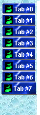
Figure 6.2 TabbedPaneDemo with custom tab rendering, LEFT layout
<<file figure6-2.gif>>
Figure 6.3 TabbedPaneDemo with custom tab rendering, BOTTOM layout
<<file figure6-3.gif>>
The Code: TabbedPaneDemo.java
see \Chapter6\2
import java.awt.*;
import java.applet.*;
import java.awt.event.*;
import javax.swing.*;
import javax.swing.event.*;
import javax.swing.border.*;
import javax.swing.plaf.TabbedPaneUI;
import javax.swing.plaf.ComponentUI;
import javax.swing.plaf.basic.BasicTabbedPaneUI;

public class TabbedPaneDemo extends JApplet implements ActionListener
{
  private ImageIcon m_tabimage;
  private ImageIcon m_utsguy;
  private ImageIcon m_jfcgirl;
  private ImageIcon m_sbeguy;
  private ImageIcon m_tiger;
  private ImageTabbedPane m_tabbedPane;
  private JButton m_topButton;
  private JButton m_bottomButton;
  private JButton m_leftButton;
  private JButton m_rightButton;
  private JButton m_addButton;
  private JButton m_removeButton;
  private JLabel m_status;
  private JLabel m_loading;
  private AudioClip m_layoutsound;
  private AudioClip m_tabsound;

  public void init() {
    m_loading = new JLabel("Initializing applet...",
      SwingConstants.CENTER);
    getContentPane().add(m_loading);

    Thread initialize = new Thread() {
      public void run() {
        m_tabimage = new ImageIcon("tabimage.gif");
        m_utsguy = new ImageIcon("utsguy.gif");
        m_jfcgirl = new ImageIcon("jfcgirl.gif");
        m_sbeguy = new ImageIcon("sbeguy.gif");
        m_tiger = new ImageIcon("tiger.gif");
        m_tabbedPane = new ImageTabbedPane(
          new ImageIcon("bloo.gif"),
          new ImageIcon("bubbles.jpg"));
        m_topButton = new JButton("TOP");
        m_bottomButton = new JButton("BOTTOM");
        m_leftButton = new JButton("LEFT");
        m_rightButton = new JButton("RIGHT");
        m_addButton = new JButton("add");
        m_removeButton = new JButton("remove");
        m_status = new JLabel();

        Color buttonColor = new Color(245,242,219);
        JPanel buttonPanel = new JPanel();
        buttonPanel.setLayout(new GridLayout(1,6));
        JPanel lowerPanel = new JPanel();
        lowerPanel.setLayout(new BorderLayout());

        m_topButton.setBackground(buttonColor);
        m_bottomButton.setBackground(buttonColor);
        m_leftButton.setBackground(buttonColor);
        m_rightButton.setBackground(buttonColor);
        m_addButton.setBackground(buttonColor);
        m_removeButton.setBackground(buttonColor);
        m_topButton.addActionListener(TabbedPaneDemo.this);
        m_bottomButton.addActionListener(TabbedPaneDemo.this);
        m_leftButton.addActionListener(TabbedPaneDemo.this);
        m_rightButton.addActionListener(TabbedPaneDemo.this);
        m_addButton.addActionListener(TabbedPaneDemo.this);
        m_removeButton.addActionListener(TabbedPaneDemo.this);

        buttonPanel.add(m_topButton);
        buttonPanel.add(m_bottomButton);
        buttonPanel.add(m_leftButton);
        buttonPanel.add(m_rightButton);
        buttonPanel.add(m_addButton);
        buttonPanel.add(m_removeButton);
        buttonPanel.setBackground(buttonColor);
        buttonPanel.setOpaque(true);
        buttonPanel.setBorder(new CompoundBorder(
          new EtchedBorder(EtchedBorder.RAISED),
          new EtchedBorder(EtchedBorder.LOWERED)));

        lowerPanel.add("Center", buttonPanel);
        m_status.setHorizontalTextPosition(SwingConstants.LEFT);
        m_status.setOpaque(true);
        m_status.setBackground(buttonColor);
        m_status.setForeground(Color.black);
        lowerPanel.add("South", m_status);

        createTab();
        createTab();
        createTab();
        createTab();

        getContentPane().setLayout(new BorderLayout());
        m_tabbedPane.setBackground(new Color(245,232,219));
        m_tabbedPane.setOpaque(true);
        getContentPane().add("South", lowerPanel);
        getContentPane().add("Center", m_tabbedPane);
        m_tabbedPane.addChangeListener(new MyChangeListener());
        m_layoutsound = getAudioClip(getCodeBase(), "switch.wav");
        m_tabsound = getAudioClip(getCodeBase(), "tab.wav");

        getContentPane().remove(m_loading);
        getRootPane().revalidate();
        getRootPane().repaint();
      }
    };
    initialize.start();
  }

  public void createTab() {
    JLabel label = null;
    switch (m_tabbedPane.getTabCount()%4) {
      case 0:
        label = new JLabel("Tab #" + m_tabbedPane.getTabCount(),
          m_utsguy, SwingConstants.CENTER);
        break;
      case 1:
        label = new JLabel("Tab #" + m_tabbedPane.getTabCount(),
          m_jfcgirl, SwingConstants.CENTER);
        break;
      case 2:
        label = new JLabel("Tab #" + m_tabbedPane.getTabCount(),
          m_sbeguy, SwingConstants.CENTER);
        break;
      case 3:
        label = new JLabel("Tab #" + m_tabbedPane.getTabCount(),
          m_tiger, SwingConstants.CENTER);
        break;
    }
    label.setVerticalTextPosition(SwingConstants.BOTTOM);
    label.setHorizontalTextPosition(SwingConstants.CENTER);
    label.setOpaque(true);
    label.setBackground(Color.white);
    m_tabbedPane.addTab("Tab #" + m_tabbedPane.getTabCount(),
      m_tabimage, label);
    m_tabbedPane.setForegroundAt(m_tabbedPane.getTabCount()-1,
      Color.white);
    m_tabbedPane.setSelectedIndex(m_tabbedPane.getTabCount()-1);
    setStatus(m_tabbedPane.getSelectedIndex());
  }

  public void killTab() {
    if (m_tabbedPane.getTabCount() > 0) {
      m_tabbedPane.removeTabAt(m_tabbedPane.getTabCount()-1);
      setStatus(m_tabbedPane.getSelectedIndex());
    }
    else
      setStatus(-1);
  }

  public void setStatus(int index) {
    if (index > -1)
      m_status.setText(" Selected Tab: " + index);
    else
      m_status.setText(" No Tab Selected");
  }

  public void actionPerformed(ActionEvent e) {
    if (e.getSource() == m_topButton) {
      m_tabbedPane.setTabPlacement(SwingConstants.TOP);
      m_layoutsound.play();
    }
    else if(e.getSource() == m_bottomButton) {
      m_tabbedPane.setTabPlacement(SwingConstants.BOTTOM);
      m_layoutsound.play();
    }
    else if(e.getSource() == m_leftButton) {
      m_tabbedPane.setTabPlacement(SwingConstants.LEFT);
      m_layoutsound.play();
    }
    else if(e.getSource() == m_rightButton) {
      m_tabbedPane.setTabPlacement(SwingConstants.RIGHT);
      m_layoutsound.play();
    }
    else if(e.getSource() == m_addButton)
      createTab();
    else if(e.getSource() == m_removeButton)
      killTab();
    m_tabbedPane.invalidate();
  }

  public static void main(String[] args) {
    new TabbedPaneDemo();
  }

  class MyChangeListener implements ChangeListener
  {
    public void stateChanged(ChangeEvent e) {
      setStatus(
        ((JTabbedPane) e.getSource()).getSelectedIndex());
      m_tabsound.play();
    }
  }
}

class ImageTabbedPane extends JTabbedPane
{
  // Display properties
  private Image m_tabBackground;
  private Image m_paneBackground;

  public ImageTabbedPane(ImageIcon tabBackground,
   ImageIcon paneBackground) {
    m_tabBackground = tabBackground.getImage();
    m_paneBackground = paneBackground.getImage();
    setUI((ImageTabbedPaneUI) ImageTabbedPaneUI.createUI(this));
  }

  public void setTabBackground(Image i) {
    m_tabBackground = i;
  }

  public void setPaneBackground(Image i) {
    m_paneBackground = i;
  }

  public Image getTabBackground() {
    return m_tabBackground;
  }

  public Image getPaneBackground() {
    return m_paneBackground;
  }
}

class ImageTabbedPaneUI extends BasicTabbedPaneUI
{
  private Image m_image;

  public static ComponentUI createUI(JComponent c) {
    return new ImageTabbedPaneUI();
  }

  public void update(Graphics g, JComponent c) {
    if (c instanceof ImageTabbedPane)
    {
      Image paneImage = ((ImageTabbedPane) c).getPaneBackground();
      int w = c.getWidth();
      int h = c.getHeight();
      int iw = paneImage.getWidth(tabPane);
      int ih = paneImage.getHeight(tabPane);
      if (iw > 0 && ih > 0)
      {
        for (int j=0; j < h; j += ih)
        {
          for (int i=0; i < w; i += iw)
          {
            g.drawImage(paneImage,i,j,tabPane);
          }
        }
      }
    }
    paint(g,c);
  }

  public void paint(Graphics g, JComponent c) {
    if (c instanceof ImageTabbedPane)
      m_image = ((ImageTabbedPane) c).getTabBackground();
    super.paint(g,c);
  }

  protected void paintTabBackground(Graphics g, int tabPlacement,
   int tabIndex, int x, int y, int w, int h, boolean isSelected ) {
    Color tp = tabPane.getBackgroundAt(tabIndex);
    switch(tabPlacement) {
      case LEFT:
        g.drawImage(m_image, x+1, y+1, (w-2)+(x+1), (y+1)+(h-3),
          0, 0, w, h, tp, tabPane);
        break;
      case RIGHT:
        g.drawImage(m_image, x, y+1, (w-2)+(x), (y+1)+(h-3),
          0, 0, w, h, tp, tabPane);
        break;
      case BOTTOM:
        g.drawImage(m_image, x+1, y, (w-3)+(x+1), (y)+(h-1),
          0, 0, w, h, tp, tabPane);
        break;
      case TOP:
        g.drawImage(m_image, x+1, y+1, (w-3)+(x+1), (y+1)+(h-1),
          0, 0, w, h, tp, tabPane);
    }
  }
}
Understanding the Code
Class TabbedPaneDemo
We have replaced the
JTabbedPane instance with an instance of our custom ImageTabbedPane class. This class’s constructor takes two ImageIcons as parameters. The first represents the tab background and the second represents the pane background:m_tabbedPane = new ImageTabbedPane(
new ImageIcon("bloo.gif"),
new ImageIcon("bubbles.jpg"));
We’ve also modified the
createTab() method to make the tab foreground text white because the tab background image we are using is dark.Class ImageTabbedPane
This
JTabbedPane subclass is responsible for keeping two Image variables that represent our custom tab background and pane background properties. The constructor takes two ImageIcons as parameters, extracts the Images, and assigns them to these variables. It calls setUI() to enforce the use of our custom ImageTabbedPaneUI delegate. This class also defines set() and get() accessors for both Image properties.Class ImageTabbedPaneUI
This class extends
BasicTabbedPaneUI and maintains an Image variable for use in painting tab backgrounds. The creatUI() method is overridden to return an instance of itself (remember that this method was used in the ImageTabbedPane constructor):public static ComponentUI createUI(JComponent c) {
return new ImageTabbedPaneUI();
}
The
update() method, as we discussed above, is responsible for filling the pane background and then calling paint(). So we override it to perform a tiling of the pane background image. First we grab a reference to that image check its dimensions. If any are found to be 0 or less we do not go through with painting procedure. Otherwise we tile a region of the pane equal in size to the current size of the ImageTabbedPane itself. Note that in order to get the width and height of an Image we use the following method calls:int iw = paneImage.getWidth(tabPane);
int ih = paneImage.getHeight(tabPane);
(The
tabPane reference is protected in BasicTabbedPaneUI and we use it for the ImageObsever here--it is a reference to the JTabbedPane component being rendered.) Once the tiling is done we call paint().The
paint() method simply assigns this class’s tab background Image variable to that of the ImageTabbedPane being painted. It then calls its superclass’s paint() method which we do not concern ourselves with--let alone fully understand! What we do know is that the superclass’s paint() method calls its paintTab() method, which in turn calls its paintTabBackground() method, which is actually responsible for filling the background of each tab. So we overrode this m! ethod to use our tab background Image instead. This method specifies four cases based on which layout mode the JTabbedPane is in: LEFT, RIGHT, BOTTOM, TOP. These cases were obtained directly from the BasicTabbedPaneUI source code and we did not modify their semantics at all. What we did modify is what each case does.We use the
drawImage() method of the awt.Graphics class is used to fill a rectangular area defined by the first four int parameters (which represent two points). The second four int parameters specify an area of the Image (passed in as the first parameter) that will be scaled and mapped onto the above rectangular area. The last parameter represents an ImageObserver instance.
Note: A more professional implementation would tile the images used in painting the tab background--this implementation assumes that a large enough image will be used to fill a tab’s background of any size.
Running the Code:
Figures 6.2 and 6.3 show TabbedPaneDemo in action. To deploy this applet you can use the same HTML file that was used in the previous example. Try out all different tab positions.
Note that the images used are only used within the paint() and update() methods of our UI delegate. In this way we keep with Swing’s UI delegate / component separation. One instance of ImageTabbedPaneUI could be assigned to multiple ImageTabbedPane instances using different Images, and there would be no conflicts. Also note that the images are loaded only once (when an instance of ImageTabbedPaneUI is created) so the resource overhead is minimal.
UI Guideline : Custom Tabs Look & Feel
After reading Chapter 21 on Custom Look and Feel , you may like to reconsider customising the Tabbed Pane styles. There are many possibilities which are worthy of consideration. For example the OS2 Warp style of scrolling tabs. This is particularly good where you cannot afford to give away screen space for an additional row or column of tabs. Another possibility is to fix the size of a tab. Currently tabs size of the width of the label which is largely controlled by the length of text and font selected. This lends greater graphical weight to tabs with long labels. The size of the visual target is greater and therefore tabs with long labels are easier to select than tabs with short labels. You may like to consider a tab which fixes a standard size, thus equalising the size of the target and avoiding biasing the usability toward the longer labelled tabs. Further possibilities are tabs with colour and tabs with icons to indicate useful information such as! "updated" or "new" or "mandatory input required".