Note: Unfortunately there is no easy way to access
JComboBox’s drop-down JList, which prevents us from assigning new foreground and background colors. Ideally JComboBox would provide this communication with its JList, and we hope to see this functionality in a future version.A single static
EmptyBorder instance is used for all cells that do not have the current focus. This border has top, bottom, left, and right spacing of 1, and unfortunately cannot be re-assigned.9.1.6 The ComboBoxEditor interface
abstract interface javax.swing.ComboBoxEditor
This interface describes the
JComboBox editor. The default editor is provided by the only implementing class, javax.swing.plaf.basic.BasicComboBoxEditor. But we are certainly not limited to this component. It is the purpose of this interface to allow us to implement our own custom editor. The getEditorComponent() method should be overridden to return the editor component to use. BasicComboBoxEditor’s getEditorComponent() method returns a JTextField that will be used for the currently selected! combo box item. Unlike cell renderers, components returned by the getEditorComponent() method are fully interactive and do not act like rubber stamps.The
setItem() method is intended to tell the editor which element to edit (this is called when an item is selected from the drop-down list). The getItem() method is used to return the object being edited (a String using the default editor).The
selectAll() method is intended to select all items to be edited, and the default editor implements this by selecting all text in the text field (though this method is not used in the default implementation, we might consider calling it from our own the setItem() method to show all text selected when editing starts).ComboBoxEditor
also decalres functionality for attaching and removing ActionListeners which are notified when an edit is accepted. In the default editor this occurs when Enter is pressed while the text field has the focus.
Note: Unfortunately Swing does not provide an easily reusable
ComboBoxEditor implementation, forcing custom implementations to manage all ActionListener and item selection/modification functionality from scratch (we hope to see this limitation accounted for in a future Swing release).
UI Guideline : Advice on Usage and Design
UsageComboboxes and List Boxes are very similar. In fact a Combobox is an Entry Field with a drop down List Box. Deciding when to use one or another can be difficult. Our advice is to think about reader output rather than data input. When the reader only needs to see a single item then a Combobox is the choice. Use a Combobox where a single selection is made from a collection and for reading purposes it is only necessary to see a single item, e.g. Currency USD.
Design
There are a number of things which affect the usability of a combobox. Beyond more than a few items, they become unusable unless the data is sorted in some logical fashion e.g. alphabetical, numerical. When a list gets longer, usability is affected again.Once a list gets beyond a couple of hundred items, even when sorted, it becomes very slow for the user to locate specific item in the list. Some implementations have solved this by offering an ability to type in partial text and the list "jumps" to the best match or partial match item e.g. type in "ch" and the combobox will jump to "Chevrolet" as in the example in this chapter. You may like to consider such an enhancement to a JCombobox to improve the usability in longer lists.
There are a number of graphical considerations too. Like all other data entry fields, comboboxes should be aligned to fit attractively into a panel. However, this can be problematic. You must avoid making a combobox which is simply too big for the list items contained e.g. a combobox for currency code ( typicall USD for U.S. Dollars ) only needs to be 3 characters long. So don't make it big enough to take 50 characters. It will look unbalanced. Another problem, is the nature of the list items. If you have 50 items in a list where most items are around 20 characters but one item is 50 characters long then should you make the combobox big enough to display the longer one? Well maybe but for most occasions your display will be unbalanced again. It is probably best to optimise for the more common length, providing the the longer one still has meaning when read in its truncated form. One solution to displaying the whole length of a truncated item is to use the ! tooltip facility. When the User places the mouse over an item, a tooltip appears with the full length data.
One thing you must never do is dynamically resize the combobox to fit a varying length item selection. This will provide alignment problems and may also add a usability problem because the pull-down button may become a moving target which denies the user the option to learn its position with directional memory.
9.2 Basic JComboBox example
This example displays information about popular cars in two symmetrical panels to provide a natural means of comparison. To be more or less realistic, we need to take into account that any car model comes in several trim lines which actually determine the car's characteristics and price. Numerous characteristics of cars are available on the web. For this simple example we've selected the following two-level data structure:
CAR
Name Type Description
Name String Model's name
Manufacturer String Company manufacturer
Image Icon Model's photograph
Trims Vector A collection of model's trims
TRIM
Name Type Description
Name String Trim's name
MSRP int Manufacturer's suggested retail price
Invoice int Invoice price
Engine String Engine description
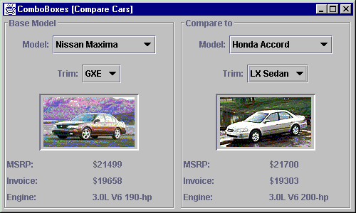
Figure 9.1 Dynamically changeable JComboBoxes allowing comparison of car model and trim information.
<<file figure9-1.gif>>
The Code: ComboBox1.java
see \Chapter9\1
import java.awt.*;
import java.awt.event.*;
import java.util.*;

import javax.swing.*;
import javax.swing.border.*;
import javax.swing.event.*;

public class ComboBox1 extends JFrame
{

  public ComboBox1()
  {
     super("ComboBoxes [Compare Cars]");
     getContentPane().setLayout(new BorderLayout());

	Vector cars = new Vector();
	Car maxima = new Car("Maxima", "Nissan", new ImageIcon("maxima.gif"));
	maxima.addTrim("GXE", 21499, 19658, "3.0L V6 190-hp");
	maxima.addTrim("SE",  23499, 21118, "3.0L V6 190-hp");
	maxima.addTrim("GLE", 26899, 24174, "3.0L V6 190-hp");
	cars.addElement(maxima);

	Car accord = new Car("Accord", "Honda", new ImageIcon("accord.gif"));
	accord.addTrim("LX Sedan", 21700, 19303, "3.0L V6 200-hp");
	accord.addTrim("EX Sedan", 24300, 21614, "3.0L V6 200-hp");
	cars.addElement(accord);

	Car camry = new Car("Camry", "Toyota", new ImageIcon("camry.gif"));
	camry.addTrim("LE V6", 21888, 19163, "3.0L V6 194-hp");
	camry.addTrim("XLE V6", 24998, 21884, "3.0L V6 194-hp");
	cars.addElement(camry);

	Car lumina = new Car("Lumina", "Chevrolet", new ImageIcon("lumina.gif"));
	lumina.addTrim("LS", 19920, 18227, "3.1L V6 160-hp");
	lumina.addTrim("LTZ", 20360, 18629, "3.8L V6 200-hp");
	cars.addElement(lumina);

	Car taurus = new Car("Taurus", "Ford", new ImageIcon("taurus.gif"));
	taurus.addTrim("LS", 17445, 16110, "3.0L V6 145-hp");
	taurus.addTrim("SE", 18445, 16826, "3.0L V6 145-hp");
	taurus.addTrim("SHO", 29000, 26220, "3.4L V8 235-hp");
	cars.addElement(taurus);

	Car passat = new Car("Passat", "Volkswagen", new ImageIcon("passat.gif"));
	passat.addTrim("GLS V6", 23190, 20855, "2.8L V6 190-hp");
	passat.addTrim("GLX", 26250, 23589, "2.8L V6 190-hp");
	cars.addElement(passat);

	getContentPane().setLayout(new GridLayout(1, 2, 5, 3));
	CarPanel pl = new CarPanel("Base Model", cars);
	getContentPane().add(pl);
	CarPanel pr = new CarPanel("Compare to", cars);
	getContentPane().add(pr);

	WindowListener wndCloser = new WindowAdapter()
	{
	   public void windowClosing(WindowEvent e)
	   {
 	     System.exit(0);
	   }
	};
	addWindowListener(wndCloser);

	pl.selectCar(maxima);
	pr.selectCar(accord);
        setResizable(false);
	pack();
	setVisible(true);
   }

   public static void main(String argv[])
   {
	new ComboBox1();
   }
}

class Car
{
	protected String m_name;
	protected String m_manufacturer;
	protected Icon   m_img;
	protected Vector m_trims;

	public Car(String name, String manufacturer, Icon img)
	{
		m_name = name;
		m_manufacturer = manufacturer;
		m_img = img;
		m_trims = new Vector();
	}

	public void addTrim(String name, int MSRP, int invoice,	String engine)
	{
		Trim trim = new Trim(this, name, MSRP, invoice, engine);
		m_trims.addElement(trim);
	}

	public String getName()
	{
		return m_name;
	}

	public String getManufacturer()
	{
		return m_manufacturer;
	}

	public Icon getIcon()
	{
		return m_img;
	}

	public Vector getTrims()
	{
		return m_trims;
	}

	public String toString()
	{
		return m_manufacturer+" "+m_name;
	}
}

class Trim
{
	protected Car    m_parent;
	protected String m_name;
	protected int    m_MSRP;
	protected int    m_invoice;
	protected String m_engine;

	public Trim(Car parent, String name, int MSRP, int invoice,
		String engine)
	{
		m_parent = parent;
		m_name = name;
		m_MSRP = MSRP;
		m_invoice = invoice;
		m_engine = engine;
	}

	public Car getCar()
	{
		return m_parent;
	}

	public String getName()
	{
		return m_name;
	}

	public int getMSRP()
	{
		return m_MSRP;
	}

	public int getInvoice()
	{
		return m_invoice;
	}

	public String getEngine()
	{
		return m_engine;
	}

	public String toString()
	{
		return m_name;
	}
}

class CarPanel extends JPanel
{
	protected JComboBox m_cbCars;
	protected JComboBox m_cbTrims;
	protected JLabel m_lblImg;
	protected JLabel m_lblMSRP;
	protected JLabel m_lblInvoice;
	protected JLabel m_lblEngine;

	public CarPanel(String title, Vector cars)
	{
		super();
		setLayout(new BoxLayout(this, BoxLayout.Y_AXIS));
		setBorder(new TitledBorder(new EtchedBorder(), title));

		JPanel p = new JPanel();
		p.add(new JLabel("Model:"));
		m_cbCars = new JComboBox(cars);
		ActionListener lst = new ActionListener()
		{
			public void actionPerformed(ActionEvent e)
			{
				Car car = (Car)m_cbCars.getSelectedItem();
				if (car != null)
				  showCar(car);
			}
		};
		m_cbCars.addActionListener(lst);
		p.add(m_cbCars);
		add(p);

		p = new JPanel();
		p.add(new JLabel("Trim:"));
		m_cbTrims = new JComboBox();
		lst = new ActionListener()
		{
			public void actionPerformed(ActionEvent e)
			{
			  Trim trim = (Trim)m_cbTrims.getSelectedItem();
			  if (trim != null)
			    showTrim(trim);
			}
		};
		m_cbTrims.addActionListener(lst);
		p.add(m_cbTrims);
		add(p);

		p = new JPanel();
		m_lblImg = new JLabel();
		m_lblImg.setHorizontalAlignment(JLabel.CENTER);
		m_lblImg.setPreferredSize(new Dimension(140, 80));
		m_lblImg.setBorder(new BevelBorder(BevelBorder.LOWERED));
		p.add(m_lblImg);
		add(p);

		p = new JPanel();
		p.setLayout(new GridLayout(3, 2, 10, 5));
		p.add(new JLabel("MSRP:"));
		m_lblMSRP = new JLabel();
		p.add(m_lblMSRP);

		p.add(new JLabel("Invoice:"));
		m_lblInvoice = new JLabel();
		p.add(m_lblInvoice);

		p.add(new JLabel("Engine:"));
		m_lblEngine = new JLabel();
		p.add(m_lblEngine);
		add(p);
	}

	public void selectCar(Car car)
	{
		m_cbCars.setSelectedItem(car);
	}

	public void showCar(Car car)
	{
		m_lblImg.setIcon(car.getIcon());
		if (m_cbTrims.getItemCount() > 0)
		  m_cbTrims.removeAllItems();
		Vector v = car.getTrims();
		for (int k = 0; k < v.size(); k++)
		  m_cbTrims.addItem(v.elementAt(k));
		m_cbTrims.grabFocus();
	}

	public void showTrim(Trim trim)
	{
		m_lblMSRP.setText("$"+trim.getMSRP());
		m_lblInvoice.setText("$"+trim.getInvoice());
		m_lblEngine.setText(trim.getEngine());
	}

}
Understanding the Code
Class ComboBox1
Class
ComboBox1 extends JFrame to implement the frame container for this example. It has no instance variables. The constructor of the ComboBox1 class creates a data collection with car information as listed above. A collection of cars is stored in Vector cars, and each car, in turn, receives one or more Trim instances. Other than this, the ComboBox1 constructor doesn't do much. It creates two instances of CarPanel (see b! elow) and arranges them in a GridLayout. These panels are used to select and display car information. Finally two cars are initially selected in both panels.Class Car
Car is a typical data object encapsulating three data fields listed at the beginning of this section: car name, manufacturer, and image. In addition, it holds the
m_trims vector representing a collection of Trim instances.Method
addTrim() creates a new Trim instance and adds it to the m_trims vector. The rest of this class implements typical getXX() methods to allow access to the protected data fields.Class Trim
Trim encapsulates four data fields listed at the beginning of this section: trim name, suggested retail price, invoice price, and engine type. In addition, it holds a reference to the parent
Car instance. The rest of this class implements typical getXX() methods to allow access to the protected data fields.Class CarPanel
This class extends
JPanel to provide the GUI framework for displaying car information. Six components are declared as instance variables:JComboBox m_cbCars
: Combo box to select a car model.JComboBox m_cbTrims
: Combo box to select a car trim for the selected model.JLabel m_lblImg
: Label to display the model's image.JLabel m_lblMSRP
: Label to display the MSRP.JLabel m_lblInvoice
: Label to display the invoice price.JLabel m_lblEngine
: Label to display the engine description.Two combo boxes are used to select cars and trims respectively. Note that
Car and Trim data objects are used to populate these combo boxes, so the actual displayed text is determined by their toString() methods. Both combo boxes receive ActionListeners to handle item selection. Then a Car item is selected, which triggers a call to the showCar() method described below. Similarly, a selection of a Trim item triggers a call to the showTrim() method.The rest of the
CarPanel constructor builds JLabels to display a car's image and trim data. Note how layouts are used in this example. A y-oriented BoxLayout creates a vertical axis used to allign and position all components. The combo boxes and supplementary labels are encapsulated in horizontal JPanels. JLabel m_lblImg receives a custom preferred size to reserve enough space for the photo image. This label is encapsulated in a panel (with its default FlowLayout) to ensure that this component will be centered over the container's space. The rest of CarPanel is occupied by the six labels, which are hosted by a 3x2 GridLayout.Method
selectCar() allows us to select a car programmatically from outside this class. It invokes the setSelectedItem() method on the m_cbCars combo box. Note that this call will trigger an ActionEvent which will be captured by the proper listener, resulting in a showCar() call.Method
showCar() updates the car image and updates the m_cbTrims combo box to display the corresponding trims of the selected model. The (getItemCount() > 0) condition is necessary because Swing throws an exception if removeAllItems() is invoked on an empty JComboBox. Finally, focus is transferred to the m_cbTrims component.Method
showTrim() updates the contents of the labels displaying trim information: MSRP, invoice price, and engine type.Running the Code
Figure 9.1 shows the
ComboBox1 application displaying two cars simultaneously for comparison. Note that all initial information is displayed correctly. Try experimenting with various selections and note how the combo box contents change dynamically.
UI Guideline : Symmetrical Layout
In this example, the design avoids the problem of having to align the different length comboboxes by using a symmetrical layout. Overall the window has a good balance and good use of white space, as in turn do each of the bordered panes used for individual car selections.
9.3 Custom model and renderer
Ambitious Swing developers may want to provide custom rendering in combo boxes to display structured data in the drop-down list. Different levels of structure can be identified by differing left margins and icons, just as is done in trees (which we will study in chapter 17). Such complex combo boxes can enhance functionality and provide a more sophisticated appearance.
In this section we will show how to merge the model and trim combo boxes from the previous section into a single combo box. To differentiate between model and trim items in the drop-down list, we can use different left margins and different icons for each. Our list should looke something like this:
Nissan Maxima
GXE
SE
GLE
We also need to prevent the user from selecting models (e.g. "Nissan Maxima" above), since they do not provide complete information about a specific car, and only serve as separators between sets of trims.
Note: The hierarchical list organization shown here can easily be extended for use in a
JList, and can handle an arbitrary number of levels. We only use two levels in this example, however, the design does not limit us to this.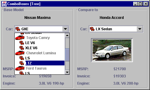
Figure 9.2 JComboBox with a custom model and a custom hierarchical rendering scheme.
<<file figure9-2.gif>>
The Code: ComboBox2.java
see \Chapter9\2
// Unchanged code from section 9.2
class CarPanel extends JPanel
{
	protected JComboBox m_cbCars;
	protected JLabel m_txtModel;	// NEW
	protected JLabel m_lblImg;
	protected JLabel m_lblMSRP;
	protected JLabel m_lblInvoice;
	protected JLabel m_lblEngine;

	public CarPanel(String title, Vector cars)
	{
		super();
		setLayout(new BoxLayout(this, BoxLayout.Y_AXIS));
		setBorder(new TitledBorder(new EtchedBorder(), title));

                JPanel p = new JPanel();	// NEW
		m_txtModel = new JLabel("");
		m_txtModel.setForeground(Color.black);
		p.add(m_txtModel);
		add(p);

		p = new JPanel();
		p.add(new JLabel("Car:"));
		CarComboBoxModel model = new CarComboBoxModel(cars);	// NEW
		m_cbCars = new JComboBox(model);
		m_cbCars.setRenderer(new IconComboRenderer());
		ActionListener lst = new ActionListener()
		{
			public void actionPerformed(ActionEvent e)
			{
				ListData data = (ListData)m_cbCars.getSelectedItem();
				Object obj = data.getObject();
				if (obj instanceof Trim)
					showTrim((Trim)obj);
			}
		};
		m_cbCars.addActionListener(lst);
		p.add(m_cbCars);
		add(p);

		p = new JPanel();
		m_lblImg = new JLabel();
		m_lblImg.setHorizontalAlignment(JLabel.CENTER);
		m_lblImg.setPreferredSize(new Dimension(140, 80));
		m_lblImg.setBorder(new BevelBorder(BevelBorder.LOWERED));
		p.add(m_lblImg);
		add(p);

		p = new JPanel();
		p.setLayout(new GridLayout(3, 2, 10, 5));
		p.add(new JLabel("MSRP:"));
		m_lblMSRP = new JLabel();
		p.add(m_lblMSRP);

		p.add(new JLabel("Invoice:"));
		m_lblInvoice = new JLabel();
		p.add(m_lblInvoice);

		p.add(new JLabel("Engine:"));
		m_lblEngine = new JLabel();
		p.add(m_lblEngine);
		add(p);
	}

	public synchronized void selectCar(Car car)
	{	// NEW
		for (int k=0; k < m_cbCars.getItemCount(); k++)
		{
		   ListData obj = (ListData)m_cbCars.getItemAt(k);
		   if (obj.getObject() == car)
		     m_cbCars.setSelectedItem(obj);
		}
	}

	public synchronized void showTrim(Trim trim)
	{	// NEW
	   Car car = trim.getCar();
	   m_txtModel.setText(car.toString());
	   m_lblImg.setIcon(car.getIcon());
	   m_lblMSRP.setText("$"+trim.getMSRP());
	   m_lblInvoice.setText("$"+trim.getInvoice());
	   m_lblEngine.setText(trim.getEngine());
	}

}

// NEW
class ListData
{
	protected Icon    m_icon;
	protected int     m_index;
	protected boolean m_selectable;
	protected Object  m_data;

	public ListData(Icon icon, int index, boolean selectable, Object data)
	{
		m_icon = icon;
		m_index = index;
		m_selectable = selectable;
		m_data = data;
	}

	public Icon getIcon()
	{
		return m_icon;
	}

	public int getIndex()
	{
		return m_index;
	}

	public boolean isSelectable()
	{
		return m_selectable;
	}

	public Object getObject()
	{
		return m_data;
	}

	public String toString()
	{
		return m_data.toString();
	}
}

class CarComboBoxModel
	extends DefaultComboBoxModel
{
	public static final ImageIcon ICON_CAR =
		new ImageIcon("car.gif");
	public static final ImageIcon ICON_TRIM =
		new ImageIcon("trim.gif");

	public CarComboBoxModel(Vector cars)
	{
		for (int k=0; k < cars.size(); k++)
		{
			Car car = (Car)cars.elementAt(k);
			addElement(new ListData(ICON_CAR, 0, false, car));

			Vector v = car.getTrims();
			for (int i=0; i < v.size(); i++)
			{
				Trim trim = (Trim)v.elementAt(i);
				addElement(new ListData(ICON_TRIM, 1, true, trim));
			}
		}
	}

	public void setSelectedItem(Object item)
	{
		if (item instanceof ListData)
		{
			ListData ldata = (ListData)item;
			if (!ldata.isSelectable())
			{
				Object newItem = null;
				int index = getIndexOf(item);
				for (int k = index+1; k < getSize(); k++)
				{
				     Object item1 = getElementAt(k);
					if (item1 instanceof ListData)
					{
						ListData ldata1 = (ListData)item1;
						if (!ldata1.isSelectable())
							continue;
					}
					newItem = item1;
					break;
				}
				if (newItem==null)
				   return;		// Selection failed
				item = newItem;
			}
		}
		super.setSelectedItem(item);
	}
}

class IconComboRenderer	extends JLabel implements ListCellRenderer
{
	public static final int OFFSET = 16;

	protected Color m_textSelectionColor = Color.white;
	protected Color m_textNonSelectionColor = Color.black;
	protected Color m_textNonselectableColor = Color.gray;
	protected Color m_bkSelectionColor = new Color(0, 0, 128);
	protected Color m_bkNonSelectionColor = Color.white;
	protected Color m_borderSelectionColor = Color.yellow;

	protected Color  m_textColor;
	protected Color  m_bkColor;

	protected boolean m_hasFocus;
	protected Border[] m_borders;

	public IconComboRenderer()
	{
		super();
		m_textColor = m_textNonSelectionColor;
		m_bkColor = m_bkNonSelectionColor;
		m_borders = new Border[20];
		for (int k = 0; k < m_borders.length; k++)
			m_borders[k] = new EmptyBorder(0, OFFSET*k, 0, 0);
		setOpaque(false);
	}

	public Component getListCellRendererComponent(JList list,
		Object obj, int row, boolean sel,
		boolean hasFocus)
	{
		if (obj == null)
		  return this;
		setText(obj.toString());
		boolean selectable = true;
		if (obj instanceof ListData)
		{
		  ListData ldata = (ListData)obj;
		  selectable = ldata.isSelectable();
		  setIcon(ldata.getIcon());
		  int index = 0;
		  if (row >= 0)	// no offset for text field (row=-1)
		    index = ldata.getIndex();
		  Border b = (index < m_borders.length ? m_borders[index] :
				new EmptyBorder(0, OFFSET*index, 0, 0));
		  setBorder(b);
		}
		else
		  setIcon(null);

		setFont(list.getFont());
		m_textColor = (sel ? m_textSelectionColor :
			(selectable ? m_textNonSelectionColor :
			m_textNonselectableColor));
		m_bkColor = (sel ? m_bkSelectionColor :
			m_bkNonSelectionColor);
		m_hasFocus = hasFocus;
		return this;
	}

	public void paint(Graphics g)
	{
		Icon icon = getIcon();
		Border b = getBorder();

		g.setColor(m_bkNonSelectionColor);
		g.fillRect(0, 0, getWidth(), getHeight());

		g.setColor(m_bkColor);
		int offset = 0;
		if  (icon != null && getText() != null)
		{
		    Insets ins = getInsets();
		    offset = ins.left + icon.getIconWidth() + getIconTextGap();
		}
		g.fillRect(offset, 0, getWidth() - 1 - offset,
			getHeight() - 1);

		if (m_hasFocus)
		{
		   g.setColor(m_borderSelectionColor);
		   g.drawRect(offset, 0, getWidth()-1-offset, getHeight()-1);
		}

		setForeground(m_textColor);
		setBackground(m_bkColor);
		super.paint(g);
    }
}
Understanding the Code
Class CarPanel
Classes
ComboBox2 (formerly ComboBox1), Car, and Trim remain unchanged in this example, so we'll start from the CarPanel class. Compared to the example in the previous section, we've removed combo box m_cbTrims, and added JLabel m_txtModel, which is used to display the current model's name (when the combo box popup is hidden, the user can see only the selected trim; so we need to display the corresponding model name separ! ately). Curiously, the constructor of the CarPanel class places this label component in its own JPanel (using its default FlowLayout) to ensure it's location in the center of the base panel.
Note: The problem is that
JLabel m_txtModel has a variable length, and the BoxLayout which manages CarPanel cannot dynamically center this component correctly. By placing this label in a FlowLayout panel it will always be centered.The single combo box ,
m_cbCars, has a bit in common with the component of the same name in the previous example. First it receives a custom model, an instance of the CarComboBoxModel class, which will be described below. It also receives a custom renderer, an instance of the IconComboRenderer class, also described below.The combo box is populated by both
Car and Trim instances encapsulated in ListData objects (see below). This requires some changes in the actionPerformed() method which handles combo box selection. First we extract the data object from the selected ListData instance by calling the getObject() method. If this call returns a Trim object (as it should, since Cars cannot be selected), we call ! the showTrim() method to display the selected data.Method
selectCar() has been modified. As we mentioned above, our combo box now holds ListData objects, so we cannot pass a Car object as a parameter to the setSelectedItem() method. Instead we have to examine in turn all items in the combo box, cast them to ListData objects, and verify that the encapsulated data object is equal to the given Car instance. The == operator verifies that the address in memory of the object corresponding to the combo box is the same ! as the address of the given object. This assumes that the Car object passed to selectCar() is taken from the collection of objects used to populate this combo box. (To avoid this limitation we could alternatively implement an equals() method in the Car class.)Method
showTrim() now does the job of displaying the model data as well as the trim data. To do this we obtain a parent Car instance for a given Trim and display the model's name and icon. The rest of this method remains unchanged.Class ListData
This class encapsulates the data object to be rendered in the combo box and adds new attributes for our rendering needs.
Instance variables:
m_icon Icon
: icon associated with the data object.m_index int
: item's index which determines the left margin (i.e. the hierarchical level).m_selectable boolean
: flag indicating that this item can be selected.m_data Object
: encapsulated data object.All variables are filled with parameters passed to the constructor. The rest of the
ListData class represents four getXX() methods and a toString() method, which delegate calls to the m_data object.Class CarComboBoxModel
This class extends
DefaultComboBoxModel to serve as a data model for our combo box . First it creates two static ImageIcons to represent model and trim. The constructor takes a Vector of Car instances and converts them and their trims into a linear sequence of ListData objects. Each Car object is encapsulated in a ListData instance with an ICON_CAR ic! on, index set to 0, and m_selectable flag set to false. Each Trim object is encapsulated in a ListData instance with ICON_TRIM icon, index set to 1, and m_selectable flag set to true.These manipulations could have been done without implementing a custom
ComboBoxModel, of course. The real reason we do implement a custom model is to override the setSelectedItem() method to control item selection in the combo box. As we learned above, only ListData instances with the m_selectable flag set to true should be selectable. To achieve this goal, the overridden setSelectedItem() method casts the selected object to a ListData instance and examines its ! selection property using isSelectable().If
isSelectable() returns false, a special action needs to be handled to move the selection to the first item following this item for which isSelectable() returns true. If no such item can be found our setSelectedItem() method returns and the selection in the combo box remains unchanged. Otherwise the item variable receives a new value which is finally passed to the setSelectedItem() implementation of the superclass
Note: You may notice that the
selectCar() method discussed above selects a Car instance which cannot be selected. This internally triggers a call to the setSelectedItem() of the combo box model, which shifts the selection to the first available Trim item. You can verify this when running the example.
Class IconComboRenderer
This class extends
JLabel and implements the ListCellRenderer interface to serve as a custom combo box renderer.Instance variables:
int OFFSET
: offset in pixels of image and text (different for cars and trims).Color m_textColor
: current text color.Color m_bkColor
: current background color.boolean m_hasFocus
: flag indicating whether this item has focus.Border[] m_borders
: an array of borders used for this component.The constructor of the
IconComboRenderer class initializes these variables. EmptyBorders are used to provide left margins while rendering components of the drop-down list. To avoid generation of numerous temporary objects, an array of 20 Borders is prepared with increasing left offsets corresponding to array index (incremented by OFFSET). This provides us with a set of different borders to use for white space in representing data at 20 distinct hierarchical levels.
Note: Even though we only use two levels in this example,
IconComboRenderer has been designed for maximum reusability. 20 levels should be enough for most hierarchies, but if more levels are necessary we’ve designed getListCellRendererComponent() (see below) to create a new EmptyBorder in the event that more than 20 levels are used.The
opaque property is set to false because we intend to draw the background ourselves.Method
getListCellRendererComponent() is called prior to the painting of each cell in the drop-down list. We first set this component’s text to that of the given object (passed as parameter). Then, if the object is an instance of ListData, we set the icon and left margin by using the appropriate EmptyBorder from the previously prepared array (based on the given ListData’s m_index property--if the index is greater than the). Note that a call to this method with row=-1 will be invoked prior to the rendering of the combo box editor, wh! ich is the part of the combo box that is always visible (see 9.1). In this case we don't need to use any border offset. Offset only makes sense when there are hierarchical differences between items in the list, not when an item is rendered alone.The rest of the
getListCellRendererComponent() method determines the background and foreground colors to use, based on whether is selected and selectable, and stores them in instance variables for use within the paint() method. Non-selectable items receive their own foreground to distinguish them from selectable items.The
paint() method performs a bit of rendering before invoking the super-class implementation. It fills the background with the stored m_bkColor (from above) excluding the icon's area (note that the left margin is already taken into account by the component's Border). It also draws a border-like rectangle if the component currently has the focus. This method then ends with a call to its super-class’s paint() method which takes responsibility for painting the label text and iconRunning the Code
Figure 9.2 shows our hierarchical drop-down list in action. Note that models and trim lines can be easily differentiated because of the varying icons and offsets. In addition, models have a gray foreground to imply that they cannot be selected.
This implementation is more user-friendly than the previous example because it displays all available data in a single drop-down list. Try selecting different trims and note how this changes data for both the model and trim information labels. Try selecting a model and note that it will result in the selection of the first trim of that model.
UI Guideline : Improved Usability
From a usability perspective the solution in fig 9.2 is an improvement over the one presented in fig 9.1. By using a combobox with a hierarchical data model, the designer has reduced the data entry to a single selection and has presented the information in an accessible and logical manner which also produces a visually cleaner result.
Further improvements could be made here by sorting the hierarchical data. In this example it would seem appropriate to sort in a two tiered fashion: alphabetically by manufacturer; and alphabetically by model. Thus Toyota would come after Ford and Toyota Corolla would come after Toyota Camry.
This is an excellent example of how the programmer can improve UI Design and Usability by doing additional work to make the User's Goal easier to achieve.
9.4 Comboboxes with memory
In some situations it is desirable to use editable combo boxes which keep a historical list of choices for future reuse. This conveniently allows the user to select a previous choice rather than typing identical text. A typical example of an editable combo box with memory can be found in find/replace dialogs in many modern applications. Another example, familiar to almost every modern computer user, is provided in many Internet browsers which use an editable URL combo box with history mechanism. These combo boxes accumulate typed addresses so the user can easily return to any previously visited site by selecting it from the drop-down list instead of manually typing it in again.
The following example shows how to create a simple browser application using an editable combo box with memory. It uses the serialization mechanism to save data between program sessions, and the
JEditorPane component (described in more detail in chapters 11 and 19) to display non-editable HTML files.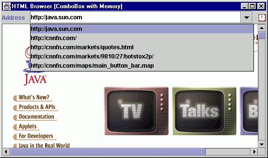
Figure 9.3 JComboBox with memory of previously visited URLs.
<<file figure9-3.gif>>
The Code: Browser.java
see \Chapter9\3
import java.awt.*;
import java.awt.event.*;
import java.io.*;
import java.net.*;

import javax.swing.*;
import javax.swing.event.*;
import javax.swing.text.*;
import javax.swing.text.html.*;

public class Browser extends JFrame
{

    protected JEditorPane   m_browser;
    protected MemComboBox   m_locator;
    protected AnimatedLabel m_runner;

    public Browser()
    {
	super("HTML Browser [ComboBox with Memory]");
	setSize(500, 300);

	JPanel p = new JPanel();
	p.setLayout(new BoxLayout(p, BoxLayout.X_AXIS));
	p.add(new JLabel("Address"));
	p.add(Box.createRigidArea(new Dimension(10, 1)));

	m_locator = new MemComboBox();
	m_locator.load("addresses.dat");
	BrowserListener lst = new BrowserListener();
	m_locator.addActionListener(lst);

	p.add(m_locator);
	p.add(Box.createRigidArea(new Dimension(10, 1)));

	m_runner = new AnimatedLabel("clock", 8);
	p.add(m_runner);
	getContentPane().add(p, BorderLayout.NORTH);

	m_browser = new JEditorPane();
	m_browser.setEditable(false);
	m_browser.addHyperlinkListener(lst);

	JScrollPane sp = new JScrollPane();
	sp.getViewport().add(m_browser);
	getContentPane().add(sp, BorderLayout.CENTER);

	WindowListener wndCloser = new WindowAdapter()
	{
	    public void windowClosing(WindowEvent e)
	    {
		m_locator.save("addresses.dat");
		System.exit(0);
	    }
        };
	addWindowListener(wndCloser);

	setVisible(true);
	m_locator.grabFocus();
    }

    class BrowserListener  implements ActionListener, HyperlinkListener
    {
		public void actionPerformed(ActionEvent evt)
		{
			String sUrl = (String)m_locator.getSelectedItem();
			if (sUrl == null || sUrl.length() == 0 ||
				m_runner.getRunning())
				return;

			BrowserLoader loader = new BrowserLoader(sUrl);
			loader.start();
		}

		public void hyperlinkUpdate(HyperlinkEvent e)
		{
			URL url = e.getURL();
			if (url == null || m_runner.getRunning())
				return;
			BrowserLoader loader = new BrowserLoader(url.toString());
			loader.start();
		}
   }


	class BrowserLoader extends Thread
	{
		protected String m_sUrl;

		public BrowserLoader(String sUrl)
		{
			m_sUrl = sUrl;
		}

		public void run()
		{
			setCursor( Cursor.getPredefinedCursor(Cursor.WAIT_CURSOR));
			m_runner.setRunning(true);

			try
			{
				URL source = new URL(m_sUrl);
				m_browser.setPage(source);
				m_locator.add(m_sUrl);
			}
			catch (Exception e)
			{
				JOptionPane.showMessageDialog(Browser.this,
					"Error: "+e.toString(),
					"Warning", JOptionPane.WARNING_MESSAGE);
			}

			m_runner.setRunning(false);
			setCursor(Cursor.getPredefinedCursor(Cursor.DEFAULT_CURSOR));
		}
	}

	public static void main(String argv[])
	{
		new Browser();
	}

}

class MemComboBox  extends JComboBox
{
	public static final int MAX_MEM_LEN = 30;

	public MemComboBox()
	{
		super();
		setEditable(true);
	}

	public void add(String item)
	{
		removeItem(item);
		insertItemAt(item, 0);
		setSelectedItem(item);
		if (getItemCount() > MAX_MEM_LEN)
			removeItemAt(getItemCount()-1);
	}

	public void load(String fName)
	{
		try
		{
			if (getItemCount() > 0)
				removeAllItems();
			File f = new File(fName);
			if (!f.exists())
				return;
			FileInputStream fStream =
				new FileInputStream(f);
			ObjectInput  stream  =
				new  ObjectInputStream(fStream);

			Object obj = stream.readObject();
			if (obj instanceof ComboBoxModel)
				setModel((ComboBoxModel)obj);

			stream.close();
			fStream.close();
		}
		catch (Exception e)
		{
			e.printStackTrace();
			System.err.println("Serialization error: "+e.toString());
		}
	}

	public void save(String fName)
	{
		try
		{
			FileOutputStream fStream =
				new FileOutputStream(fName);
			ObjectOutput  stream  =
				new  ObjectOutputStream(fStream);

			stream.writeObject(getModel());

			stream.flush();
			stream.close();
			fStream.close();
		}
		catch (Exception e)
		{
			e.printStackTrace();
			System.err.println("Serialization error: "+e.toString());
		}
	}
}

class AnimatedLabel extends JLabel implements Runnable
{
	protected Icon[] m_icons;
	protected int m_index = 0;
	protected boolean m_isRunning;

	public AnimatedLabel(String gifName, int numGifs)
	{
		m_icons = new Icon[numGifs];
		for (int k = 0; k < numGifs; k++)
			m_icons[k] = new ImageIcon(gifName+k+".gif");
		setIcon(m_icons[0]);

		Thread tr = new Thread(this);
		tr.setPriority(Thread.MAX_PRIORITY);
		tr.start();
	}

	public void setRunning(boolean isRunning)
	{
		m_isRunning = isRunning;
	}

	public boolean getRunning()
	{
		return m_isRunning;
	}

	public void run()
	{
		while(true)
		{
			if (m_isRunning)
			{
				m_index++;
				if (m_index >= m_icons.length)
					m_index = 0;
				setIcon(m_icons[m_index]);
				Graphics g = getGraphics();
				m_icons[m_index].paintIcon(this, g, 0, 0);
			}
			else
			{
				if (m_index > 0)
				{
					m_index = 0;
					setIcon(m_icons[0]);
				}
			}
			try { Thread.sleep(500); } catch(Exception ex) {}
		}
	}
}
Understanding the Code
Class Browser
This class extends
JFrame to implement the frame container for our browser. Instance variables:JEditorPane m_browser
: text component to parse and render HTML files.MemComboBox m_locator
: combo box to enter/select URL address.AnimatedLabel m_runner
: traditional animated icon alive while the browser is requesting a URL.The constructor creates the custom combo box,
m_locator, and an associated explanatory label. Then it creates the m_runner icon and places all three components in the northern region of our frame’s content pane. JEditorPane m_browser is created and placed in a JScrollPane to provide scrolling capabilities. This is then added to the center of the content pane.Note that the
WindowListener, as used in many previous examples to close the frame and terminate execution, receives an additional function: it invokes our custom save() method (see below) on our custom combo box component before destroying the frame. This saves the list of visited URLs entered as a file called "addresses.dat" in the current running directory.Class Browser.BrowserListener
This inner class implements both the
ActionListener and HyperlinkListener interfaces to manage navigation to HTML pages. The actionPerformed() method is invoked when the user selects a new item in the combo box . It verifies that the selection is valid and the browser is not currently running (i.e. requesting a URL). If these checks are passed it then creates and starts a new BrowserLoader instance (see below) for the specified address.Method
hyperlinkUpdate() is invoked when the user clicks a hyperlink in the currently loaded web page. This method also determines the selected URL address and starts a new BrowserLoader to load it.Class Browser.BrowserLoader
This inner class extends
Thread to load web pages into the JEditorPane component. It takes a URL address parameter in the constructor and stores it in a instance variable. The run() method sets the mouse cursor to hourglass (Cursor.WAIT_CURSOR) and starts the animated icon to indicate that the browser is busy.The core functionality of this thread is enclosed in its
try/catch block. If an exception occurs during processing of the requested URL, it is displayed in simple dialog message box (we will learn discuss JOptionPane in chapter 14).The actual job of retrieving, parsing, and rendering the web page is hidden in a single call to the
setPage() method. So why do we need to create this separate thread instead of making that simple call, say, in BrowserListener? The reason is, as we discussed in chapter 2, by creating separate threads to do potentially time-consuming operations we avoid clogging up the event-dispatching thread.Class MemComboBox
This class extends
JComboBox to add a historical mechanism for this component. The constructor creates an underlying JComboBox component and sets its editable property to true.The
add() method adds a new text string to the beginning of the list. If this item is already present in the list, it is removed from the old position. If the resulting list is longer than the pre-defined maximum length then the last item in the list is truncated.Method
load() loads a previously stored ComboBoxModel from file "addresses.dat" using the serialization mechanism. The significant portion of this method reads an object from an ObjectInputStream and sets it as the ComboBoxModel. Note that any possible exceptions are only printed to the standard output and purposefully do not distract the user (since this serialization mechanism should be considered an optional feature).Similarly, the
save() method serializes our combo box’s ComboBoxModel. Any possible exceptions are, again, printed to standard output and do not distract the user.Class AnimatedLabel
Surprisingly, Swing does not provide any special support for animated components, so we have to create our own component for this purpose. This provides us with an interesting example of using threads in Java.
Note: Animated GIFs are fully supported by
ImageIcon (see chapter 5) but we want complete control over each animated frame here.AnimatedLabel
extends JLabel and implements the Runnable interface. Instance variables:Icon[] m_icons
: an array of images to be used for animation.int m_index
: index of the current image.boolean m_isRunning
: flag indicating whether the animation is running.The constructor takes a common name of a series of GIF files containing images for animation, and the number of those files. These images are loaded and stored into an array. When all images are loaded a thread with maximum priority is created and started to run this
Runnable instance.The
setRunning() and getRunning() methods simply manage the m_isRunning flag.In the
run() method we cyclically increment the m_index variable and draw an image from the m_icons array with the corresponding index, exactly as you would expect from an animated image. This is done only when the m_isRunning flag is set to true. Otherwise, the image with index 0 is displayed. After an image is painted, AnimatedLabel yields control to other threads and sleeps for 500 ms.The interesting thing about this component is that it runs in parallel with other threads which do not necessary yield control explicitly. In our case the concurrent
BrowserLoader thread spends the main part of its time inside the setPage() method, and our animated icon runs in a separate thread signaling to the user that something is going on. This is made possible because this animated component is running in the thread with the maximum priority. Of course, we should use such thread priority with caution. In our case it is appropriate since our thread consumes only a small amount of the processor's time and does yield control to the lesser-priority threads (when it sleeps).
Note: As a good exercise try using threads with normal priority or Swing's
Timer component in this example. You will find that this doesn't work as expected: the animated icon does not show any animation while the browser is running.Running the Code
Figure 9.3 shows the Browser application displaying a web page. Note that the animated icon comes to life when the browser requests a URL. Also note how the combo box is populated with URL addresses as we navigate to different web pages. Now quit the application and re-start it. Note that our addresses have been saved and restored (by serializing the combo box model, as discussed above).
Note: HTML rendering functionality is not yet matured. Do not be surprised if your favorite web page looks signigicantly different in our Swing-based browser. As a matter of fact even the JavaSoft home page throws several exceptions while being displayed in this Swing component. (These exceptions occur outside our code, during the
JEditorPane rendering--this is why they are not caught and handled by our code.)
UI Guideline : Usage of a Memory Combobox
The example given here is a good usage for such a device. However, a memory combobox will not always be appropriate. Remember the advice that usability of an unsorted comboboxes tends to degrade rapidly as the number of items grows. Therefore, it is sensible to deploy this technique where the likelihood of more than say 20 entries is very small. The browser example is good because it is unlikely that a user would type more than 20 URLs in a single web surfing session.
Where you have a domain problem which is likely to need a larger number of memory items but you still want to use a memory combobox, consider adding a sorting algorithm, so that rather than most recent first, you sort into a meaningful index such as alphabetical order. This will improve usability and mean that you could easily populate the list up to 2 or 3 hundred items.
9.5 Custom editing
In this section we will discuss a custom editing feature to make the example from the last section even more convenient and similar to modern browser applications. We will attach a key event listener to our combo box’s editor and search for previously viosited URLs with matching beginning strings. If a match occurs the remainder of that URL is displayed in the editor, and by pressing Enter we can accept the suggestion. Most modern browsers also provide this functionality.
Note that the caret position will remain unchanged as well as the text on the left side of the caret (i.e. the text most likely typed by the user). The text on the right side of the caret represents the browser's suggestion which may or may not correspond to the user's intentions. To avoid distracting the user, this portion of the text is highlighted, so any newly typed character will replace that suggested text.
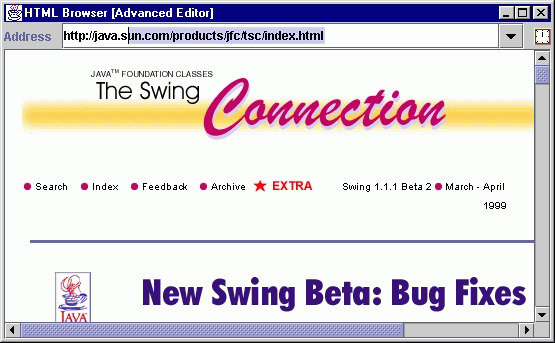
Figure 9.4 JComboBox with custom editor suggesting previously visited URLs.
<<file figure9-4.gif>>
The Code: Browser.java
see \Chapter9\4
public class Browser extends JFrame
{
  // Unchanged code from section 9.4

  public Browser() {
    super("HTML Browser [Advanced Editor]");

    // Unchanged code from section 9.4

    MemComboAgent agent = new MemComboAgent(m_locator);

    // Unchanged code from section 9.4
  }
  // Unchanged code from section 9.4
}

class MemComboAgent extends KeyAdapter
{
    protected JComboBox   m_comboBox;
    protected JTextField  m_editor;

    public MemComboAgent(JComboBox comboBox)
    {
	m_comboBox = comboBox;
	m_editor = (JTextField)comboBox.getEditor().getEditorComponent();
	m_editor.addKeyListener(this);
    }

    public void keyReleased(KeyEvent e)
    {
	char ch = e.getKeyChar();
	if (ch == KeyEvent.CHAR_UNDEFINED || Character.isISOControl(ch))
	   return;
	int pos = m_editor.getCaretPosition();
	String str = m_editor.getText();
	if (str.length() == 0)
	   return;

	for (int k = 0; k < m_comboBox.getItemCount(); k++)
	{
	    String item = m_comboBox.getItemAt(k).toString();
	    if (item.startsWith(str))
	    {
		m_editor.setText(item);
		m_editor.setCaretPosition(item.length());
		m_editor.moveCaretPosition(pos);
		break;
	    }
	}
    }
}
Understanding the Code
Class Browser
This class has only one change in comparison with the previous example: it creates an instance of our custom
MemComboAgent class and passes it a reference to our m_locator combo box.Class MemComboAgent
This class extends
KeyAdapter to listen for keyboard activity. It takes a reference to a JComboBox component and stores it in an instance variable along with the JTextField component used as that combo box’s editor. Finally, a MemComboAgent object adds itself to that editor as a KeyListener to be notified of all keyboard input that is passed to the editor component.Method
keyReleased() is the only method we implement. First this method retrieves the pressed characters and verifies that they are not control characters. We also retrieve the contents of the text field and check that it is not empty (to avoid annoying the user with suggestions in an empty field). Note that when this method is invoked the pressed key will already have been included in this text.This method then walks through the list of combo box items and searches for an item starting with the combo box editor text. If such an item is found it is set as the combo box editor’s text. Then we place the caret at the end of that string using
setCaretPosition(), and move it back to its initial position in the backward direction using the moveCaretPosition() method. This final JTextComponent method places the caret in its original position and highlights all text to its right (see chapters 11 and 19).
Note: A more sophisticated realization of this idea may include separate processing of URL protocol and host, as well as using threads for smooth execution.
Running the Code
Figure 9.4 shows our custom combo box’s editor displaying a portion of a URL address taken from its list. Try entering some new addresses and browsing to them. After some experimentation, try typing in an address that you have already visited with this application. Notice that the enhanced combo box suggests the remainder of this address from its pull-down list. Press "Enter" as soon as an address matches your intended selection to avoid typing the complete URL.