


MobiLink Synchronization User's Guide
MobiLink Monitor
Using the MobiLink Monitor
The Chart pane presents the same information as the Details Table, but in graphical format. The bars in the Chart represent the length of time taken by each synchronization, with subsections of the bars representing the phases of the synchronization.
Click a synchronization to select that synchronization in the Details Table.
Double-click a synchronization to open the Synchronization Session Properties for the synchronization. For more information, see Synchronization Properties.
You can group the data by worker thread or by user. Choose View
There are three ways to select the data that is visible:
Scrollbar Click the scrollbar at the bottom of the Chart pane and slide it.
Go To dialog Open this dialog by choosing View
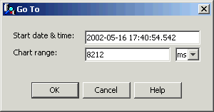
Start Date & Time lets you specify the start time for the data that appears in the Chart pane. If you change this setting, you must specify at least the year, month, and date of the date-time.
Chart Range lets you specify the duration of time that is displayed. The chart range can be specified in milliseconds, seconds, minutes, hours, or days. The chart range determines the granularity of the data: a smaller length of time means that more detail is visible.
Overview Pane The box in the Overview pane indicates the area being displayed in the Chart. It allows you to quickly select a portion of data to view. You can easily resize or move the box to see different data, or see data at different granularity. If you make the box smaller you shorten the interval of the visible data in the Chart, which makes more detail visible. Click to move the current box without changing the zoom. Drag in the Overview to redraw the box and select a different zoom and position.
At the bottom of the Chart pane there is a scale showing time periods. The format of the time is readjusted automatically depending on the span of time that is displayed. You can always see the complete date-time by hovering your cursor over the scale.
You can view or set the colors in the Chart pane by opening the Options dialog (available from the Tools menu). The default color scheme for the Chart pane uses green for uploads, red for downloads, and blue for begin and end phases, with a darker shade for earlier parts of a phase.
For information about setting colors, see Options.