

MobiLink Synchronization User's Guide
MobiLink Monitor
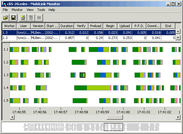
Following is an example of the MobiLink Monitor when synchronization data has been collected:

The Monitor has three panes:
Details Table is the top pane. It is a spreadsheet that shows the total time taken by each synchronization, with a breakdown showing the amount of time taken by each part of the synchronization.
Chart is the middle pane. It provides a graphical representation of the data. The scale at the bottom of this pane represents time. You can select the data that is displayed in the Chart by drawing a box around data in the Overview pane; or by choosing View
In the screen shot above, the cursor is hovering over the time scale, and so a box is apparent that shows the complete date and time for the position of the cursor.
Overview is the bottom pane. It shows an overview of all the data. To choose data to see in the Chart, click in the Overview and draw a box. The Chart will show everything that is located in the box.
In addition, there is an Options dialog that you can use to customize the data, and properties dialogs for viewing more detailed information. All of these panes and dialogs are described in detail, below.
Details Table pane
Chart pane
Overview pane
Options
Session Properties
Synchronization Properties


