
|
|
|
In Java look and feel applications, the following common mouse operations are available to users:
 In your design, assume a two-button mouse. Use mouse button 1 (usually the left button) for selection, activation of components, dragging, and the display of drop-down menus. Use mouse button 2 (usually the right button) to display contextual menus. Do not use the middle mouse button; it is not available on most target platforms.
 Be aware that Macintosh systems usually have a one-button mouse, other personal computers and network computers usually have a two-button mouse, and UNIX systems usually have a three-button mouse.
Restrict interaction to the use of mouse button 1 and mouse button 2. Macintosh users can simulate mouse button 2 by holding down the Control key while using mouse button 1.
The following figure shows the relative placement of mouse buttons 1 and 2 on Macintosh, PC, and UNIX mouse devices.
Figure 45 Cross-Platform Mouse Buttons and Their Default Assignments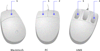
The pointer can assume a variety of shapes. For instance, in a text-editing application, the pointer might assume an I-beam shape (called a "text pointer" in the JDK) to indicate where the insertion point will be if the user presses the mouse button. The insertion point is the location where typed text or a dragged or pasted selection will appear. When the pointer moves out of the editor pane, it returns to its initial appearance as a default pointer.
The Java look and feel defines a set of pointer types that map to the corresponding native platform pointers; therefore, the appearance of pointers can vary from platform to platform, as shown in the following table. When no corresponding pointer exists in the native platform toolkit, the pointer is supplied by the JFC.
 In addition to the shapes in Table 7, a pointer graphic can be defined as an image and created using Toolkit.createCustomCursor if you are using the Java 2 platform.
Mouse-over feedback is a visual effect that occurs when users move the pointer over an area of an application window.
In the Java look and feel, mouse-over feedback can be used to show borders on toolbar buttons when the pointer moves over them. A slightly different effect is used to display tool tips. For details, see Toolbars and Tool Tips.
Clicking and Selecting Objects
In the Java look and feel, the selection of objects with the mouse is similar to the standard practice for other graphical user interfaces. Users select an object by clicking it. Clicking an unselected object also deselects any previous selection.
JFC-provided text selection follows these general rules:
JFC-provided selection in lists and tables follows these general rules:
It can be difficult for users to find and access desired features given all the commands in the menus and submenus of a complex application. Contextual menus (sometimes called "pop-up menus") enable you to make such functions available throughout the graphical interface and to associate menu items with relevant objects.
Users can access contextual menus in two ways:
Since users often have difficulty knowing whether contextual menus are available and what is in them, ensure that the items in your contextual menu also appear in the menu bar or toolbar of the primary windows in your application.
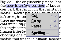
Be sure that the commands in your contextual menu apply only to a selected object or group of objects. For instance, a contextual menu might include cut, copy, and paste commands limited to a selected text range, as shown in the preceding figure.
Remember that users on the Microsoft Windows and UNIX platforms display a contextual menu by clicking or pressing mouse button 2. Macintosh users hold down the Control key while clicking.
Drag-and-drop operations include moving, copying, or linking selected objects by dragging them from one location and dropping them over another. These operations provide a convenient and intuitive way to perform many tasks using direct manipulation. Common examples of drag and drop in the user interface are moving files by dragging file icons between folders or dragging selected text from one document to another. The Java 2 platform supports drag and drop between two Java applications or between a Java application and a native application. For example, on a Microsoft Windows system, users can drag a text selection from a Java application and drop it into a Microsoft Word document.
Drag and drop in Java applications is similar to standard behavior on other platforms. Users press mouse button 1 while the pointer is over a source object and then drag the object by moving the pointer while holding down the mouse button. To drop the object, users release the button when the pointer is over a suitable destination. A successful drop triggers an action that depends on the nature of the source and destination. If the drag source is part of a range selection, the entire selection (for example, several file icons or a range of text) is dragged.
Pointer and Destination Feedback
During any drag-and-drop operation, your Java look and feel application needs to give visual feedback using the pointer and the destination.
Provide the user with feedback that a drag operation is in progress by changing the shape of the pointer when the drag is initiated.
Provide destination feedback so users know where the dragged object can be dropped. Use one or both of the following methods to provide destination feedback:
Java objects are specified by their MIME (Multipurpose Internet Mail Extensions) types, and the JavaTM runtime environment automatically translates back and forth between MIME types and system-native types as needed. As an object is dragged over potential targets, each potential target can query the drag source to obtain a list of available data types and then compare that with the list of data types that it can accept. For example, when dragging a range of text, the source might be able to deliver the text in a number of different encodings or as plain text, styled text, or HTML text. If there is a match in data types, potential targets should be highlighted as the pointer passes over them to indicate that they can accept the dragged object.
The Java look and feel assumes a PC-style keyboard. The standard ASCII keys are used, along with the following modifier keys: Shift, Control, and Alt (Option on the Macintosh); the function keys F1 through F12; the four arrow keys; Delete, Backspace, Home, End, Page Up, and Page Down. Enter and Return are equivalent. (Return does not appear on PC keyboards.)
A modifier key is a key that does not produce an alphanumeric character but can be used in combination with other keys to alter an action. Typical modifier keys in Java look and feel applications are Shift, Control, and Alt.
This section describes and provides recommendations for the use of keyboard operations, which include keyboard shortcuts, mnemonics, and other forms of navigation, selection, and activation that utilize the keyboard instead of the mouse. A mnemonic is an underlined letter that typically appears in a menu title, menu item, or the text of a button or other component. The underlined letter reminds users how to activate the equivalent command by pressing the Alt key and the character key that corresponds to the underlined letter. For instance, you could use a mnemonic to give keyboard focus to a text area or to activate a command button. A keyboard shortcut is a sequence of keys (such as Control-A) that activates a menu command.
The keyboard focus (sometimes called "input focus") designates the active window or component where the user's next keystrokes will take effect. Focus typically moves when users click a component with a pointing device, but users can also control focus from the keyboard. Either way, users designate the window, or component within a window, that receives input. (There are exceptions: for instance, a left-alignment button on a toolbar should not take focus away from the text area where the actual work is taking place.)
When a window is first opened, assign initial keyboard focus to the component that would normally be used first. Often, this is the component appearing in the upper-left portion of the window. If keyboard focus is not assigned to a component in the active window, the keyboard navigation and control mechanisms cannot be used. The assignment of initial keyboard focus is especially important for people who use only a keyboard to navigate through your application--for instance, those with visual or mobility impairments.
In the Java look and feel, many components (including command buttons, checkboxes, radio buttons, toggle buttons, lists, combo boxes, tabbed panes, editable cells, and tree views) indicate keyboard focus by displaying a rectangular border (blue, in the default color theme).
Figure 47 Keyboard Focus Indicated by Rectangular Border
Editable text components, such as text fields, indicate keyboard focus by displaying a blinking bar at the insertion point.
Figure 48 Keyboard Focus Indicated by Blinking Bar at Insertion Point
Menus indicate focus with a colored background for menu titles or menu items (blue, in the default color theme).
Figure 49 Keyboard Focus Indicated by Colored Background
Split panes and sliders indicate focus by darkening the drag-textured areas (blue, in the default color theme).
Figure 50 Keyboard Focus Indicated by Drag Texture
Keyboard Navigation and Activation
Keyboard navigation and activation enable users to move keyboard focus from one user interface component to another via the keyboard.
In general, pressing the Tab key moves focus through the major components; Shift-Tab moves through the components in the reverse direction. Control-Tab and Control-Shift-Tab work in a similar fashion and are particularly useful when keyboard focus is in an element that accepts tabs, such as a text area or a table. Arrow keys are often used to move within groups of components--for example, Tab puts focus in a set of radio buttons and then the arrow keys move focus among the radio buttons. However, the Tab key is used to move among checkboxes.
Once an element has focus, pressing the spacebar typically activates it or selects it. In a list, pressing Shift-spacebar extends the selection; pressing Control-spacebar makes another selection without affecting the current selections.
Some components do not need explicit keyboard focus to be operated. For example, the default button in a dialog box can be operated by pressing the Enter or Return key without the default button having keyboard focus. Similarly, scrollbars can be operated from the keyboard if focus is anywhere within the scroll pane.
Keyboard navigation can be useful not only for accessibility purposes, but also for power users, users who prefer the keyboard over the mouse, or users who choose alternative input methods like voice input or onscreen keyboards.
Ensure that all application functions are accessible from the keyboard by unplugging the mouse and testing the application's keyboard operations.
Some of the keyboard operations in the tables in Appendix A are temporarily incomplete or unimplemented. However, the key sequences listed in this appendix should be reserved for future versions of the JFC and the Java 2 platform.
The setNextFocusableComponent method from JComponent can be used to set the order for tabbing by chaining components together--specifying for each component what the next component in the sequence is.
The common operations for keyboard navigation and activation in the Java look and feel are summarized in the following table. Within the table, the term "group" refers to a group of toolbar buttons, menu titles, text, or table cells.
|
Action |
Keyboard Operation |
|---|---|
| Navigates in, navigates out | Tab1 |
| Navigates out of a component that accepts tabs | Control-Tab1 |
| Moves focus left one character or component within a group | Left arrow |
| Moves focus right one character or component within a group | Right arrow |
| Moves focus up one line or component within a group | Up arrow |
| Moves focus down one line or component within a group | Down arrow |
| Moves up one view | Page Up |
| Moves down one view | Page Down |
| Moves to the beginning of data; in a table, moves to the beginning of a line | Home |
| Moves to the end of data; in a table, moves to the last cell in a row | End |
| Activates the default command button | Enter or Return |
| Dismisses a menu or dialog box without changes | Escape |
| Activates or selects the component (with keyboard focus) | Spacebar |
| 1 With Shift key, reverses direction |
Keyboard shortcuts are keystroke combinations (consisting of a modifier key and a character key, like Control-Z) that activate a menu item from the keyboard even if the menu for that command is not currently displayed. Unlike mnemonics, keyboard shortcuts do not post menus; rather, they perform the indicated actions directly.
Figure 51 Edit Menu With Keyboard Shortcuts and Mnemonics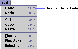
To use a keyboard shortcut in Java look and feel applications, users hold down the Control key (and optionally, an additional modifier key, such as Shift) and press the character key that is shown after the menu item. Typing the keyboard shortcut has the same effect as choosing the menu item. For instance, to undo an action, users can either choose the Undo item from the Edit menu or hold down the Control key and press Z.
Do not use the Meta key (the Command key on the Macintosh platform) for a keyboard shortcut, except as an alternate for Control. It is not available on many target platforms.
Specify keyboard shortcuts for frequently used menu items to provide an alternative to mouse operation. The Java look and feel displays keyboard shortcuts using standard abbreviations for key names, separated by hyphens.
Be aware of and use the common shortcuts across platforms that are summarized in the following table.
Since keyboard shortcuts are not always equivalent on different platforms, ensure that any new keyboard shortcuts you have created are compatible with existing shortcuts on all your target platforms.
Mnemonics provide yet another keyboard alternative to the mouse. A mnemonic is an underlined letter in a menu title, menu item, or other interface component. It reminds the user how to activate the equivalent command by simultaneously pressing the Alt key and the character key that corresponds to the underlined letter.
Figure 52 File Menu With Mnemonics and Keyboard Shortcuts
When keyboard focus is not in a text element, the Alt modifier is not always required. Menus are an example. For instance, to choose the Exit command from the File menu, the user can hold down the Alt key and press F to post the File menu, and then press X.
Once users have displayed a menu with a keyboard sequence, the subsequent key they press will activate a command only from that menu. Hence, users can press Alt-F to display the File menu and then type A to activate the Save As command, or press Alt-E to display the Edit menu, and then type A to activate the Select All command.
You can also provide mnemonics for components within the dialog boxes in your applications. However, it is important to note that this situation requires that you use a modifier key. For instance, within a dialog box, you might want to provide a mnemonic for the Help button. Once keyboard focus has moved within the dialog box, users press Alt, and then H to activate the Help button.
Do not associate mnemonics with the default button or the Cancel button in a dialog box. Use Enter or Return for the default button and Escape for the Cancel button instead.
Choose mnemonics that avoid conflicts. For instance, you cannot use the letter P as the mnemonic for both the Print and Page Setup commands.
When you assign mnemonics, follow these guidelines in the specified order.
| 1. | Use common mnemonics as they appear in Table 10 below. |
| 2. | If the mnemonic does not appear in the table of common mnemonics (Table 10), choose the first letter of the menu item. (For instance, choose J for Justify.) |
| 3. | If the first letter of the menu item conflicts with those of other items, choose a prominent consonant. (For instance, the letter S may have already been designated as the mnemonic for the Style command. Therefore, choose the letter Z as the mnemonic for the Size command.) |
The setMnemonic method can be used to specify mnemonics on buttons, checkboxes, radio buttons, toggle buttons, and menu titles. The setDisplayedMnemonic method can be used for labels, and the setAccelerator method for menu items.
|
java.sun.com :
|
Previous | Next | Contents | Index | Search |
Copyright 1999 Sun Microsystems, Inc. All Rights Reserved.