
|
|
|
Because the quality of your graphics can affect user confidence and even the perceived stability of your application, it is wise to seek the advice of a professional visual designer.
In a cross-platform delivery environment, you need to ensure that the visual components of your application reproduce legibly and aesthetically on all your target systems. In many cases, you might not know which platforms will be used to run your software or what display capabilities they might have.
Online graphics consist of the visual representations of JFC components in the Java look and feel, which are drawn for you by the toolkit, and application graphics such as icons and splash screens, which you supply.
The Java look and feel components use a simple color model that reproduces well even on displays with a relatively small number of available colors. You can use the theme mechanism to change the colors of the components. For details, see Themes.
 Use themes to control the colors of Java look and feel components--for instance, to provide support for display devices with minimal available colors (fewer than 16 colors).
You need to supply icons, button graphics, pictures and logos for splash screens, and About boxes. Since these graphics might be displayed on a number of different platforms and configurations, you must develop a strategy for ensuring a high quality of reproduction.
Use color only as a secondary means of representing important information. Make use of other characteristics (shape, texture, size, or intensity contrast) that do not require color vision or a color monitor.
The colors available on your users' systems, along with graphic file formats, determine how accurately the colors you choose are displayed on screen. Judging color availability is difficult, especially when you are designing applications to be delivered on multiple configurations or platforms.
The number of colors available on a system is determined by the bit depth, which is the number of bits of information used to represent a single pixel on the monitor. The lowest number of bits used for modern desktop color monitors is usually 8 bits (256 colors); 16 bits provide for thousands of colors (65,536, to be exact); and 24 bits, common on newer systems, provide for millions of colors (16,777,216). The specific colors available on a system are determined by the way in which the target platform allocates colors. Available colors might differ from application to application.
Designers sometimes use predefined color palettes when producing images. For example, some web designers work within a set of 216 "web-safe" colors. These colors reproduce in many web browsers without dithering (as long as the system is capable of displaying at least 256 colors). Dithering occurs when a system or application attempts to simulate an unavailable color by using a pattern of two or more colors or shades from the system palette.
Outside web browsers, available colors are not so predictable. Individual platforms have different standard colors or deal with palettes in a dynamic way. The web-safe colors might dither when running in a standalone application, or even in an applet within a browser that usually does not dither these colors. Since the colors available to a Java application can differ each time it is run, especially across platforms, you cannot always avoid dithering in your images.
 Identify and understand the way that your target platforms handle colors at different bit depths. To achieve your desired effect, test your graphics on all target platforms at depths less than 16 bits.
You can use two graphic file formats for images on the Java platform: GIF (Graphics Interchange Format) and JPEG (named after its developers, the Joint Photographic Experts Group).
GIF is the common format for application graphics in the Java look and feel. GIF files tend to be smaller on disk and in memory than JPEG files. Each GIF image is limited to 256 colors, or 8 bits of color information per pixel. A GIF file includes a list (or palette) of the colors (256 or fewer) used in the image. The number of colors in the palette and the complexity of the image are two factors that affect the size of the graphic file.
On 8-bit systems, some of the colors specified in a GIF file will be unavailable if they are not part of the system's current color palette. These unavailable colors will be dithered by the system. On 16-bit and 24-bit systems, more colors are available and different sets of colors can be used in different GIF files. Each GIF image, however, is still restricted to a set of 256 colors.
JPEG graphics are generally better suited for photographs than for the more symbolic style of icons, button graphics, and corporate type and logos. JPEG graphics use a compression algorithm that yields varying image quality depending on the compression setting, whereas GIF graphics use lossless compression that preserves the appearance of the original 8-bit image.
At monitor depths greater than 8 bits, most concerns about how any particular color reproduces become less significant. Any system capable of displaying thousands (16 bits) or millions (24 bits) of colors can find a color very close to, or exactly the same as, each value defined in a given image. Newer systems typically display a minimum of thousands of colors. Different monitors and different platforms might display the same color differently, however. For instance, a given color in one GIF file might look different to the eye from one system to another.
Many monitors or systems still display only 256 colors. For users with these systems, it might be advantageous to use colors known to exist in the system palette of the target platforms. Most platforms include a small set of "reserved" colors that are always available. Unfortunately, these reserved colors are often not useful for visual design purposes or for interface elements because they are highly saturated (the overpowering hues one might expect to find in a basic box of magic markers). Furthermore, there is little overlap between the reserved color sets of different platforms, so reserved colors are not guaranteed to reproduce without dithering across platforms.
Select colors that do not overwhelm the content of your application or distract users from their tasks. Stay away from saturated hues. For the sake of visual appeal and ease of use, choose groups of muted tones for your interface elements.
Since there is no lowest-common-denominator solution for choosing common colors across platforms (or even colors that are guaranteed to reproduce on a single platform), some of the colors in your application graphics will dither when running in 8-bit color. The best strategy is to design images that dither gracefully, as described in the following section.
Images with fine color detail often reproduce better on 8-bit systems than those images that are mapped to a predefined palette (such as the web-safe palette) and use large areas of solid colors. Dithering in small areas is less noticeable than it is over larger areas, and, for isolated pixels of a given color, dithering simply becomes color substitution. Often colors in the system palette can provide a fair-to-good match with those specified in a GIF file. The overall effect of color substitution in small areas can be preferable to the dithering patterns produced for single colors, or to the limited number of colors resulting from pre-mapping to a given color palette.
The following table shows a graphic with a blur effect that contains a large number of grays. Remapping this graphic to the web-safe palette reduces the number of grays to two and results in an unpleasing approximation of the original graphic. However, the original GIF file displays acceptably in a Java application running in 8-bit color on various operating systems, even though the systems might not have available the exact colors in the image.
|
|
Original Graphic |
Microsoft Windows |
Macintosh |
CDE |
|---|---|---|---|---|
| Original colors |
 |
 |
 |
 |
| Remapped to web-safe palette |
 |
 |
 |
 |
There are no absolutely safe cross-platform colors. Areas of solid color often dither, producing distracting patterns. One effective way to avoid coarse dithering patterns is to "pre-dither" your artwork intentionally. This approach minimizes obvious patterned dithering on 8-bit systems while still permitting very pleasing effects on systems capable of displaying more than 256 colors.
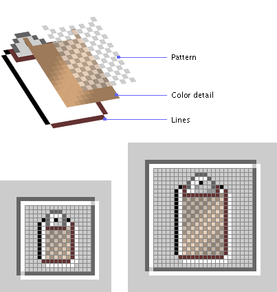
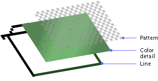
To achieve this effect, overlay a semitransparent checkerboard pattern on your graphics. The following figure shows how to build a graphic using this technique.
Figure 34 Adding a Pattern to Avoid Coarse Dithering Patterns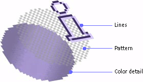
| 1. | Use a graphics application with layers. |
| 2. | Apply the pattern only to areas that might dither badly. Leave borders and other detail lines as solid colors. |
| 3. | Play with the transparency setting for the pattern layer until the pattern is dark enough to mix with the color detail without overwhelming it visually. A 25% transparency with the default secondary 2 color (RGB 153-153-153) produces a good result for most graphics. |
| 4. | Test your results on your target 8-bit platforms. |
The following table shows the variable results of graphic reproduction in 8-bit color, using different styles for various operating systems.
|
Styles |
Original Graphic |
Windows 95 (8 bits) |
Mac OS 8.5 (8 bits) |
CDE (8 bits) |
|---|---|---|---|---|
| Plain |
 |
 |
 |
 |
| Dithering added |
 |
 |
 |
 |
| Gradient |
 |
 |
 |
 |
| Dithering added to gradient |
 |
 |
 |
 |
The plain graphic in the preceding table, which uses a large area of a single web-safe color, dithers badly on Windows 95 and CDE. Adding a pattern to the plain color improves the appearance only slightly. A gradient effect is added to the graphic to add some visual interest; this produces a banding effect on Mac OS 8.5. Adding the dithered pattern produces good results on all three platforms with 8-bit color. In 16-bit and 24-bit color, the graphic reproduction is very close to, or exactly the same as, the originals.
Application graphics that you design fall into three broad categories:
|
Graphic Type |
Examples |
Basic 3D Style |
Pre-Dithered |
|---|---|---|---|
| Icons |
 |
 |
 |
| Button graphics |
 |
 |
 |
| Symbols |
 |
 |
 |
Use the GIF file format for iconic and symbolic graphics. It usually results in a smaller file size than the JPEG format and uses lossless compression.
Put all application graphics in resource bundles.
 Where possible, use globally understood icons, button graphics, and symbols. Where none exist, create them with input from international sources. If you can't create a single symbol that works in all cultures, define appropriate graphics for different locales (but try to minimize this task).
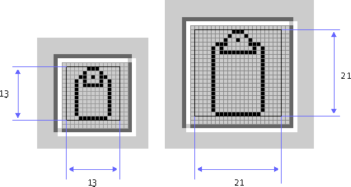
Icons typically represent containers, documents, network objects, or other data that users can open or manipulate within an application. An icon usually appears with identifying text.
The two standard sizes for icons are 16 x 16 pixels and 32 x 32 pixels. The smaller size is more common and is used in JFC components such as the internal frame (to identify the contents of the window or minimized internal frame) and tree view (for container and leaf nodes). You can use 32 x 32 icons for applications designed for users with visual impairments or for objects in a diagram, such as a network topology.
Design icons to identify clearly the objects or concepts they represent. Keep the drawing style symbolic, as opposed to photo-realistic. Too much detail can make it more difficult for users to recognize what the icon represents.
When designing large and small icons that represent the same object, make sure that they have similar shape, color, and detail.
Specify values for the accessibleDescription and accessibleName properties for each icon so that assistive technologies can find out what it is and how to use it.
The following figure shows sample 32 x 32 and 16 x 16 icons for files and folders drawn in two different styles. Note that many objects are difficult to draw in a flush 3D style, particularly at the smaller 16 x 16 size. Three visual elements appear in the sample icons: an interior highlight (to preserve the flush style used throughout the Java look and feel), a pattern to minimize dithering (described in Working With Available Colors), and a dark border.
Figure 35 Two Families of Icons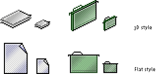
Use a single style to create a "family" of icons that utilize common visual elements to reflect similar concepts, roles, and identity. Icons in families might use a similar palette, size, and style.
Don't mix two- and three-dimensional styles in the same icon family.
For satisfactory display on a wide range of background colors and textures, use a clear, dark exterior border and ensure that there is no anti-aliasing or other detail around the perimeter of the graphic.
The following section uses a simple folder as an example of how to draw an icon. Before you start, decide on a general design for the object. In this example, a hanging file folder is used to represent a directory.
|
1. Draw a basic outline shape first.
Icons can use as much of the available space as possible, since they are displayed without borders. Icons should usually be centered horizontally in the available space. For vertical spacing, consider aligning to the baseline of other icons in the set, or aligning with text (for instance, in a tree). If both sizes are required, work on them at the same time rather than trying to scale down a detailed 32 x 32 icon later; both sizes then can evolve into designs that are recognizable as the same object. | |
2. Add some basic color (green is used here). |

|
|
3. Draw a highlight on the inside top and left. This practice creates the flush 3D style of the Java look and feel.
|
|
|
4. Add some detail to the icon. In this case, the crease or "fold" mark in the hanging folder is drawn. |
|
|
5. Try a gradient that produces a "shining" effect instead of the flat green. Here a dark green has replaced the black border on the right and bottom; black is not a requirement as long as there is a well-defined border.
|

|
|
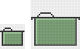
6. Add a pattern to prevent coarse dithering. This technique minimizes banding and dithering on displays with 256 or fewer colors (see Maximizing Color Quality). The first graphic is an exploded view of an icon that shows how the pattern is added.
|
|
|
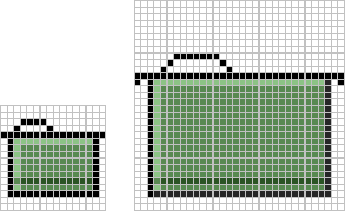
The next graphic shows an icon in which a pattern has been added to the color detail. |

|
|
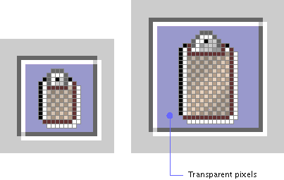
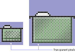
7. Define the empty area around the icon graphic (in which you have not drawn anything) as transparent pixels in the GIF file. This practice ensures that the background color shows through; if the icon is dragged to or displayed on a different background, the area surrounding it matches the color or pattern of the rest of the background.
|
|
Button graphics appear inside buttons--most often in toolbar buttons. Such graphics identify the action, setting, mode, or other function represented by the button. For instance, clicking the button might carry out an action (creating a new file) or set a state (boldfaced text).
The two standard sizes for button graphics are 16 x 16 pixels and 24 x 24 pixels. Either size (but not both at the same time) can be used in toolbars or tool palettes, depending on the amount of space available. For details on toolbars, see Toolbars. For more on palette windows, see Palettes.
If you include both text and graphics in a button, the size of the button will exceed 16 x 16 or 24 x 24 pixels. If the button size is an issue, consider using tool tips instead.
Do not include text as part of your button graphics (GIF files). Use button text instead. Keep the button text in a resource bundle to facilitate localization.
Note, however, that toolbar buttons can display text instead of graphics, particularly if your usability testing establishes that the action, state, or mode represented by the button graphic is difficult for users to comprehend. Tool tips for toolbar buttons can help clarify the meaning of a button. For details, see Tool Tips for Toolbar Buttons.
When designing your button graphics, clearly show the action, state, or mode that the button initiates.
Keep the drawing style symbolic; too much detail can make it more difficult for users to understand what a button does.
Use a flush 3D border to indicate that a button is clickable.
Draw a clear, dark border without anti-aliasing or other exterior detail (except the flush 3D highlight) around the outside of a button graphic.
The following figure shows sample button graphics designed for toolbars and for the contents of a tool palette.
Figure 36 Button Graphics for a Toolbar and a Tool Palette
Use a single style to create a "family" of button graphics with common visual elements. You might use a similar palette, size, and style for different button groups, such as toolbar buttons, toggle buttons, or command buttons. Review the graphics in context before finalizing them.
To produce the flush 3D effect, add an exterior white highlight on the outside right and bottom of the graphic and an interior highlight on the inside left and top.
Figure 37 Flush 3D Effect in a Button Graphic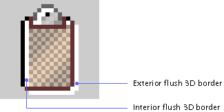
The size of a button graphic includes all the pixels within the border. As shown in the following illustration, horizontal and vertical dimensions are both either 24 or 16 pixels. The border abuts the button graphic (that is, there are no pixels between the border and the graphic).
Figure 38 Button Graphics With Borders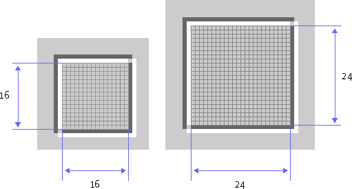
Determining the Primary Drawing Area
Because the white pixels in both the button border and the button graphic are less visually significant than the darker borders, the area used for most of the drawing is offset within the 16 x 16 or 24 x 24 space. The following illustration shows the standard drawing area for both button sizes. Note that the white highlight used to produce the flush 3D style in the button graphic might fall outside this area.
Figure 39 Primary Drawing Area in Buttons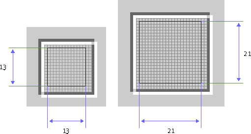
The following illustrations show 16 x 16 and 24 x 24 button graphics that use the maximum recommended drawing area. Notice that on all sides there are 2 pixels between the dark border of the button graphic and the dark portion of the button border.
Figure 40 Maximum-Size Button Graphics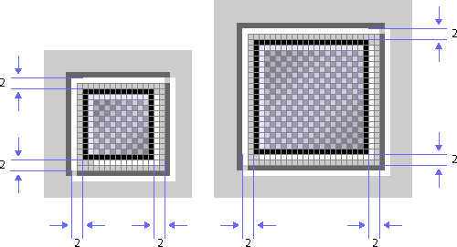
When drawing a button graphic, first decide on a general design that represents the action or setting activated by the button. In the following examples, a clipboard suggests the Paste command.
1. Decide which size you want to use for the button or toolbar graphic.
2. Draw a basic outline shape, taking care to remain within the primary drawing area.
3. Add some basic color.
4. Add the flush 3D effect by drawing highlights on the inside left and top, and on the outside bottom and right of the outline.
This is a good basic design, but because of the large area using a single color, the graphic lacks visual interest and might not reproduce well on some systems.
5. Try a gradient instead of the flat color.
6. Add a pattern. This technique minimizes banding and dithering on displays with 256 or fewer colors (see Maximizing Color Quality).
The first figure shows an exploded view of the button graphic without flush 3D highlights. The next figure shows the effect of the pattern on the color detail of the button graphic.
7. Define the empty area around your button graphic (in which you have not drawn anything) as transparent pixels in the GIF file.
This practice ensures that the background color shows through; if the theme changes, the area around the button graphic will match the rest of the background canvas in the interface.
Symbols include any small graphic (typically 48 x 48 pixels or smaller) that stands for a state or a concept but has no directly associated action or object. Symbols might appear within dialog boxes, system status alert boxes, and event logs. Saturated colors might be useful for status or warning symbols.
The examples in the following figure show the graphic from an Info alert box and a caution symbol superimposed on a folder icon to indicate a hypothetical state. The style for symbols is not as narrowly defined as that for icons and button graphics. The examples in the following figure use a flush or etched effect for interior detail but not for the border of the graphic.
Ensure adequate contrast between a warning symbol and the icon or background it appears against.
Application graphics present an excellent opportunity for you to enhance your corporate or product identity. This section presents information about installation screens, splash screens, About boxes, and login splash screens.
Note - The examples presented in this section use the sample text-editing and mail applications, MetalEdit and MetalMail. They are not appropriate for third-party use.
Use the JPEG file format for any photographic elements in your installation screens, splash screens, and About boxes.
Designing Installation Screens
An installation screen is a window containing images that are displayed in an application installer. Often the first glimpse users have of your application is the installer. Consequently, an installation screen introduces and reinforces your corporate and product identity. The number of screens in an installer can vary.
Use a plain window for installation screens, and draw any desired border inside the window.
Provide a clearcut way for your users to move through the steps required to perform the installation, and enable them to cancel or stop the installation at any point.
 The JWindow component is typically used to implement plain windows.
See Layout and Visual Alignment for general guidelines on how to arrange and align items.
A splash screen is a plain window that appears briefly in the time between the launch of a program and the appearance of its main application window. Nothing other than a blank space is included with a JFC-supplied plain window; you must provide the border and the contents of the splash screen. For instance, the black border on the window in the following figure is part of the GIF file supplied by the splash screen designer.
Figure 42 Splash Screen for MetalEdit
Although not required, splash screens are included in most commercial products. Splash screens typically have the following elements:
Check with your legal adviser about requirements for placing copyright notices or other legal information in your splash screens.
To get the black border that is recommended for splash screens, you must include a 1-pixel black border as part of the image you create.
The JWindow component, not the JFrame component, is typically used to implement the plain window that provides the basis for splash screens.
Designing Login Splash Screens
If your application requires users to log in, you might consider replacing the traditional splash screen with a login splash screen.
Figure 43 Login Splash Screen for MetalMail
The elements of this screen might include:
To save time and to increase the chance of users viewing a splash screen, it is a good idea to combine your login screen and your splash screen.
Provide a way for users to exit the login splash screen without first logging in.
The JDialog component, not the JWindow component, is typically used to implement a login splash screen.
An About box is a dialog box that contains basic information about your application.
Figure 44 About Box for MetalEdit
An About box might contain the following elements:
Because users typically display About boxes by choosing the About Application item from the Help menu, be sure that the About box is accessible while your application is running.
Because the dialog box title bar might not include a Close button on all platforms, include a Close button in your About boxes so that users can dismiss them after reading them. Follow the guidelines for button placement described in Spacing in Dialog Boxes.
|
java.sun.com :
|
Previous | Next | Contents | Index | Search |
Copyright 1999 Sun Microsystems, Inc. All Rights Reserved.