
|
|
|
Visual design and aesthetics affect user confidence in and comfort with your application. A polished and professional look without excess or oversimplification is not easy to attain. This chapter discusses these high-level, visual aspects of Java look and feel applications:
You can use the theme mechanism to control many of the fundamental attributes of the Java look and feel design, including colors and fonts. You might want to change the colors to match your corporate identity, or you might increase color contrast and font size to enable users with visual impairments to use your application. The theme mechanism enables you to specify alternative colors and fonts across an entire Java look and feel application.
 The technical documentation for the class javax.swing.plaf.metal.DefaultMetalTheme is available at the Swing Connection web site at http://java.sun.com/products/jfc/tsc.
If you want to change the color theme of your application, be sure that your interface elements remain visually coherent. The Java look and feel uses a simple color model so that it can run on a variety of platforms and on devices capable of displaying various depths of color. Eight colors are defined for the interface:
Within the primary and secondary color groups in the default theme, there is a gradation from dark (primary 1 and secondary 1) to lighter (primary 2 and secondary 2) to lightest (primary 3 and secondary 3).
The visual elements of Java look and feel applications use the primary colors as follows:
The usage is illustrated in the following figure.
Figure 23 Primary Colors in Default Color Theme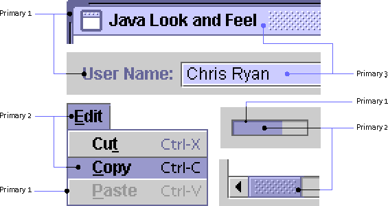
The visual elements of Java look and feel applications use the secondary colors as follows:
The usage is shown in the following figure.
Figure 24 Secondary Colors in Default Color Theme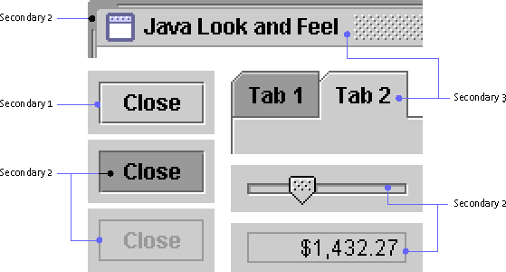
Black and white have defined roles in the Java look and feel color model. In particular, black appears in:
Default Java Look and Feel Theme
The following table summarizes the eight colors defined in the Java look and feel. It provides swatches and values representing each color in the default theme. It also gives details about the roles each color plays in basic drawing, three-dimensional effects, and text.
 Unless you are defining a reverse-video theme, maintain a dark-to-light gradation like the one in the default theme so that interface objects are properly rendered. To reproduce three-dimensional effects correctly, make your secondary 1 color darker than secondary 3 (the background color); make secondary 2 (used for highlights) lighter than the background color.
Ensure that primary 1 (used for labels) has enough contrast with the background color (secondary 3) to make text labels easily readable.
Redefinition of Colors
The simplest modification you can make to the color theme is to redefine the primary colors. For instance, you can substitute greens for the purple-blues used in the default theme, as shown in the following figure.
You can use the same value for more than one of the eight colors--for instance, a high-contrast theme might use only black, white, and grays. The following figure shows a theme that uses the same grays for primary 2 and secondary 2. White functions as primary 3 and secondary 3 as well as in its normal role.
Figure 26 High-Contrast Color Theme
As part of the theme mechanism and parallel to the color model, the Java look and feel provides a default font style model for a consistent look. You can use themes to redefine font typefaces, sizes, and styles in your application. The default Java look and feel theme defines four type styles: the control font, the system font, the user font, and the small font. The actual fonts used vary across platforms.
The following table shows the mappings to Java look and feel components for the default theme.
To ensure consistency, ease of use, and visual appeal, use the supplied default fonts unless there is compelling reason for an application-wide change (such as higher readability). Use the theme mechanism if you do make modifications.
Do not write font sizes or styles directly into your application source code. Some users might be able to read print only with a screen reader or a magnifier.
Use the appropriate layout manager to ensure that the layout of your application can handle different font sizes.
 Ensure that the font settings you choose are legible and can be rendered well on your target systems.
In the default theme, six methods are used to return references to the four type styles. The getControlTextFont, getMenuTextFont, and getWindowTitleFont methods return the control font; getSystemTextFont returns the system font; getUserTextFont returns the user font; and getSubTextFont returns the small font.
All fonts in the Java look and feel are defined in the default Java look and feel theme as Dialog, which maps to a platform-specific font.
This section describes standards for the capitalization of text in the Java look and feel. Text is an important design element and appears throughout your application in such components as command buttons, checkboxes, radio buttons, alert box messages, and labels for groups of interface elements. Strive to be concise and consistent with language.
For all text that appears in the interface elements of your application, follow one of two capitalization conventions: headline capitalization or sentence capitalization. Use headline capitalization for most names, titles, labels, and short text. Use sentence capitalization for lengthy text messages.
Do not capitalize words automatically. You might encounter situations in your interface when capitalization is not appropriate, as in window titles for documents users have named without using capitalization.
 Use standard typographical conventions for sentences and headlines in your application components. Let translators determine the standards in your target locales.
Place all text in resource bundles so that localization experts don't have to change your application's source code to accommodate translation.
Headline Capitalization in English
Most items in your application interface should use headline capitalization, which is the style traditionally used for book titles (and the section titles in this book). Capitalize every word except articles ("a," "an," and "the"), coordinating conjunctions (for example, "and," "or," "but," "so," "yet," and "nor"), and prepositions with fewer than four letters (like "in"). The first and last words are always capitalized, regardless of what they are.
Use headline capitalization for the following interface elements (examples are in parentheses):
If your tool tips are longer than a few words, sentence capitalization is acceptable. Be consistent within your application.
Sentence Capitalization in English
When text is in the form of full sentences, capitalize only the first word of each sentence (unless the text contains proper nouns, proper adjectives, or acronyms that are always capitalized). Avoid the use of long phrases that are not full sentences.
Use sentence capitalization in the following interface elements (examples are in parentheses):
Give careful consideration to the layout of components in your windows and dialog boxes. A clear and consistent layout streamlines the way users move through an application and helps them utilize its features efficiently. The best designs are aesthetically pleasing and easy to understand. They orient components in the direction in which people read them, and they group together logically related components.
Note - Throughout this book, the spacing illustrations for all user interface elements use pixels as the unit of measurement. A screen at approximately 72 to 100 pixels per inch is assumed.
When you lay out your components, remember that users might use the mouse, keyboard, or an assistive technology to navigate through them; therefore, use a logical order (for instance, place the most important elements within a dialog box first in reading order).
Between-Component Padding and Spacing Guidelines
Use multiples of 6 pixels for perceived spacing between components. If the measurement involves a component edge with a white border, subtract 1 pixel to arrive at the actual measurement between components (because the white border on active components is less visually significant than the dark border). In these cases, you should specify the actual measurement as 1 pixel less--that is, 5 pixels between components within a group and 11 pixels between groups of components.
Note - Exceptions to these spacing guidelines are noted in the relevant component chapters in Part III. For instance, the perceived spacing between toolbar buttons is 3 pixels, whereas the actual spacing is 2 pixels.
In the following figure, a perceived 6-pixel vertical space is actually 5 pixels between checkbox components. The figure also shows how the perceived spacing between inactive objects is preserved. Note that the dimensions of inactive components are the same as active objects, although the white border of active objects is replaced by an invisible 1-pixel border on the bottom and right side of inactive objects.
Figure 27 Perceived and Actual Spacing of Active and Inactive Components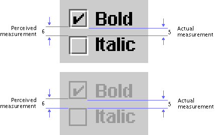
Insert 5 pixels (6 minus 1) between closely related items such as grouped checkboxes. Insert 11 pixels (12 minus 1) for greater separation between sets of components (such as between a group of radio buttons and a group of checkboxes). Insert 12 pixels between items that don't have the flush 3D border highlight (for instance, text labels, titled borders, and padding at the top and left edges of a pane).
For guidelines on the spacing of individual JFC components with the Java look and feel, see Toolbar Button Spacing and Padding, Command Button Spacing, Radio Button Spacing, and Checkbox Spacing.
The most effective method of laying out user interface elements is to use a design grid with blank space to set apart logically related sets of components. A grid divides the available space into areas that can help you to arrange and align components in a pleasing layout. Grids make it easy for users to see the logical sequence of tasks and to understand the relationships between sets of components.
The following illustration shows a sample grid that provides standard margins and divides the remaining space into five columns. Horizontal divisions aid in scanning and interpreting the components and sets of related options.
Use the appropriate layout manager to control horizontal space for the variable width of internationalized text strings.
Figure 28 Grid With Horizontal Divisions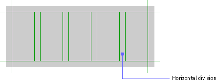
You can use the number and width of components and their associated labels to determine the number of columns in a grid. At the beginning of the design process, vertical divisions are more difficult to set because they depend on the depth of components and sets of components, which are not yet placed.
Developing a grid is an ongoing process. If you know how much space is available, you can start working with the components to determine the most effective use of space. A grid can also help you to determine how much space to allocate to a given set of components. If you can define a grid that will work for a number of layouts, your application will have a more consistent appearance.
For spacing between rows and columns, use multiples of 6 pixels minus 1, to allow for the flush 3D border (see Between-Component Padding and Spacing Guidelines).
Design grids are not to be confused with the AWT Grid Layout Manager.
Layout of a Simple Dialog Box
The following illustrations show steps in the process of using a grid to lay out a simple find dialog box.
First, determine the functional requirements. Then add the components according to the Java look and feel placement and spacing standards. For instance, you must right-align command buttons in dialog boxes at the bottom and separate them vertically from the rest of the components by 17 pixels.
Figure 29 Vertical Separation of Command Buttons
Using the grid as a guide, add the rest of the components. Place the most important options, or those you expect users to complete first, prior to others in reading order.
In the following illustration, the most important option--the text field for the search string--has been placed first. Related options are aligned with it along one of the column guides. Spacing between components and groups of components follows the Java look and feel standards.
Figure 30 Vertical Separation of Component Groups
The JFC enables you to specify a titled border for panels, which you can use as containers for components inside your application's windows.
Figure 31 Spacing for a Panel With Titled Border
Since titled borders take up considerable space, do not use them to supply titles for components; use labels instead.
Use a titled border in a panel to group two or more sets of related components, but do not draw titled borders around a single set of checkboxes or radio buttons.
Use titled borders sparingly: they are best when you must emphasize one group of components or separate one group of components from other components in the same window. Do not use multiple rows and columns of titled borders; they can be distracting and more confusing than simply grouping the elements with a design grid.
Never nest titled borders. It becomes difficult to see the organizational structure of the panel and too many lines cause distracting optical effects.
Insert 12 pixels between the edges of the panel and the titled border. Insert 12 pixels between the bottom of the title and the top of the first label (as well as between the label and the components) in the panel. Insert 11 pixels between component groups and between the bottom of the last component and the lower border.
Allow for internationalized titles and labels in panels that use titled borders.
A titled border can be created as follows:
myPanel.setBorder(new TitledBorder(new LineBorder
(MetalLookAndFeel.getControlShadow()),
"<< Your Text Here >>"));
Text is an important design element in your layouts. The way you align and lay out text is vital to the appearance and ease of use of your application. The most significant layout issues with respect to text are label orientation and alignment.
Use language that is clear, consistent, and concise throughout your application text. Moreover, ensure that the wording of your labels, component text, and instructions is legible and grammatically correct.
Label Orientation
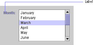
You indicate a label's association with a component when you specify its relative position. Hence, consistency and clarity are essential. In the following figure, the label appears before and at the top of the list in reading order.
In general, orient labels before the component to which they refer, in reading order for the current locale. For instance, in the U.S. locale, place labels above or to the left of the component. Positioning to the left is preferable, since it allows for separation of text and components into discrete columns. This practice helps users read and understand the options.
Label Alignment
Between components, alignment of multiple labels becomes an issue. Aligning labels to a left margin can make them easier to scan and read. It also helps to give visual structure to a block of components, particularly if there is no immediate border (such as a window frame) surrounding them. If labels vary greatly in length, the use of right alignment can make it easier to determine the associated component; however, this practice also introduces large areas of negative space, which can be unattractive. The use of concise wording in labels can help to alleviate such difficulties. For an example of right-aligned labels in an applet, see Figure 12.
Align labels with the top of associated components.
Avoid the use of titled borders as organizing elements. They add clutter reduce readability, and compound alignment problems by introducing the title as an additional text label. Instead, use design grids and careful alignment of labels to give visual structure to your layouts.
To accommodate differences in languages, decide on the behavior you want to occur during resize operations. Be specific about layout, spacing, and ordering. Use the layout managers to accommodate these differences.
Since the length and height of translated text varies, use layout managers properly to allow for differences in labels.
If used appropriately, animation has great potential to be a useful and attractive part of a user interface. You can use animation to let users know that the system is busy with a task or to draw attention to important events.
Do not overuse animation since it distracts users and draws attention away from other elements of your application.
Screen readers, which are used by people with visual impairments, do not recognize images that move. Use the accessibleDescription field to describe what is represented by the animation.
Animation is especially useful when you want to communicate that the system is busy. Progress indication shows users the state of an operation; delay indication lets users know that an application or a part of an application is not available until an operation is done.
Properly used, animation can be of minimal disruption to the user. Feedback lets users know the application has received their input and is operating on it.
When the application is processing a long operation and users can continue to work in other areas of the application, provide them with information regarding the state of the process.
During a long operation, when users must wait until the operation is complete, change the shape of the pointer.
For example, an application's pointer might change to the wait pointer after the user selects a file and before the file opens. For information on the JFC-supplied pointer shapes available in the Java look and feel, see Table 7.
If you know the estimated length of an operation (for example, if the user is copying files) or the number of operations, use the Java look and feel progress bar. This bar fills from left to right as the operation progresses, as shown in the following figure.
Figure 33 Animation in a Progress Dialog Box
For more on progress bars, see Progress Bars.
Another way to indicate delay is to use animated pointers, which are supported by the Java 2 platform. Instead of just changing to a wait pointer, you can go one step further by animating the pointer image while the system is busy.
Animation is useful when you want to call attention to events. For instance, in a mail application, you might use animation to indicate that new mail has arrived. Another example is a monitoring system that uses animation to alert users when failures occur.
When creating system status animation, consider the target users and their environment. If the animation needs to be visible from across the room, a bolder animation coupled with sound might be just the right thing. On the other hand, that same animation viewed by a user sitting at the workstation would be annoying.
When feasible, let users configure system status animation, so they can adapt their systems to the environment.
|
java.sun.com :
|
Previous | Next | Contents | Index | Search |
Copyright 1999 Sun Microsystems, Inc. All Rights Reserved.