
|
|
|
Buttons, combo boxes, and sliders are examples of controls--interface elements users can manipulate to perform an action, select an option, or set a value. A button is a control that users click to perform an action, set or toggle a state, or set an option. In the Java look and feel, buttons include command and toggle buttons, toolbar buttons, checkboxes, and radio buttons. A combo box is a control that enables users to select one option from an associated list; users can also type a choice into an editable combo box. A slider is a control that enables users to set a value in a range.
A progress bar is an interface element that indicates one or more operations are in progress and shows users what proportion of the operation has been completed. In contrast to the other components in this chapter, no user manipulation is involved.
Figure 113 Buttons, Combo Box, Slider, and Progress Bar
 For text in buttons, sliders, and combo boxes, use headline capitalization.
 Make sure you use the appropriate layout manager to lay out your controls so they allow for the longer text strings frequently associated with localization.
A command button is a button with a rectangular border that contains text, a graphic, or both. These buttons typically use button text, often a single word, to identify the action or setting that the button represents. See Command Buttons in Dialog Boxes for a list of commonly used command button names and their recommended usage.
Command buttons can stand alone or appear in a row, as shown in the following illustration.
Command buttons that appear in toolbars are called "toolbar buttons." The following figure shows toolbar buttons for a text-editing application. See Toolbar Buttons for details.
When a command button is unavailable, the dimmed appearance indicates that it cannot be used. The following figure shows the appearance of available, pressed, and dimmed command buttons.
Figure 116 Available, Pressed, and Unavailable Command Buttons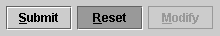
Users can click command buttons to specify a command or initiate an action, such as Save, Cancel, or Submit Changes.
For a list of keyboard operations for the activation of command buttons, see Table 15.
Display mnemonics in button text, with the exception of default command buttons and the Cancel button in dialog boxes. To make command buttons without text more accessible, set tool tips that describe or name the functions of the buttons.
For general details on keyboard operations and mnemonics, see Keyboard Operations and Mnemonics. For details on displaying a command button's tool tip, see Table 30.
For details on layout and spacing of command buttons, see Command Button Spacing.
One of the buttons in any window can be the default command button. The JFC gives default command buttons a heavier border.
Default command buttons typically appear in dialog boxes. The default command button is activated when users press Return or Enter. A default command button (such as Save in the following figure) should represent the action most often performed, assuming that the action will not lead to loss of user data.
Figure 117 Default and Nondefault Command Buttons
The Enter and Return equivalents work unless keyboard focus is currently on a component that accepts the Enter or Return key. For instance, if the insertion point is in a multiline text area and the user presses Return, the insertion point moves to the beginning of a new line rather than activating a default button. Keyboard focus must be moved to another component before the default button can be activated with the keyboard.
The JFC does not automatically implement the Escape key as the keyboard equivalent for the Cancel button, so you must implement this behavior. As with the Enter and Return keys for the default command button, the Cancel button should not require keyboard focus to be activated by the Escape key.
Since you are not required to have a default button in every circumstance, you can use discretion about including them in your interface elements.
Never make an unsafe choice the default button. For instance, a button that would result in discarding unsaved changes should not be the default command button.
Do not supply mnemonics for the default and Cancel buttons.
Combining Graphics With Text in Command Buttons
In some circumstances, you might use a graphic along with text to identify the action or setting represented by a command button.
Figure 118 Command Buttons Containing Both Text and Graphics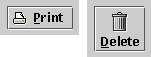
Place the text after or below the image in command buttons containing both text and graphics.
Include mnemonics in your command button text--with the exception of the default and Cancel buttons.
For a list of commonly used mnemonics, see Table 10.
Using Ellipses in Command Buttons
In circumstances in which a command button does not fully specify an action or operation and a dialog box finishes the specification, you can notify the user that this situation is about to occur by placing an ellipsis mark after the button text. For example, after clicking a Print... button, users are presented with a dialog box in which to specify printer location, how many copies to print, and so forth. By contrast, a Print command that prints one copy to the default printer without displaying a dialog box would not require an ellipsis mark.
When users must view a dialog box to finish the specification of a command initiated in a command button, use an ellipsis mark (...) after the button text. When a full specification of the command is made in the button text, do not use ellipses.
For a consistent appearance, follow the guidelines described in this section to create padding within and space between command buttons. The following figure shows button text (Help) centered in a command button.
Center the button text within buttons.
Figure 119 Command Button Text With Centered Text
Since the length and height of translated text varies, use layout managers properly to allow for differences.
The blank space between the button text and the button border is referred to as "command button padding." Often command buttons appear in groups within a dialog box or an applet. In such a case, the button in the group with the widest text determines the inner padding, as shown in the following figure. Here the Cancel button has the widest text. The padding is 12 pixels on either side of the button text. The other buttons in the group (OK and Help) have the same width as the Cancel button.
Determine which button has the widest button text, and insert 12 pixels of padding on either side of the text. Make all the remaining buttons in the group the same size as the button with the longest text.
Space buttons in a group 5 pixels apart. (Because of the white border on the right side of a button, the apparent spacing will be 6 pixels.)
Figure 120 Spacing in Command Button Groups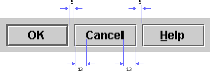
A toggle button is a button that represents a setting with two states--on and off. Toggle buttons look similar to command buttons and display a graphic or text that identifies the button. The graphic or button text should remain the same whether the button is in the on or off state.
Users can click toggle buttons to turn a setting on or off--for instance, to toggle between italic and plain style in selected text.
You can use toggle buttons to represent an independent choice, like checkboxes (see here), or an exclusive choice within a set, like radio buttons (see here).
 Toggle buttons can be placed in a button group to get radio button behavior.
An independent toggle button behaves like a checkbox. Whether it appears alone or with other buttons, its setting is independent of other controls. An example of an independent toggle button is a Bold button on a toolbar, as shown in the following illustration.
Figure 121 Independent Toggle Buttons in a Toolbar
When users click the Bold button, it is highlighted to indicate that the bold style has been applied to the selection or that text to be entered will be bold. If the button is clicked again, it reverts to the normal button appearance and the bold style is removed from the selection.
Although checkboxes and independent toggle buttons have the same function, as a general rule, use checkboxes in dialog boxes and toggle buttons with a graphic in toolbars.
When toggle buttons are independent (like checkboxes) and used outside a toolbar, separate them with 5 pixels. Within a toolbar, separate independent toggle buttons by 2 pixels.
For details on the spacing of toggle buttons, see Command Button Spacing.
A toggle button can also work as part of a group to represent an exclusive choice within the set. A common example is a set of toolbar toggle buttons representing left, centered, and right text alignment along with justification, as shown in the following figure.
Figure 122 Standard Separation of Exclusive Toggle Buttons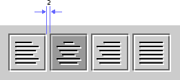
If users click the button representing left alignment, the button is highlighted to indicate that text is aligned flush with the left border of the document. If users then click the button representing centered alignment, the appearance of the Align Left button reverts to the normal button appearance and the Center button is highlighted to indicate centered alignment of the selected text.
You can use grouped toggle buttons with labels equally well in toolbars or dialog boxes. In the following example, the label identifies the abbreviations in the button text in a dialog box.
Figure 123 Grouped Toggle Buttons With a Label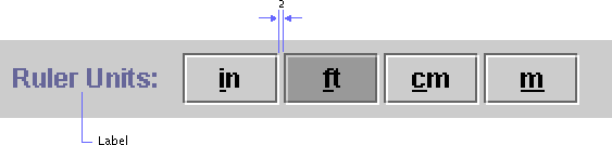
When toggle buttons form a radio set, separate them with 2 pixels.
A checkbox is a control that represents a setting or value with an on or off choice. The setting of an individual checkbox is independent of other checkboxes--that is, more than one checkbox in a set can be checked at any given time.
A check mark within the checkbox indicates that the setting is selected. The following figure shows both active and inactive checkboxes in selected and nonselected states.
When the user clicks a checkbox, its setting toggles between off and on. When a checkbox is disabled, the user cannot change its setting.
For a list of keyboard operations for checkboxes, see Table 13.
Use the checkbox graphic that is supplied with the component (the square box with the check mark inside).
Display checkbox text to the right of the graphic unless the application is designed for locales with right-to-left writing systems, such as Arabic and Hebrew. In this case, display the text to the left of the graphic.
Although checkboxes and independent toggle buttons have the same function, use checkboxes in dialog boxes and use toggle buttons with a graphic in toolbars.
The setMnemonic method can be used to specify mnemonics in checkboxes.
In addition to standard checkboxes, the JFC includes a component that is the functional equivalent of the checkbox for use in menus. See Checkbox Menu Items for more information.
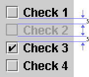
This section provides the spacing guidelines for checkbox components. As shown in the following figure, the height of the checkbox square doesn't change in an inactive checkbox even though the white highlight border is not drawn. Hence, while the checkbox is the same size, the last row and column of pixels on the bottom and right are the same color as the background canvas. The apparent spacing is 6 pixels between components; however, the actual spacing is 5 pixels.
Space checkboxes 5 pixels apart.
Use the appropriate layout manager to achieve consistent spacing in checkbox button groups.
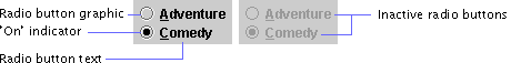
A radio button represents an exclusive choice within a set of related options. Within a set of radio buttons, only one button can be on at any given time. The following figure shows active radio buttons and inactive radio buttons in both on and off states.
When users click a radio button, its setting is always set to on. An inner filled circle within the round button indicates that the setting is selected. If another button in the set has previously been selected, its state changes to off. When a radio button is inactive, users cannot change its setting.
For a list of keyboard operations for radio buttons, see Table 21.
Use the supplied radio button graphics (the open buttons with inner filled circles).
Display radio button text to the right of the graphic unless the application is designed for locales with right-to-left writing systems, such as Arabic and Hebrew. In those locales, place the text to the left of the graphic.
Although radio buttons and toggle buttons in a radio set have the same function, use radio buttons in dialog boxes and use grouped toggle buttons with graphics in toolbars. Grouped toggle buttons with text identifiers work well in either situation.
The JFC includes a component that is the functional equivalent of the radio button for use in menus. See Radio Button Menu Items for more information.
This section provides guidelines for the spacing of radio buttons. The height of the radio button is 12 pixels, not counting the white highlight border. Inactive radio buttons do not have white borders. Hence, while the radio button is the same size, the last row and column of pixels on the bottom and right are the same color as the background canvas. As shown in the following figure, the apparent spacing is 6 pixels between components; however, the actual spacing is 5 pixels.
Figure 127 Radio Button Spacing
Space radio buttons 5 pixels apart, as shown in the preceding figure.
Use the appropriate layout manager to achieve consistent spacing in radio button groups.
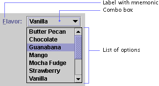
A combo box is a component with a drop-down arrow that users click to display an associated list of choices. If the list is too long to display fully, a vertical scrollbar appears.
The currently selected item appears in the combo box. As users move the pointer over the list, each option under the pointer is highlighted. An option chosen from the list will replace the current selection. In the following figure, the currently selected option is Vanilla, and the Guanabana option will replace Vanilla when the combo box is closed.
Users can close either editable or noneditable combo boxes by clicking the drop-down arrow in the combo box again, choosing an item from the list, or clicking anywhere outside the combo box.
For a list of keyboard operations appropriate for combo boxes, see Table 14.
You can use combo boxes to provide a way for users to indicate a choice from a set of mutually exclusive options. Noneditable combo boxes enable users to choose one item from a limited set of items. Editable combo boxes provide users the additional option of typing in an item.
Use headline capitalization for the text in the items in the combo box list.
To facilitate keyboard access, provide labels with mnemonics for combo boxes.
 In the JFC, the term "combo box" includes both of what Microsoft Windows applications call "list boxes" and "combo boxes."
Noneditable combo boxes (sometimes called "list boxes" or "pop-up menus") display a list from which users can select one item.
The following figure shows a noneditable combo box with a drop-down arrow to the right of the currently selected item. (Note the gray background in the default Java look and feel theme, indicating that users cannot edit text.)
Figure 129 Noneditable Combo Box
To make a selection, users have two options:
In either case, the currently selected item changes to reflects the choice.
You can use a noneditable combo box instead of a group of radio buttons or a list if space is limited in your application.
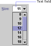
Editable combo boxes combine a text field with a drop-down arrow that users click to display an associated list of options. As shown in the following figure, editable combo boxes initially appear as editable text fields with a drop-down arrow. The white background of the editable combo box indicates that users can type, select, and edit text.
To make a choice, users have three options:
You can use an editable combo box to save users time by making the most likely menu choices available while still enabling users to type other values in the text field. An example might be the specification of a font size. The combo box might initially display the current size, say 12. Users could select from a list of standard sizes (10, 12, 14, 18, or 24 points) or type in their own values--for instance, 22 points.
Whenever possible, interpret user input into an editable combo box in a case-insensitive way. For example, it should not matter whether the user types Blue, blue, or BLUE.
You can specify the maximum number of items to be displayed before a scrollbar appears.
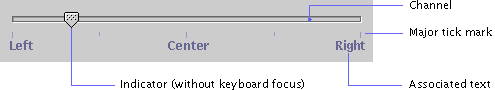
A slider is a control that is used to select a value from a continuous or discontinuous range. The position of the indicator reflects the current value. Major tick marks indicate large divisions along the range of values (for instance, every ten units); minor tick marks indicate smaller divisions (for instance, every five units).
The default slider in the Java look and feel is a nonfilling slider. An example is a slider that adjusts left-right balance in a stereo speaker system, as shown in the following figure.
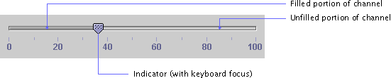
A filling slider is also available. The filled portion of the channel, shown in the following figure, represents the range of values below the current value.
Users can drag the indicator to set a specific value or click the channel to move back and forth by one unit. Sliders can represent a series of discrete values, in which case the indicator snaps to the value closest to the end point of the drag operation.
For a list of keyboard operations for sliders, see Table 23.
If the slider represents a continuous range or a large number of discrete values and the exact value that is chosen is important, provide a text field where the chosen value can be displayed. For instance, a user might want to specify an annual retirement savings contribution of 2.35%. In such a situation, consider making the text field editable to give users the option of typing in the value directly.
The JSlider.isFilled client property can be used to enable the optional filling slider.
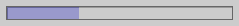
A progress bar indicates that one or more operations is under way and shows users what proportion of the operation has been completed. The progress bar consists of a rectangular bar that fills as the operation progresses, as shown in the following figure.
Users cannot interact with a progress bar. If you would like to enable users to set a value in a range, use the slider component, described here.
You can orient the progress bar horizontally, so it fills from left to right, or vertically, so it fills from bottom to top. Within the bounds of the progress bar, you can display a text message that is updated as the bar fills. By default, the message shows the percentage of the process completed--for example, 25%.
The following figure shows another use of the progress bar. In this example of a process control application, the progress bar is not used to track the progress of an operation; rather, it is used as a gauge to show the temperature of a vat in a candy factory. The temperature indicates the proportion of the maximum temperature that has been reached (more than three-quarters), and the text message within the progress bar specifies the exact value (114 degrees).
Figure 134 Text Inside a Progress Bar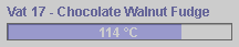
If you create your own message to display inside the progress bar, make it concise.
|
java.sun.com :
|
Previous | Next | Contents | Index | Search |
Copyright 1999 Sun Microsystems, Inc. All Rights Reserved.

