
|
|
|
Text components enable users to view and edit text in an application. The simplest text component you can provide is a label, which presents read-only information. A label is usually associated with another component and describes its function. A text field is a rectangular area that displays a single line of text, which can be editable or noneditable. A password field is an editable text field that displays masking characters in place of the characters that the user types.
Other text components display multiple lines of text. A text area displays text in a single font, size, and style. You can configure an editor pane to display different types of text through the use of a plug-in editor. These editors include a plain text editor, a styled text editor, an RTF (rich text format) editor, and an HTML (Hypertext Markup Language) editor.
 Make your text easier to localize by using resource bundles. A resource bundle stores text separately so that localizers don't have to change the application's source code to accommodate translation.
For guidelines on translating text, see Planning for Internationalization and Localization.
A label consists of read-only text, graphics, or both. Labels serve two functions in an application: to identify components and to communicate status and other information. Users cannot select a label.
You can associate a label with a component (such as a text field, slider, or checkbox) to describe the use of the component. In the following figure, the Salary Contribution: label lets users know they can use the slider to adjust their salary contribution.
Figure 136 Label That Describes the Use of a Slider
You can also use a label to describe a group of components. In the following figure, the Color: label describes a group of three radio buttons. The text (Red, Yellow, and Blue) is part of the radio buttons and not a separate component, as is the Color: label.
Figure 137 Label That Describes a Radio Button Group
 Keep the text of the label brief, and use terminology that is familiar to users.
Active and Inactive Labels
You can make a label active or inactive so that its state is the same as the component it describes. Active labels are drawn in the primary 1 color defined in the application's color theme. Inactive labels are drawn in the secondary 2 color defined in the application's color theme. The following figure shows an active and inactive label.
Figure 138 Active and Inactive Labels
Make a label inactive when the component it describes is inactive.
Spacing, Position, and Capitalization of Labels
The following figure shows the recommended spacing, position, and capitalization of labels.
Figure 139 Spacing Between a Label and a Component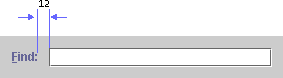
Insert 12 pixels between a label and the component it describes when labels are right aligned. When labels are left aligned, insert 12 pixels between the longest label and its associated component.
Display a label before or above the component it describes. For languages that read from left to right, "before" is to the left of the component.
Use headline capitalization in the label text and place a colon at the end of the text.
For more information on aligning labels in the user interface, see Text Layout. For more information on capitalization, see Capitalization of Text in the Interface.
You can specify a mnemonic for a label. When the mnemonic is activated, it gives focus to the component that the label describes. This technique is often used with a label that accompanies an editable text field. In the following figure, the text field gets focus when users press Alt-N.
Figure 140 Label With a Mnemonic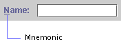
If you can't add a mnemonic directly to the component that requires one, as in the case of an editable text field, place the mnemonic in the component's label.
 The displayedMnemonic property can be used to specify the mnemonic in a label.
The labelFor property can be used to associate a label with another component so that the component gains focus when the label's mnemonic is activated.
Labels That Communicate Status and Other Information
You can use a label to communicate status or give instructions to users. In addition, you can instruct your application to alter a label to show a change in state. The progress bar in the following figure uses two labels that change as the operation progresses. The application changes the top label to reflect the file currently being copied, and it updates the bottom label as the progress bar fills.
Figure 141 Labels That Clarify the Meaning of a Progress Bar
Use sentence capitalization in the text of a label that communicates status.
A text field is a rectangular area that displays a single line of text. A text field can be editable or noneditable.
In a noneditable text field, users can select and copy text, but they cannot change it. Only the application can change the contents of a noneditable text field. The background of a noneditable text field is the secondary 3 color defined in the application's color theme. In the default theme, the background color is gray, as shown in the following figure.
Figure 142 Noneditable Text Field
In an editable text field, users can type or edit a single line of text. For example, a find dialog box has a text field in which users type a string for which they want to search. A text field has keyboard focus when it displays a blinking bar that indicates the insertion point. When users type in text that is too long to fit in the field, the text scrolls horizontally. By default, the background of an editable text field is white.
The following figure shows an editable text field with keyboard focus. The Language: label is a separate component from the text field.
Figure 143 Editable Text Field With Blinking Bar
In an editable text field, users can:
The following figure shows a text field with the letters Jeffer selected. The insertion point is at the end of the selected text and indicates that the text field has keyboard focus. The selected text is overwritten when the user types or pastes new text.
Figure 144 Editable Text Field With Selected Text
To associate a mnemonic with a text field, you must give the text field a label. You can then assign a mnemonic to the label, and make the mnemonic give focus to the text field. For details, see Mnemonics in Labels. For keyboard operations appropriate to text fields, see Table 28.
Depending on the type of data, you might be able to check individual characters for errors as they are typed--for example, if users try to type a letter into a text field that should contain only numbers. In this case, do not display the character in the field. Instead, sound the system beep. If the user types three illegal characters in a row, post an Error alert box that explains the legal entries for the text field.
If you plan an action based on the string in the text field (such as searching for the string or performing a calculation) do so when users signify that they have completed the entry by typing Enter or Return or by moving keyboard focus outside the text field.
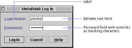
The password field is an editable text field that displays a masking character instead of the characters that users type. Asterisks are displayed in the password field by default. You can designate any Unicode character as the masking character (but make sure the character is available in the current font).
The password field is commonly used in a login dialog box, as shown in the following figure. The Password: label is a separate component from the password field.
A password field provides users some of the same editing capabilities as an editable text field, but not the cut and copy operations. For keyboard operations appropriate to password fields, see Table 28.
The setEchoChar method can be used to change the masking character--for example, from asterisks to pound signs.
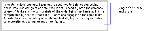
A text area provides a rectangular space in which users can view, type, and edit multiple lines of text. The JFC renders such text in a single font, size, and style, as shown in the following figure.
Users can type and replace text in a text area. See Text Fields for a description of text-editing features supplied by the JFC. For keyboard operations appropriate to text areas, see Table 27.
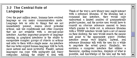
You can enable word wrap so that the text wraps to the next line when it reaches the edge of the text area, as shown in the preceding figure. You can enable scrolling by placing the text area inside a scroll pane. In this case, the text scrolls horizontally and vertically when it is too long to fit in the text area.
The following figure shows a text area inside a scroll pane. For information on scrolling, see Scroll Panes.
Figure 147 Text Area in a Scroll Pane
The lineWrap and wrapStyleWord properties of the text area can be set to true to enable word wrap on word boundaries.
An editor pane is a multiline text pane that uses a plug-in editor kit to display a specific type of text, such as RTF (rich text format) or HTML (Hypertext Markup Language). An editor kit is capable of displaying all fonts provided in the AWT. The JFC provides four kits that you can plug into an editor pane:
You can also create your own editor kit or use a third-party editor kit. For an example of how to create an editor kit, see Java Swing by Robert Eckstein, Marc Loy, and Dave Wood.
The setEditable method can be used to turn text editing on or off in an editor kit.
You can use the default editor kit to display text in a single font, size, and style. This kit is functionally equivalent to a text area.
You can use a styled text editor kit to display multiple fonts, sizes, and styles, as shown in the following figure. You can also embed images and components (such as tables) in a styled text editor kit.
Figure 148 Styled Text Editor Kit
You can use an RTF editor kit to read, write, and display RTF text, as shown in the following figure. The RTF editor kit also provides the capabilities provided by the styled editor kit.
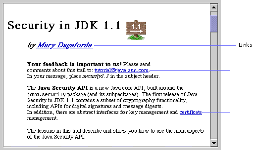
You can use an HTML editor kit to display text in HTML 3.2. Users can click a link on the HTML page to generate an event, which you can use to replace the contents in the pane.
|
java.sun.com :
|
Previous | Next | Contents | Index | Search |
Copyright 1999 Sun Microsystems, Inc. All Rights Reserved.