
|
|
|
Lists, tables, and trees provide a way to organize related information so users can easily make comparisons of the data. A list is a one-dimensional arrangement of data, and a table is a two-dimensional arrangement of data. A tree view is an outline of hierarchical relationships.
Figure 151 List, Table, and Tree View
A list displays a set of items, which can be text, graphics, or both. You can use a list to present users with a set of exclusive or nonexclusive choices. For example, you might use a list to present the days of the week, from which users could choose one day on which to start their calendars. Or, you might use a list to display pizza toppings, from which users could make several selections, as shown in the following figure.
For other components that enable users to select one item from a limited set of items, see Noneditable Combo Boxes and Radio Buttons. For a component that enables users to select one item from a limited set of items or type in an alternative item, see Editable Combo Boxes. For a component that enables users to select one value from a continuous or discontinuous range of values, see Sliders.
For the keyboard operations appropriate for lists, see Table 19.
 When resizing a list, be sure that it always displays a whole number of lines.
You can provide vertical and horizontal scrolling of the items in a list by placing the list inside a scroll pane. Users can then scroll the list as described in Scroll Panes.
If you place a list in a scroll pane, make the vertical and horizontal scrollbars appear only when needed. This behavior is the default behavior of scroll panes.
The JFC provides three selection models that you can use to enable users to select list items: single item, single range, and multiple ranges. Single-item selection provides users with an exclusive choice. Single-range and multiple-range selection provide users with nonexclusive choices.
You can enable users to select a single item by clicking it. The item gets keyboard focus. The prior selection, if any, is deselected. In the following figure, the user has selected Pepperoni.
Figure 153 Single-Item Selection in a List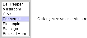
You can enable users to select a single item or a range of items. Users select an item by clicking it. The item gets keyboard focus and becomes the anchor point of the selection. Users extend the selection by moving the pointer to another item and Shift-clicking. In the following figure, the user first clicked Sausage and then Shift-clicked Pineapple.
Figure 154 Range of Selected Items in a List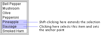
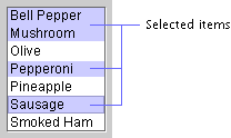
You can enable users to select a single item, a range of items, or multiple ranges of items (also known as "discontinuous," "discontiguous," or "disjoint" ranges). Users select a single item by clicking it and extend the selection by Shift-clicking. To start another range, users Control-click an item. That item gets keyboard focus and becomes the anchor point of the new range. In addition, the selection of the item is toggled--if the item was initially selected, it is deselected, and vice versa. Shift-clicking extends the new range.
In the following figure, the user selected the first range by clicking Bell Pepper and then Shift-clicking Mushroom. The user selected additional ranges by Control-clicking Pepperoni and Sausage.
Figure 155 Multiple Ranges of Selected Items in a List
A table organizes related information into a series of rows and columns. Each field in the table is called a "cell." By default, a cell contains a text field, but you can replace it with graphics and other components, such as a checkbox or combo box. The cell with keyboard focus has an inner border, which is drawn in the primary 1 color in the application's color theme.
The following figure illustrates the use of a table to display the records of employees in a company database. The cell with the value 377 is selected and has keyboard focus.
Figure 156 Table in a Scroll Pane
The background color of a cell depends on whether the cell is selected, whether the cell is editable, and the background color of the table. The following table shows how a cell gets its background color.
|
Type of Cell |
Background Color |
Example |
|---|---|---|
| An unselected cell (editable or noneditable) | The background color of the table, which is white by default. |
 |
| A selected cell that is editable and currently has keyboard focus | White. The inner border is drawn in the primary 1 color to indicate that the cell has keyboard focus. (For information on color themes in the Java look and feel, see Colors.) |
 |
| Any other selected cell | The primary 3 color, which is light blue in the default color theme. |
 |
Users can select and edit a cell if the component in that cell supports editing. For example, if a cell contains a text field, users can type, cut, copy, and paste text. For more information on editing text in a table, see Editable Text Fields. For the keyboard operations that are appropriate for tables, see Table 26.
The JFC provides several options that enable you to define the appearance of your table. You can turn on the display of horizontal and vertical lines that define the table cells, as shown in Figure 156. You can set the horizontal and vertical padding around the content of a cell. You can also set the width of the columns.
When resizing a table vertically, make sure that it always displays a whole number of lines.
You can provide scrolling of your table by placing the table inside a scroll pane. A table has column headers only when it is in a scroll pane. For information on scrolling, see Scroll Panes.
You can enable users to rearrange the columns in the table. When users drag the column header to the right or left, the entire column moves. Releasing the mouse button places the column at the new location.
The following figure shows the Last Name column being dragged to the right. In this case, the column is selected (although users can also drag an unselected column).
Figure 157 Reordering Columns by Dragging a Column Header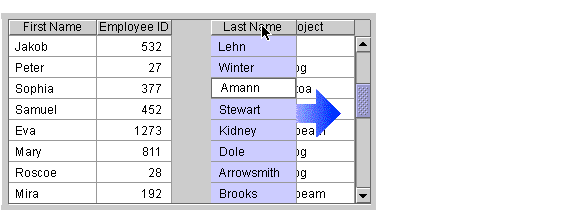
You can enable users to resize the columns in a table. Users drag the right border of the column header to the right to make the column wider, and to the left to make the column narrower. When users resize a column, you must decide whether to change the width of the entire table or adjust the other columns so the overall width is preserved. The JFC-supplied resize options are described in the following table.
You can give users the ability to sort the rows in a table by clicking the column headers. An email application, which displays a list of messages in a table, is well suited for row sorting. As shown in the following figure, users can sort the messages by date, sender, or subject. The header of the From column appears in bold to indicate that the messages are currently sorted alphabetically by sender.
Figure 158 Row Sorting in an Email Application
Provide a visual indicator for the table column that currently determines the sort order. For example, put the column header text in bold.
If your application has a menu bar, provide row sorting as a set of menu items as well (for example, include "Sort by Sender" in the View menu).
 Row sorting is not included with the table component. However, the JFC contains sample code that can be used to implement row sorting. See The Java Tutorial for more information.
When designing a table, you must decide which objects (cells, rows, or columns) users can select. The JFC provides 24 models for selecting objects in tables, but they are not all distinct.
The following nine selection models are recommended for use in the Java look and feel:
You can turn off selection in a table. Nothing is selected when users click in a cell.
You can enable users to select a cell by clicking it. The cell gets keyboard focus, which is indicated by an inner border. Any previous selection is deselected.
In the following figure, the cell containing 377 is selected and has keyboard focus. The cell cannot be edited, as indicated by the primary 3 background color.
Figure 159 Single-Cell Selection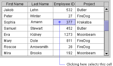
You can enable users to select a single cell or a rectangular range of cells. Users select a cell by clicking it. That cell gets keyboard focus and becomes the anchor point of the selection. Users extend the selection by moving the pointer to a new cell and Shift-clicking. Users can also select a range of cells by dragging through the range.
In the following figure, the user has selected the range by clicking Sophia and then Shift-clicking 1273. The cell containing Sophia is editable, as indicated by its white background.
Figure 160 Range of Selected Cells
In range selection, the selection always extends from the cell with the anchor point to the cell where the user Shift-clicked. If users move the pointer within the selection and Shift-click, the selection becomes smaller. For example, if the user Shift-clicks Stewart in the preceding figure, the selection is reduced to four cells (Sophia, Amann, Samuel, and Stewart).
You can enable users to select an entire row by clicking any cell in the row. The clicked cell gets keyboard focus, which is indicated by an inner border. Any previous selection is deselected.
In the following figure, the user has clicked the cell containing 811. This cell is not editable, as indicated by its background color.
Figure 161 Single-Row Selection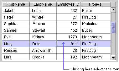
You can enable users to select one row or a range of rows. Users select a row by clicking any cell in the row. The cell that has been clicked gets keyboard focus and becomes the anchor point of the selection. Users extend the selection by moving the pointer to a new row and Shift-clicking. Users can also select a range of rows by dragging through the range.
In the following figure, the user has clicked Amann and then Shift-clicked Dole. The cell containing Amann is editable, as indicated by its white background.
Figure 162 Range of Selected Rows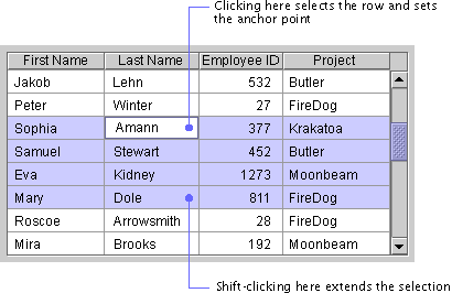
In range selection, the selection always extends from the row with the anchor point to the row where the user has Shift-clicked. If users Shift-click within an existing selection, the selection becomes smaller. For example, if the user Shift-clicks Stewart in the preceding figure, the selection is reduced to the two rows containing Amann and Stewart.
You can enable users to select a single row, a range of rows, or multiple row ranges (also known as "discontinuous," "discontiguous," or "disjoint" ranges). Users select a single row by clicking any cell in the row and extend the selection by Shift-clicking. To start another range, users Control-click any cell in a row. The cell gets keyboard focus and becomes the anchor point of the new range. The selection of the row toggles as follows:
Users can also select another range by dragging through the range while holding down the Control key.
In the following figure, the user has selected the first range by clicking Winter and then Shift-clicking Amann. The user has created another range by Control-clicking Mary and then Shift-clicking Roscoe. The cell containing Mary has keyboard focus and is editable.
Figure 163 Multiple Ranges of Selected Rows
Multiple-range selection is well suited for an email application that uses a table to display message headers, as shown in Figure 158. Users can select one or more message headers (especially useful for deleting messages).
You can enable users to select an entire column by clicking any cell in the column. The cell that was clicked gets keyboard focus, which is indicated by an inner border. Any previous selection is deselected.
In the following figure, the user has clicked Amann in the Last Name column. The white background indicates that the cell can be edited.
Figure 164 Single-Column Selection
You can enable users to select one column or a range of columns. Users select a column by clicking any cell in the column. The cell that was clicked gets keyboard focus and becomes the anchor point of the selection. Users extend the selection by moving the pointer to a new column and Shift-clicking. Users can also select a range of columns by dragging through the range.
In the following figure, the user has clicked 1273 and then Shift-clicked Amann. The cell containing 1273 cannot be edited, as indicated by its background color.
Figure 165 Range of Selected Columns
In range selection, the selection always extends from the column with the anchor point to the column where the user has Shift-clicked. If users Shift-click within an existing selection, the selection becomes smaller.
You can enable users to select a single column, a range of columns, or multiple-column ranges (also known as "discontinuous," "discontiguous," or "disjoint" ranges). Users select a single column by clicking any cell in the column and extend the selection by Shift-clicking. To start another range, users Control-click any cell in the column. The cell gets keyboard focus and becomes the anchor point of the range. The selection of the column toggles as follows:
Users can also select another range by dragging through the range while holding down the Control key.
In the following figure, the user has clicked Peter and then Shift-clicked Amann. The user has selected another range by Control-clicking Krakatoa, which has keyboard focus and can be edited, as indicated by its white background.
Figure 166 Multiple Ranges of Selected Columns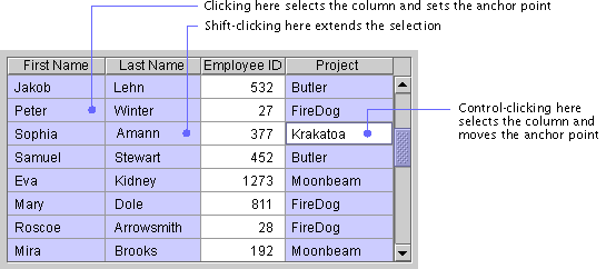
A tree view represents a set of hierarchical data in the form of an indented outline, which users can expand and collapse. Tree views are useful for displaying data such as the folders and files in a file system or the table of contents in a help system.
A tree view consists of nodes. The top-level node, from which all other nodes branch, is the root node. Nodes that might have subnodes are called "containers." All other nodes are called "leaves." The default icon for a container is a folder, and the default icon for a leaf is a file. Each node is accompanied by text.
Turners appear next to each container in the tree view. The turner points right when the container is collapsed and down when the container is expanded.
In the following figure, the Projects, Fire station, First floor, and Landscaping nodes are expanded containers; all the other containers are collapsed. Landscaping is a container without subnodes. Communications, Garage, and Shop are leaves. The turner, container, and leaf graphics shown in this figure are the default graphics provided by the JFC.
Figure 167 Tree View With Top-Level Lines
Users can click the right-pointing turner to expand a container so that its contents are visible in the tree view. The turner rotates to point downward. Clicking the downward-pointing turner collapses a container so that its contents are no longer visible. For the keyboard operations that are appropriate for tree views, see Table 32.
In most tree views, display the second level of the hierarchy as your highest level. Your outline will be easier to use if you do not display the root node.
Display turners for all containers in the tree view, including the containers at the highest level. Turners remind users that they can expand and collapse the node.
Setting the rootVisible property of the tree view to false turns off the display of the root node.
Setting the showsRootHandles of the tree view to true turns on the display of turners for the highest-level containers.
The JFC provides you three options for including lines in a tree view. The first option is not to include any lines. The second option is to draw lines that separate the top-level nodes, as shown in Figure 167. The third option is to draw lines that define the hierarchical relationships of the nodes, as shown in the following figure.
Figure 168 Tree View With Hierarchy Lines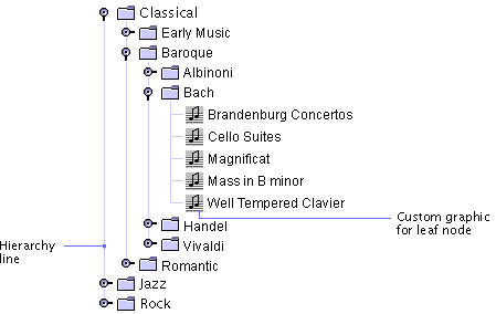
The client property JTree.lineStyle can be set to None to display no lines, to Horizontal to display top-level lines, and to Angled to display hierarchy lines.
You can substitute your own graphics for the JFC-supplied container and leaf node graphics. For example, if your hierarchy represents the clients and servers in a network, you might include graphic representations of the clients and servers. In Figure 168, a custom music graphic is used for the leaf nodes. You might also use separate graphics to show when a container is expanded and when it is collapsed.
You can enable users to edit the text in a tree view. When editing is enabled, users can change text using the same editing commands that they use for text fields. These commands are described in Editable Text Fields.
Setting the editable property to true enables editing of all nodes in the tree.
|
java.sun.com :
|
Previous | Next | Contents | Index | Search |
Copyright 1999 Sun Microsystems, Inc. All Rights Reserved.