 |
This section gives an overview of the the main features of the GIMP windows and dialogs. The GIMP windows fall into four main categories. They are the Toolbox window; the image window; the Layers, Channels, and Paths dialogs; and the dialogs for selecting colors, brushes, patterns, gradients, and palettes. Each of these is briefly introduced in the following sections.
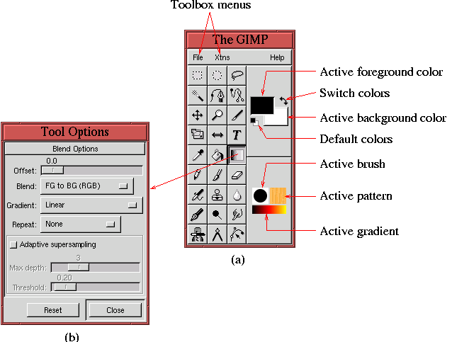
Figure 1.1(a)
![[*]](cross_ref_motif.gif) , and their uses are
discussed in various places in this book.
, and their uses are
discussed in various places in this book.
Almost all the tools in the Toolbox have options. Double-clicking on a tool brings up its Tool Options dialog . Once opened, the dialog remains open until it is explicitly closed, supplying the interface for the tool options in use at the moment. Changing tools automatically changes the Tool Options dialog, if its window is open. This dialog can also be invoked with Toolbox:File/Dialogs/Tool Options or by typing C-S-t in the Toolbox window. Figure 1.1(b) shows the Tool Options dialog for the Gradient tool.
The image window is the most important window in the GIMP. It is also
the most feature-rich. Figure 1.2(a)
*image-window.xcf-16.0 (RGB) 200%which gives quite a bit of information about this image. The string image-window.xcf is the name of the file on disk which contains the original version of this image, and the * indicates that the image in the window has been modified with respect to the version on the disk. Thus, to avoid losing the changes made to the image it must be saved (see Section 1.2). The string 16.0 gives the window number, 16, and the view number, 0. Every time a new image window is opened, the window number is incremented except when the new window is created using New View and, then, the view number is incremented (see Section 1.8.2 for more on view numbers). The string in parentheses, (RGB), gives the image type (see Section 1.4), which can be RGB, Grayscale, or Indexed. Finally, the string 200% indicates that the image is zoomed and is displayed in its window at twice its true size.
Additional information about the image can be had from the Window Info dialog, which is shown in Figure 1.2(b), and which is found in the Image:View menu, or can be displayed by typing C-S-i in the image window. This dialog gives the image type, its dimensions in pixels, and its resolution in dots per inch. The units of the rulers at the left and upper sides of the image window correspond to the dimensions shown in the Window Info dialog. Moving the mouse cursor into the image window makes an arrow appear on each ruler, indicating the cursor's position. The cursor position is also precisely shown in the status bar. In Figure 1.2(a), the status bar indicates that the mouse cursor is located at the position (99,150). Both the rulers and the status bar can be toggled off, which is done with Toggle Rulers and Toggle Statusbar, both found in the Image:View menu.
The most important feature of the image window is the Image menu, shown in Figure 1.2(c). This menu is displayed by right-clicking in the image window and can also be displayed by clicking the arrow icon found in the upper-left corner of the window (see Figure 1.2(a)). The Image menu and its submenus stay open until one of its items has been selected by the mouse. However, these menus can be opened as separate windows and, in so doing, be made to remain on the screen. This is done by clicking on the dashed line at the top of the menu. This is illustrated in Figure 1.2(d). The menu window can be eliminated from the screen by again clicking on the dashed line at the top of the menu.
When an image is larger than can be displayed by the image window, the scroll bars seen in Figure 1.2(a) allow the image to be panned inside the window. However, there is also a special panner window that can be displayed by clicking and holding the left mouse button on the four-way arrow icon found at the lower-right corner of the image window. The panner window is shown in Figure 1.2(e). Dragging the mouse in this window pans the image in the image window. Alternatively, the image can also be panned by middle-button-clicking and dragging with the mouse in the image window.
Finally, there are a pair of buttons found at the lower-left corner of the image window that are used for the Quick Mask function. This function is covered in Section 4.5.2.
The Layers, Channels, and Paths dialogs are very
important tools in the GIMP. These dialogs can be displayed by
selecting Layers & Channels from the Image:Dialogs menu or by typing C-l in the image window and
selecting the appropriate tab. The three dialogs are shown in
Figures 1.3(a), (b), and (c).
Clicking on the Active Foreground Color or Active
Background Color patches in the Toolbox window (see
Figure 1.1(a)), brings up the Color
Selection dialog shown in Figure 1.4(a).
Choosing a color in the Color Selection dialog makes that color appear in the Active Foreground Color or Active Background Color patch (see Figure 1.1(a)), depending on which patch was clicked to invoke the Color Selection tool. Clicking the Swap Colors icon (the two-headed arrow next to the active color patches) switches the foreground and background colors. This can also be accomplished by typing x in the image window. Clicking the Default Colors icon (the small black and white rectangles below the color patches) reverts the foreground and background colors to their defaults of black and white. This can also be accomplished by typing d in the image window.
Figure 1.5(a)
Figure 1.6(a)
Figure 1.7(a)
Figure 1.8(a)