
|
|
|
1: The Java Look and Feel
This book sets standards for the use of the Java look and feel. By following these guidelines, you can create Java applications that effectively support all users worldwide, including those with physical and cognitive limitations.
The Java look and feel is the default interface for applications built with the Java Foundation Classes. The Java look and feel is designed for cross-platform use and can provide:
Three distinctive visual elements are the hallmarks of the Java look and feel components: the flush 3D style, the drag texture, and the color model.
In the Java look and feel, component surfaces appear to be at the same level as the surrounding canvas. This "flush 3D" style is illustrated in the following figure.
Figure 1 Consistent Use of the Flush 3D Style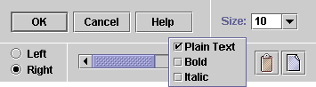
The clean, modern appearance reduces the visual noise associated with beveled edges. Flush 3D components fit in with a variety of applications and operating systems.
A textured pattern, used throughout the Java look and feel, indicates items that users can drag. Such an indication cues cross-platform users in a reliable way. The following figure demonstrates several uses of the drag texture.
Figure 2 Consistent Use of the Drag Texture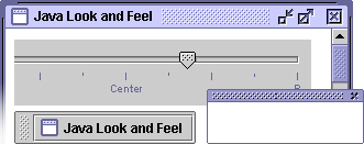
A simple and flexible color model ensures compatibility with platforms and devices capable of displaying quite different color depths. The default colors provide an aesthetically pleasing and comfortable scheme for interface elements, as shown in the following figure.
Figure 3 Role of the Color Model in Compatibility
The Java look and feel implements widely understood interface elements (windows, icons, menus, and pointers) and works in the same way on any operating system that supports the Java Foundation Classes (JFC). The visual tour in this section shows off two JFC applications with the Java look and feel: MetalEdit and Retirement Savings Calculator. MetalEdit is a standalone, text-editing application; Retirement Savings Calculator is an applet displayed in a browser window.
The following figure shows a Microsoft Windows desktop with MetalEdit and Retirement Savings Calculator. MetalEdit has a menu bar and toolbar as well as a text-editing area. Retirement Savings Calculator is displayed inside a web browser. Other Microsoft Windows applications are also present; some are represented by minimized windows.
Although the windows of many applications can be open on the desktop, only one can be the active window. In the figure, MetalEdit is the active window (indicated by the color of the title bar), whereas the Netscape NavigatorTM browser, which contains Retirement Savings Calculator, is inactive. As an applet, Retirement Savings Calculator is displayed within an HTML page.
Figure 4 Typical Desktop With Applications on the Microsoft Windows
Platform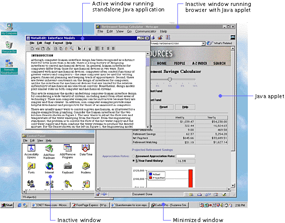
This section uses a hypothetical text-editing application called "MetalEdit" to illustrate some of the most important visual characteristics of the Java look and feel, including its windows, menus, toolbars, editor panes, dialog boxes, and alert boxes.
The windows in Java look and feel applications use the borders, title bars, and window controls of the platform they are running on. For instance, the MetalEdit document window shown in Figure 4 is running on a Microsoft Windows desktop and uses the standard Microsoft window frame and title bar. As shown in the following figure, the contents of the document window (menu bar, toolbar, and editor pane) use the Java look and feel. However, the window borders, title bars, and window controls have a platform-specific appearance.
Figure 5 Document Window on Three Platforms
The menu bar, which is the horizontal strip under the window title, displays the titles of application menus, called "drop-down menus." Drop-down menus provide access to an application's primary functions. They also enable users to survey the features of the application by looking at the menu items. Chapter 9 contains discussions of drop-down menus, submenus, and contextual menus and provides guidelines for the creation of menus and menu items for your application.
The following figure shows the contents of the Edit and Format menus from the MetalEdit menu bar. The menu items are divided into logical groupings by menu separators (in the flush 3D style). For instance, in the Edit menu, the Cut, Copy, and Paste commands, which are related to the clipboard, are separated from Undo and Redo commands, which reverse or restore changes in the document. For more information, see Separators. Selected menu titles are highlighted in blue in the default Java look and feel theme. For details, see Themes.
Figure 7 Example Drop-down Menus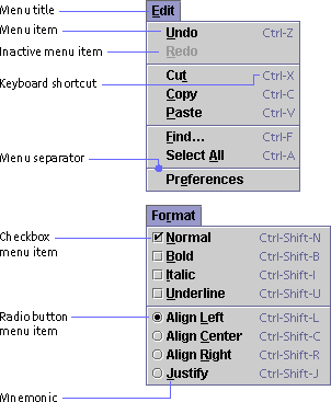
Keyboard shortcuts offer an alternative to using the mouse to choose a menu item. For instance, to copy a selection, users can press Control-C. For details, see Keyboard Shortcuts.
Mnemonics provide yet another way to access menu items. For instance, to view the contents of the Edit menu, users press Alt-E. Once the Edit menu has keyboard focus, users can press C to copy a selection. These alternatives are designated by underlining the "E" in Edit and the "C" in Copy. For details, see Mnemonics.
The menus shown in Figure 7 illustrate two commonly used menu titles, menu items, and menu item arrangements for Java look and feel applications. For details, see Drop-down Menus and Menu Items.
A toolbar displays command and toggle buttons that offer immediate access to the functions of many menu items. The MetalEdit toolbar is divided into four areas for functions relating to file management, editing, font styles, and alignment. Note the flush 3D style of the command and toggle buttons and the textured drag area to the left of the toolbar. For details, see Toolbars.
The document text in the following figure is displayed in an editor pane with a styled text editor plug-in kit, which is embedded in a scroll pane. (Note the use of the drag texture in the scroll box.) For more on styled text editor plug-in kits, see Editor Panes. For details on scroll panes, see Scroll Panes.
In the Java look and feel, dialog boxes use the borders and title bars of the platform they are running on. However, the dialog box contents have the Java look and feel. Chapter 8 describes dialog boxes in the Java look and feel and contains recommendations for their use.
Figure 10 shows a preferences dialog box with the title bars, borders, and window controls of several platforms. The dialog box enables users to specify options in the MetalEdit application. Noneditable combo boxes are used to select ruler units and a font. Text fields are used to specify the margins. An editable combo box enables users to specify font size. Radio buttons and checkboxes are used to set other preferences. Clicking the Browse command button displays a file chooser in which users can select a stationery folder.
Note the flush 3D borders of the combo boxes, text fields, radio buttons, checkboxes, and command buttons. Labels use the primary 1 color, one of eight colors in the default Java look and feel theme. For a thorough treatment of basic controls (including combo boxes, radio buttons, checkboxes, and command buttons), see Chapter 10. For a detailed discussion of text fields and labels, see Chapter 11.
MetalEdit provides mnemonics and keyboard navigation and activation sequences for each of the interactive controls in the preferences dialog box. The dialog box in the following figure illustrates two ways to create a mnemonic: directly in a component, indicated by an underlined letter in the component text, or in a label associated with the component, indicated by an underlined letter in the label.
Figure 10 Example Dialog Boxes on Microsoft Windows, Macintosh, and CDE
Platforms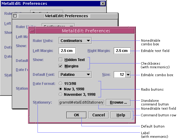
The alert boxes in a Java look and feel application use the borders, title bars, and window controls of the platform they are running on. However, the symbols, messages, and command buttons supplied by the JFC use the Java look and feel. (You provide the actual message and specify the number of command buttons as well as the button text. The JFC provides layouts for the symbol, the message, and the command buttons.)
When users try to close a window without saving changes, the Warning alert box asks them if they would like to save changes. Of the three command buttons in MetalEdit's Warning alert box, shown in the following figure, the default command button is Save. The Don't Save button closes the window without saving changes. The Cancel button closes the dialog box but leaves the unsaved document open. For details, see Alert Boxes.
Figure 11 Example Alert Boxes on CDE, Microsoft Windows, and Macintosh
Platforms
Retirement Savings Calculator Applet
The sample applet, Retirement Savings Calculator, is part of a web page displayed in the Netscape Navigator browser, as shown in the following figure. This human resources applet enables employees of a fictitious company to determine their contributions to a retirement savings plan. To make it easy for all employees to access information on their retirement savings, the company provides the applet in a web page. (Note the boundaries of the applet. The HTML page also includes a banner in the GIF format as well as an HTML header with the title of the page.) All the JFC components shown in the sample applet use the Java look and feel.
Figure 12 Applet on an HTML Page in a Browser (Exploded View)
The applet obtains an employee's current retirement savings contribution and other salary data from a database and fills noneditable text fields with the relevant data. The employee can drag a slider to specify a salary contribution and click a radio button to specify whether new contributions go to a money market, bond, or stock market fund. A row of command buttons offers a choice of whether to save changes, reset the salary contribution, or display help.
Using the employee's input, the applet calculates the employee's weekly and yearly gross salary, tax withholding, other deductions, retirement savings contribution, net paycheck, and the company's matching funds. Results are displayed in a table. Finally, the employee can type an assumed appreciation rate in an editable text field to see accumulated future savings or instruct the applet to use the five-year fund history to project savings in the chart at the bottom of the applet.
Figure 13 Retirement Savings Calculator Applet
For more information on the components used in this applet, see Text Fields, Sliders, Radio Buttons, Command Buttons, and Tables.
|
java.sun.com :
|
Previous | Next | Contents | Index | Search |
Copyright 1999 Sun Microsystems, Inc. All Rights Reserved.

